The network for creativity
Join 1.25M professional creatives like you
Connect with clients, get discovered, and run your business 100% commission-free
Creatives on Contra have earned over $150M and we are just getting started
Back to feedPost
The synthesis of a craft.
A preview of the visual identity for Tapidecor, a brand where furniture is created from scratch through artisanal manufacturing and signature upholstery.
The development is based on a geometric synthesis representing the iconic profile of a chair. As the most essential form of a seat, this structure symbolizes the primary physical touchpoint between the user and the design, capturing the essence of the craft: the balance between structural firmness, functionality, and the comfort of the finish.
The system features two variants: an integrated version where the naming is housed within the core of the symbol, and a pure logomark for high-impact applications (wood engraving, embroidery, or stamps), where the form maintains the brand identity on its own.
Brand DesignIconography DesignAdobe Creative CloudAdobe IllustratorAdobe PhotoshopbranddesignericondesignbrandingstudioVisual Design


this is genius i love it


Thank you!!

Obsessed!
Thank you! ✨

Very nice!
Glad you like it!:)


That's so neat.
Thanks, Daniel! Glad you liked the execution

This is great

The restraint here is what makes it work reducing a chair to its most essential geometric form and building an entire identity system from that single insight is really solid thinking. The dual variant approach (integrated vs pure logomark) shows it was designed to actually be used, not just presented. Great work.
I appreciate the analysis! the dual approach was essential to make the system versatile and ready for real-world application :)
Exactly and that's the hardest part to get right. A lot of identity systems look great in the case study but fall apart the moment they hit an actual surface. Yours clearly didn't skip that step.

Wow, love this!
Glad you liked it, Sharon! Thanks for the support

LOVE the logo mark
Thank you, Ashlyn! The logomark was definitely my favorite part of the process

Amazing Design 🔥

Amazing

A geometric mark derived from the actual product 🙌 that's the kind of concept that makes a logo feel inevitable rather than designed.


Thoughtful!!


daaamn! 💯🔥
Thank youuuu Nikita :)!

Thank you!
The network for creativity
Join 1.25M professional creatives like you
Connect with clients, get discovered, and run your business 100% commission-free
Creatives on Contra have earned over $150M and we are just getting started
Trending

Claude
Claude has entered the design space. How are you using it?

Contra University
Learn from expert creatives how to earn more using next-gen AI tools.
Brand Design
The best brand designers are on Contra. Scroll to see what's trending in brand design. What are you building?
creativeaiflow
Creative AI workflows are evolving. What tools do you use, and what are their strengths and weaknesses?
freelancerlife
Freelancer life is wins, pivots, and everything in between. What’s yours right now?
Related posts

No.ex — Next Operational Experience
No.ex is a conceptual visual identity exploring how modern systems behave, evolve, and communicate through design.
Positioned between digital experimentation and physical presence, No.ex combines editorial structure, immersive visual direction, and future-oriented aesthetics to create a dynamic and adaptive identity language.
The project investigates movement, signal, structure, and interaction through posters, large-scale applications, environmental graphics, and visual systems designed for both digital and real-world spaces.
Rather than functioning as a traditional brand, No.ex exists as a visual framework — one that reflects contemporary culture, technological progression, and the constant evolution of modern communication.
2026© AMNE Studio.
Enmanuel Jimenez V.
Jv® Studio. —
All rights reserved.


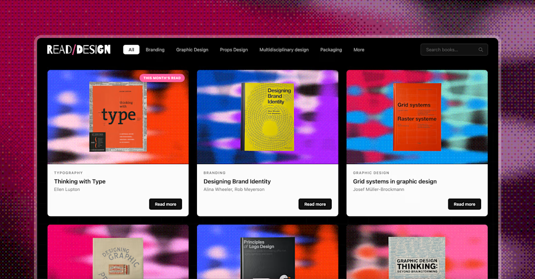
Read/Design is a personal project that started as a way to keep my curiosity about design alive. Think of it as a digital library built from the books I've collected over the years. The idea is to share, every month in an Instagram post, the insights that stuck with me the most, with the goal of spreading knowledge and encouraging the reading of physical books.
Since sharing your process is the thing now, here's how this came together: I designed the graphics and website myself in the old-fashioned way, but the site itself was built in Claude Code with a Notion database behind it. Huge respect for developers. This build cost me two migraines and way too many tokens.

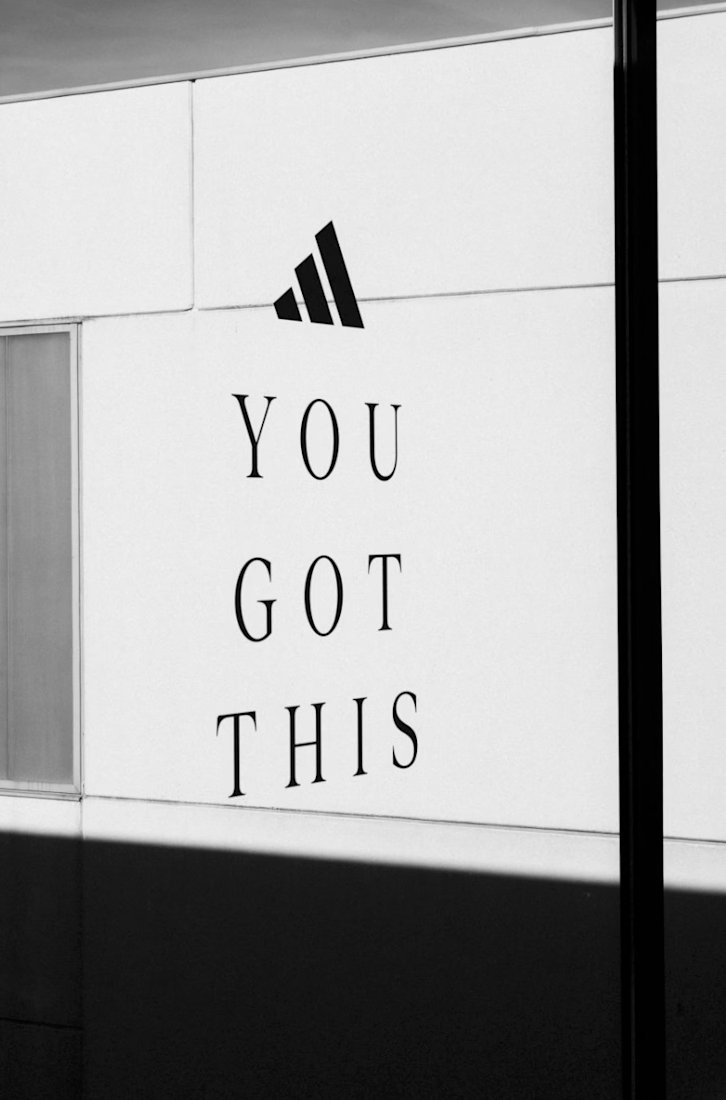
Real Madrid Experience — Brand & Experiential Photography for Coerver UK & Adidas
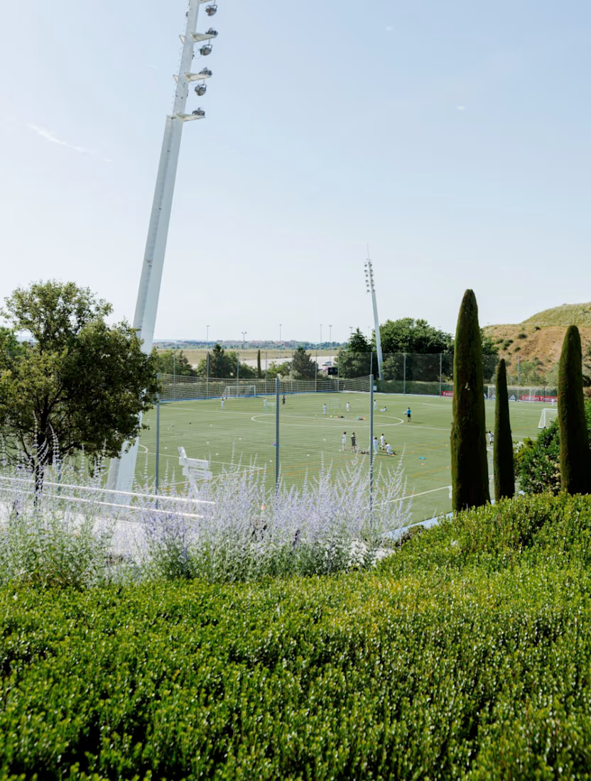
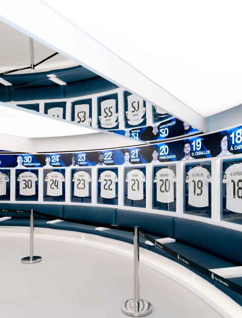
Documenting the Real Madrid Experience in Madrid, Spain—an immersive program designed by Coerver UK in partnership with Adidas. The initiative brings international youth players and their families into the environment of professional football, featuring intensive training sessions at Real Madrid’s Training Complex (Valdebebas) and an exclusive tour of the Santiago Bernabéu Stadium.
Client Trust & Partnership (Repeat Hire) This project marked the third time Coerver UK trusted me to document their international sports experiences in Spain. Recurring collaborations like this allow for a deeper understanding of the brand's narrative, visual standards, and overall tone over time.
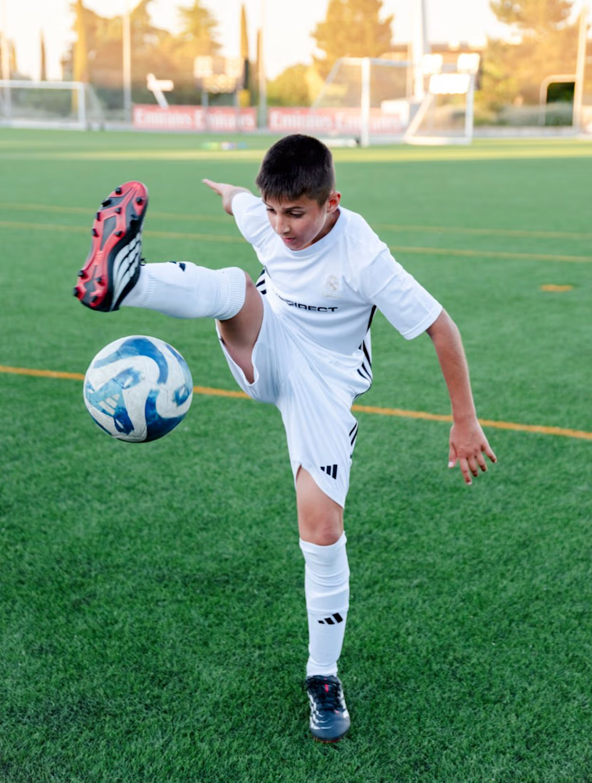
The Creative Challenge Sports storytelling requires balancing fast-paced athletic action with intimate, candid human moments. The key goal was to build immediate trust with international families and maintain an unobtrusive presence, capturing authentic emotions without disrupting the natural flow of the event.
Visual Approach & Delivery
1. Dynamic Action Coverage: Documenting high-intensity drills with technical precision.
2. Candid Storytelling: Capturing raw reactions—the wonder of entering the Bernabéu, focus before drills, and shared family celebrations.
3. Brand Integration: Seamlessly incorporating Adidas and Coerver UK visual elements into natural, non-staged compositions.
Scope of Work: On-location Documentary Photography, Event Coverage, Photo Editing & Color Grading.
Location: Madrid, Spain.


It's beautiful...
Well done



