The network for creativity
Join 1.25M professional creatives like you
Connect with clients, get discovered, and run your business 100% commission-free
Creatives on Contra have earned over $150M and we are just getting started
Back to feedPost
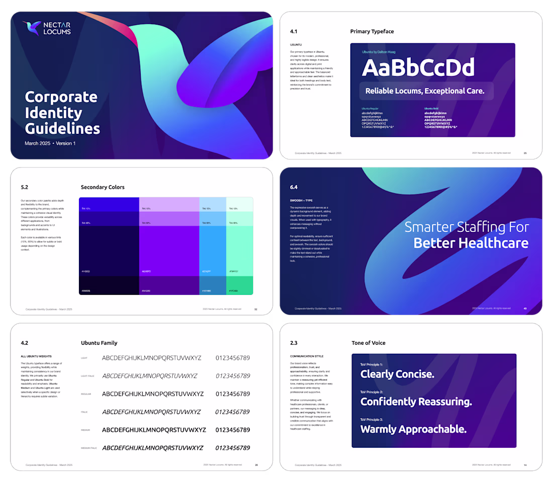
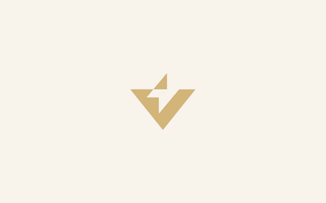
Healthcare branding is usually sterile blue templates or cold corporate stuff. Nectar Locums wanted neither.
They came with nothing. No logo, no colors, no direction. Just a name and a goal: build trust between locum professionals and hospitals.
Started with a logo sprint. Geometric for precision, organic for empathy, hybrid for balance. Tested everything in real context, not just as marks but inside actual UI and layouts.
Then the system. Deep indigo for reliability. Lavender for warmth. Humanist typography. 8-point grid running through everything.
An identity that feels calm, confident, and human. Not another healthcare template.
Full scope: logo, colors, typography, wireframes, website, brand book.
Read the full case study
The network for creativity
Join 1.25M professional creatives like you
Connect with clients, get discovered, and run your business 100% commission-free
Creatives on Contra have earned over $150M and we are just getting started
Related posts
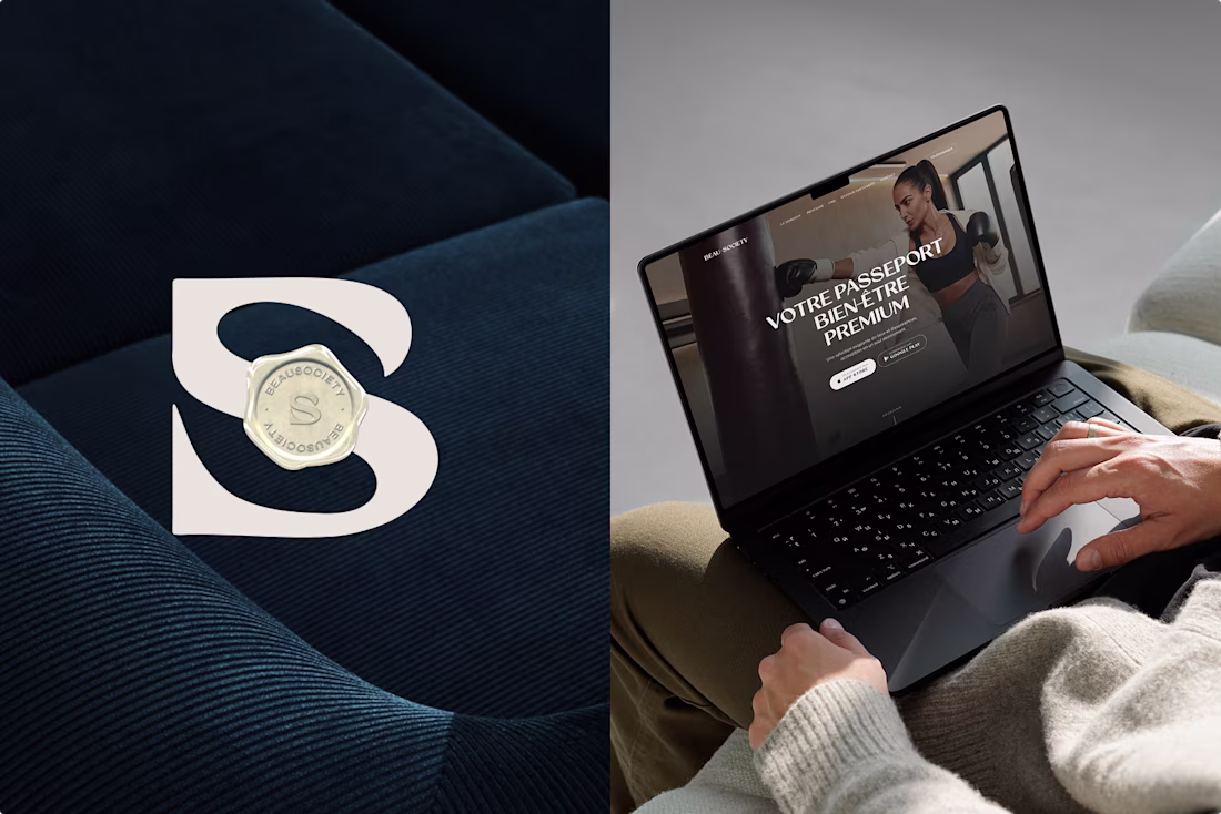
Would you pay a 400€/month membership without needing convincing?
This was my challenge with Beau Society, a premium wellness membership in Lyon 💆
Instead of justifying the price, I've built a brand that removes the decision entirely: strategy, creative direction and design, all engineered so that 400€ feels OBVIOUS to the target audience, not expensive.
What's more exhausting for you: paying for wellness, or figuring out where to spend it?
For me: The second, and I learned it the hard way! 💀
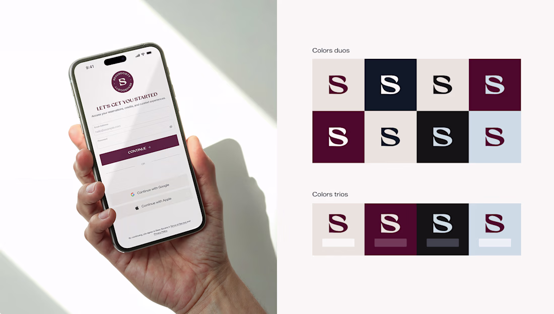
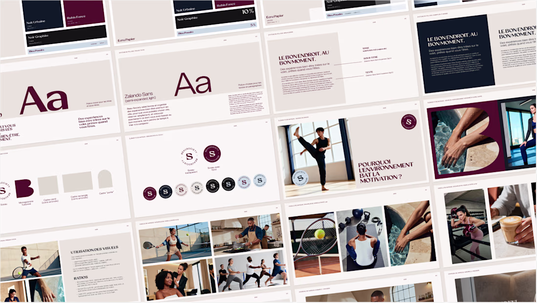
the decision-removal angle is the whole game. price stops being a debate the moment the brand signals you're already the kind of person who buys it, and the serif system plus that monogram pull that off. reads like membership not a purchase, really nice work
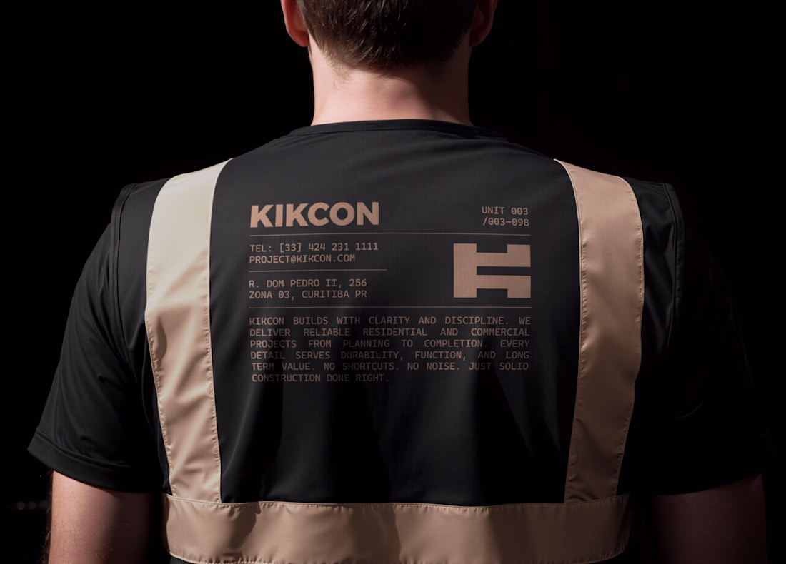
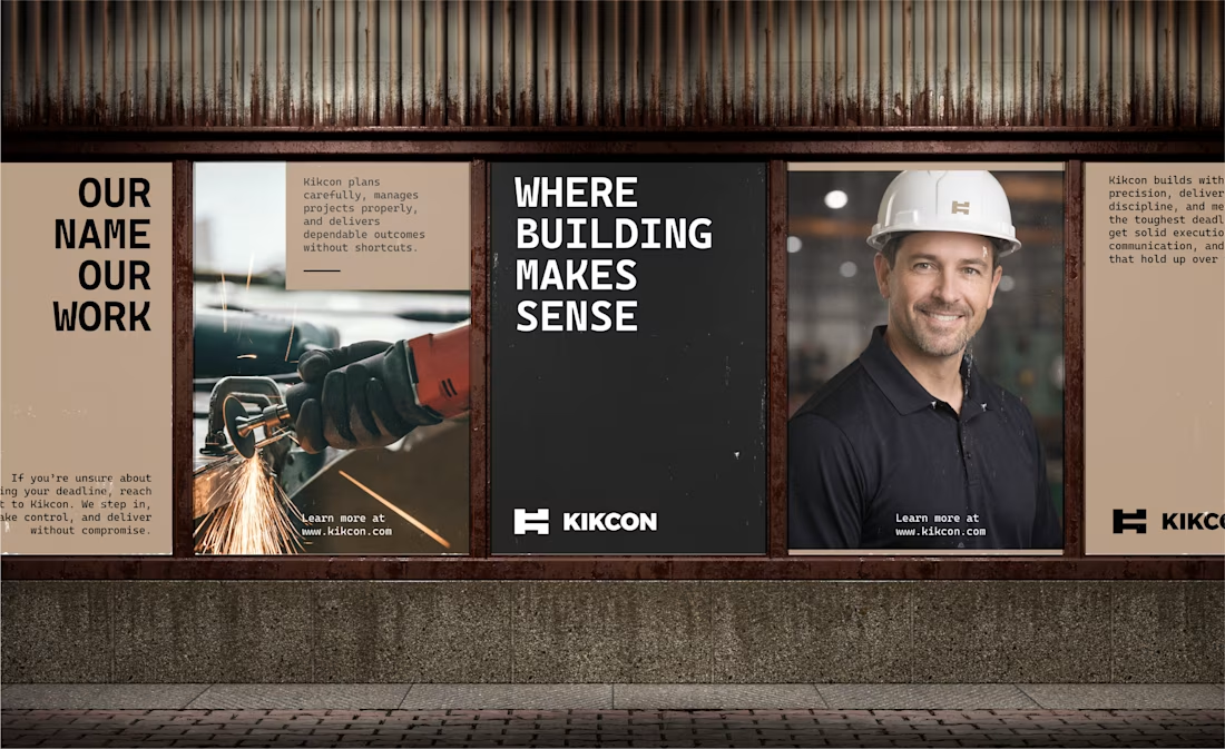
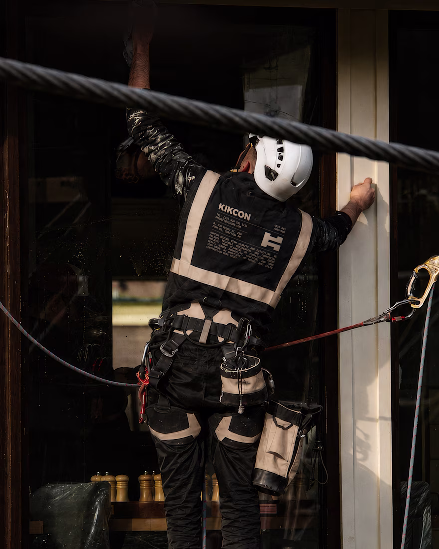
Just wrapped up final form brand identity work for KIKCON - a construction & residential build company.
developed in close collaboration with the client, Kikcon’s visual identity reflects its family-built foundation and its commitment to quality construction in South Australia.
Really enjoyed working on this project!
Looking good Pawel!
Love the color palette.
Hello Founders.
Over the past year, we've been creating logos that genuinely improve customer perception. Not generic marks, but thoughtful logomarks that tell the story you want.
Perception is a major factor in customer decision-making, and it's what we focus on heavily in branding.
Here are some logo lockups we've worked on.
We're open for new logo design and branding projects.
Send a DM or email to ► info@donatus.agency
Good job
Challenges
View allTrending
Claude
Claude has entered the design space. How are you using Claude Design?
Contra University
Learn from expert creatives how to earn more using next-gen AI tools.
fifaworldcup2026
The World Cup is here and the whole world's watching. How are you designing for the world stage?
creativeaiflow
Creative AI workflows are evolving. What tools do you use, and what are their strengths and weaknesses?
freelancerlife
Freelancer life is wins, pivots, and everything in between. What’s yours right now?