The network for creativity
Join 1.25M professional creatives like you
Connect with clients, get discovered, and run your business 100% commission-free
Creatives on Contra have earned over $150M and we are just getting started
Back to feedPost
Taste Test
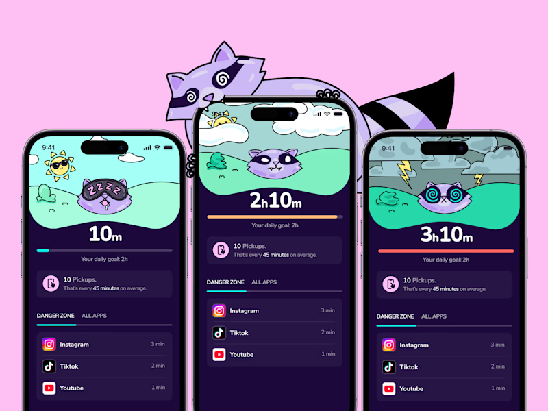
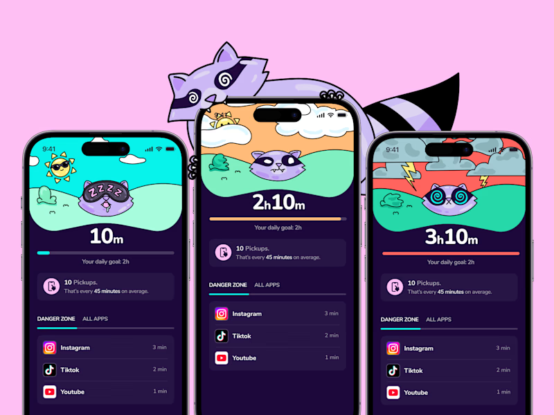
I'm testing a few new backgrounds for detach, that tell the "screentime" level a bit more clearly. I'm not sure wether to stay with natural sky colors, or go all in with color! Wdyt?
16 voted
27%
43 voted
73%
59 votes
Closed

Went with colorful, having each app get its own hue makes the screentime breakdown scannable at a glance instead of needing to read the labels first.


Amazing Work😍

💖

Good work

The colourful works well


colorful one

Colorfull work

colorful is good, give vibrant view

I prefer dark only style because it doesn’t distract users from the main goal of the page (which is reading the content) but to be honest the illustration are really good in both style

I voted colorful, but only because the hue can carry meaning here: let it encode the screentime level rather than just decorate. On a wind-down app like detach, calm sky tones for low usage warming up as it climbs would let the background tell the story on its own.

Color. Color is fun and needed now.
Also trying to branch with more color in my designs.

Go with colors, for sure! This way, these cute illustrations won’t just work as aesthetic fillers - they’ll have a clear functional purpose by directly signaling status changes. The use of color can also help emphasize the changing emotions and states of your app’s character. :)
Overall, both versions look pretty cool! 🔥

The colourful works well

Colorful 😍


dario the colorful one gets my vote. the orange phone pops

Love the style 😍

colorful for me!!!! quick question, how you did the presentation of the multiple screens? including the racoon, it is sooo cooll!
The network for creativity
Join 1.25M professional creatives like you
Connect with clients, get discovered, and run your business 100% commission-free
Creatives on Contra have earned over $150M and we are just getting started




Related posts

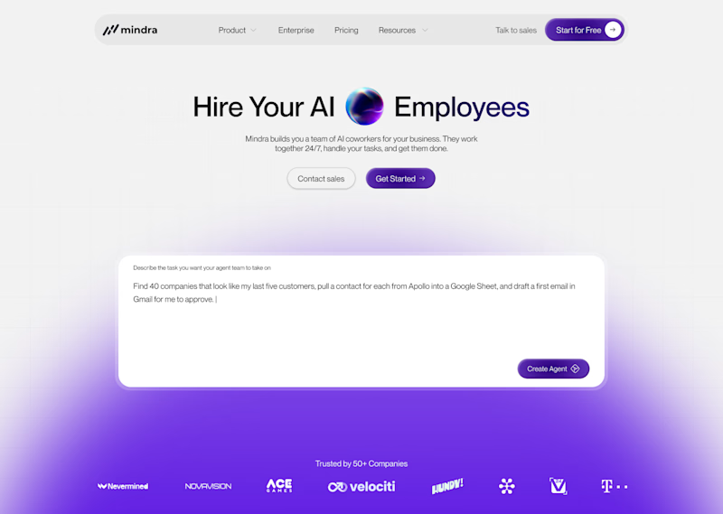
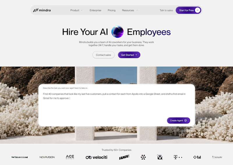
2 same animations, different format. Which one do you like? Why??🤔
28 voted
50%
28 voted
50%
56 votes
Closed

The horizontal frame gives that line chart more room, but the square crop makes the red-to-blue type shift hit harder. Both feel tight.


B

💳 Making Financial Products Feel Simple
I designed this finance website for Sendit, with one goal in mind: make everyday payments feel simple, trustworthy, and effortless.
The design focuses on:
Clear messaging and strong visual hierarchy
Trust-focused finance UI
Simple payment interactions
Clean, modern layouts
Conversion-focused sections
A responsive experience designed around the user
For fintech products, good design isn’t just about looking modern. It’s about making people feel confident when money is involved.
If you’re building a fintech, SaaS, payment platform, or financial product and need a website that communicates trust and clarity, I’d love to work with you.


Solid execution on a hard brief.