The network for creativity
Join 1.25M professional creatives like you
Connect with clients, get discovered, and run your business 100% commission-free
Creatives on Contra have earned over $150M and we are just getting started
Back to feedPost

Just finished my third landing page template ✨
This one features a futuristic purple UI with glowing gradients and a bold hero section — perfect for modern SaaS and AI products.
Curious what you think 👀
The network for creativity
Join 1.25M professional creatives like you
Connect with clients, get discovered, and run your business 100% commission-free
Creatives on Contra have earned over $150M and we are just getting started







Related posts

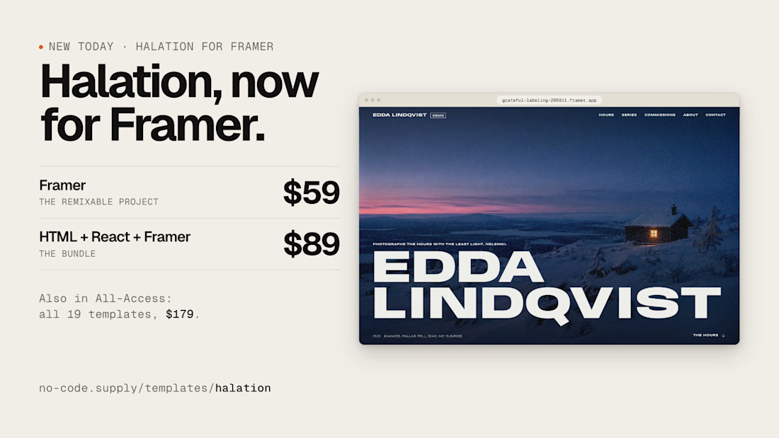
Photography template Halation is now on @Framer
https://www.framer.com/marketplace/templates/halation-photos/


Nice one

Brand Identity Kit: an animated brand showcase template 🌿
I built a 3D-style brand scene that anyone can make their own. The sign, products and palette are all separate named layers, so swapping the images, retyping the text and changing five color fills turns it into a different brand with the same animation.
Best for brand launches, identity presentations and product reveals, whether you’re pitching a client, showing a rebrand or opening a new store.
How I built it: I designed the brand and products as separate layers, then used the @SVGator MCP with an AI assistant to structure the project and animate it, and finished it by hand in the editor.


Amazing 🔥🔥

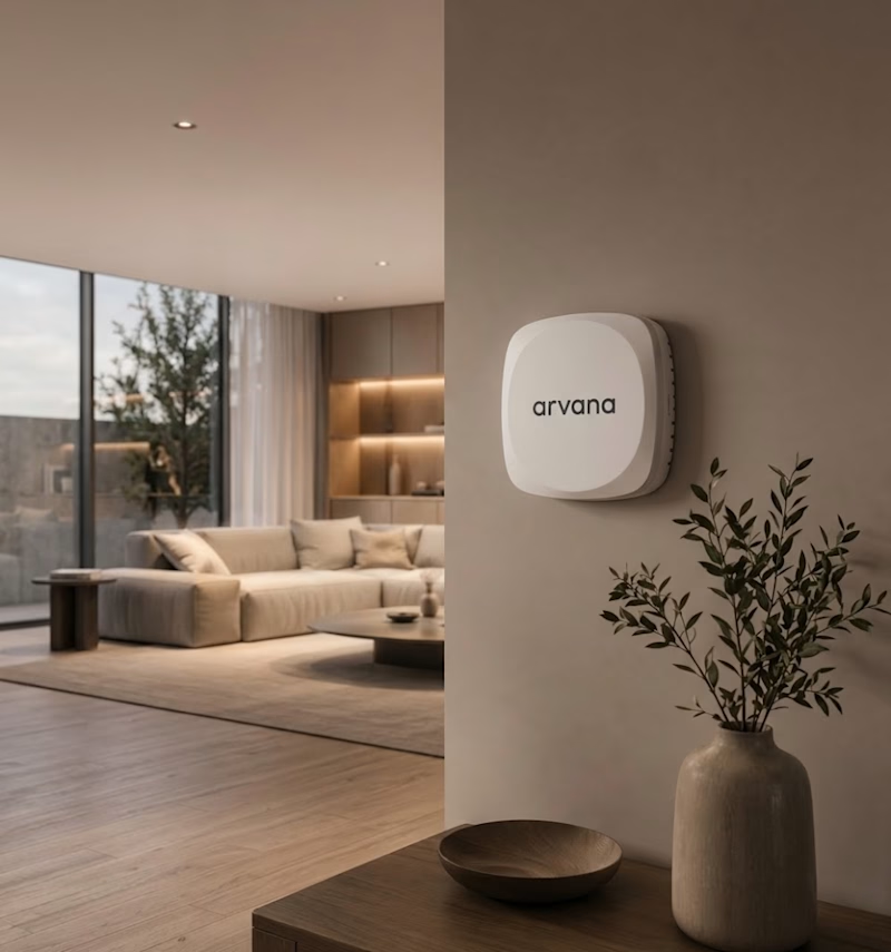
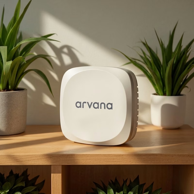
✨ Two renders. One product. Which Arvana visual do you prefer?
Exploring realistic 3D product rendering for Arvana, blending minimal design with warm, natural interiors. 🏡🤍
🏠 Option 1: Lifestyle & Ambient
☀️ Option 2: Clean & Product-Focused
Which one stands out to you? 👀 Cast your vote! 🗳️👇
3 voted
27%
8 voted
73%
11 votes
Closed