The network for creativity
Join 1.25M professional creatives like you
Connect with clients, get discovered, and run your business 100% commission-free
Creatives on Contra have earned over $150M and we are just getting started
Back to feedPost
Most electronic music visuals lean way too hard on tired clichés, but for maketrancemusic, we threw out the rulebook. As the designer behind the identity, I skipped the noise to focus on architectural precision and razor-sharp typography. We engineered a bespoke, structural logo that hits that heavy balance between raw rhythm and ice-cold restraint. This identity doesn’t just show up on a digital feed; it flexes its architectural muscle and absolutely owns the room.


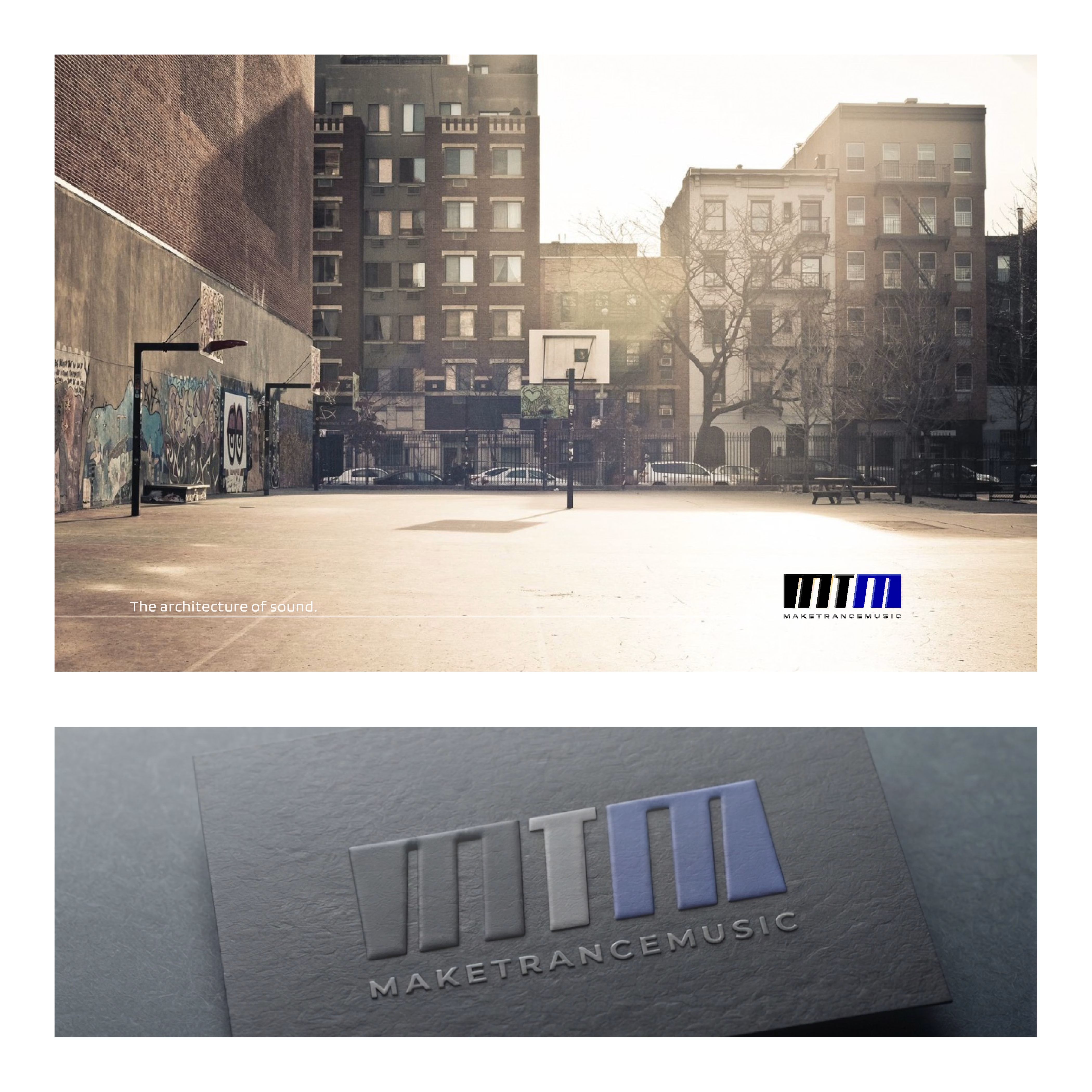


the gray logo feels so solid

Thanks, Benjamin!
That direction actually started as an experiment with vertical line weights to create a bit of creative disorder and highlight some irregular elements. The client ultimately wanted to lean into a much simpler, solid structure, though.
Do you usually prefer...

Since the genre usually lives in total chaos... 😊
Appreciate the support!
The network for creativity
Join 1.25M professional creatives like you
Connect with clients, get discovered, and run your business 100% commission-free
Creatives on Contra have earned over $150M and we are just getting started

Challenges
View all


Related posts

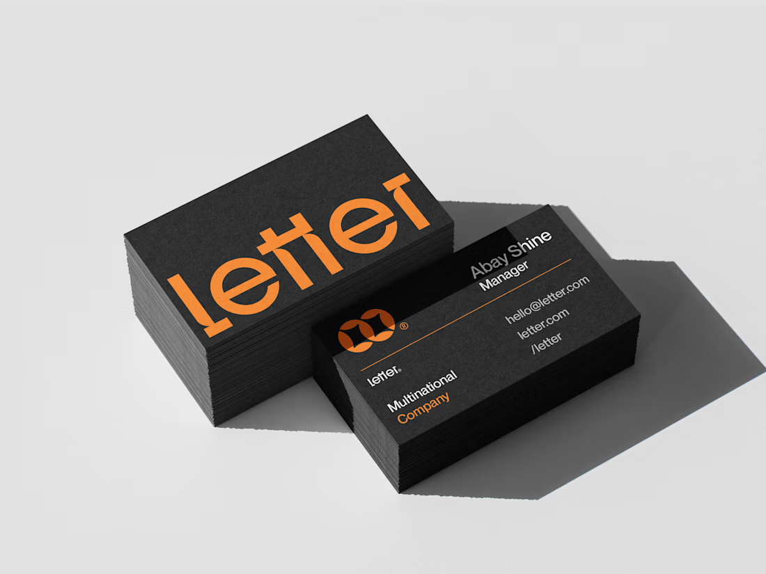
Letter — Visual Identity for a Multinational Company
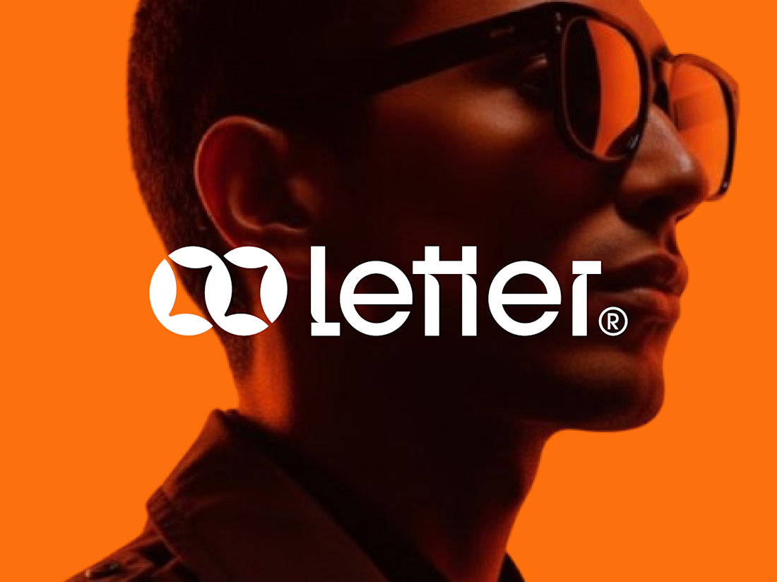
For Letter, I built the mark around two interlocking loop forms — a subtle nod to connection and precision, the kind of detail that makes a logo feel deliberate at a glance.
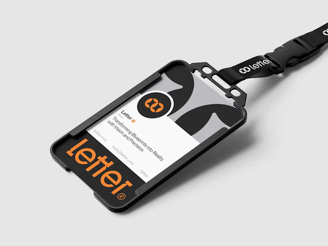
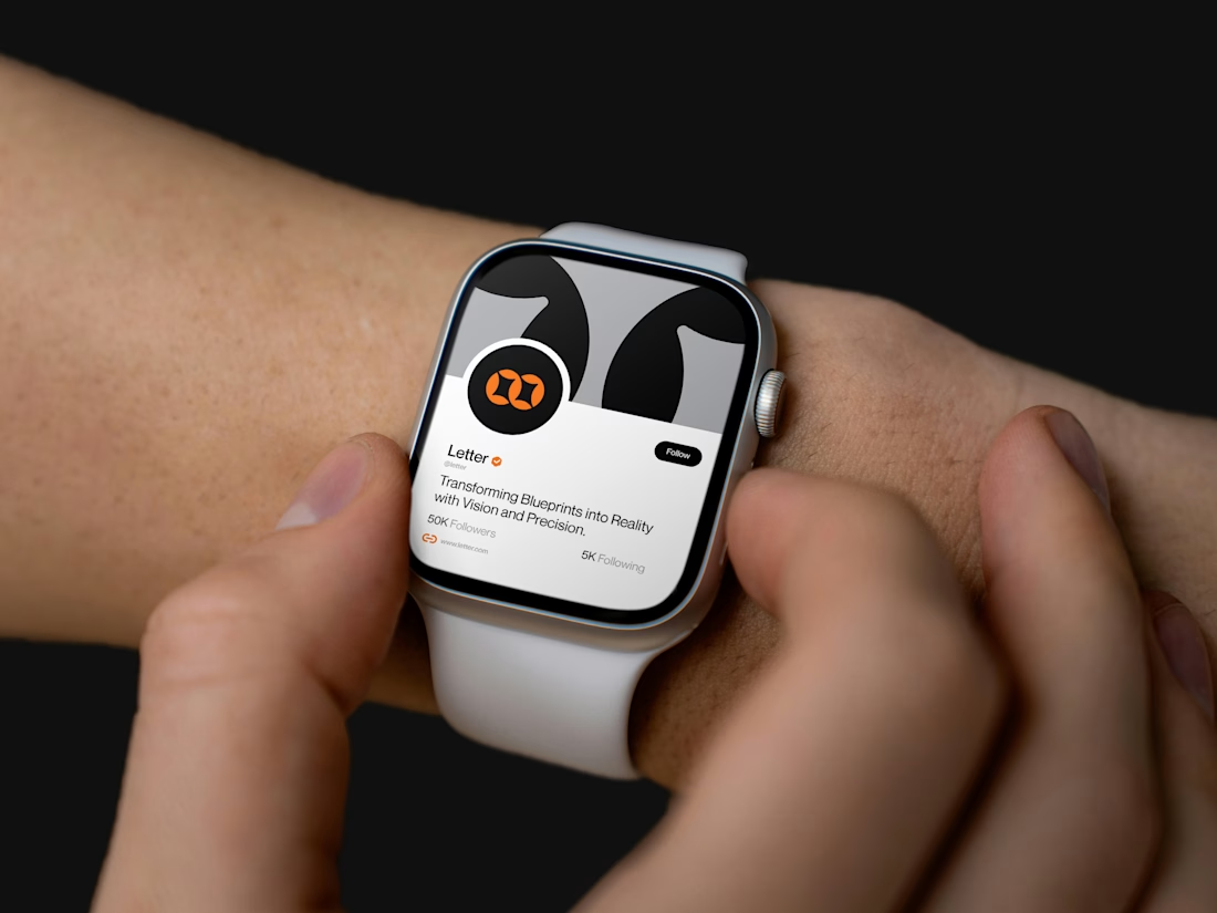
I developed the full system from there: wordmark, icon mark, a bold orange-and-black palette, and mockups across ID badges, business cards, lanyards, and even a smartwatch — showing the brand holding its identity everywhere it lands.
Transforming Blueprints into Reality with Vision and Precision.

Absolutely amazing work, well done!

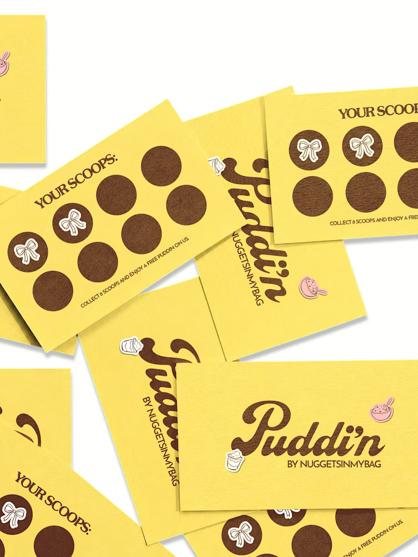
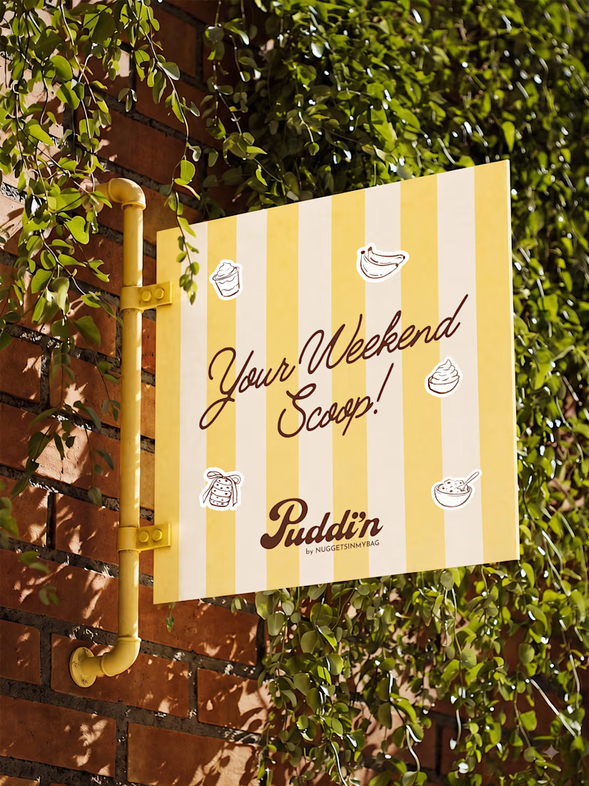
The idea for Puddin’ was to create a dessert brand that felt playful, nostalgic, and full of personality. I didn’t want it to look like just another polished food brand. I wanted the identity to feel warm, slightly quirky, and something you’d actually want to interact with.
So we built the visual direction around soft, playful colours, expressive typography, and a hand-drawn illustration style.
This is where we started, turning the personality of Puddin’ into a visual language.
Brand DesignLogo DesignPackaging DesignAdobe After EffectsAdobe IllustratorAdobe Photoshopbrandidentitybrandcollateralpackagingdesign



Love it. Looks unique to me!


Great design and beautiful presentation.