The network for creativity
Join 1.25M professional creatives like you
Connect with clients, get discovered, and run your business 100% commission-free
Creatives on Contra have earned over $150M and we are just getting started
Back to feedPost
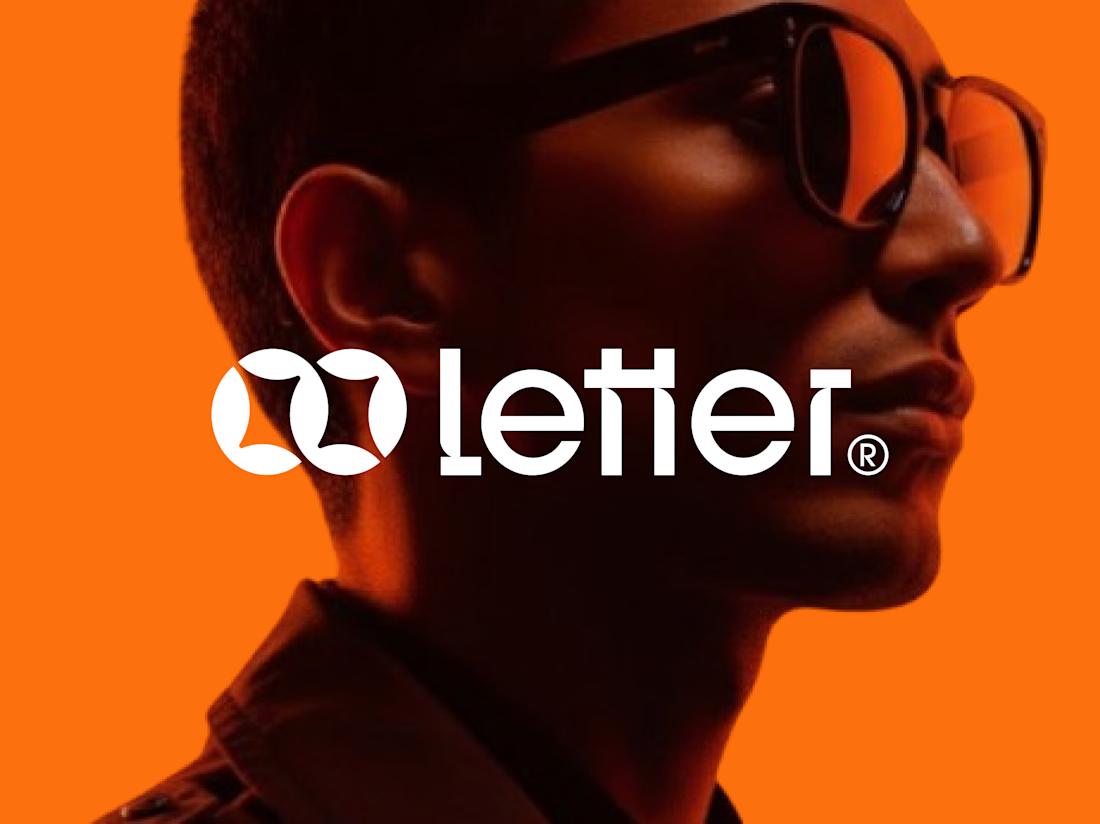
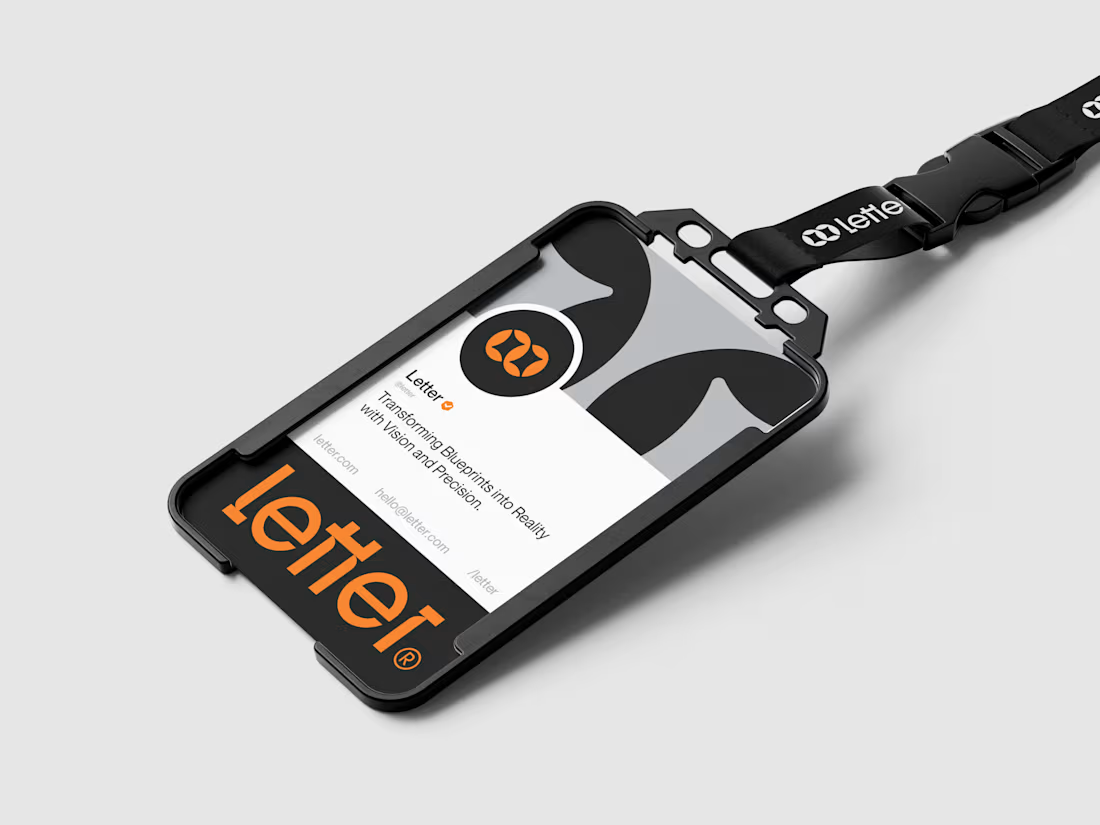
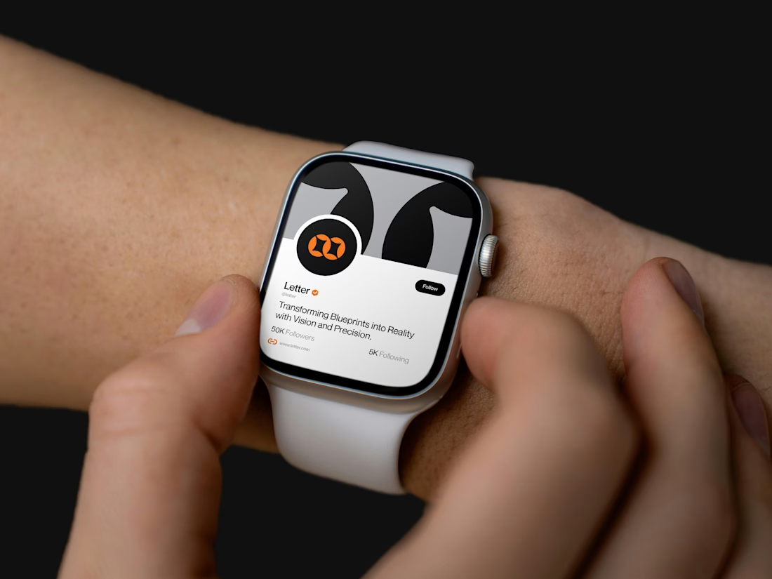
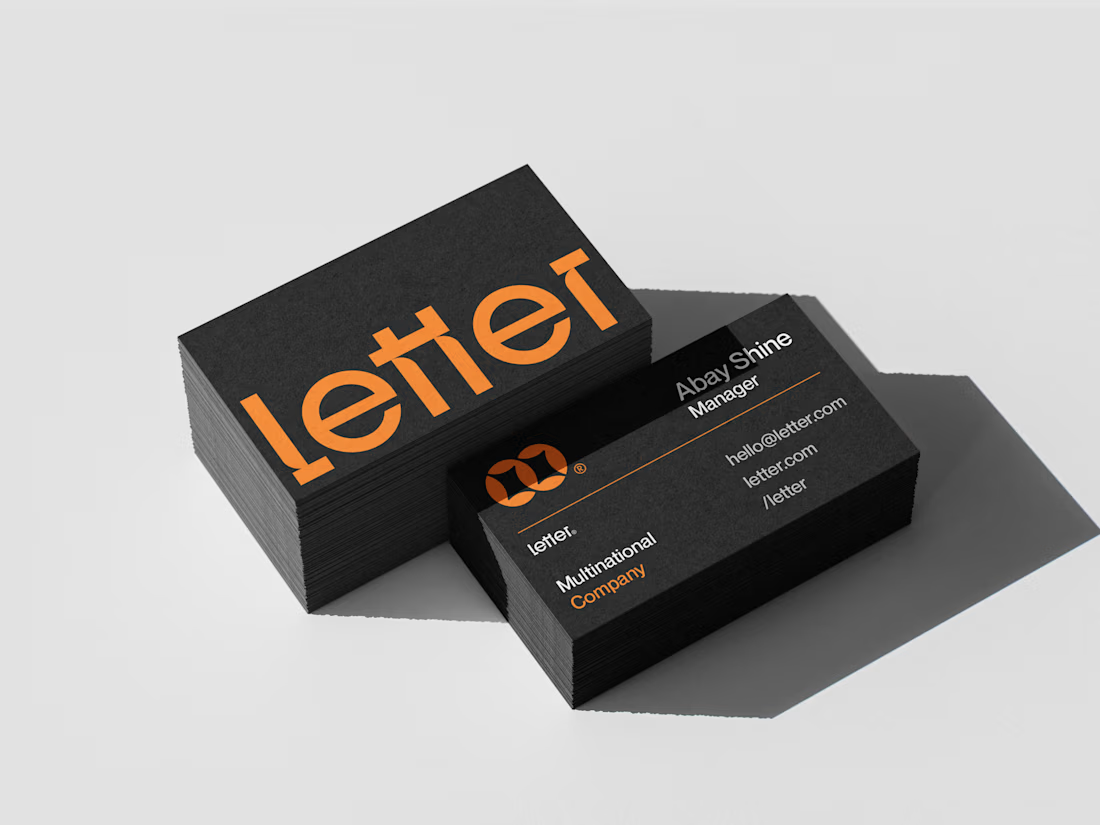
Letter — Visual Identity for a Multinational Company
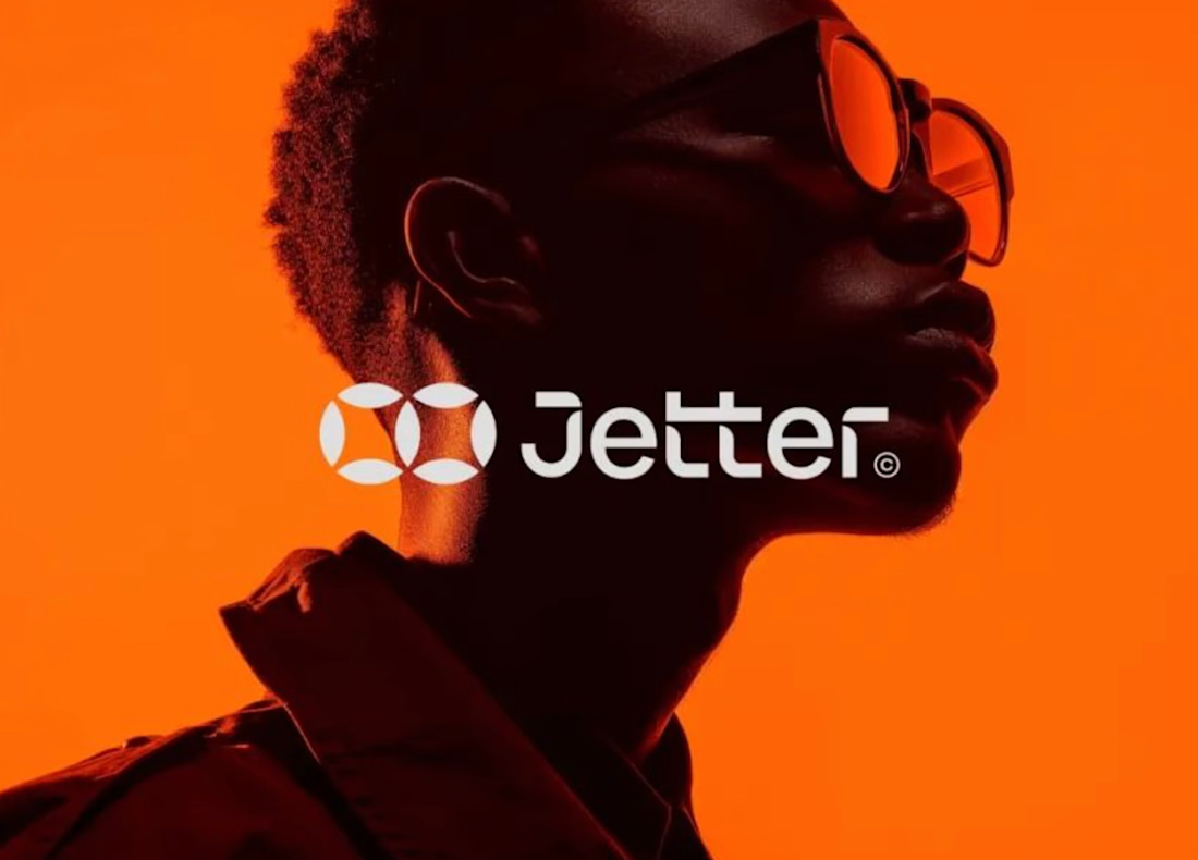
For Letter, I built the mark around two interlocking loop forms — a subtle nod to connection and precision, the kind of detail that makes a logo feel deliberate at a glance.
I developed the full system from there: wordmark, icon mark, a bold orange-and-black palette, and mockups across ID badges, business cards, lanyards, and even a smartwatch — showing the brand holding its identity everywhere it lands.
Transforming Blueprints into Reality with Vision and Precision.



Sleek work!

thanks.


the orange Letter logo pops
Thank you so much. 🙏


Smooth work!
Thank you


Good work🔥👏👏
Thanks

Nice branding
Thank you

Thanks

Sorry but this is flattery at best
https://www.behance.net/gallery/192944243/Jetter?utm_source=Pinterest&utm_medium=organic

Absolutely love the concept and execution! 🔥
Thanks

Attractive work!
Thanks

Absolutely amazing work, well done!
thanks

nicely crafted project 👏
Thanks

Good 🥰
Thanks

thanks.

The whole piece has a killer vibe. There is a really clean harmony going on between the custom mark and the typography. 👍
thanks

love the colour palette 🔥
Thank you so much for your great feedback.

Clean and elegant design, love it
Thanks.
The network for creativity
Join 1.25M professional creatives like you
Connect with clients, get discovered, and run your business 100% commission-free
Creatives on Contra have earned over $150M and we are just getting started











Related posts




Clean and confident work! The green gradient with the mark feels very modern for fintech - trustworthy but not boring. The app screens look really polished. Curious how you landed on this mark, does it represent growth / movement?

A flower that inflates arrives in the mail.
Next month, a phone made of shell.
STILL LIFE SERVICE. Case study dropping soon.
Which object earns your shelf? Reply below.
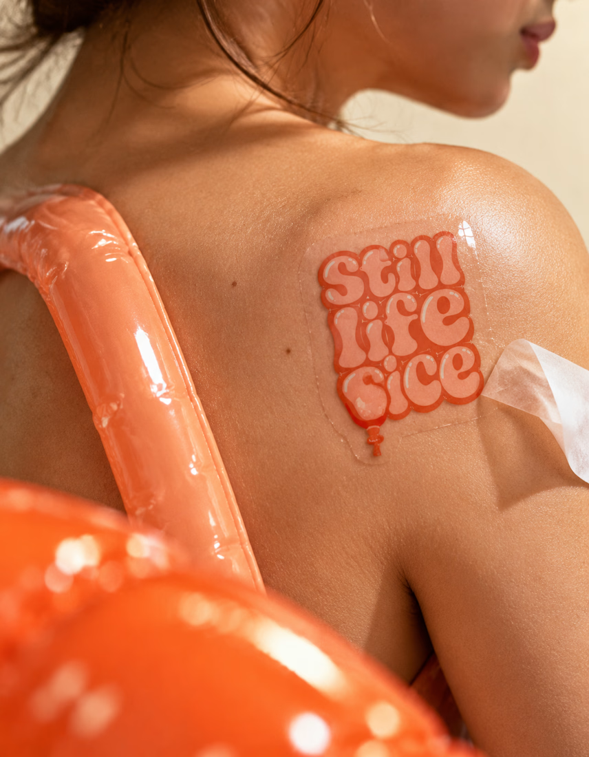
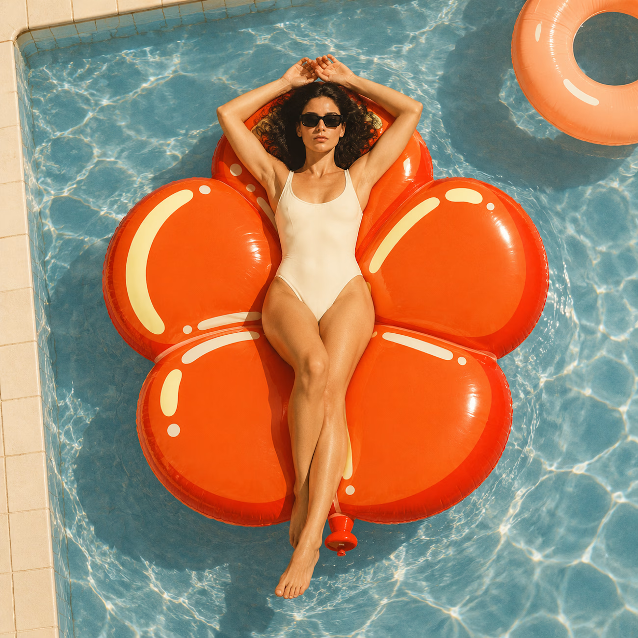
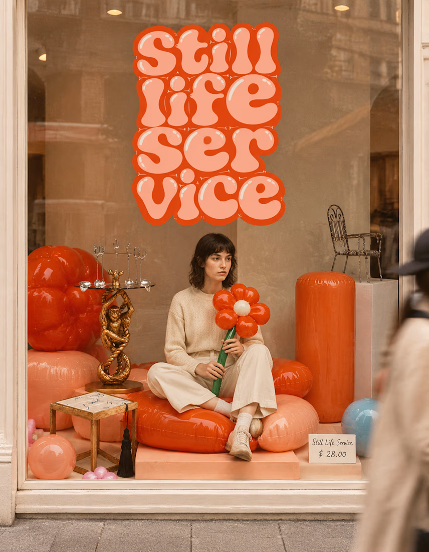

The inflatable flower. Only houseplant I'm guaranteed not to kill. Also, a new object every month is a sneaky good retention hook, people will stay subscribed just to see what's next.

A natural and premium packaging concept inspired by the purity of wildflower honey and the beauty of nature. The design combines warm honey tones, textured paper, bold typography, and a clean label layout to create an authentic, handcrafted feel.

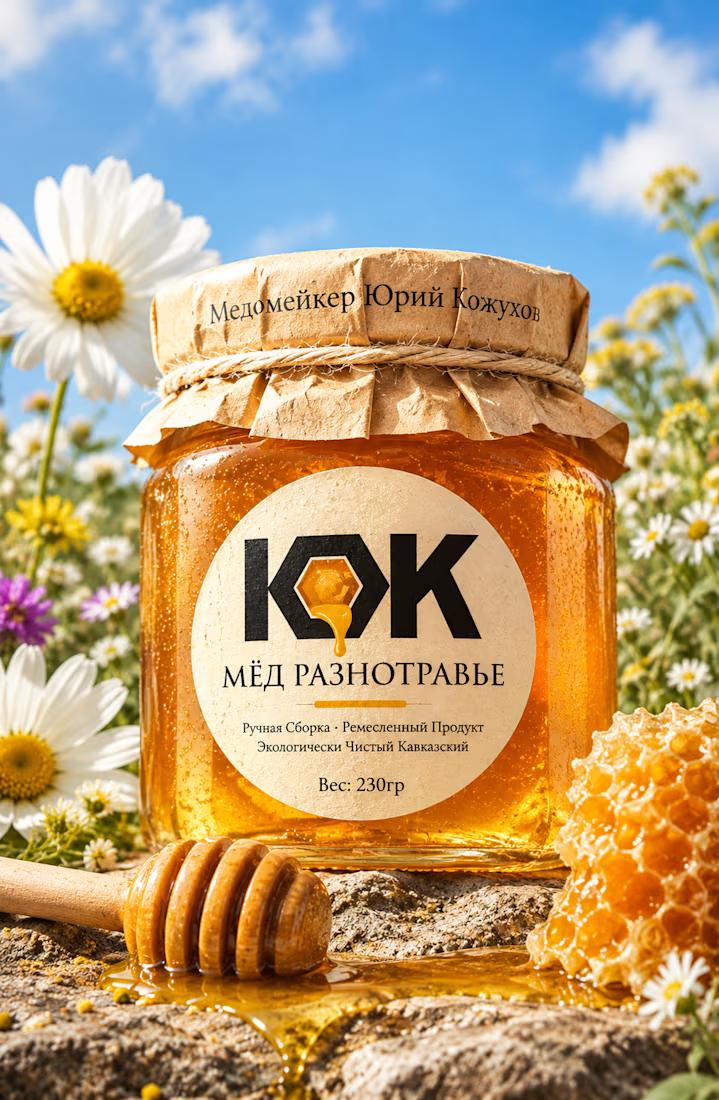

The honey drop sitting inside the O of the wordmark is a delightful detail, Umar. Textured paper plus that bold type really sells the handcrafted feel. This would stand out beautifully on a shelf.