The network for creativity
Join 1.25M professional creatives like you
Connect with clients, get discovered, and run your business 100% commission-free
Creatives on Contra have earned over $150M and we are just getting started
Back to feedPost
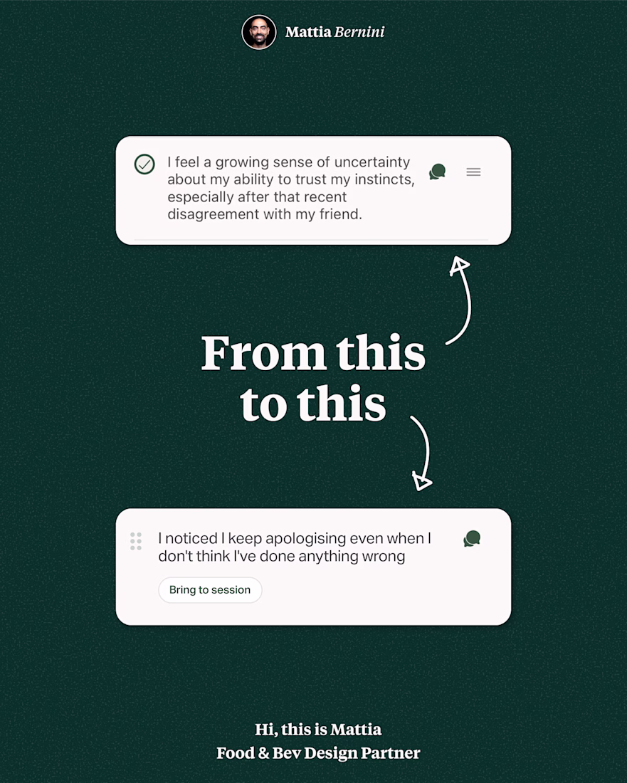
A checkbox was breaking my client's therapy app. Here's why.
The client approached me with a design challenge their UX team had flagged.
In their research they discovered users kept hesitating on a specific page, not being able to complet the task they designed.
The screens they shared looked fine. Clean layout, clear list, simple interaction.
The problem wasn't visual. It was affordance.
A checkbox carries a specific meaning people learned over decades of using digital devices: mark as done, task complete, move on.
But this wasn't the goal of the component.
The goal was to help users bring a specific topic to their next session.
We replaced the checkbox with a pill button that said: "Bring to session."
Same data. Similar look. Completely different mental model.
Users can now complete the task.
The network for creativity
Join 1.25M professional creatives like you
Connect with clients, get discovered, and run your business 100% commission-free
Creatives on Contra have earned over $150M and we are just getting started
Related posts
Retro Reel Timer — Minimal Cartoon UI
A playful reinterpretation of a classic reel-to-reel timer, redesigned with a softer colour palette, simplified shapes and a clean cartoon-inspired visual style. The interface keeps the nostalgic character of analogue recording equipment while presenting the controls in a modern, friendly and easy-to-understand layout.
The design focuses on strong visual hierarchy, balanced spacing and clear interaction states. Bold timer typography, rounded controls and subtle depth help the interface feel approachable without becoming visually cluttered, creating a distinctive concept suitable for a mobile timer, audio recorder or productivity application.
The reel spools doubling as eyes is a smart way to add character without adding extra elements, keeps the layout clean while still being playful. Nice fit for a productivity tool that doesn't want to feel sterile.
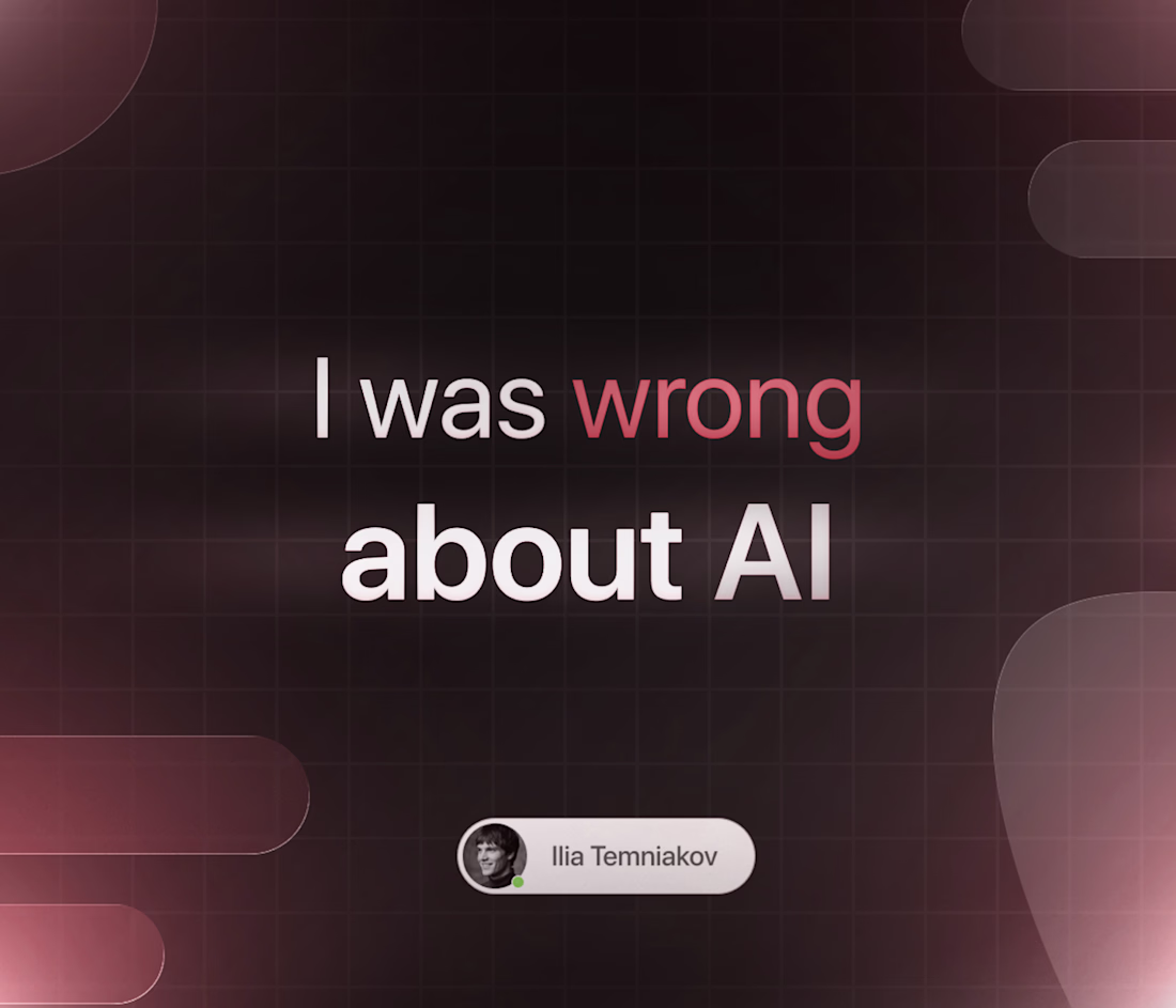
I was wrong about AI and development. Here's what changed my mind.
A year ago, if you'd told me AI would touch a meaningful chunk of my actual paid work, I'd have pushed back. I thought of it as a toy for writing boilerplate — useful, but nowhere near the real craft of building something pixel-accurate, something that actually holds up in production.
I don't think that anymore.
I ship landing pages in 1-2 days now that used to take a week. Not because I cut corners — because AI removes the boring 60% (debugging syntax, Googling the same CSS trick for the hundredth time, writing the same n8n node logic from scratch) so I can spend more time on the 40% that actually makes a project good: animation feel, structure that won't break in six months, thinking about what the client actually needs.
Here's the part that surprised me most: the developers who are getting replaced aren't losing to AI directly. They're losing to other developers who figured out how to use AI as leverage, faster than they did.
I used to think "using AI" meant admitting I couldn't do it myself. Now I think refusing to use it is the actual risk.
Still think craft matters more than ever — AI can't tell you what "feels right" for a client's brand, and it definitely can't build trust with a design studio on a call. But the tools changed. Pretending otherwise isn't purity, it's just slower.
What's something you changed your mind about this year?
The shift from seeing AI as boilerplate help to using it in paid work is a relatable arc. What was the first real project where it genuinely changed your mind?
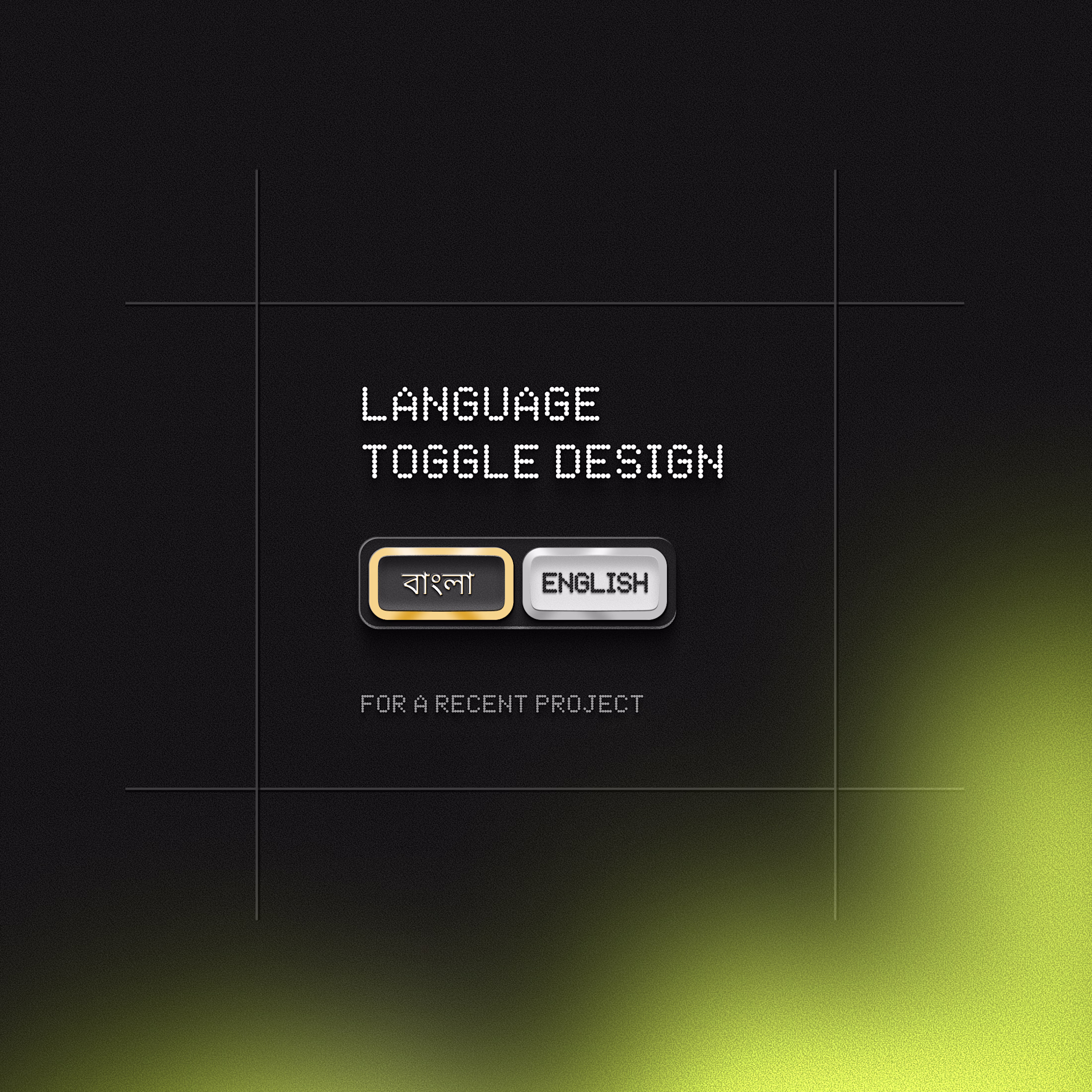
The retro terminal aesthetic paired with a Bangla/English toggle is such an unexpected combo, and it works. Was localization part of the brief from the start or something you pitched in after seeing the initial concept?
Trending
Claude
Claude has entered the design space. How are you using Claude Design?
Contra University
Learn from expert creatives how to earn more using next-gen AI tools.
creativeaiflow
Creative AI workflows are evolving. What tools do you use, and what are their strengths and weaknesses?
freelancerlife
Freelancer life is wins, pivots, and everything in between. What’s yours right now?