The network for creativity
Join 1.25M professional creatives like you
Connect with clients, get discovered, and run your business 100% commission-free
Creatives on Contra have earned over $150M and we are just getting started
Back to feedPost

Living Luxury — Real Estate Website
I designed Living Luxury as a modern real estate experience focused on presenting properties in a clean, premium, and easy-to-navigate way. The goal is to make it simple for visitors to explore properties, view details, and get in touch when they find something they like.
What I can build for this type of website:
Property Listings with clean and attractive property cards
Advanced Search & Filters for location, price, property type, bedrooms, etc.
Property Detail Pages with images, pricing, features, location, and full descriptions
Property Gallery to showcase high-quality interior and exterior images
Map & Location Integration so users can easily find properties
Featured Properties to highlight premium listings
Agent Profiles with contact information and property listings
Inquiry & Contact Forms for buyer and seller leads
Responsive Design optimized for mobile, tablet, and desktop
SEO-Friendly Structure for better search visibility
Fast Performance with a clean and optimized layout
Premium UI/UX with elegant typography, smooth interactions, and a luxury-focused visual style
The overall focus is to create a professional real estate website that builds trust, showcases properties beautifully, and turns visitors into genuine inquiries.
The network for creativity
Join 1.25M professional creatives like you
Connect with clients, get discovered, and run your business 100% commission-free
Creatives on Contra have earned over $150M and we are just getting started

Challenges
View all


Related posts

30+ pages, 3 weeks, and honestly one of my favorite projects in a while.
I'd been wanting to design something more tech-driven for a long time, and Gryd, a platform turning construction permit data into intelligence for insurers, lenders, and real estate teams, was exactly that.
Wireframes first, then UI across every page, fully responsive, with animation on the key screens, all built inside the brand the client had already set.
Case study's on my profile.
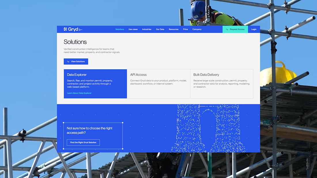
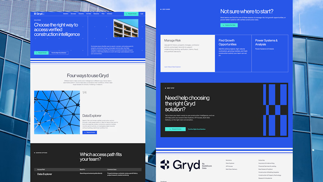
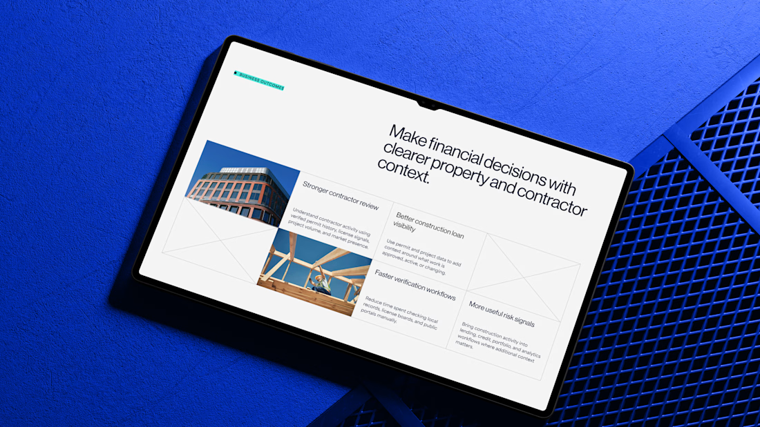

Clean design 😍

Most luxury eyewear brands sell frames. Very few sell the feeling of putting them on.
Orelux was designed to close that gap. Not just with product shots but with a world. Editorial campaign photography of real people wearing real confidence. A hero that says "See the World in Style" and means it before you scroll once.
The home screen sets the tone full-bleed lifestyle imagery, an in-app try-on preview, and an "Explore Collection" CTA that earns the click.
Three sections. Every reason to buy answered before the question is asked.
This is what luxury e-commerce looks like when the design respects the product as much as the person wearing it.
Does this feel like an eyewear website that converts browsers into buyers? 👇
Designed by Orbix Studio.
Tools: Figma
#WebDesign #LuxuryDesign #EcommerceUI #UIDesign #ContraFreelance #ProductDesign #FashionDesign #LandingPage


You spend 6 figures on a brand tracking agency. They spend three months "running the wave." You get a 100-page slide deck that tells you what happened in Q2 while you’re already halfway through Q3.
That’s a post-mortem, not a strategy.
We built the identity and product framing for Timelaps to represent the opposite: continuous visibility.
Research-grade data from 4,000+ consumers, flowing in real-time. No "waves", no dusty decks, just an always on dashboard that shows you if your marketing is actually landing before the budget is gone.
If you’re still waiting 90 days to see if your brand is growing, you’re flying blind.


I have to say, You leave an ipression everytime you appear in my feed. You have got great taste Daniel💪