The network for creativity
Join 1.25M professional creatives like you
Connect with clients, get discovered, and run your business 100% commission-free
Creatives on Contra have earned over $150M and we are just getting started
Back to feedPost

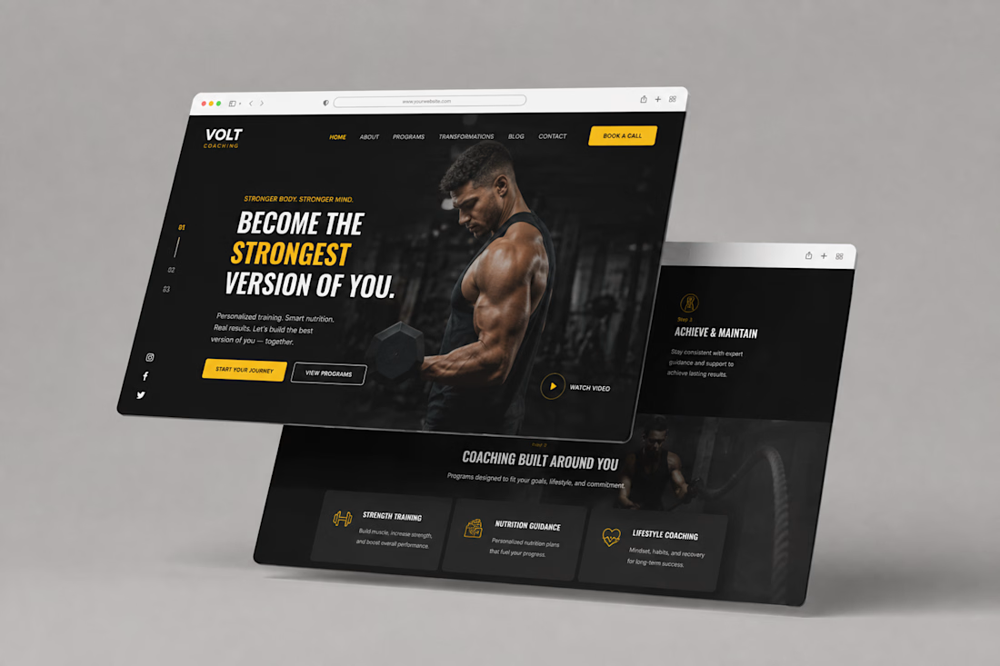
Volt Coaching — Fitness Coaching Website Design
Description
A bold website design concept for Volt Coaching, created to give the brand a strong, energetic digital presence while making its coaching programs easy to explore.
The design combines a dark visual direction with bold typography, yellow accents, strong imagery, clear navigation, and prominent calls to action to create an engaging experience for visitors looking to start their fitness journey.


The network for creativity
Join 1.25M professional creatives like you
Connect with clients, get discovered, and run your business 100% commission-free
Creatives on Contra have earned over $150M and we are just getting started







Related posts

I tried experimenting a little with my previous design. I changed the fonts and background a bit. Which version do you like better?
22 voted
73%
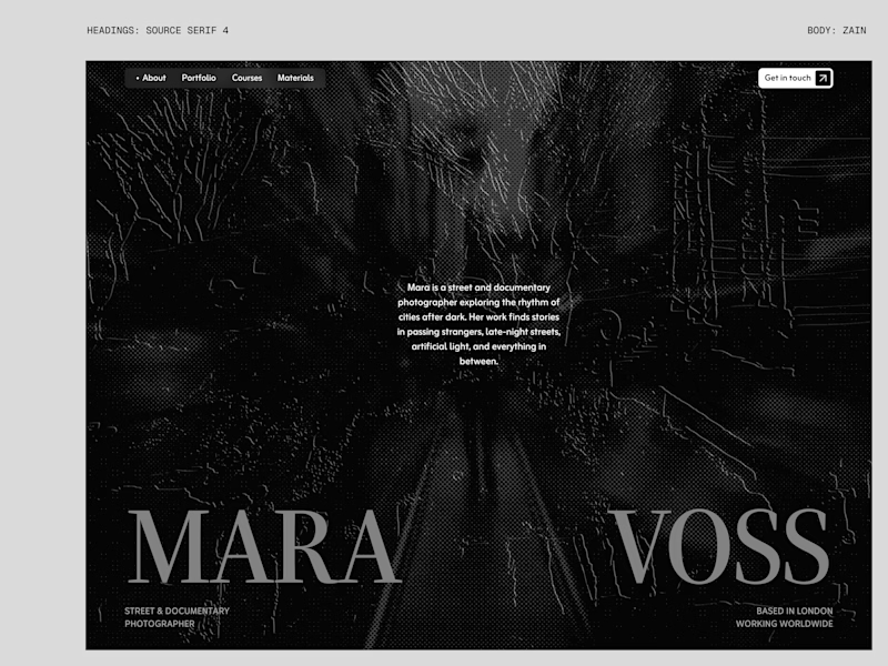
8 voted
27%
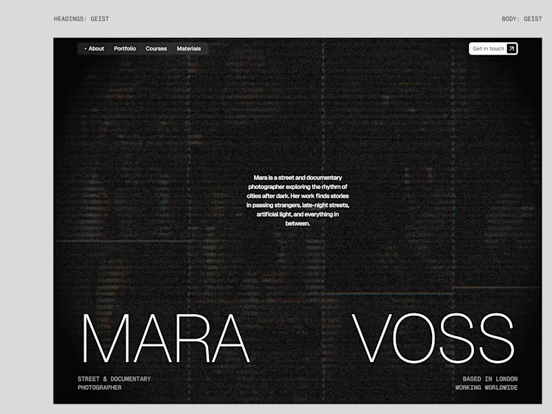
30 votes
Closed

New design for sure. The distressed texture in the type makes it feel like actual street photography lives inside the letters. The previous version is clean but this one has grit.

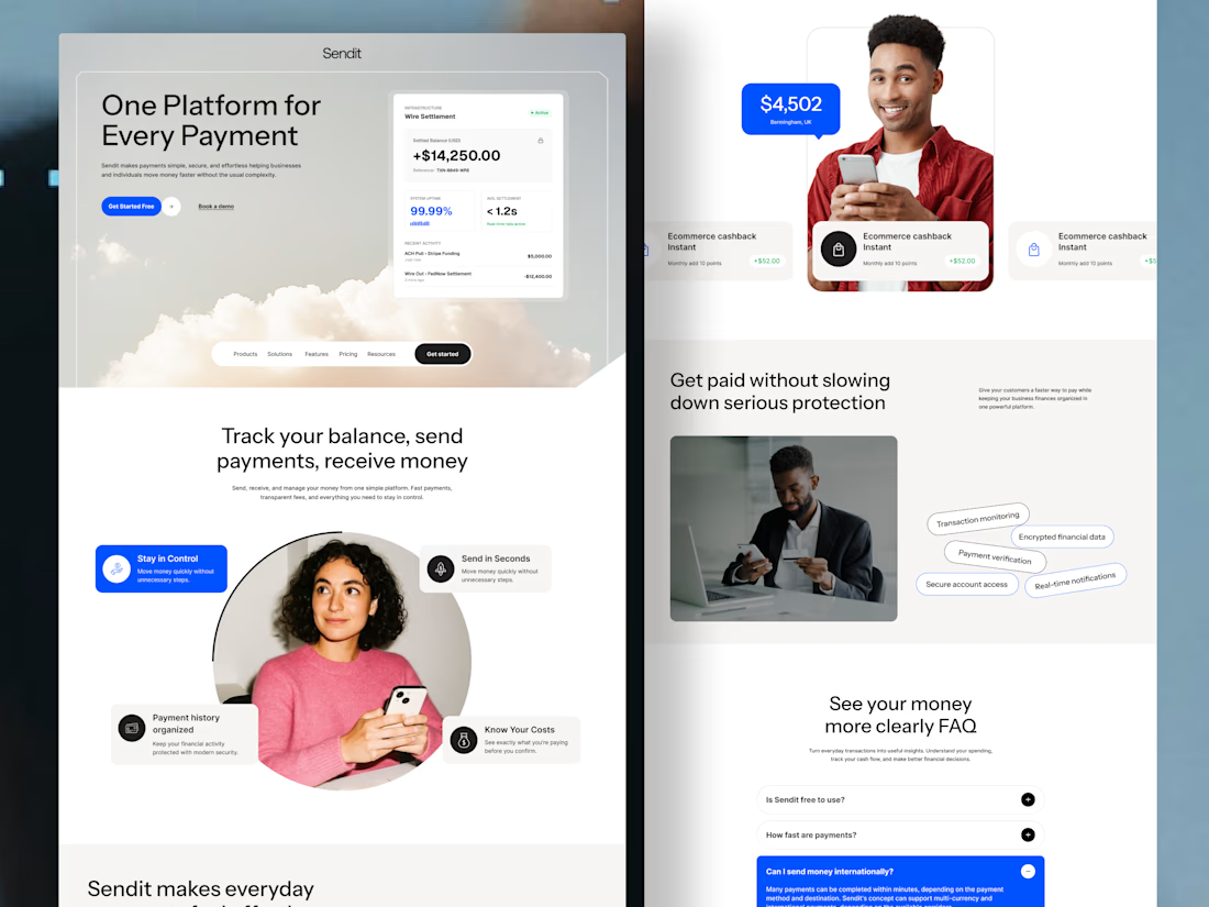
Sendit finance payment website Homepage
Instead of overwhelming users with financial terminology, the experience guides them from
Understanding → trusting → taking action.
Designed for businesses that want their website to do more than look good—it should help people understand the product and move closer to becoming customers.
The design focuses on:
💳 Clear payment-focused messaging
🔐 Trust and security signals
📊 Simple presentation of financial features
🎯 Strong, action-focused CTAs
👤 Human-centered visuals to build confidence
✨ Clean UI with a modern fintech feel
If you're building a fintech, SaaS, payment platform, or financial product and your website isn't communicating its value clearly, I'd love to help.
Available for website design, landing pages & UI/UX design.


Love the creative approach.


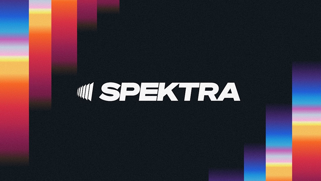
A closer look at the Spektra logo I designed.
The mark fans out from a narrow point, while the wordmark leans forward. together, they give it a sense of movement without needing much detail.
There’s a lot of color in the wider identity, so the logo holds its own in plain white. Simple geometry with enough weight to stand up to everything around it.



This is fire, Daniel
The logo conveys the story