The network for creativity
Join 1.25M professional creatives like you
Connect with clients, get discovered, and run your business 100% commission-free
Creatives on Contra have earned over $150M and we are just getting started
Back to feedPost
Taste Test

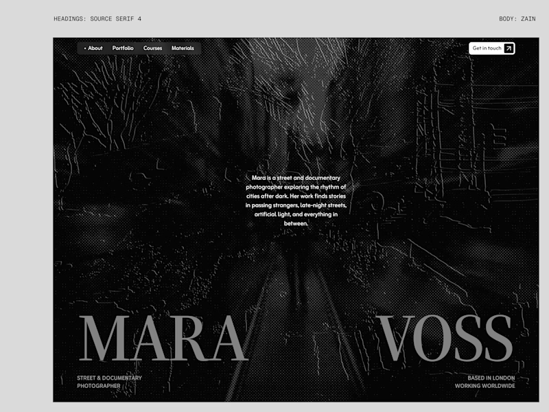
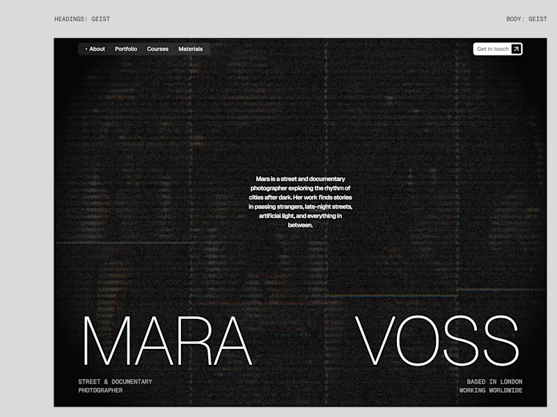
I tried experimenting a little with my previous design. I changed the fonts and background a bit. Which version do you like better?

22 voted
73%
8 voted
27%
30 votes
Closed

Both versions have a strong editorial mood, but the new one feels a touch more resolved—the contrast gives the type room to carry the story. The comparison makes the refinement really easy to see.

New design for sure. The distressed texture in the type makes it feel like actual street photography lives inside the letters. The previous version is clean but this one has grit.

The textured type gives the new version more of a street-photography feel.

New design! Great work

Labelling each version with its heading and body stack makes this answerable: the choice is one family versus a serif pairing, not just which one looks nicer.

that's totally new design - and looks sharp 🔥

The changes look nice starting from the background.

New design, no contest. The old one whispers, the new one actually walks into the room. That lighter grain lets MARA VOSS breathe instead of drowning in the black.

New design looks great. The background and typography work together here.
The new one drops the wordmark to a grey serif so the halftone photo reads first, where the old white grotesque sat on top of it. Same grid, different order of attention.
It has a structure now and it feels intentionally designed not like an asset is added.
The network for creativity
Join 1.25M professional creatives like you
Connect with clients, get discovered, and run your business 100% commission-free
Creatives on Contra have earned over $150M and we are just getting started











Related posts

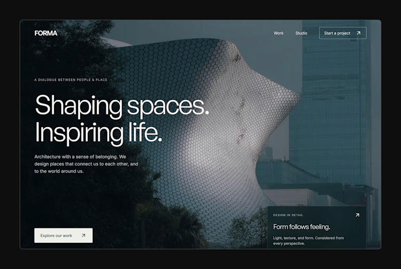
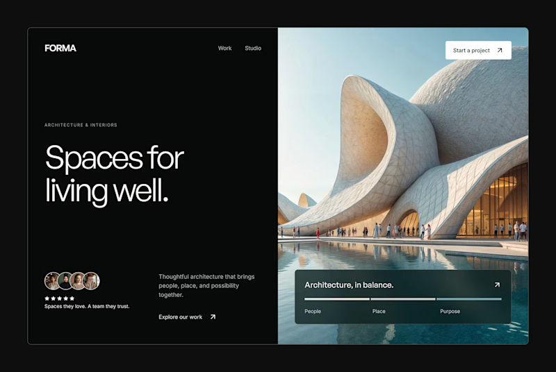
Design Exploration: Hero Section of Architecture Website. Which one do you think much better?


12 voted
43%
16 voted
57%
28 votes
Closed


A little peek at the brand work we did for Elio Mortgage.
A warm, approachable identity full of warm vibrant colors paired with soft sun rising inspired gradients, inner glows and custom illustrations & more. Loved this direction!
Full case study coming soon, from process to final identity.
Plenty of logo explorations to share too!


That color palette takes the whole identity to a different level!! I loove it.

Two visual directions for the same brief. Which do you prefer?
2 voted
29%
5 voted
71%
7 votes
Closed

Direction A is more better to me it feels modern professional cartoony style that's impressive ❤️❤️
Great job Ayoub🔥🔥