The network for creativity
Join 1.25M professional creatives like you
Connect with clients, get discovered, and run your business 100% commission-free
Creatives on Contra have earned over $150M and we are just getting started
Back to feedPost
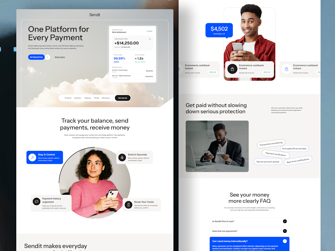
Sendit finance payment website Homepage
Instead of overwhelming users with financial terminology, the experience guides them from
Understanding → trusting → taking action.
Designed for businesses that want their website to do more than look good—it should help people understand the product and move closer to becoming customers.
The design focuses on:
💳 Clear payment-focused messaging
🔐 Trust and security signals
📊 Simple presentation of financial features
🎯 Strong, action-focused CTAs
👤 Human-centered visuals to build confidence
✨ Clean UI with a modern fintech feel
If you're building a fintech, SaaS, payment platform, or financial product and your website isn't communicating its value clearly, I'd love to help.
Available for website design, landing pages & UI/UX design.



I really like the balance between functionality and aesthetics here. It looks beautiful, but it also feels like the design decisions were made with the user's experience in mind.

Thanks

Professional and clean work you did.
Thanks

The understanding → trust → action sequence gives this homepage a clear narrative. It is also a useful structure for a product explainer: establish the problem before introducing the next step.

Putting the trust signals between understanding and the CTA is the right order for payments. Most fintech homepages sell the action first and leave security proof to a footer badge.

Love the creative approach.
Thanks bro
The network for creativity
Join 1.25M professional creatives like you
Connect with clients, get discovered, and run your business 100% commission-free
Creatives on Contra have earned over $150M and we are just getting started

Challenges
View all


Related posts


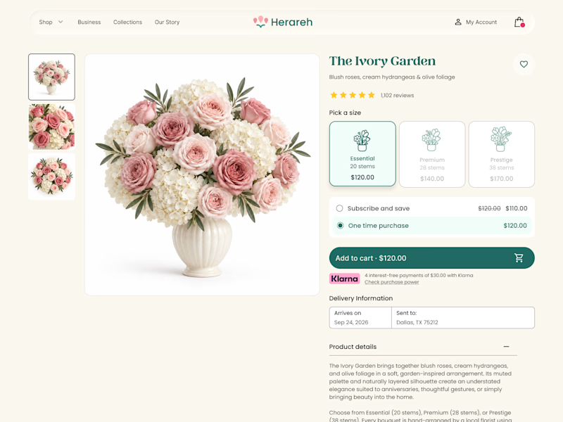
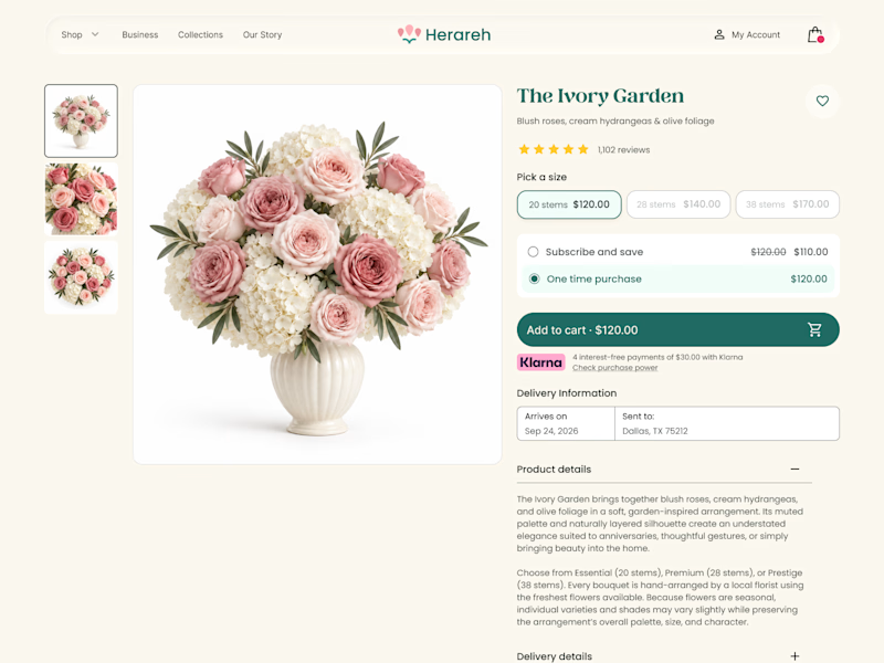

Icon cards for me, bouquets are such a visual purchase that a scannable icon beats reading "small/medium/large" every time. Did the compact chips version convert worse in testing, or are you still gathering data on that?

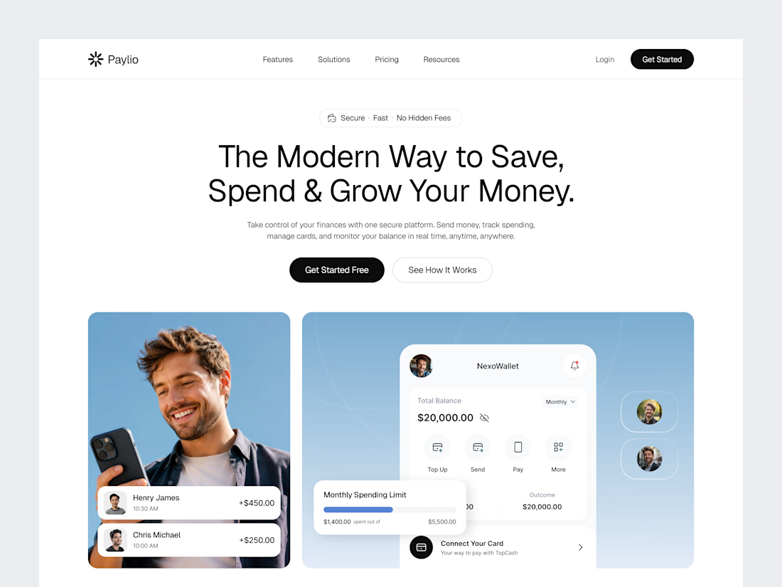

When your landing Page is so goated that you no longer need a launch video.


Thats what a landing page do for you hahahaah