The network for creativity
Join 1.25M professional creatives like you
Connect with clients, get discovered, and run your business 100% commission-free
Creatives on Contra have earned over $150M and we are just getting started
Back to feedPost

Most dashboards get built backwards.
Someone asks for "a Power BI report," and six hours later they get 12 charts, 40 filters, and zero answers to the question they actually had.
I spent last summer inside a bank's data team (TransPecos Bank) watching this happen — and fixing it. The projects that actually got used by leadership weren't the ones with the most charts. They were the ones that answered one specific question clearly: where is money getting wasted, and why.
That's the lens I bring to every dashboard now — start with the decision someone needs to make, then build backward into the data.
A few things I've built this into:
→ A regression model that flagged where operating costs were quietly outpacing asset utilization
→ SQL pipelines that turned scattered transaction data into one clean reporting view
→ Dashboards small business owners could actually open on a Monday and know what to do next
I'm opening up a few spots to build this kind of dashboard for small businesses, banks, and real estate teams who are stuck staring at spreadsheets instead of answers.
If that's you — or you know someone drowning in data with no time to make sense of it — send me a message. Happy to look at what you've got and tell you honestly whether a dashboard would actually help, no pitch.
The network for creativity
Join 1.25M professional creatives like you
Connect with clients, get discovered, and run your business 100% commission-free
Creatives on Contra have earned over $150M and we are just getting started
Related posts

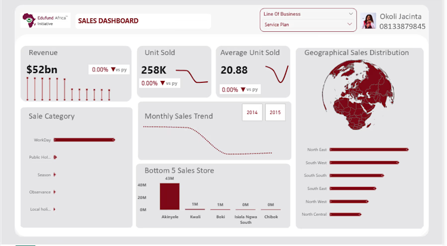
Sales Performance Dashboard | Power BI
Designed and developed an interactive sales analytics dashboard to help stakeholders monitor revenue, customer growth, product performance, and regional sales trends in one centralized view.
Tools Used:
- Power BI
-Power Query
- DAX
- PowerPoint (wireframing and dashboard planning)
My Contributions:
- Imported and transformed raw sales data using Power Query.
- Built a star schema data model by creating relationships between fact and dimension tables.
Developed DAX measures for:
- Total Sales ($105M)
- Total Quantity Sold (6M units)
- Total Customers (9,191)
- Average Unit Price ($17.6)
- Created Previous Year (PY) metrics and Year-over-Year growth calculations for sales, quantity, and customers.
- Implemented conditional formatting with dynamic color indicators to highlight performance changes.
Dashboard Features:
- Geographic sales analysis using Shape Maps.
- Monthly trends for sales, quantity, pricing, and customer acquisition.
- Customer segment analysis using donut charts.
- Product and country performance rankings using stacked bar charts.
- Interactive filtering for business units and service plans.
Business Impact:
The dashboard provides decision-makers with a single source of truth for tracking sales performance, customer behavior, and regional trends, enabling faster and more informed business decisions.
Data VisualizationMicrosoft Power BIBusiness AnalysisData AnalysisMicrosoft ExcelMicrosoft PowerPoint



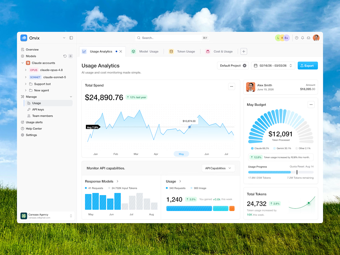
Managing AI usage should feel clear, not complicated. Orvix brings total spend, token usage, model activity, API capabilities, budget progress, and cost monitoring into one clean analytics dashboard. With structured sidebar navigation, tab-based workflows, soft data cards, blue-highlighted charts, and easy-to-scan usage metrics, the interface helps teams understand AI consumption, track spending, and optimize performance with more confidence.
📩 Collaborate with Us? Contra Cansaas Agency

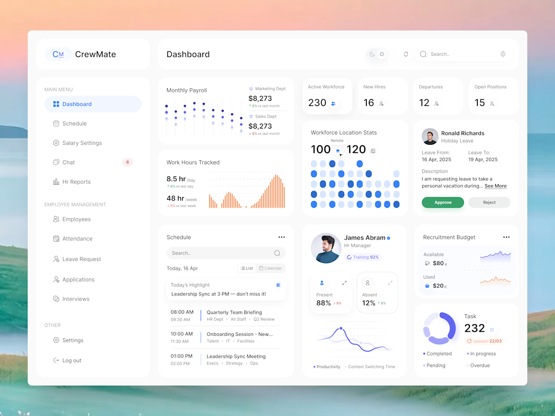
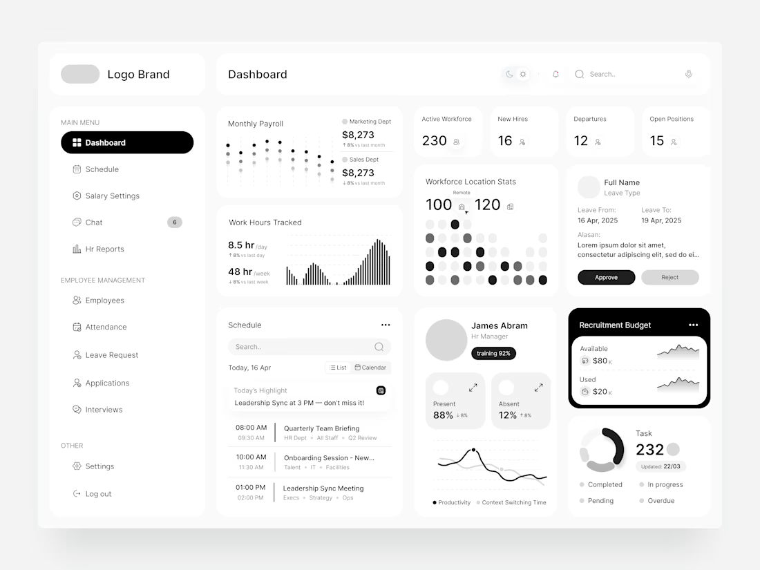
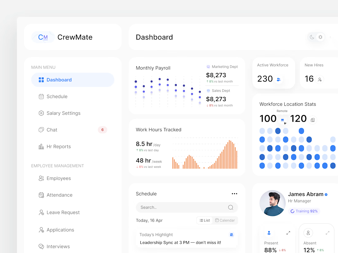
Managing people and operations becomes easier when everything is organized in one place. CrewMate is an HR management dashboard designed to help teams oversee employee data, attendance, performance, and workforce insights through a centralized platform. Built with a clean interface and data-driven workflows to support more efficient people management.
📩 Open for new design collaborations.














Trending

Claude
Claude has entered the design space. How are you using Claude Design?

Contra University
Learn from expert creatives how to earn more using next-gen AI tools.
creativeaiflow
Creative AI workflows are evolving. What tools do you use, and what are their strengths and weaknesses?
freelancerlife
Freelancer life is wins, pivots, and everything in between. What’s yours right now?