
Jacinta Okoli
Data Analyst | Excel | Power BI | Data Visualization| SQL
Profile in progress
Jacinta is building their profile!
Superstore Sales Performance Dashboard
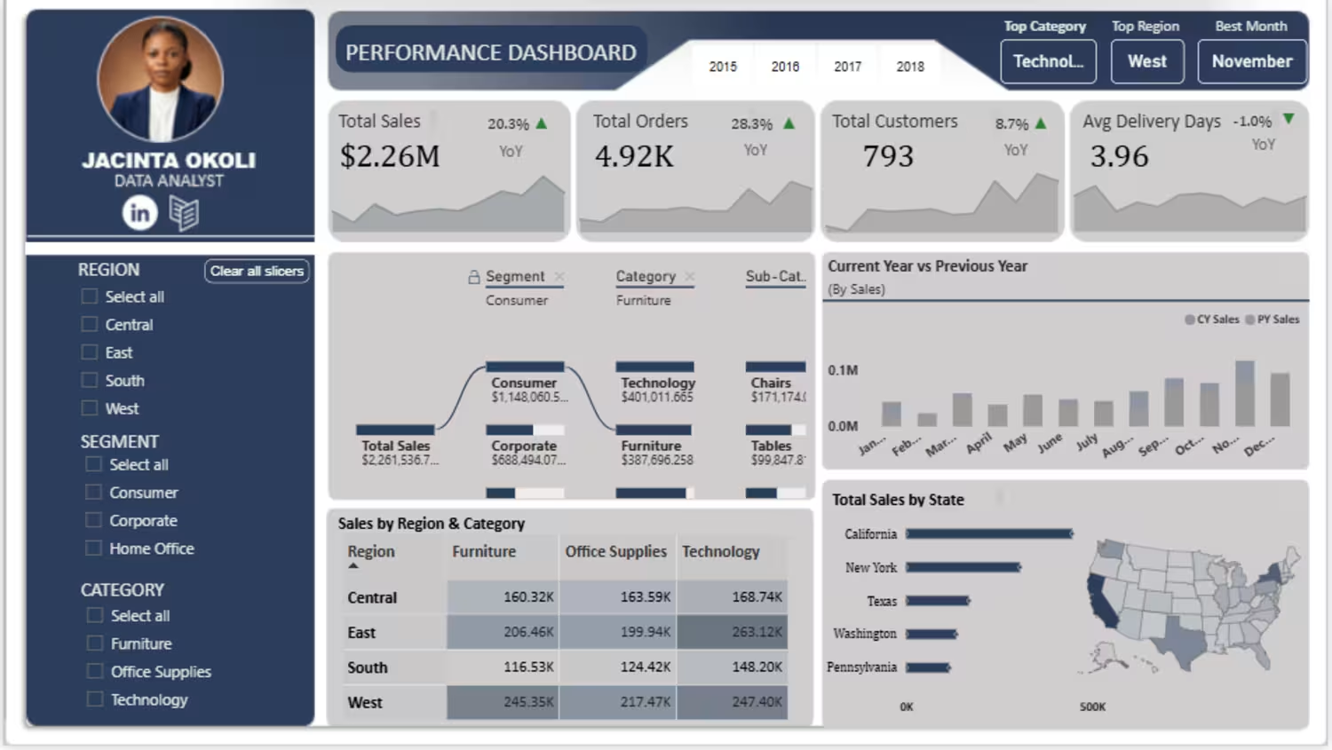
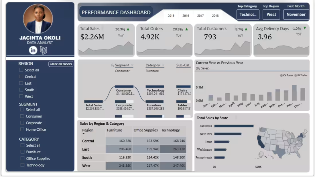
I built this Superstore Sales Performance Dashboard using Power BI, DAX, and Excel to analyze sales performance and turn raw data into actionable business insights.
📊 Key KPIs
Total Sales: $2.26M
Total Orders: 4.92K
Total Customers: 793
Average Delivery Days: 3.96
🔎 What the Dashboard Shows
Current Year vs Previous Year performance
Year-over-Year (YoY) analysis
Sales by Region and Category
Sales by State
Monthly sales trends
Segment, Category and Sub-Category analysis
Dynamic Top Category, Top Region and Best Month insights
Interactive Region, Segment and Category filters
🛠️ Tools Used
Excel — Data cleaning and preparation
Power BI — Data modelling, visualization and dashboard design
DAX — KPI measures, YoY calculations and dynamic insights
💡 Key Learning
This project strengthened my ability to work with DAX, Date Tables, relationships, filter context, dynamic measures and data storytelling.
More importantly, I learned that building a strong analytics project is not about getting everything right immediately. It is about building, troubleshooting, learning, and improving until the data tells a clear story.
This project is another step in my journey toward becoming a stronger Data Analyst.
#DataAnalytics #PowerBI #DAX #Excel
#DataVisualization #BusinessIntelligence #DataAnalyst #AnalyticsPortfolio
#LearningInPublic #DataStorytelling
0
4
Superstore Sales Performance Dashboard
Interactive Sales & Business Performance Analysis
Tools: Excel ·Power BI · DAX
Project Overview
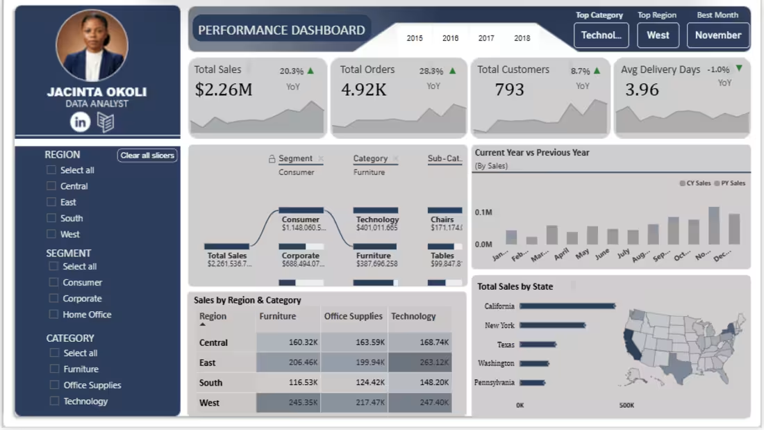
The Superstore Sales Performance Dashboard is an interactive business intelligence project developed to analyze sales, orders, customers, delivery performance, and regional/product trends.
The project involved taking the Superstore sales raw dataset through the stages of data preparation, modelling, analysis, DAX development, visualization, and dashboard design.
The final result is a single-page Power BI dashboard designed to provide a high-level overview of business performance while allowing users to drill into specific segments, categories, regions, and time periods.
Business Objective:
The objective of this project was to answer questions such as:
- How are sales performing over time?
- How does the current year's performance compare with the previous year?
- Which categories and sub-categories contribute most to sales?
- Which regions are performing strongest?
- How many orders and customers are being served?
- How efficiently are orders being delivered?
- Which states generate the highest sales?
- What changes when the data is filtered by Region, Segment, or Category?
The goal was to transform these questions into an interactive dashboard that communicates the answers clearly.
- Data Preparation:
I began by preparing the Superstore dataset in Excel before moving into Power BI.
The original dataset contained fields such as:
Order ID
Order Date
Ship Date
Ship Mode
Customer ID
Customer Name
Segment
Country
City
State
Postal Code
Region
Product ID
Category
Sub-Category
Product Name
Sales
During preparation, I created additional analytical fields including:
Year
Month Number
Month Name
Quarter
Delivery Days
The data was then loaded into Power BI for modelling and visualization.
- Data Modelling:
I created a dedicated Date Table and established a relationship between the Date Table and the cleaned sales dataset. This allowed me to perform time-based analysis and build:
Current Year calculations
Previous Year calculations
Year-over-Year comparisons
Monthly trends
I also created a dedicated Measure Table to organize the DAX measures used throughout the dashboard.
Key KPIs
The dashboard contains four primary performance indicators:
Total Sales $2.26M Provides an overall view of sales
generated.
Total Orders 4.92K Measures the total number of orders in
the dataset.
Total Customers 793 Shows the number of customers
represented in the analysis.
Average Delivery Days 3.96 days Provides an indication of delivery efficiency.
Each KPI is supported by year-over-year calculations and visual trend indicators.
DAX & Analytical Measures
One of the main technical components of this project was developing DAX measures to move beyond simple aggregations.
I created measures for:
Total Sales
Total Orders
Total Customers
Average Delivery Days
Current Year Sales
Previous Year Sales
Current Year Orders
Previous Year Orders
Current Year Customers
Previous Year Customers
Current Year Average Delivery Days
Previous Year Average Delivery Days
YoY calculations
YoY percentage calculations
Dynamic performance indicators
Top Category
Top Region
Best Month
I also used conditional logic to create visual indicators for positive and negative year-over-year movement.
- Dashboard Features
1. KPI Performance Cards:
The four KPI cards provide an immediate overview of business performance.
Each card includes:
- Current KPI value
- YoY percentage
- Growth/decline indicator
- Mini trend visualization
2. Dynamic Performance Insights
The dashboard includes three dynamic insight badges:
Top Category
Top Region
Best Month
These update based on the dashboard's filter context.
For example, the dashboard can identify:
Top Category: Technology
Top Region: West
Best Month: November
This provides users with quick insights before they even begin exploring the charts.
3. Total Sales Decomposition Tree
The decomposition tree allows Total Sales to be explored through:
Segment → Category → Sub-Category
This makes it possible to move from the overall sales figure into the underlying contributors.
4. Current Year vs Previous Year
A monthly comparison chart was created to compare current-year performance against the previous year.
This makes it easier to identify periods of stronger or weaker performance throughout the year.
5. Sales by Region & Category
A matrix was used to compare sales across:
Region × Category
This provides a compact view of how different product categories perform across Central, East, South and West regions.
6. Total Sales by State
A combination of a ranked bar chart and geographic map was used to analyze state-level sales performance.
This allows both ranking and geographic distribution to be viewed together.
7. Interactive Filters
The dashboard includes slicers for:
- Region
- Segment
- Category
These allow users to interactively filter the dashboard and explore different portions of the dataset.
Key Dashboard Highlights:
At the displayed dashboard state, the analysis shows:
- Total Sales: $2.26M
- Total Orders: 4.92K
- Total Customers: 793
- Average Delivery Days: 3.96
The dashboard also dynamically highlights:
- Technology as the top category
- West as the top region
- November as the best month
These values are dynamic and respond to the dashboard's filtering context.
What I Learned:
This project significantly improved my understanding of Power BI and analytical thinking.
1. Data modelling matters:
I learned that creating a proper Date
Table and relationship is essential when building reliable time-based analysis.
2. DAX is more than writing formulas:
I learned how DAX can be used to create analytical logic, compare time periods, identify rankings, and make dashboard elements respond dynamically to user selections.
3. Visual choice should follow the question:
A dashboard shouldn't contain charts simply because they look attractive. The visual should help answer a specific business question.
4. Dashboard design requires iteration:
I started with a wireframe and repeatedly adjusted the dashboard while building it. This taught me that good dashboard design is an iterative process involving:
Planning → Building → Testing → Refining
5. Troubleshooting is part of learning:
Not everything worked immediately. From relationships and DAX measures to conditional formatting, slicers and visual behaviour, I had to troubleshoot several issues throughout the project. That experience helped me understand Power BI more deeply than simply following a tutorial
Challenges I Encountered:
One of the biggest challenges was translating a reference dashboard design into something that worked with my own dataset and Power BI environment. Rather than copying the dashboard exactly, I learned to ask:
"What business purpose does this visual serve, and how can I recreate that purpose using my own data?"
This helped me make design decisions based on functionality rather than appearance alone.
Key Takeaway:
This project reinforced an important lesson for me:
A good data analyst doesn't just create charts. They transform data into information that people can understand and use.
The technical skills matter, but so do:
problem-solving, data storytelling, visual communication, attention to detail, and the ability to keep learning when something doesn't work.
Project Outcome:
The final result is an interactive Power BI dashboard that brings together:
Data Preparation + Data Modelling + DAX + Business Analysis + Data Visualization + Dashboard Design into one analytical solution.
This project represents another step in my journey toward becoming a professional Data Analyst.
Tools Used:
Excel
Data preparation & initial analysis
Power BI
Data modelling, visualization & dashboard development
DAX
Measures, time intelligence, dynamic insights & KPI calculations
1
6
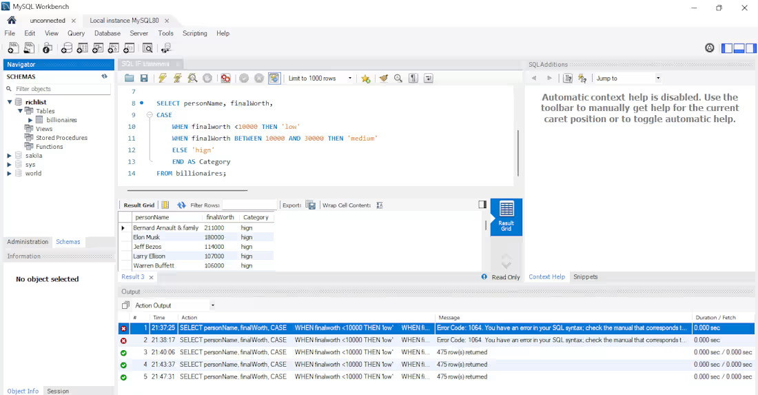
Customer Segmentation Using SQL CASE Statements
Used SQL conditional logic to segment records into business categories based on numerical thresholds. Implemented CASE WHEN statements to classify entities into low, medium, and high-value groups, enabling easier downstream analysis and reporting.
Skills Demonstrated:
- SQL
- CASE Statements
- Data Transformation
- Data Categorization
- Business Logic Implementation
- Feature Engineering
Business Value:
Converting continuous metrics into categories allows organizations to simplify reporting, improve customer targeting, and support decision-making processes.
2
2
304
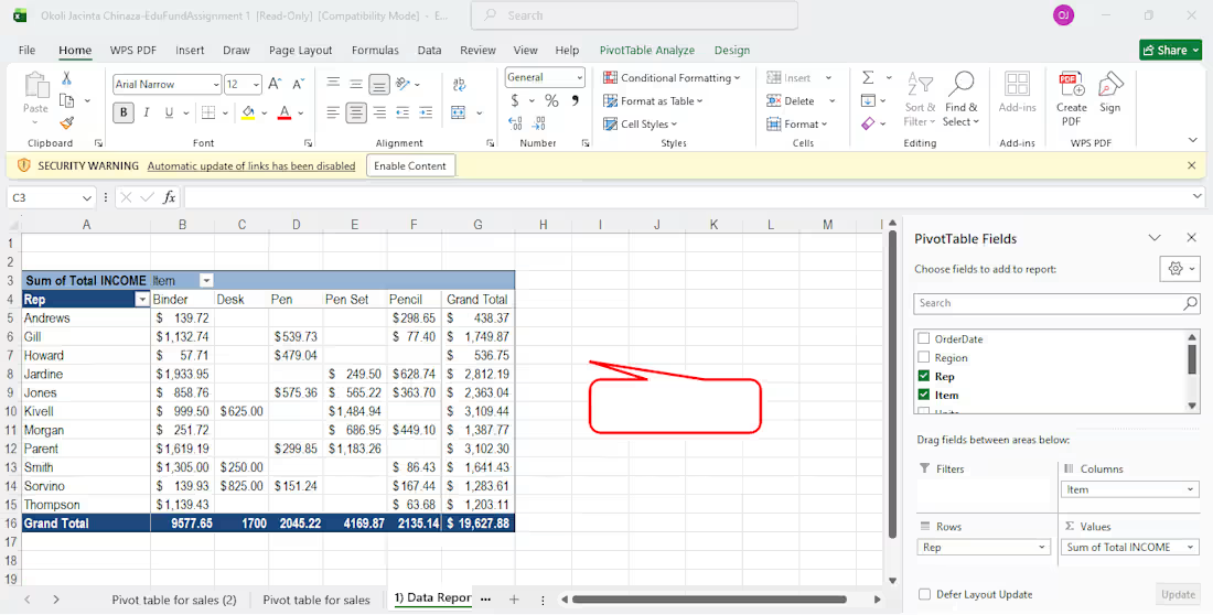
Sales Performance Analysis using Excel Pivot Tables
Analyzed sales performance data using Excel Pivot Tables to identify revenue contribution across sales representatives and product categories. Built interactive summaries to compare individual sales performance, product demand, and overall business revenue.
Tools Used:
- Microsoft Excel
- Pivot Tables
- Pivot Charts
- Data Aggregation
- Business Reporting
My Contributions:
- Structured raw sales data for analysis.
- Built Pivot Tables to summarize sales by:
- Sales Representatives
- Product Categories
- Revenue Contribution
- Created dynamic reports to compare performance across products and team members.
- Used Excel aggregation functions to generate business insights from transactional data.
Key Insights:
Identified top-performing sales representatives.
Determined highest revenue-generating product categories.
Highlighted sales concentration across products and personnel.
Business Value:
The analysis provided management with a quick overview of sales performance and product contribution, enabling data-driven decisions around sales strategy and resource allocation.
1
141