The network for creativity
Join 1.25M professional creatives like you
Connect with clients, get discovered, and run your business 100% commission-free
Creatives on Contra have earned over $150M and we are just getting started
Back to feedPost

Case Study: Luxury Watch Landing Page — Where Design Meets Precision
Every great product deserves a website that matches its quality. For this project, I designed a premium, cinematic landing page for a luxury watch brand — focused on one goal: making visitors feel the product before they even buy it.
What went into this design:
Elegant Typography & Dark Aesthetic — A moody black-and-gold color palette that instantly communicates luxury and exclusivity.
Product-First Layout — Multiple angles of the watch showcased in a clean grid, letting the craftsmanship speak for itself.
Technical Storytelling — Instead of just showing the product, I highlighted what makes it special (Caliber, Jewels, Frequency) — building trust through detail.
Clear Conversion Path — A bold "Pre-Order Now" button placed exactly where the user's attention naturally lands.
Why this matters for your brand:
A great product can get lost online without the right presentation. Whether you're launching a physical product, a tech gadget, or a premium service — I design landing pages that don't just look good, they build desire and drive action.
If you have a product that deserves a website as premium as itself, let's talk. I'll design something that turns visitors into buyers.
📩 Message me to start your project.


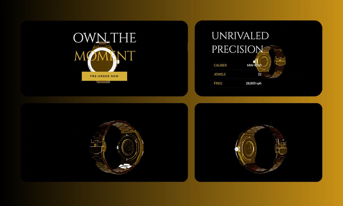

The dark-and-gold palette earns its keep here, it does not just look premium, it hides glare on the watch renders so the detail shots stay readable. One thing I would want to know before calling it done: is Pre-Order Now wired to a real payment capture, or just an email...
The network for creativity
Join 1.25M professional creatives like you
Connect with clients, get discovered, and run your business 100% commission-free
Creatives on Contra have earned over $150M and we are just getting started

Challenges
View all


Related posts

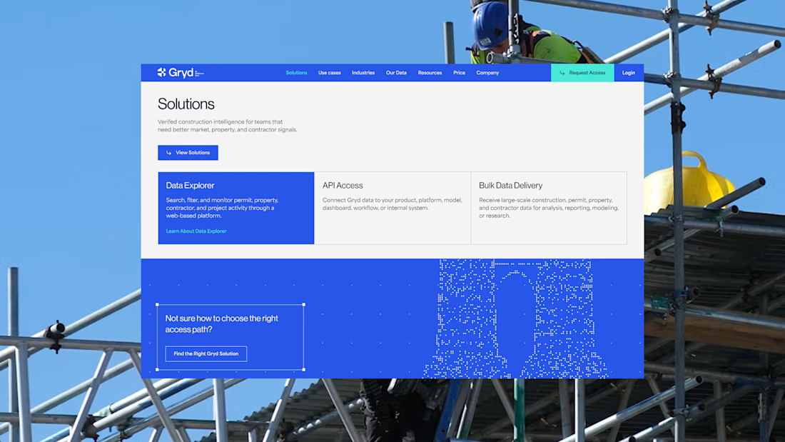
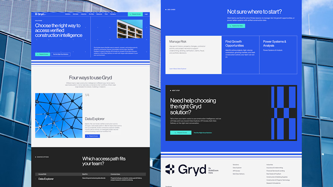
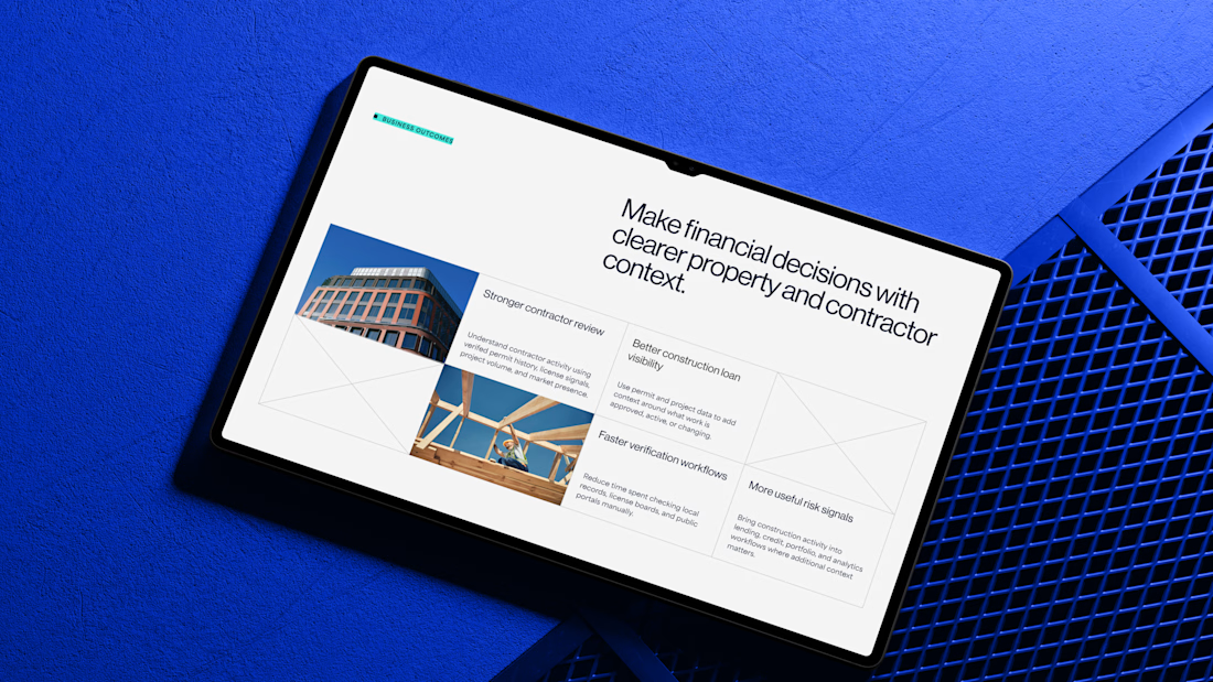
30+ pages, 3 weeks, and honestly one of my favorite projects in a while.
I'd been wanting to design something more tech-driven for a long time, and Gryd, a platform turning construction permit data into intelligence for insurers, lenders, and real estate teams, was exactly that.
Wireframes first, then UI across every page, fully responsive, with animation on the key screens, all built inside the brand the client had already set.
Case study's on my profile.

Clean design 😍

Most luxury eyewear brands sell frames. Very few sell the feeling of putting them on.
Orelux was designed to close that gap. Not just with product shots but with a world. Editorial campaign photography of real people wearing real confidence. A hero that says "See the World in Style" and means it before you scroll once.
The home screen sets the tone full-bleed lifestyle imagery, an in-app try-on preview, and an "Explore Collection" CTA that earns the click.
Three sections. Every reason to buy answered before the question is asked.
This is what luxury e-commerce looks like when the design respects the product as much as the person wearing it.
Does this feel like an eyewear website that converts browsers into buyers? 👇
Designed by Orbix Studio.
Tools: Figma
#WebDesign #LuxuryDesign #EcommerceUI #UIDesign #ContraFreelance #ProductDesign #FashionDesign #LandingPage



A