The network for creativity
Join 1.25M professional creatives like you
Connect with clients, get discovered, and run your business 100% commission-free
Creatives on Contra have earned over $150M and we are just getting started
Back to feedPost

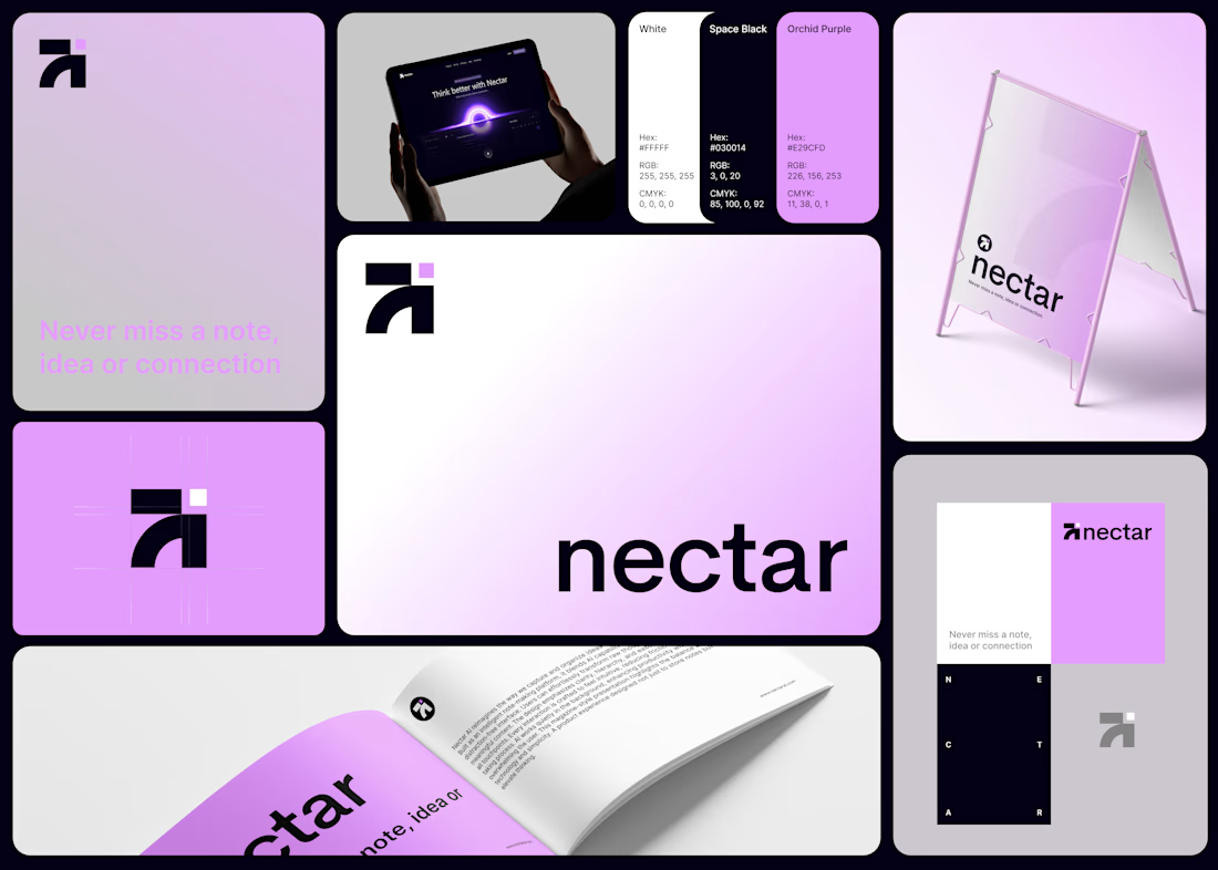
Been exploring branding lately, and this is one of the concepts I worked on for Nectar
Built the brand identity for Nectar, an AI note-taking app with one job: help you never lose a thought, idea, or connection.
The mark is simple an arrow and an "N" folded into one shape, plus a tiny purple square that shows up as a signature detail throughout. Kept the palette to just three colors (black, white, and Orchid Purple) so it stays clean everywhere it lands app screens, signage, print.
Lowercase wordmark, bold and rounded, because the whole point of Nectar is to feel effortless, not clinical.
Simple brand, doing a simple job well: keeping your best ideas from slipping away. 💭
What do you think of the branding? Would love to hear your thoughts.

The network for creativity
Join 1.25M professional creatives like you
Connect with clients, get discovered, and run your business 100% commission-free
Creatives on Contra have earned over $150M and we are just getting started

Challenges
View all


Related posts


Spent the last few months rebuilding the digital presence for Shiva Group, a multi-brand automotive dealership group running JLR, Mahindra, Triumph, KTM, Bajaj, and MG Select showrooms across North India.
New site architecture, cleaner model pages, a live outlet locator across 50+ locations built entirely on Framer. Genuinely happy with how it turned out, and it's already paying off for them too, with $1.2M+ in vehicle bookings coming through the site in the first month!



Running JLR, Mahindra, Triumph, KTM, Bajaj and MG under one coherent site architecture without it feeling generic is genuinely hard, those brands pull in very different visual directions. How much did each individual brand's voice have to bend to make the system hold together?

Designed a dashboard concept for tracking net worth across every asset type — stocks, crypto, property, pensions, funds, cash, and liabilities — all in one place.
Instead of the usual pie chart or bar graph, the centerpiece is a dial: a single, glanceable gauge showing where your wealth actually sits. Behind it, a quiet grid of every asset category fades in and out of visibility, reinforcing that everything's accounted for even when it's not the focus.
Dark UI, a single confident green accent, and a lot of negative space — built to make a genuinely overwhelming task (seeing your entire financial picture at once) feel calm instead of cluttered.


wow the animation feels super smooth, what is this animation for?


Some designers are obsessed with removing friction. Usually, they’re wrong.
When it comes to high stakes fintech "invisible" is a bug, not a feature.
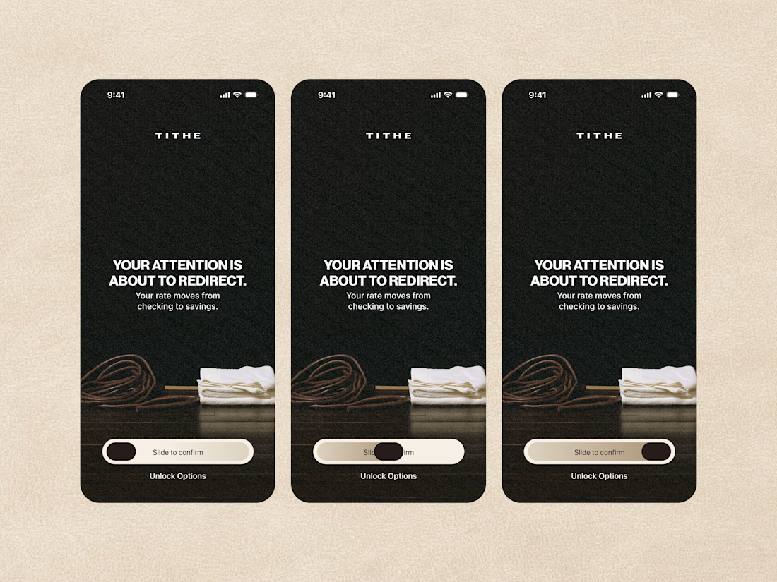
We designed the Tithe onboarding with a mandatory slide to confirm. One second of friction to ensure a lifetime of trust.
Don't just make it fast but rather feel right.

The slide-to-confirm is a nice touch. For financial decisions, that extra moment of intention makes sense.