The network for creativity
Join 1.25M professional creatives like you
Connect with clients, get discovered, and run your business 100% commission-free
Creatives on Contra have earned over $150M and we are just getting started
Back to feedPost

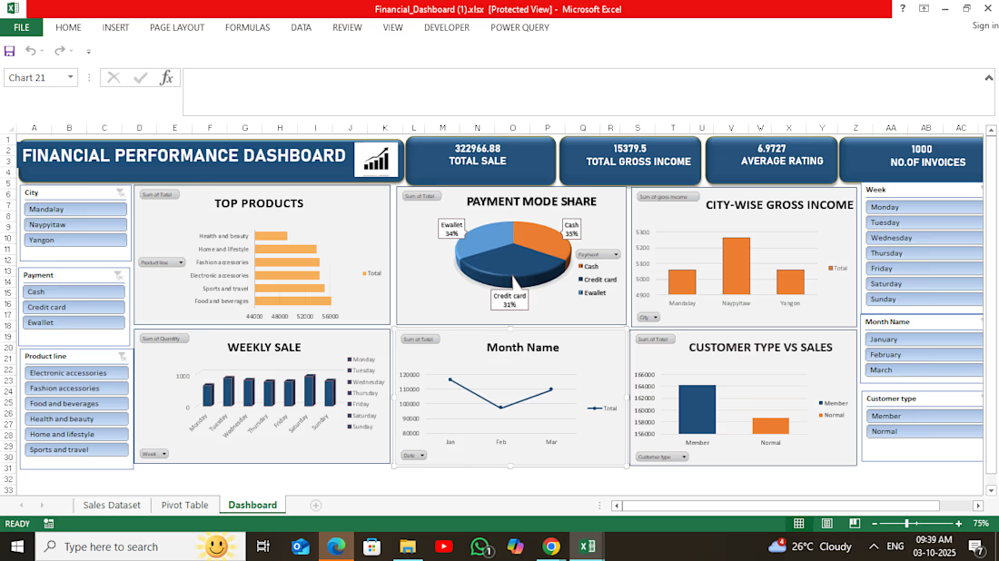
Financial Analysis Dashboard in Excel
An Excel-based financial analysis project focused on organizing, analyzing, and visualizing financial data to identify important trends and performance patterns.
Key areas covered:
• Data cleaning and organization
• Financial calculations and analysis
• KPI and performance analysis
• Pivot Tables for summarization
• Charts and visualizations
• Trend and comparison analysis
• Interactive Excel reporting
The project demonstrates how Excel can be used to transform raw financial data into a clear and structured report for better business understanding and decision-making.

The network for creativity
Join 1.25M professional creatives like you
Connect with clients, get discovered, and run your business 100% commission-free
Creatives on Contra have earned over $150M and we are just getting started

Challenges
View all


Related posts

Animated Fintech UI for pie showing portfolio performance, Investment income, Investment advisory, and smart advisory features through interactive financial visualization
A motion exploration for Pie, bringing key wealth-management features to life through animated UI components.
The concept explores how portfolio performance, investment income, investment advisory, and smart advisory can be presented in a clear and engaging way while keeping the overall experience simple and premium.
A look at how motion can make financial products feel more intuitive, modern, and easier to understand.


The motion-led charts make a dense wealth-management story feel approachable; the distinct panels give each metric room to breathe while still reading as one system.

Hi, I'm Rohan — a data analyst who turns messy data into clean dashboards and clear business insights 📊
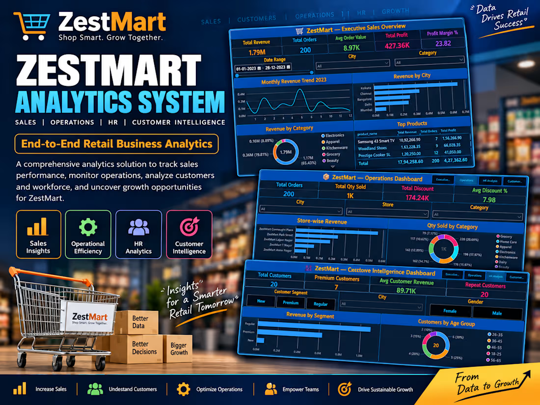
Recently completed a 20-day end-to-end analytics pipeline (Excel → SQL → Python → Power BI) for a fictional retail chain — 4 interactive dashboards tracking sales, operations, HR & customer intelligence, with ₹1.79M in revenue analyzed across 200 orders.
I also work on HR analytics, real estate dashboards, and retail sales analysis — check out my full portfolio below 👇
Open to data cleaning, dashboard building, and SQL/analytics projects of any size. Let's turn your data into decisions!
#DataAnalytics #PowerBI #SQL #Excel #Python

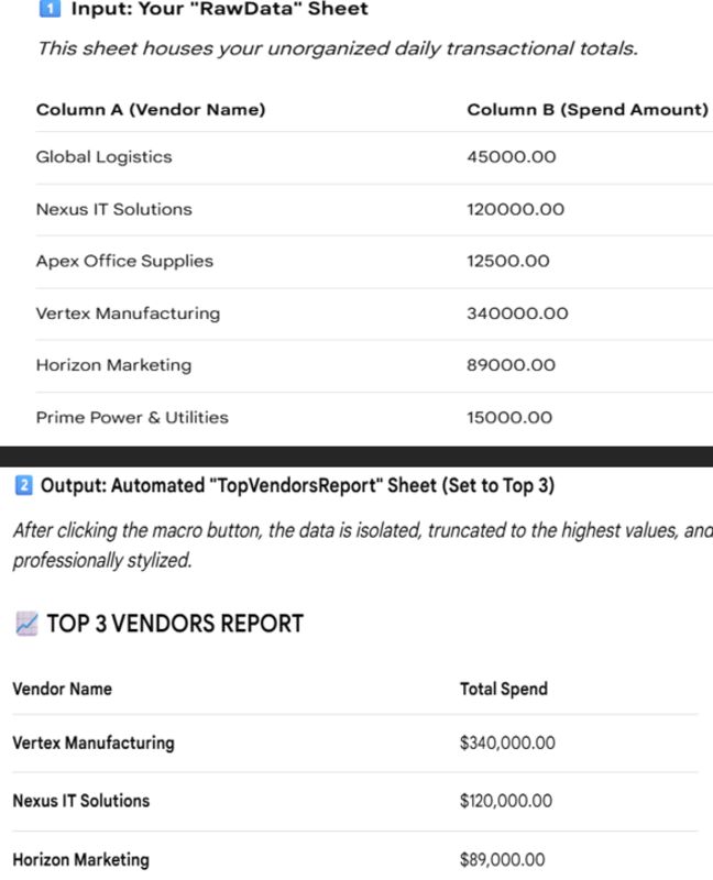
Generating an automated Top Vendors Report using an Excel Macro moves client data through three distinct phases: Extraction, Isolation, and Visual Enhancement.
Step 1: Data Replication & Sorting – The macro copies original invoice/spend records into a dedicated reporting sheet to preserve the master data. It then sorts the entire list by total spend in descending order.
Step 2: Threshold Trimming – It looks at client data's target (e.g., Top 5 or Top 10) and deletes all rows beneath that cutoff, cleanly removing lower-tier spend data.
Step 3: Executive Formatting – It dynamically builds professional headers, applies currency styling ($#,##0.00), colors the table headers for a dashboard feel, and auto-adjusts column widths so text is never cut off.
.