The network for creativity
Join 1.25M professional creatives like you
Connect with clients, get discovered, and run your business 100% commission-free
Creatives on Contra have earned over $150M and we are just getting started
Back to feedPost
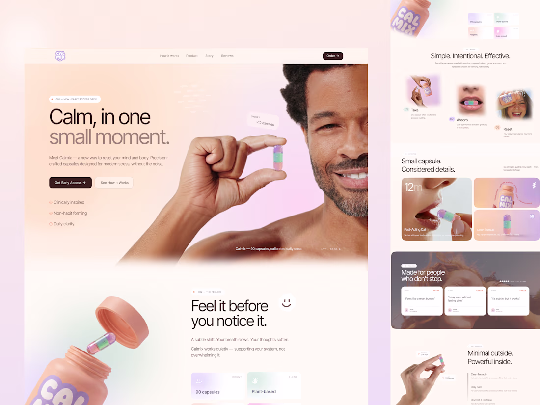
ecently worked on a wellness landing page concept, and I wanted to share a bit of my thinking behind it.
The idea wasn’t just to “design a product page” — it was to design a feeling.
Something calm, quiet, and reassuring from the very first scroll.
Here’s what I focused on as a designer:
• Clarity over complexity — The product is simple, so the UI had to reflect that. No noise, just what matters.
• Emotional tone — Soft gradients, warm lighting, and human expressions to create a sense of ease.
• Micro-storytelling — Breaking the experience into small steps (Take → Absorb → Reset) so users instantly understand how it fits into their life.
• Trust signals — Clean, minimal feature blocks instead of overwhelming claims.
• Product-first visuals — Letting the capsule and bottle feel tactile and real, almost touchable.
One thing I’ve been thinking more about lately:
Good design doesn’t shout. It gently guides.
Curious — when you design for wellness or lifestyle products, do you prioritize emotion first or clarity first?
Nice work
Thanks
The network for creativity
Join 1.25M professional creatives like you
Connect with clients, get discovered, and run your business 100% commission-free
Creatives on Contra have earned over $150M and we are just getting started
Related posts
3 Figma Make hacks you wish you knew sooner! 🔥
👉 Keep these in mind when working on your project for Config Makeathon. 7 days left to submit your prototype!
Thank you, very helpful tips
- 1 decision made based on gut feelings rather than evidence.
- 1 decision driven by personal opinion — "I'm the CEO, and I think this is better."
- 1 team debating which option is better without any supporting data.
- >1 platform filled with distractions, making it difficult to focus on creating or participating in A/B tests.
- >1 person struggling to make an everyday decision — for example, choosing which mouse is better.
- 1 version that could have performed better, but was never tested.
,...
------------
🚀 Maybe you're right. Maybe I'm right. Let's find out.
🔥 How it works
- Creating a test costs 500 Gold.
- You earn Gold by voting on other people's tests.
- The system encourages everyone to contribute value back to the community before asking for feedback.
- Once a test is created, you can revisit it anytime, copy the link, and share it with friends, teammates, clients, or anyone whose opinion matters.
- Get fast, clear insights that help you make decisions without digging through endless discussions.
- Track your ranking and see where you stand within the community.
🔥 AI-Powered Features
- Generate and structure A/B tests faster with AI assistance.
- Automatically summarize community comments and feedback.
- Unlock deeper AI-powered analysis to understand not just what won, but why it won.
👍 Use Cases
- Which UI is better?
- Which landing page converts better?
- Which logo should I choose?
- Which product idea has more potential?
- Which mouse should I buy?
- What should I wear today?
From product decisions to everyday choices, A/B Battle helps turn uncertainty into confidence.
Spend less time overthinking.
Make decisions faster.
Have a better day with mAyBe!!!
- Discover it yourself : https://steep-odd-85537659.figma.site/
- 255 versions in Figma make: https://www.figma.com/make/8iwith7uVSU9iiSeIY3weC/mAyBe?t=uowgHgbDZU4tUyGt-1
- by MAX.terpiece -
I like your creativity
BABBU
Every toddler invents their own language. Babbu is my daughter Matilda's word for ball. By the time she says it correctly, I'll have already forgotten how it sounded.
Babbu is a private dictionary for the words only your child says, the mispronunciations, the invented names, the sounds that make sense to no one but you. No social features. No accounts. Just a growing archive of a specific, unrepeatable moment in your child's life.
Try it here: https://adobe-slush-93538397.figma.site
✨ What it does
- Add a word as your child says it, plus what it actually means
- Record their voice directly in the app
- Automatically matches an illustration to the word's meaning, translating it from any language
- Colour-code each card
- Search your collection
- Share a snapshot of the full dictionary with family as a single link
🛠️ Built with
Figma Make
Anthropic API — icon matching with automatic translation
Native browser MediaRecorder API — audio recording, no dependencies
localStorage — fully private, lives on your device
🔮 What's next
Live sync so the dictionary stays up to date for everyone
Family members can contribute words from their end
Milestones view — first word, tenth, fiftieth
A printed book of the whole dictionary
This is so wonderful! Did you make the video with Weave?
Trending
Claude
Claude has entered the design space. How are you using Claude Design?
Contra University
Learn from expert creatives how to earn more using next-gen AI tools.
MagicPath
The canvas is infinite, and exploration is becoming the workflow. How are you using MagicPath?
creativeaiflow
Creative AI workflows are evolving. What tools do you use, and what are their strengths and weaknesses?
freelancerlife
Freelancer life is wins, pivots, and everything in between. What’s yours right now?