The network for creativity
Join 1.25M professional creatives like you
Connect with clients, get discovered, and run your business 100% commission-free
Creatives on Contra have earned over $150M and we are just getting started
Back to feedPost

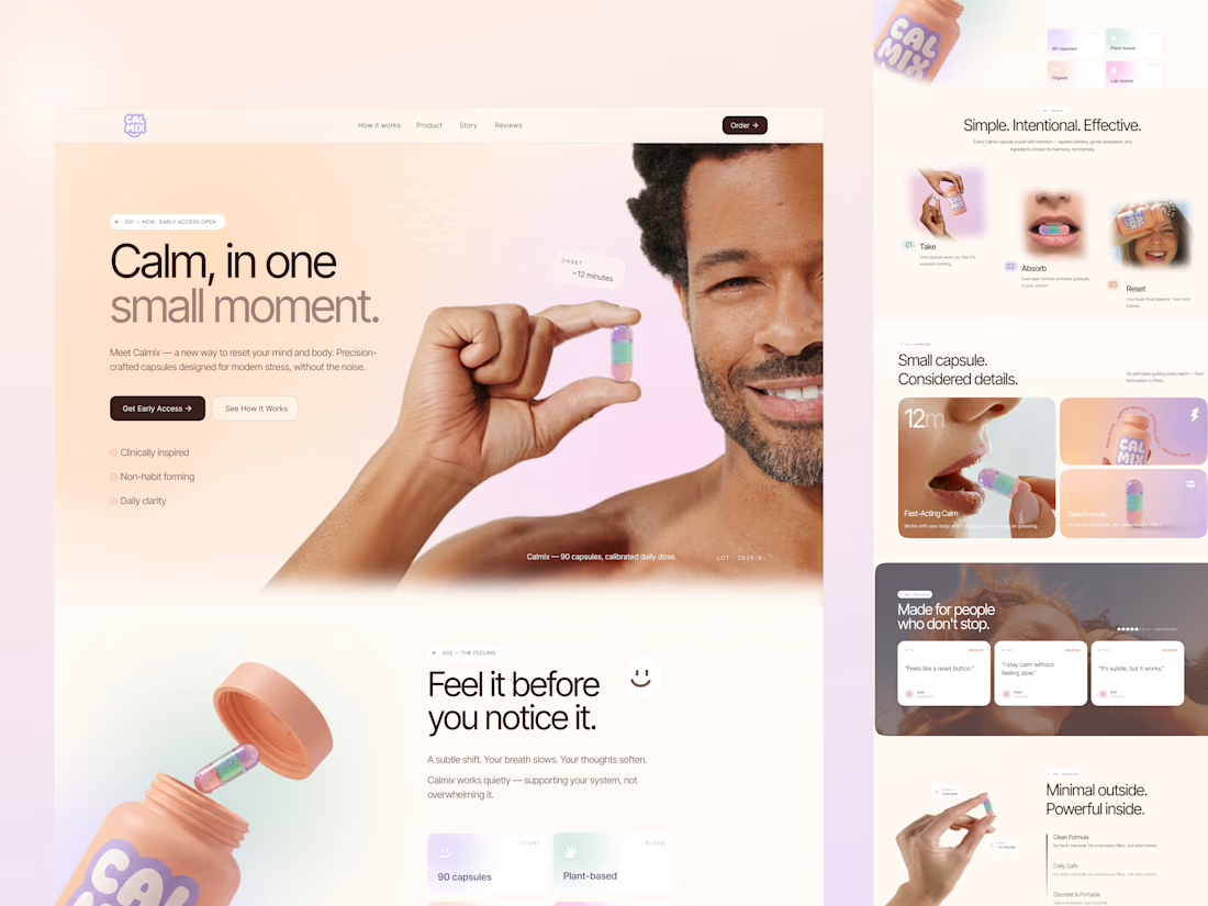
ecently worked on a wellness landing page concept, and I wanted to share a bit of my thinking behind it.
The idea wasn’t just to “design a product page” — it was to design a feeling.
Something calm, quiet, and reassuring from the very first scroll.
Here’s what I focused on as a designer:
• Clarity over complexity — The product is simple, so the UI had to reflect that. No noise, just what matters.
• Emotional tone — Soft gradients, warm lighting, and human expressions to create a sense of ease.
• Micro-storytelling — Breaking the experience into small steps (Take → Absorb → Reset) so users instantly understand how it fits into their life.
• Trust signals — Clean, minimal feature blocks instead of overwhelming claims.
• Product-first visuals — Letting the capsule and bottle feel tactile and real, almost touchable.
One thing I’ve been thinking more about lately:
Good design doesn’t shout. It gently guides.
Curious — when you design for wellness or lifestyle products, do you prioritize emotion first or clarity first?
The network for creativity
Join 1.25M professional creatives like you
Connect with clients, get discovered, and run your business 100% commission-free
Creatives on Contra have earned over $150M and we are just getting started
Challenges
View all


Related posts

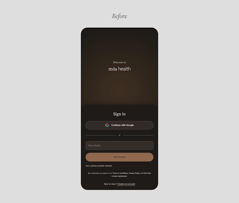
A founder ask me for a feedback on there product, so i started reviewing the healthcare app, and something felt off.
The website felt warm and welcoming. You could tell there were real people behind the brand.
But once you opened the app to sign up, that feeling was gone.
And honestly, for something as personal as healthcare, that matters. People need to feel comfortable before they trust you with their health.
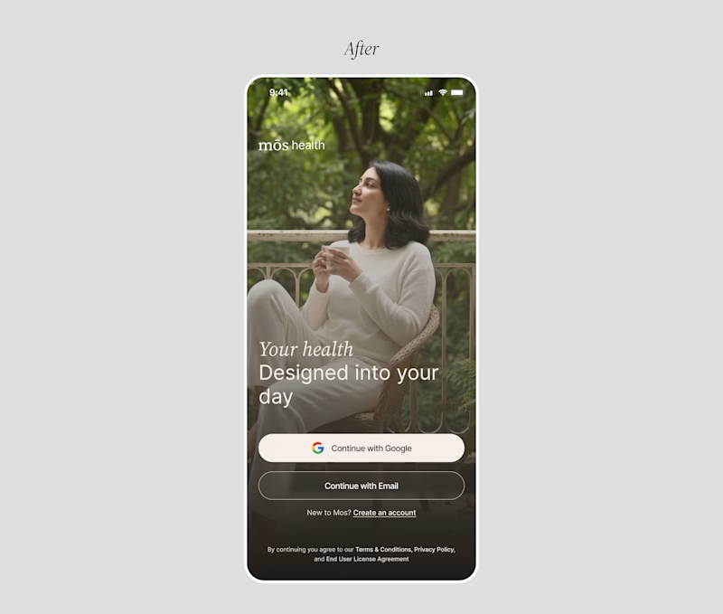
So I worked on the onboarding screen to bring that feeling back.
Nothing complicated. I added a human touch through imagery and kept the screen simple, while making the app feel more connected to the website.
Sometimes, it's not about adding more to a screen. It's about making what's already there feel right.
Which would make you more comfortable signing up:
Before or After?

4 voted
14%
25 voted
86%
29 votes
Closed

Good catch on the disconnect between the website and signup flow. Carrying that human warmth into onboarding feels especially relevant for healthcare. Have you had a chance to test the redesign with new users?

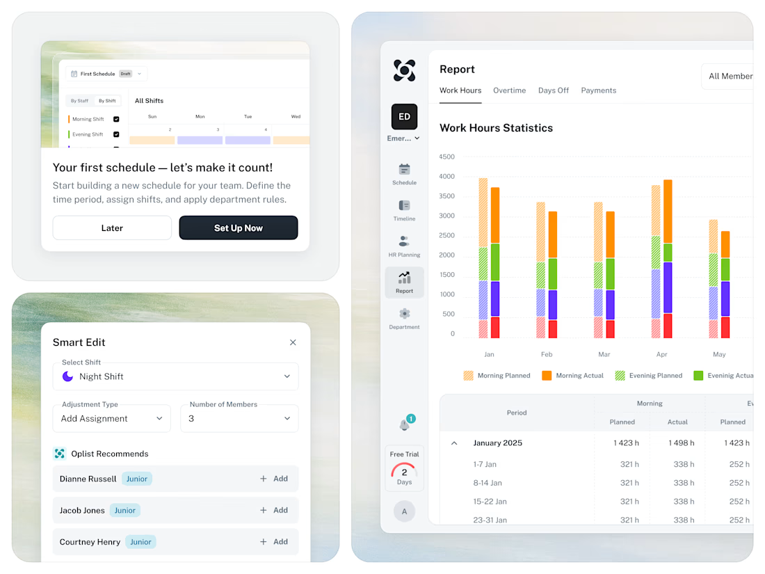
🚀 From Excel chaos to a clear SaaS workflow for staff scheduling.




Same animation, one detail changed.
Motion blur or clean.
Which one feels better? 👇
16 voted
53%
14 voted
47%
30 votes
Closed

Blure is more focused and better ❤️❤️