The network for creativity
Join 1.25M professional creatives like you
Connect with clients, get discovered, and run your business 100% commission-free
Creatives on Contra have earned over $150M and we are just getting started
Back to feedPost
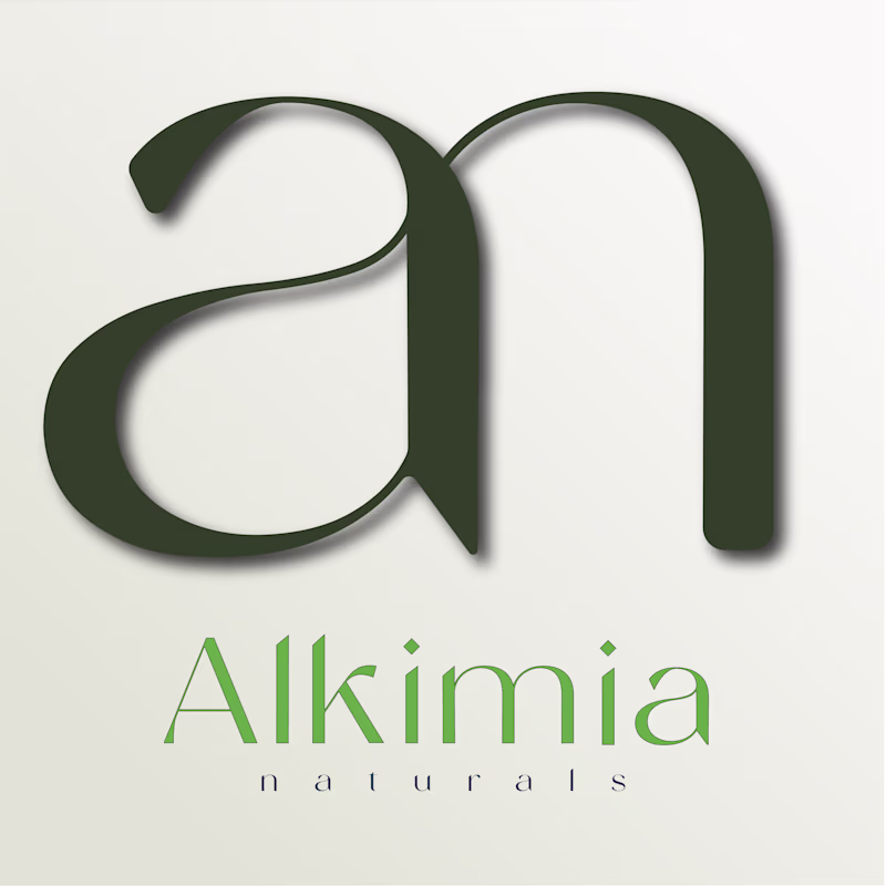
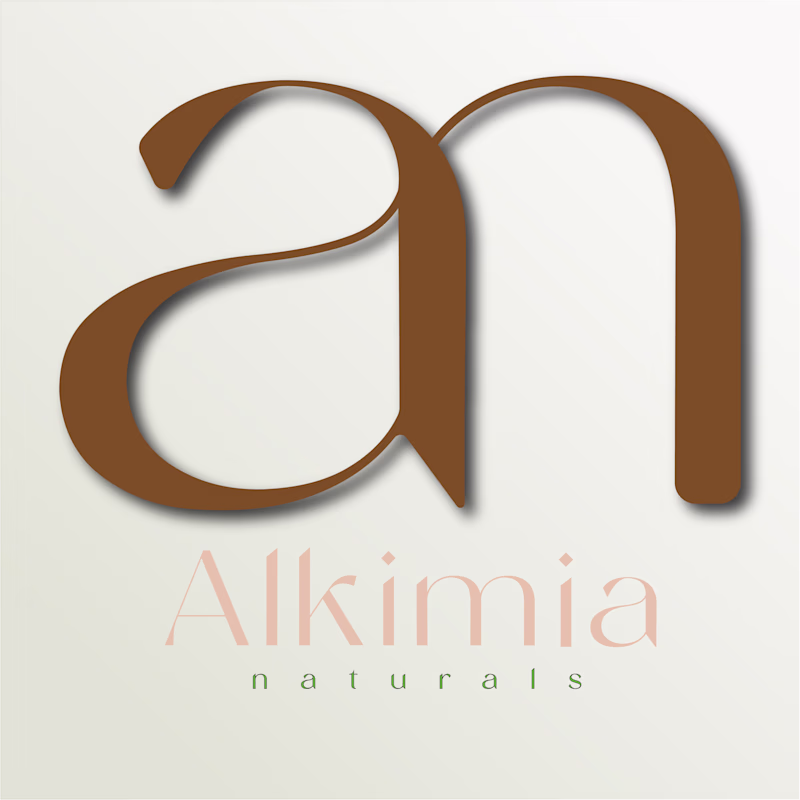
Taste Test
I’d love your opinion on this one: should the tags and icons use the primary color, or should I bring in the tertiary color as the accent? I can also adjust the shade lighter or darker, but I want the version that feels best overall. What would you go with?
2 voted
50%
2 voted
50%

4 votes
Closed
I love the Tertiary Colors
Thank you for your feedback! Still experimenting with the different tints and shades of both Primary and Tertiary colors..
i love the primary colors
Thanks for the feedback!
Love this!
Thank you so much!
The network for creativity
Join 1.25M professional creatives like you
Connect with clients, get discovered, and run your business 100% commission-free
Creatives on Contra have earned over $150M and we are just getting started
Related posts
I'm a little bit undecided about the colors, which would your prefer better for a cosmetics brand?
5 votes
Ends in 1d
I like the green tone
Trying out different styles for a restaurant landing page that I'm working. Witch do you think is better?
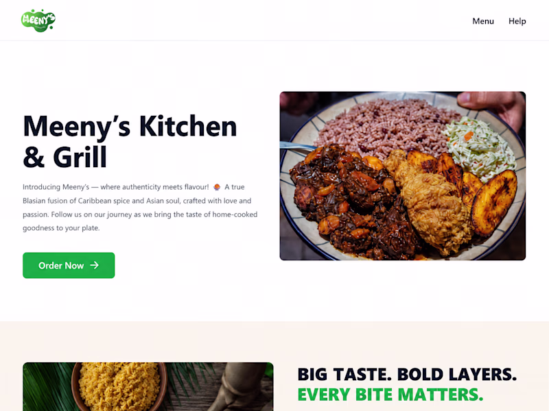
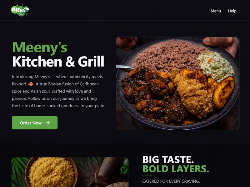
5 votes
Ends in 1d
I like the dark version better.
Round 2 👀
Which visual style is more appealing to you, and what emotions does each design evoke for you?


20 votes
Ends in 1d
Left one for me. The green naturally reinforces the financial context, so the $140M immediately felt more connected to growth and value to me.
Challenges
View allTrending
Claude
Claude has entered the design space. How are you using Claude Design?
Contra University
Learn from expert creatives how to earn more using next-gen AI tools.
creativeaiflow
Creative AI workflows are evolving. What tools do you use, and what are their strengths and weaknesses?
portfolioreview
The best portfolios tell a story, not just show a grid. Share yours for feedback.
freelancerlife
Freelancer life is wins, pivots, and everything in between. What’s yours right now?