The network for creativity
Join 1.25M professional creatives like you
Connect with clients, get discovered, and run your business 100% commission-free
Creatives on Contra have earned over $150M and we are just getting started
Back to feedPost
Taste Test
I’d love your opinion on this one: should the tags and icons use the primary color, or should I bring in the tertiary color as the accent? I can also adjust the shade lighter or darker, but I want the version that feels best overall. What would you go with?
2 voted
50%

2 voted
50%

4 votes
Closed

i love the primary colors


Thanks for the feedback!

Love this!
Thank you so much!
The network for creativity
Join 1.25M professional creatives like you
Connect with clients, get discovered, and run your business 100% commission-free
Creatives on Contra have earned over $150M and we are just getting started











Related posts

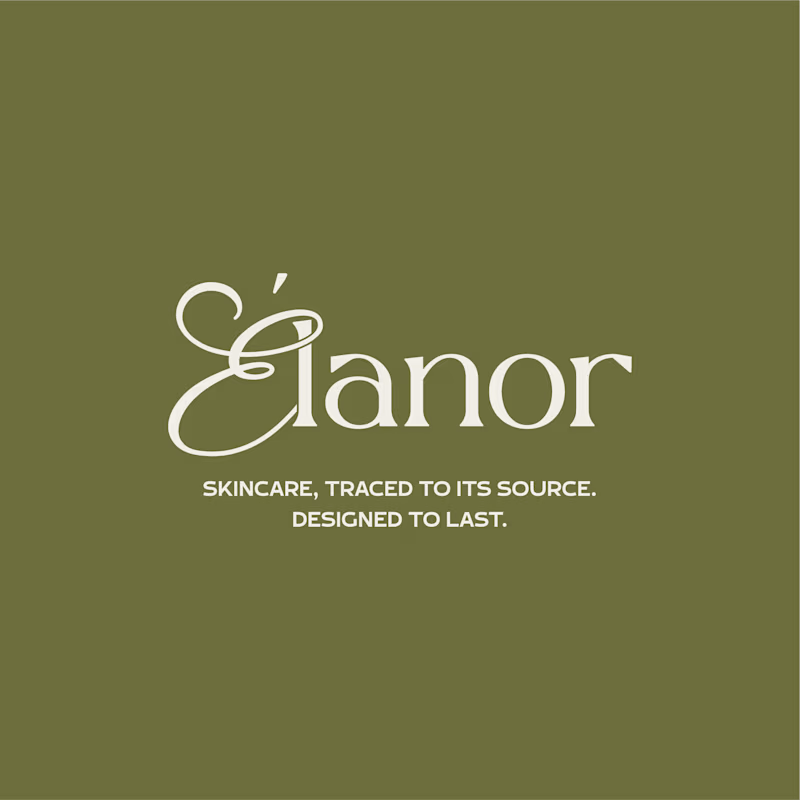
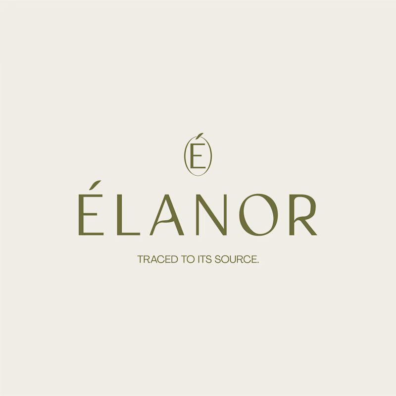
Can two different typographic directions change how you perceive the same skincare brand? 👀
For Elanor, a skincare brand I’ve worked on, I’m putting two wordmark directions head to head.
A. Script Combo brings more personality and a distinctive, expressive touch.
B. Contemporary feels cleaner, more restrained, and modern.
Now I want your honest opinion: A or B? Which direction feels right for Elanor, and why?
14 votes
Ends in 1d


Script Combo!! I'm not usually fan of script combos but I think it was well done here!