The network for creativity
Join 1.25M professional creatives like you
Connect with clients, get discovered, and run your business 100% commission-free
Creatives on Contra have earned over $150M and we are just getting started
Back to feedPost
CONTUR. Contemporary sandwich shop identity&packaging


Great work! ✨

Thanks 🤍
The network for creativity
Join 1.25M professional creatives like you
Connect with clients, get discovered, and run your business 100% commission-free
Creatives on Contra have earned over $150M and we are just getting started



Related posts

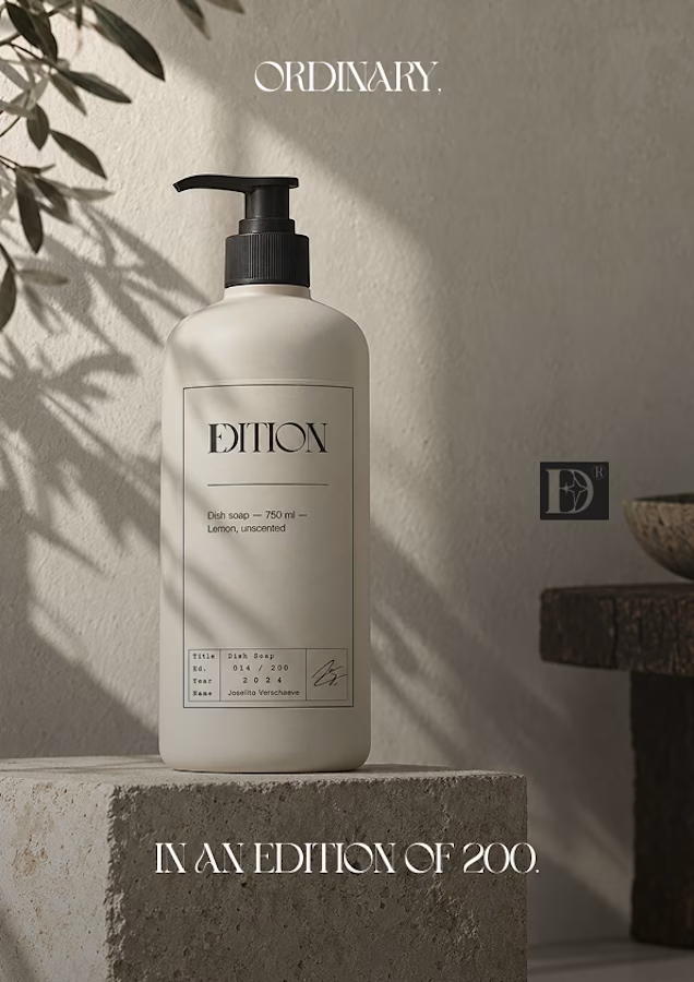
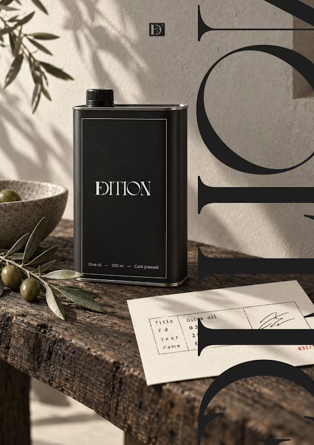
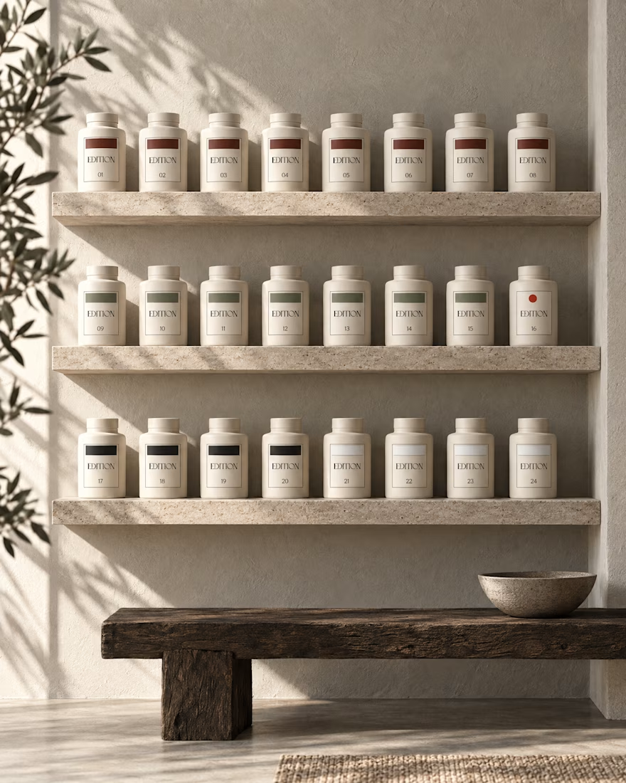
Ever signed for a pack of pasta? Soon you will.
EDITION is a brand where nothing is decorative and everything is numbered.
Case study landing very soon.

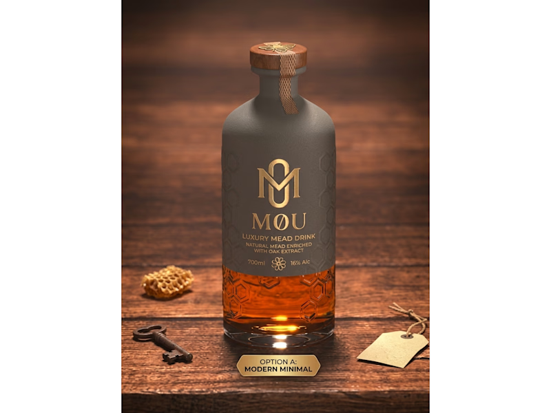
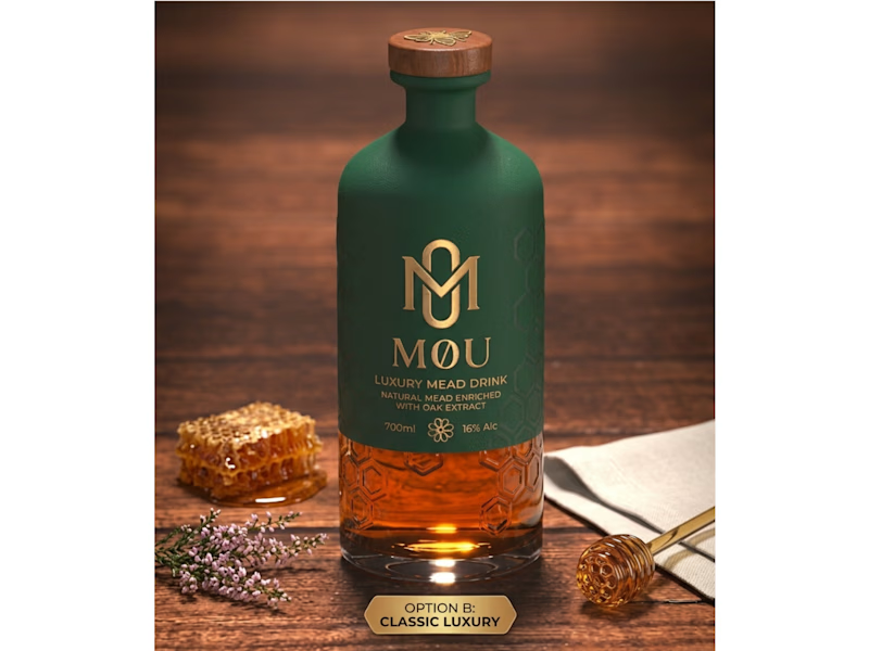
Craft Meets Heritage: Which M0U Packaging Wins?
I created two distinct packaging concepts for M0U, a luxury oak-enriched honey mead brand. Both designs keep the custom geometric gold monogram and embossed honeycomb glass intact while testing two different visual directions:
Option A (Modern Minimal): Features a matte slate-grey wrap and a textured neck seal for a contemporary, understated shelf presence.
Option B (Classic Luxury): Uses a deep forest-green finish paired with warm gold foil accents to highlight natural botanical heritage.
Which packaging direction grabs your attention first—A or B? Drop your vote below!
Looking to elevate your brand with custom logo systems and standout packaging design? Let’s connect and bring your vision to life.
3 votes
Ends in 10h

B — the forest green and gold feel luxurious.

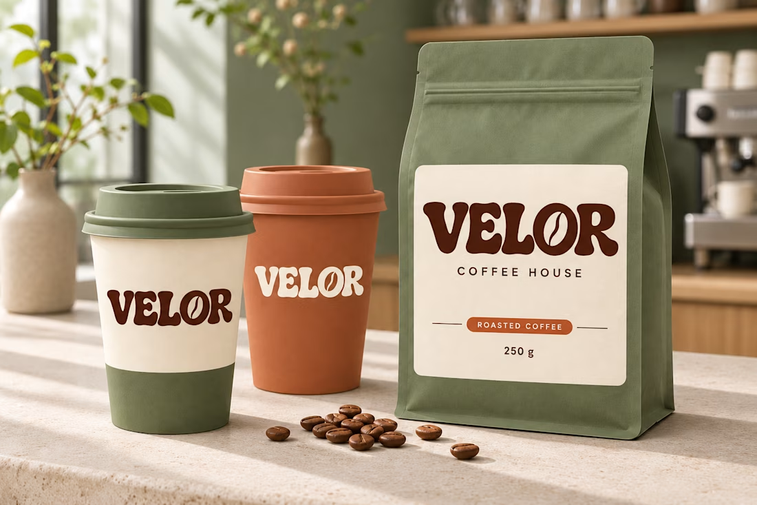
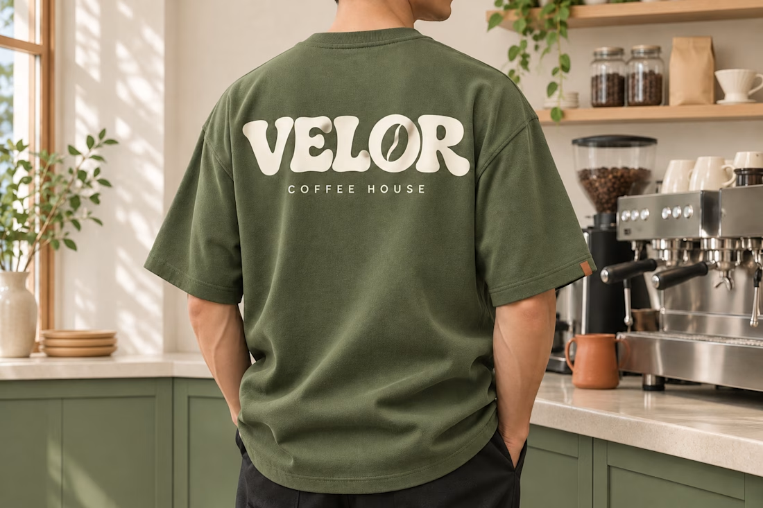
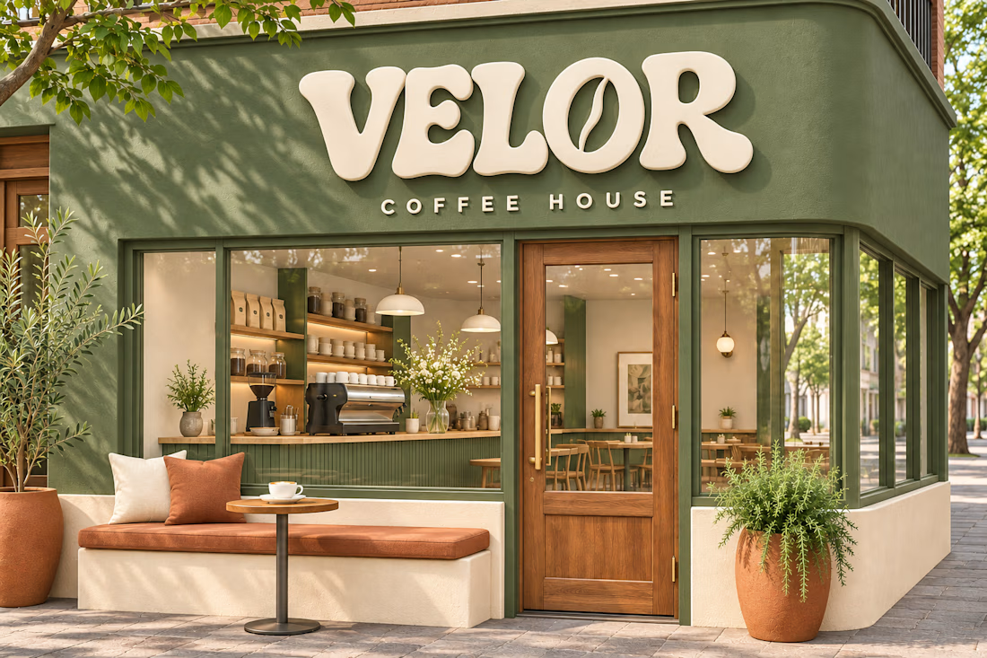
Meet VELOR ☕ Coffee Shop Branding & Visual Identity
A coffee shop’s personality starts before the first sip—with its sign, its packaging, and the atmosphere that welcomes you inside.
For this VELOR concept, I created a warm, expressive identity built around custom lettering, including a coffee-bean detail inside the “O.”
The design brings together:
• A distinctive typographic logo
• Sage green, warm cream, terracotta, and espresso colours
• Branded takeaway cups and coffee bags
• Coffee shop storefront signage
• Staff T-shirts that carry the same visual identity
Every element follows one direction, making the brand feel connected wherever customers experience it.
Launching a business or planning a brand makeover?
I can help with brand identity, packaging, UI/UX design, Framer websites, and full-stack development—from the first idea to a finished digital experience.
Message me on Contra to discuss your project.
#BrandIdentity #CoffeeShopBranding #LogoDesign #PackagingDesign #WebDesign #Framer