
Andreea Nep
Designer Crafting Visuals Rooted in Strategy
New to Contra
Andreea is ready for their next project!
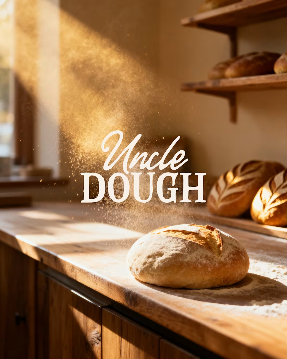
Uncle Dough is a sourdough bakery built on warmth, craft, and character. The brief was to create a brand that reflects slow fermentation, honest ingredients, and a welcoming neighborhood feel.
I developed the brand identity and all supporting materials, translating these values into a cohesive visual system. The challenge was balancing traditional bakery cues with a bold, approachable presence — resulting in a brand that feels familiar, yet distinctive across touchpoints.
2
1
112
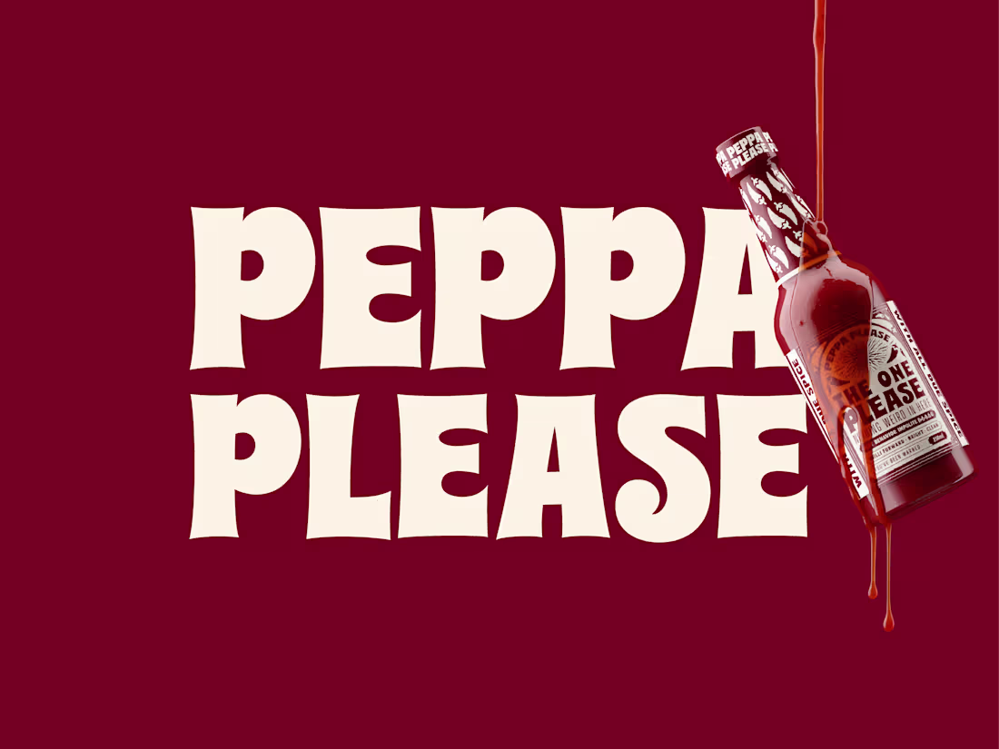
Hot sauce with something to say and ingredients you can actually pronounce.
I developed the brand identity and packaging from four keywords: bold, spicy, cheeky, fun. The goal was to balance expressive character with a considered, tactile feel.
The visual direction combines a playful tone with an apothecary-inspired structure. A central sun motif anchors the label system — warm, bold, and slightly mystical — creating a recognizable and flexible core element.
The bottle was modeled in Blender and rendered to produce a consistent set of base visuals. These renders were used as reference inputs for AI-generated mockups, enabling scalable exploration of brand applications while maintaining control over form, lighting, and materials.
2
4
137
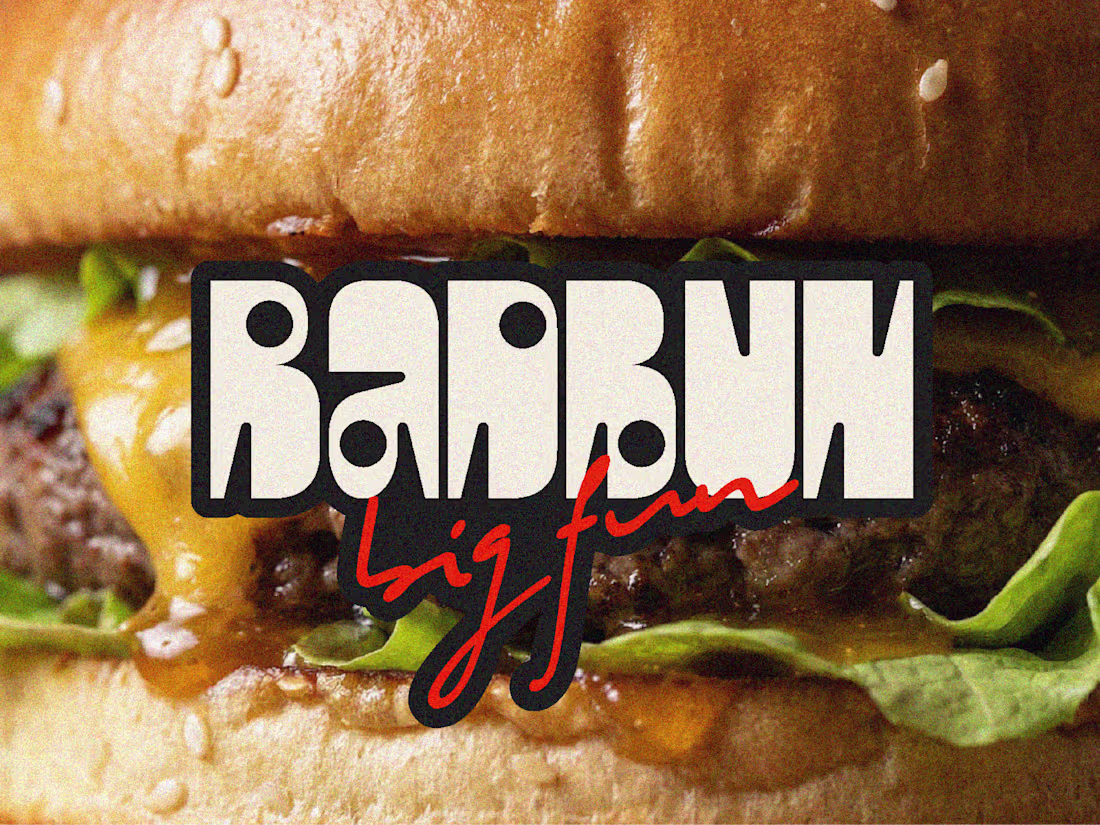
Bad Bun is a burger joint with a rebellious streak. Not your average takeaway — it's the place you go before the party, after the party, and sometimes instead of the party. The ask was to create a brand that felt bold, unapologetic and made to be seen. Something playful and confident, with just enough chaos to feel authentic. The kind of branding people instantly recognise — and want to be part of.
The approach:
I came at it from the culture first. Bad Bun isn't just food — it's a mood, a crowd, a late-night energy. So the brand had to live beyond the logo. I developed a full visual world built around that personality: a tone of voice that's got attitude without trying too hard, a visual system that's deliberately a little unruly, and a character-driven illustration language that shows up consistently across every surface. The packaging talks back. The menu reads like a playlist. The merch is something people actually want to wear. Every touchpoint was designed to feel like it belongs to a place worth talking about.
Deliverables: Brand strategy · Visual identity · Tone of voice · Packaging design · Menu design · Merch · Environmental graphics
6
10
375
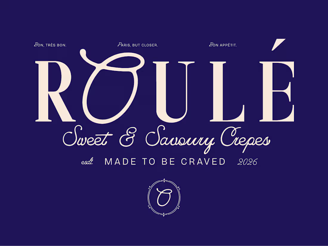
ROULÉ is a Parisian-inspired crêperie built around one simple obsession: the perfectly rolled crêpe. The challenge was to create a brand that felt effortlessly cool, design-forward, and rooted in French street food culture — without feeling like a pastiche. A brand that earns its place on a billboard, a cobalt awning, a street sign, a takeaway box, and a scallop-edged menu card — all with the same quiet confidence.
6
5
283