The network for creativity
Join 1.25M professional creatives like you
Connect with clients, get discovered, and run your business 100% commission-free
Creatives on Contra have earned over $150M and we are just getting started
Back to feedPost
Two visual directions for Talixo.
Green or Cream which one would you pick?😊

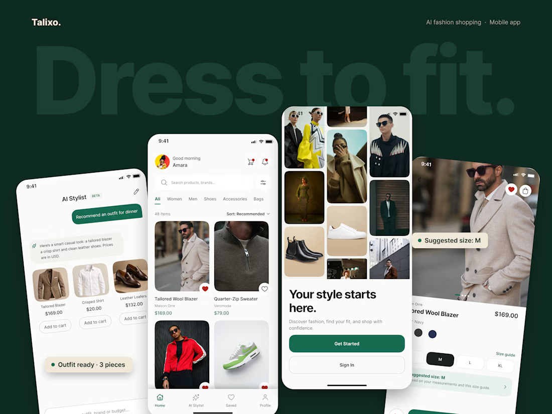
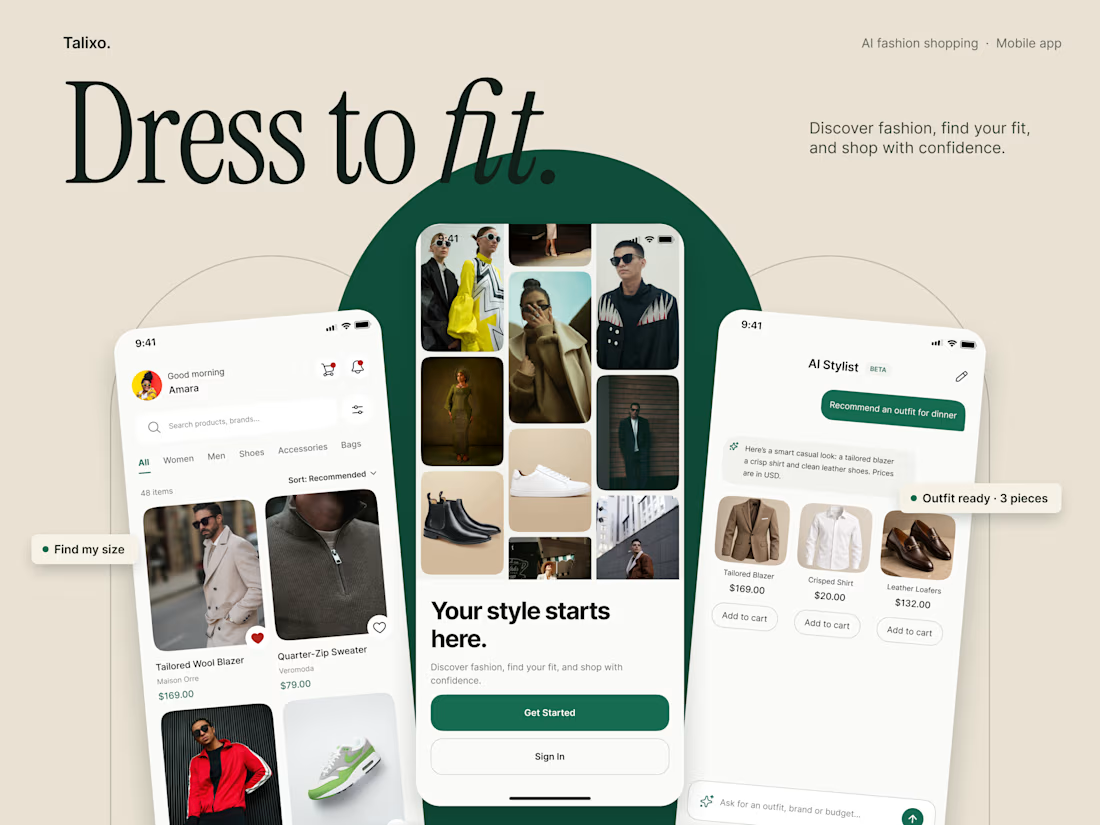

Good to see two real directions instead of two colour swaps. Who is Talixo's main user? That would decide it for me.

Talixo is designed for style conscious shoppers who value personalization and convenience. The focus is on making fashion discovery and finding the right fit more intuitive through AI.
The network for creativity
Join 1.25M professional creatives like you
Connect with clients, get discovered, and run your business 100% commission-free
Creatives on Contra have earned over $150M and we are just getting started



Related posts

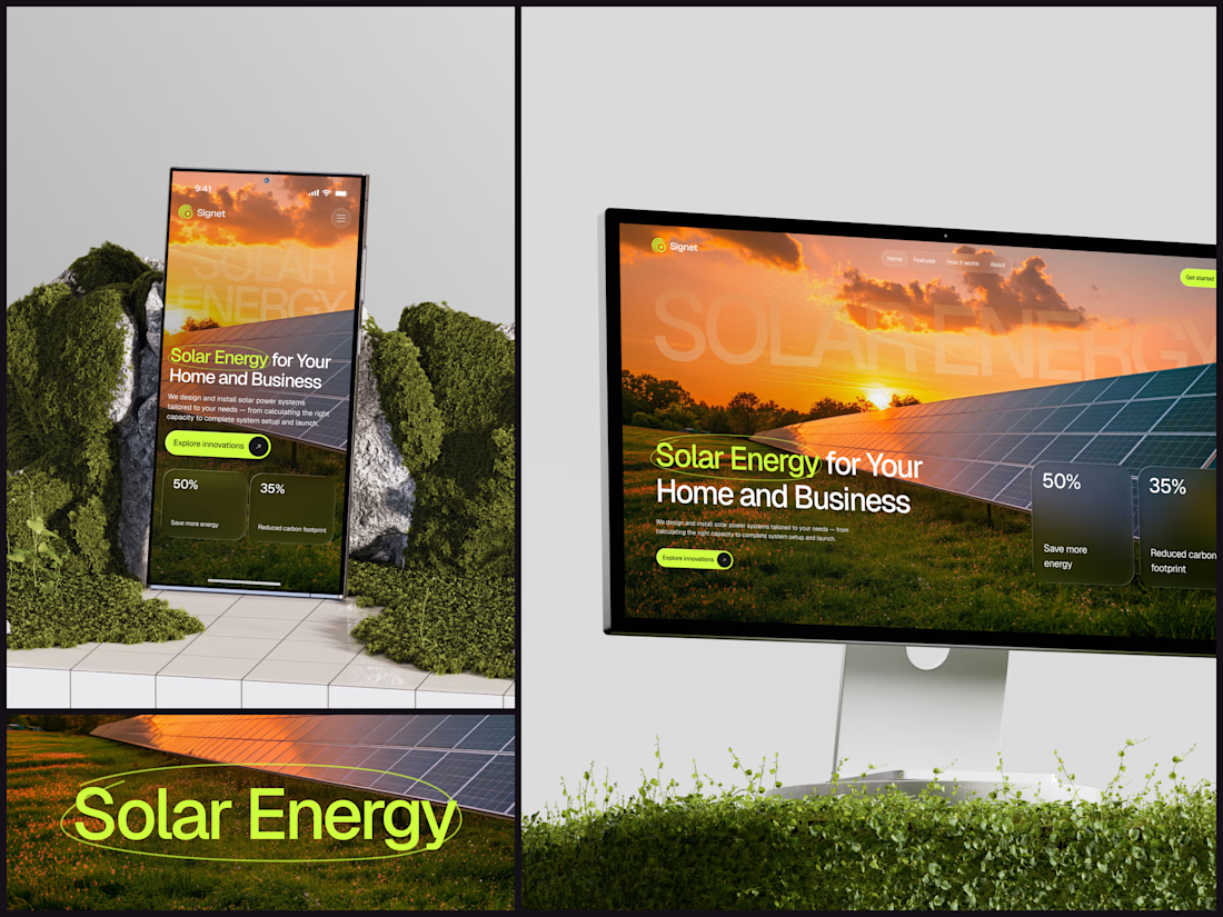
Solar Energy Website
A thin lime circle tells you which two words this page is about.
The headline sits over a sunset photo of a panel field. The "Get started" and "Explore innovations" buttons share the circle's lime, so the eye moves from the circled words straight to the next step.
Large faded capitals repeat those two words across the sky, faint enough to stay inside the photo. On mobile they break onto two lines, and the headline and button stack above two frosted cards.
Only two words of "Solar Energy for Your Home and Business" are lime, and the whole page follows them.
Designed by the Hue & Machine team.
#SolarEnergy #RenewableEnergy #CleanTech #WebDesign #LandingPage #HeroSection #UIDesign #ResponsiveDesign #MobileDesign #FigmaDesign



This is really cool, Nice job Dmytro

Absolutely goated


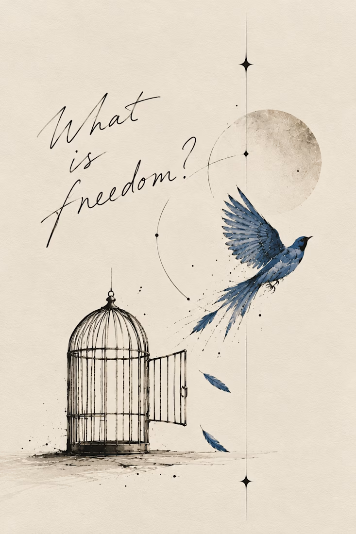
What happens when a poet picks up a pen and remembers she likes to sketch too:)
I write poetry over at @words.bycm on IG and since Inktober is here, I thought it was time to let that side of me out of its little corner of Instagram.
This is 'What Is Freedom?', a poem I wrote...
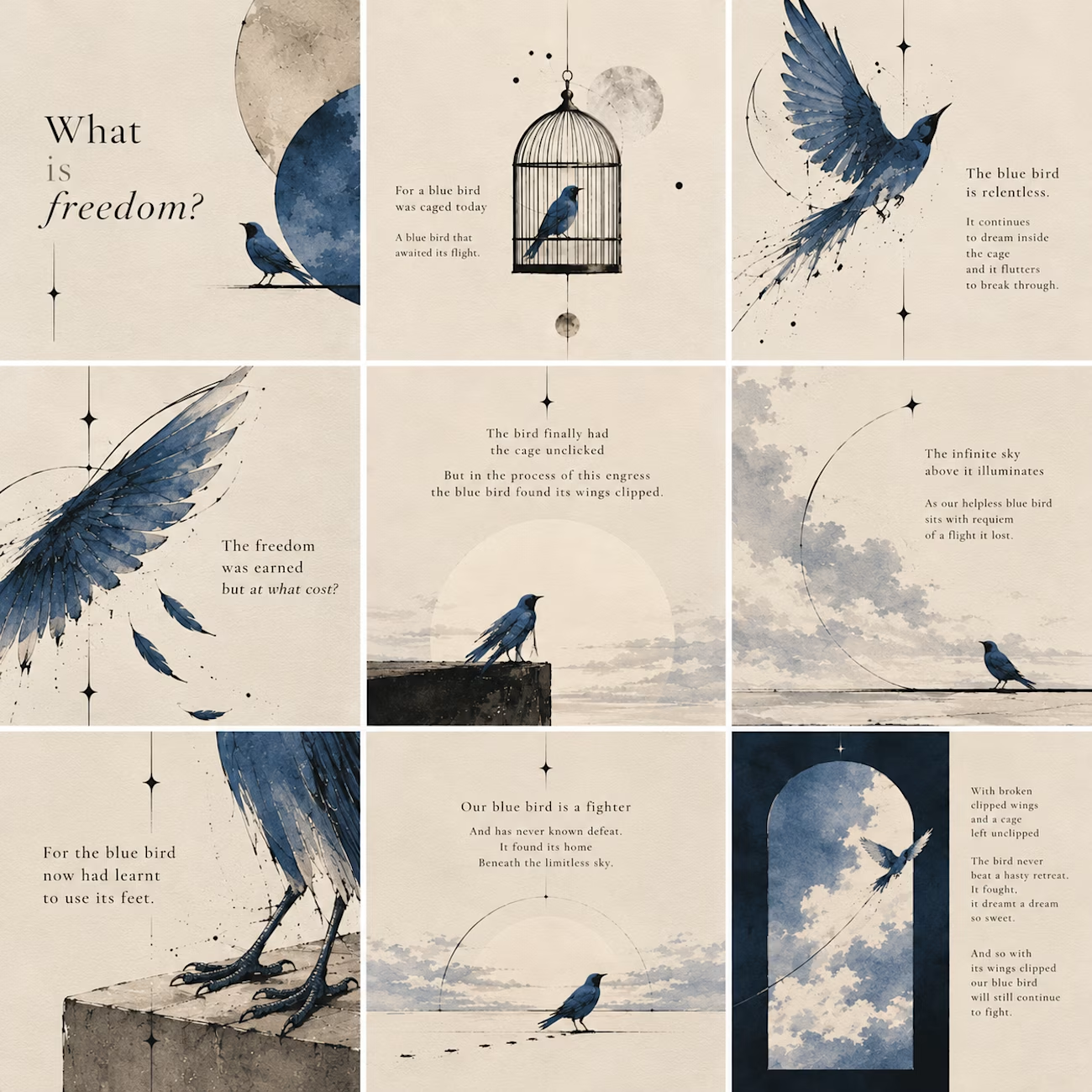
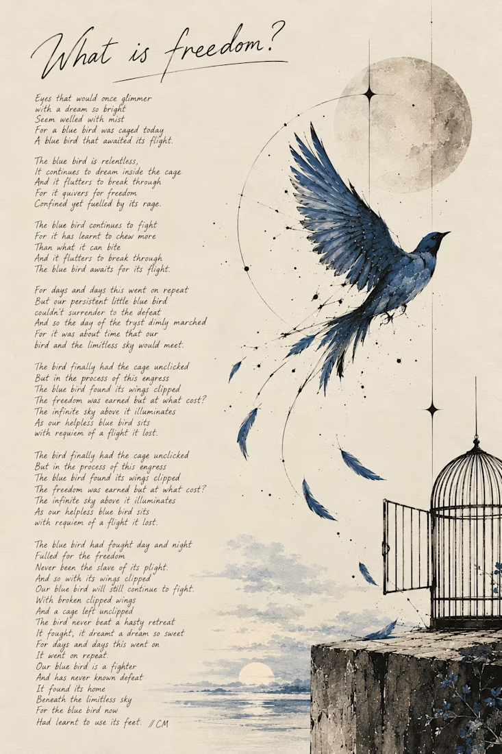
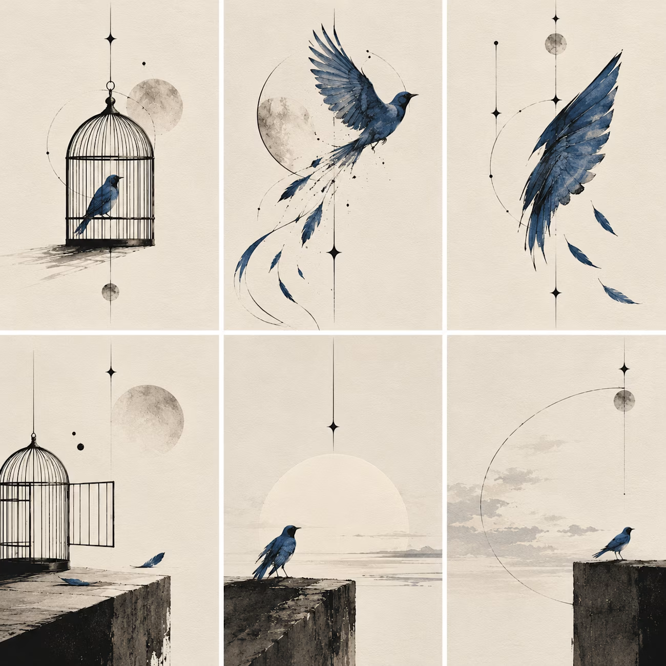

Kudos to you, you've really done a great work.


I took part on Video.js Skins Design Challenge on
Introducing Frame
- An editorial skin for Video.js 10, and the small publication that presents it.
- FRAME treats the player like a page in a well-made journal: the picture comes first and the controls stay quiet until you need them. Inside the picture everything is white on ink; the page's one accent color is kept for its buttons.
GitHub Link - https://github.com/olivebishop/frame
Live Link - https://frame-one-psi.vercel.app


Really like the editorial feel.