The network for creativity
Join 1.25M professional creatives like you
Connect with clients, get discovered, and run your business 100% commission-free
Creatives on Contra have earned over $150M and we are just getting started
Back to feedPost
I took part on Video.js Skins Design Challenge on
Introducing Frame
- An editorial skin for Video.js 10, and the small publication that presents it.
- FRAME treats the player like a page in a well-made journal: the picture comes first and the controls stay quiet until you need them. Inside the picture everything is white on ink; the page's one accent color is kept for its buttons.
GitHub Link - https://github.com/olivebishop/frame
Live Link - https://frame-one-psi.vercel.app


Really like the editorial feel.


thank you 🙌
The network for creativity
Join 1.25M professional creatives like you
Connect with clients, get discovered, and run your business 100% commission-free
Creatives on Contra have earned over $150M and we are just getting started



Related posts

What if sending money felt a little more like giving a gift?
For Nova, I explored a banking app that brings payments, cards, and a bit of personality together. You can check your balance, browse recent transactions, send or request money, top up, and pay bills.
My favorite part is the digital postcard feature. Before sending a transfer, you can add a little illustrated card—a heart, a birthday greeting, or a playful character. A simple way to make birthday money or a thank-you feel more personal.
I carried that same 3D character into onboarding, pairing it with bold red gradients and large, clear payment details. There’s room for play, while the recipient and amount stay easy to check.
Would you add a postcard to a transfer? I’d love to know what occasion you’d use it for.






CHRONOS: Dark, Cinematic Landing Page for a Luxury Watch Brand
The brief: A hero section for a luxury watch brand that feels expensive and quiet, and still gives the visitor a clear next step.
What I focused on
Colour: Deep green and black as the base, red used only for the light beam, the first headline word and the button. Limited colour keeps it premium.
Typography: A high-contrast serif for the headline, which gives it a watchmaking feel, and a clean sans-serif for supporting text so it stays easy to read.
Hierarchy: Watch first, headline second, button third. The eye moves in that order, and the animation follows it.
Motion: Slow, controlled movement only: a soft fade-in, a rising headline and a gentle light pulse. No bounce or flashy effects.
Trust: Three short proof points under the button, so the page isn’t only atmosphere.

Love the lighting.

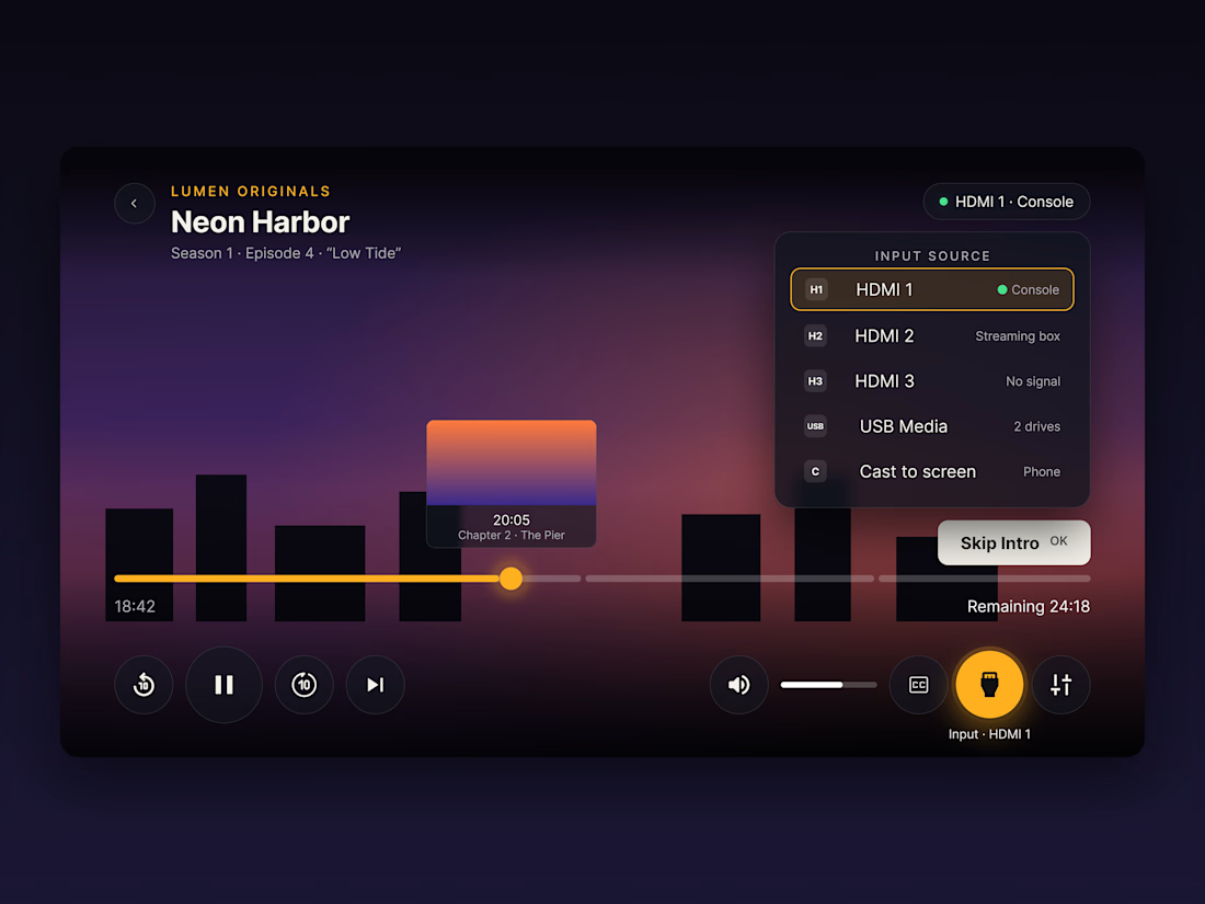
Lumen: TV Video Player UI
A video player interface designed for the living-room TV, where the only input is a remote.
Most player UIs are designed for a mouse or a finger. On a TV, people navigate with a D-pad from across the room, so I rebuilt the player around that.
What I focused on:
→ Focus states over hover. The selected control scales up, fills with amber and glows, so it's always clear what the remote is pointing at.
→ Input source switching. HDMI 1–3, USB and Cast sit in one panel, each with a live status (Console, Streaming box, No signal) so people don't have to guess which source is active.
→ Chaptered progress bar with a thumbnail preview, making seeking easier with step-based remote input.
→ 10-foot readability. Large buttons (104px), large type, and safe margins so nothing gets cut off by TV overscan.
→ One accent colour. A dusk-toned background with a single amber highlight keeps the controls clear without competing with the video.
Does the focus wrap around?