The network for creativity
Join 1.25M professional creatives like you
Connect with clients, get discovered, and run your business 100% commission-free
Creatives on Contra have earned over $150M and we are just getting started
Back to feedPost
Lumen: TV Video Player UI
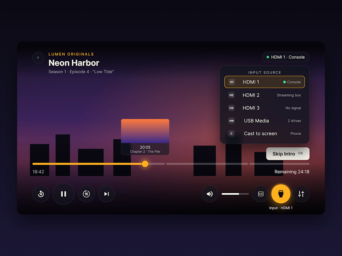
A video player interface designed for the living-room TV, where the only input is a remote.
Most player UIs are designed for a mouse or a finger. On a TV, people navigate with a D-pad from across the room, so I rebuilt the player around that.
What I focused on:
→ Focus states over hover. The selected control scales up, fills with amber and glows, so it's always clear what the remote is pointing at.
→ Input source switching. HDMI 1–3, USB and Cast sit in one panel, each with a live status (Console, Streaming box, No signal) so people don't have to guess which source is active.
→ Chaptered progress bar with a thumbnail preview, making seeking easier with step-based remote input.
→ 10-foot readability. Large buttons (104px), large type, and safe margins so nothing gets cut off by TV overscan.
→ One accent colour. A dusk-toned background with a single amber highlight keeps the controls clear without competing with the video.

Good call designing for the D-pad first. The chaptered seek bar with a thumbnail is a nice detail.

Thanks! Designing for the D-pad first changed a lot: focus order, big targets, and chapter stops for seeking. Glad it landed 🙌

Does the focus wrap around?
Good question! I'd wrap the controls row so a few presses on Right get you back to the start, but stop at the first and last rows in the input panel so you don't overshoot while picking a source. Curious how you'd handle it?
Same here. I'd keep focus on the last selected source when reopening the panel.
The network for creativity
Join 1.25M professional creatives like you
Connect with clients, get discovered, and run your business 100% commission-free
Creatives on Contra have earned over $150M and we are just getting started
Related posts

If a doctor has to hunt for a patient’s vital signs, the dashboard is getting in the way of care.
Doctors don’t need another dashboard. They need the full patient picture at a glance.
In healthcare, confusing UX isn’t just frustrating. It can delay understanding when every second matters.
DocuVerse brings vital signs, patient metrics, and health trends into one clear view, making complex health data easier to scan and understand.
Less searching. More clarity. Better informed decisions.
That’s what healthcare UX should deliver.
Would you design a healthcare dashboard for more data, or better decisions?


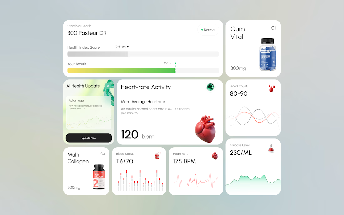
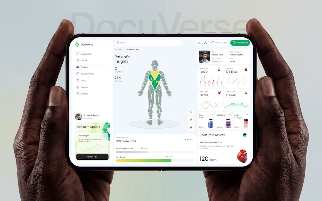

A clearer patient overview can make complex health data feel far less overwhelming. That’s thoughtful UX.


My portfolio just got a new look.
Fresh design with motion and a lot of small details you only find when you start playing with it.
See it live: https://rivii.work
Building something? If you want a site that looks as good as the thing you’ve built, my inbox is open.


The Selected Work section looks so sharp.