The network for creativity
Join 1.25M professional creatives like you
Connect with clients, get discovered, and run your business 100% commission-free
Creatives on Contra have earned over $150M and we are just getting started
Back to feedPost

CHRONOS: Dark, Cinematic Landing Page for a Luxury Watch Brand
The brief: A hero section for a luxury watch brand that feels expensive and quiet, and still gives the visitor a clear next step.
What I focused on
Colour: Deep green and black as the base, red used only for the light beam, the first headline word and the button. Limited colour keeps it premium.
Typography: A high-contrast serif for the headline, which gives it a watchmaking feel, and a clean sans-serif for supporting text so it stays easy to read.
Hierarchy: Watch first, headline second, button third. The eye moves in that order, and the animation follows it.
Motion: Slow, controlled movement only: a soft fade-in, a rising headline and a gentle light pulse. No bounce or flashy effects.
Trust: Three short proof points under the button, so the page isn’t only atmosphere.


Nice

Red only on the light beam is a smart call. Looks properly expensive.

Love the lighting.
The network for creativity
Join 1.25M professional creatives like you
Connect with clients, get discovered, and run your business 100% commission-free
Creatives on Contra have earned over $150M and we are just getting started
Related posts

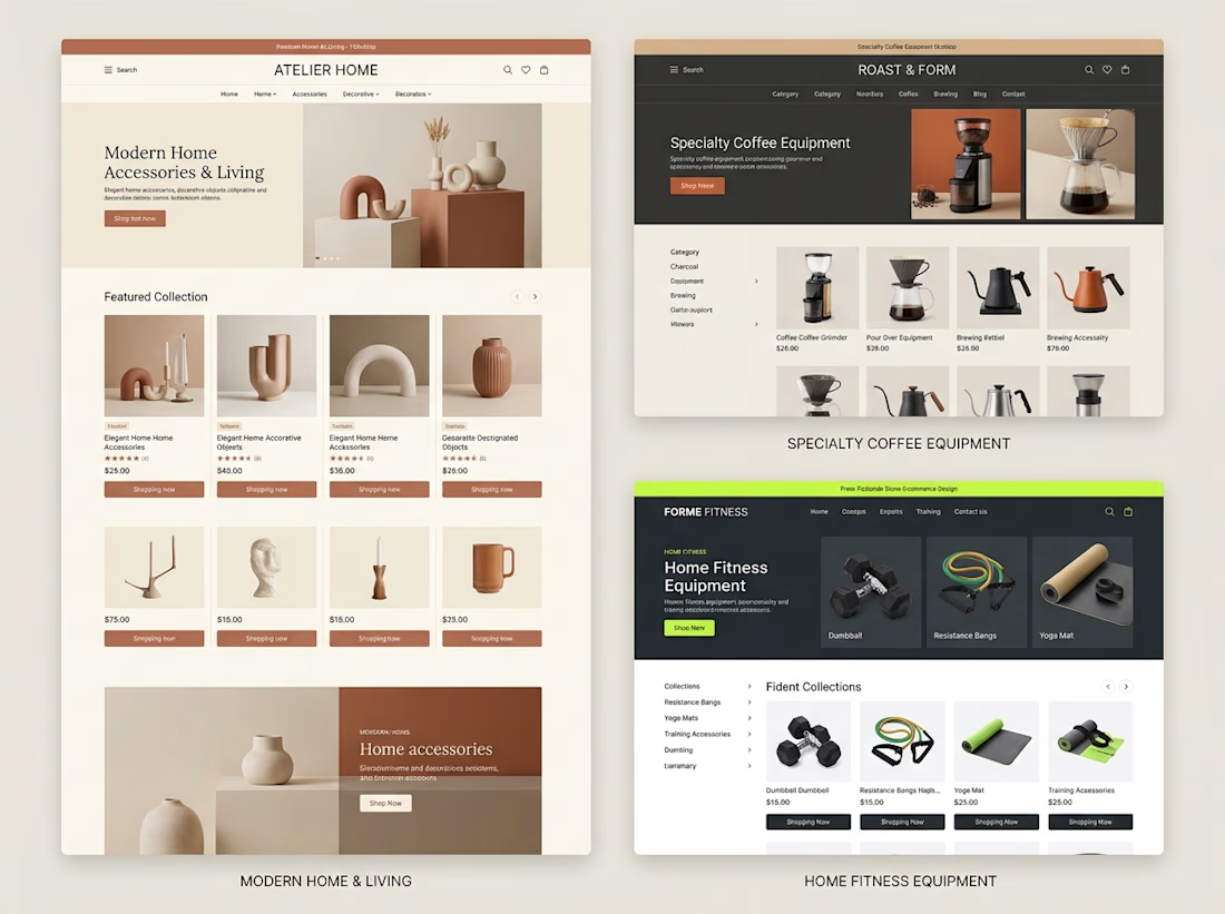
Different products need different shopping experiences.
When exploring Shopify store design, I like thinking about how the brand, product category, and customer journey should influence the final layout.
For example:
→ A home decor store needs strong visual presentation and an editorial feel.
→ A coffee equipment store needs clear categories and product information that helps customers compare options.
→ A fitness store needs organized collections and a straightforward path to the right equipment.
The goal isn't to use the same design for every business.
It's to understand what each store needs and build an experience around it.
These concepts explore three different directions, but they share one principle:
Good e-commerce design should make products easier to understand and easier to shop.
Which of these three store styles would you be most interested in exploring?



Great point. I’d pick the home decor one, editorial layouts really sell the vibe. 🔥

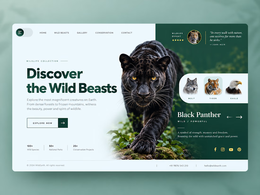
Wild Beasts – Wildlife Website UI/UX Design
A premium wildlife website landing page concept inspired by the beauty, strength, and mystery of wild animals.
The design combines a minimalist layout, immersive black panther imagery, rich forest-green colors, and elegant typography to create a visually engaging digital experience. The animal showcase section highlights different wildlife species while maintaining a clean and intuitive user interface.



Nice work

WHERE TO?
Did I wake up at the mall, or inside a dream of one?
Either way, somebody left a key on my pillow, a bike under a cover started asking questions, and the only way to find out was to go.
I tried to squeeze the whole idea, and the whole trip, into the time limit: a guy farming aura all the way down to CapCut World LA, through a bay, a side quest, a wardrobe change he never asked for, and a city that can’t decide whether it’s real or rendered.
The credits ran out before the trip did. So the edit got creative: rescue cuts, two takes braided into one, and a render error that stayed in because it earned its place.
Whether he lands in Los Angeles or in the dream of it, you’ll have to watch.
Generated in CapCut Video Studio (Seedance 2.5, Seedream 5.0 Pro, Nano Banana Pro).
#CapCutWorld #CapCutWorldLA #1000WaysToCCW @CapCut


A render error that stays in because it earned its place is a braver call than regenerating it. Same with braiding two takes into one: neither take was right on its own, the cut made it right.