The network for creativity
Join 1.25M professional creatives like you
Connect with clients, get discovered, and run your business 100% commission-free
Creatives on Contra have earned over $150M and we are just getting started
Back to feedPost

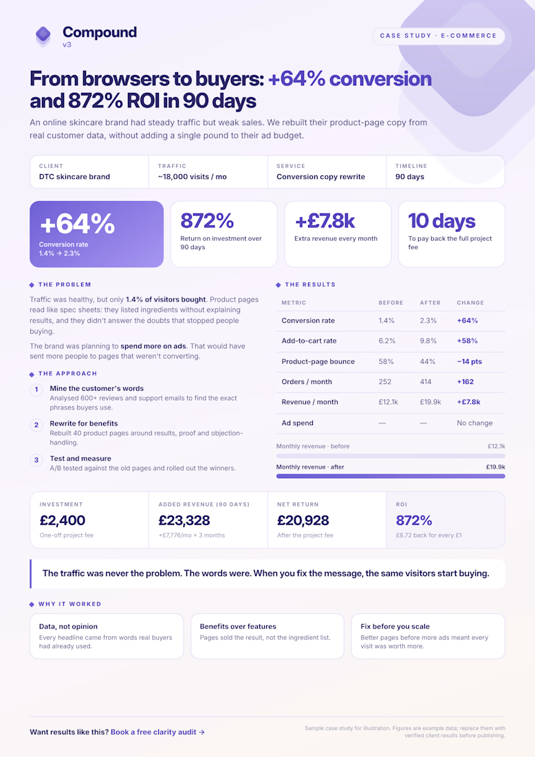
An online skincare brand had good traffic but weak sales. We rewrote 40 product pages using their customers’ own words, without adding to their ad budget. In 90 days conversion went up 64% (1.4% → 2.3%), revenue rose by £7.8k a month, and the project returned 872% on a £2,400 fee. It paid for itself in 10 days.

The network for creativity
Join 1.25M professional creatives like you
Connect with clients, get discovered, and run your business 100% commission-free
Creatives on Contra have earned over $150M and we are just getting started



Related posts


🧪 TASTY TEST: WHICH ONE MAKES NEXT WEEK FEEL SORTED?
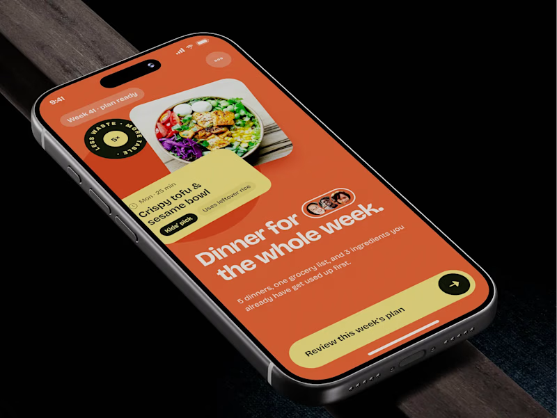
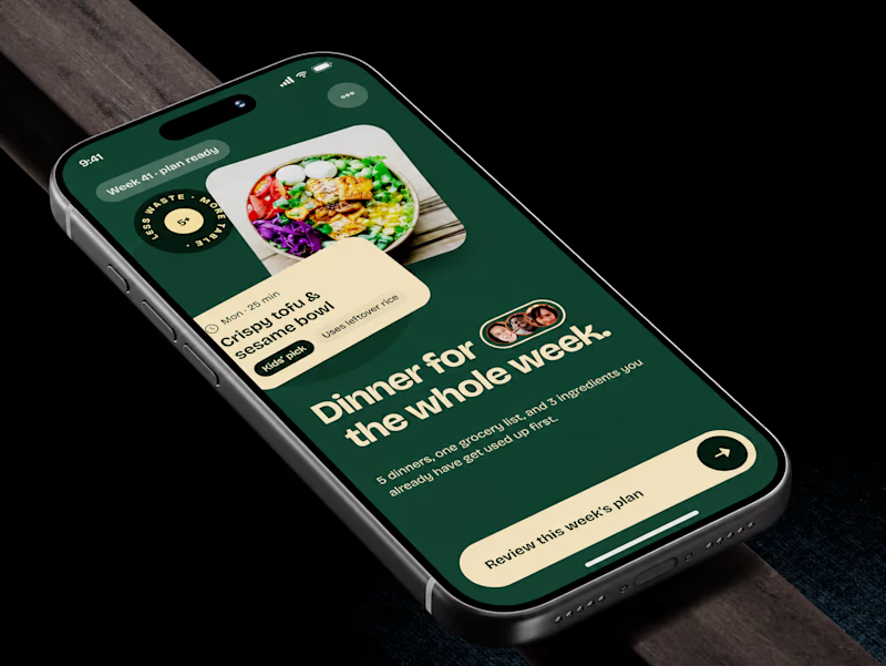
Meal planner mobile app design. Same UX, two palettes.
🍊 A · Citrus Energy
Orange + buttery yellow. Appetite first.
🌿 B · Forest Calm
Deep green + cream. A calmer weekly ritual.
💡 GROWTH THINKING
Users want dinner handled, not another planning task.
My hypothesis: orange could win the first tap; green could signal less effort. I’d test plan-open rate AND grocery-list completion. More taps mean little if people abandon the next step.
🗳️ A OR B — WHICH WOULD YOU TRUST WITH NEXT WEEK’S DINNERS?
Vote and tell me why.
📩 BUILDING A MOBILE APP? LET’S FIND WHAT’S HOLDING GROWTH BACK.
https://calendly.com/asol_design/demo
#MobileAppDesign #AsolDesign
15 voted
68%
7 voted
32%
22 votes
Closed

🎨 What makes an e-commerce website stand out: the design, the products, or the shopping experience?
Here’s a look at my e-commerce website design concept for a retro-inspired fashion store.
From product collections and featured items to community-inspired sections, the goal was to create a storefront that brings the brand’s personality to life while making product discovery feel effortless.
But I want to hear your honest thoughts 👇
💬 If you were improving this website, what would you focus on first?
🎨 The visual design and branding
🛍️ The product browsing experience
📱 The user experience and navigation
💰 The layout and conversion potential
Feel free to share your suggestions, even if you would do something differently. I’m always interested in hearing how other designers, founders, and e-commerce professionals think.
#EcommerceDesign #WebDesign #UIDesign #Shopify #UXDesign


The layout is perfect


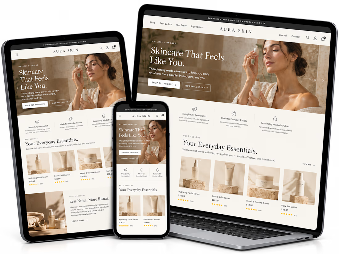
I redesigned AURA SKIN's eCommerce website to improve product discovery, usability, and the shopping experience.
The project features a premium skincare UI, personalized product-finder quiz, guided routine builder, product showcases, ingredient education, testimonials, and conversion-focused CTAs.
Following the optimization work, monthly sales reportedly grew from approximately $3K to $12K+ (300%+ growth).
Focus: Shopify, UI/UX Design, CRO, Personalized Shopping, and eCommerce Optimization.