The network for creativity
Join 1.25M professional creatives like you
Connect with clients, get discovered, and run your business 100% commission-free
Creatives on Contra have earned over $150M and we are just getting started
Back to feedPost
Most IT brands look the same. Cold blues, corporate grey, technical language. The assumption is that procurement teams and IT departments will respond to this.
But TECCO wasn't built for them.
A team with 13+ years of experience and over 200 clients offers high-tech IT solutions at accessible prices. The brand needed to feel clear, transparent, and approachable, not heavy, expensive, or distant.
Together with Agarajab, we solved it this way.
The name came first.
TECCO carries its functional role (Tech Company and Tech Consulting) and its core promise (High-Tech + Low-Cost). Short and dynamic, it replaces heavy terms like “Tech Consulting” with something far more approachable.
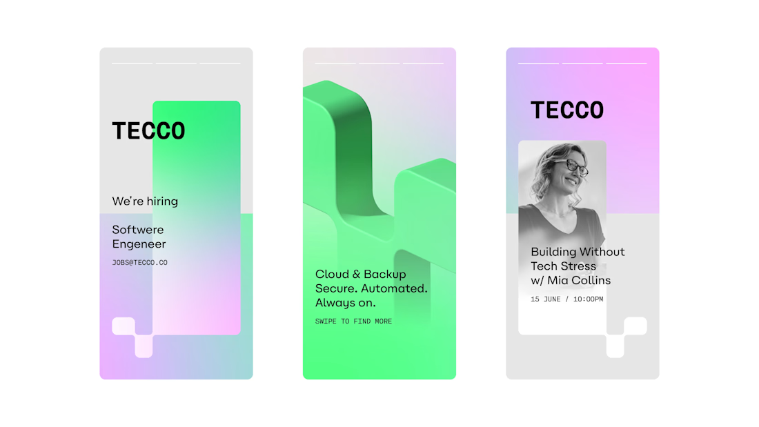
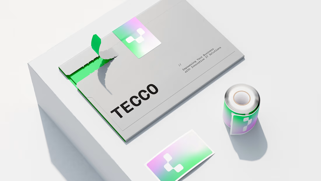
The color system follows a 'Thermal Analysis' logic. We traded the diagnostic alarm of green and red for warmth. A vibrant gradient from neon green to lilac provides a pulse check on IT health: a living business reading.
The modular T mark is designed to lock together like a puzzle piece. It symbolizes the seamless integration of technology into a business ecosystem. This logic adapts to digital and physical environments with equal agility.
Every decision looked aesthetic. Each one was strategic.
Check out the full case study: https://lnkd.in/dWB7bxCQ
#BrandStrategy #Branding #Naming #BrandIdentity #VisualIdentity #ArtDirection #CreativeDirection


nice
Cool, bro)
Love this!
Amazing work 👏🏽
Nice!
This is clean and very well executed. You made it look effortless, which usually means a lot of work happened behind the scenes. Can you walk us through how you approached it from start to finish?
The network for creativity
Join 1.25M professional creatives like you
Connect with clients, get discovered, and run your business 100% commission-free
Creatives on Contra have earned over $150M and we are just getting started
Related posts
Branding and UI assets
Love this!
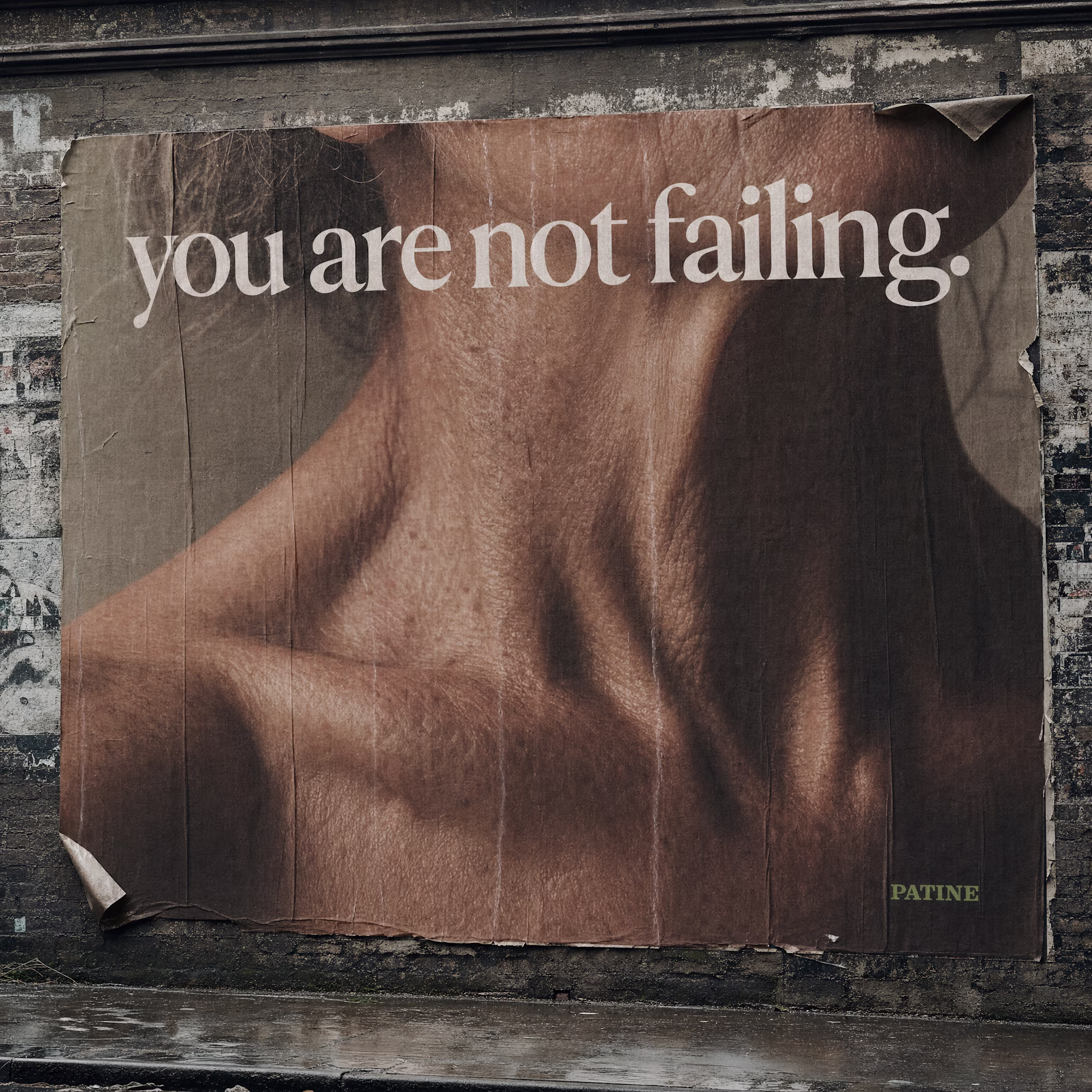
The beauty industry sells reversal.
I built the brand that sells what remains.
PATINE — a full identity for a beauty label that doesn't fight time.
It documents it.
No before/after. No glow. No ritual.
Just skin, treated the way a geologist treats rock strata.
"you are not failing. you are becoming material."
Nicely done ✅
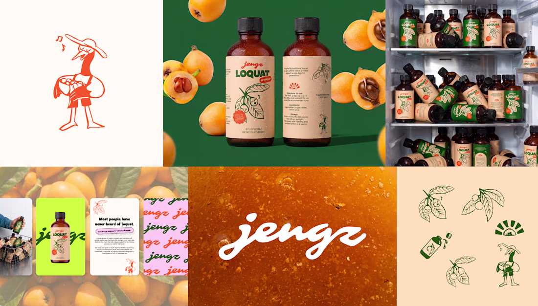
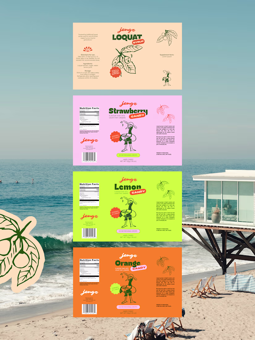
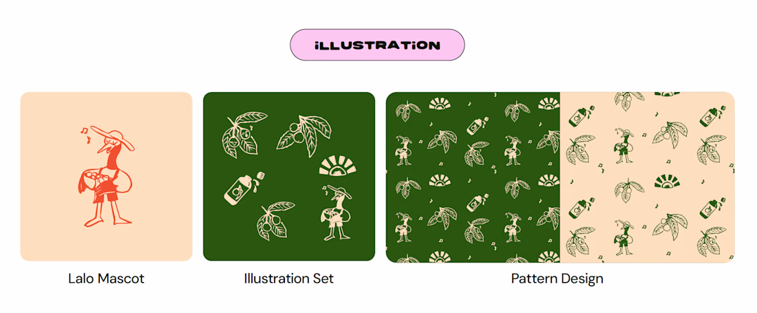
Brand in a Week is our intensive branding sprint — designed for founders who are ready to move fast without cutting corners. In just five days, we go from discovery to a complete brand identity: strategy, visual direction, logo, colour palette, typography, illustration, and everything in between.
JENGZ came to us with a bold vision — to make loquat iconic. In a week, we built them a brand to match. From the hand-lettered logo with hidden loquat details in the letterforms, to colours, typography, illustration and Lolo — the singing bird farmer mascot who brings the whole world to life. We also had time to design ready to launch assets (packaging for 4 products and social media templates)
The result? A brand that's ingredient-obsessed, naturally cool, and built to stand out on shelf, online, and everywhere else. Jeff loved it so much, he signed on for the website before the week was even out.
Loveeeee
Trending
Claude
Claude has entered the design space. How are you using Claude Design?
Contra University
Learn from expert creatives how to earn more using next-gen AI tools.
MagicPath
The canvas is infinite, and exploration is becoming the workflow. How are you using MagicPath?
creativeaiflow
Creative AI workflows are evolving. What tools do you use, and what are their strengths and weaknesses?
freelancerlife
Freelancer life is wins, pivots, and everything in between. What’s yours right now?