The network for creativity
Join 1.25M professional creatives like you
Connect with clients, get discovered, and run your business 100% commission-free
Creatives on Contra have earned over $150M and we are just getting started
Back to feedPost

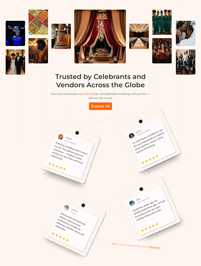
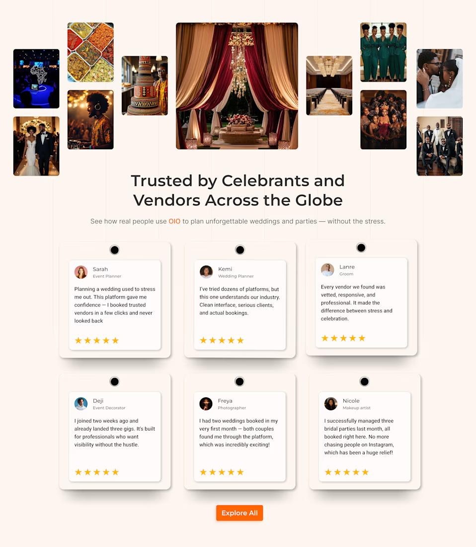
Most testimonial sections are decoration. This one was costing conversions.
A client's social proof section looked beautiful. It also took four
full screens of scrolling to read four sentences, the text was tilted
12° so it was genuinely uncomfortable to read, and one of the
"customers" on a wedding platform was a web developer talking about
his portfolio.
Nobody was reading it. Which means nobody was being convinced by it.
What I changed:
→ Straightened the cards. Pretty is worthless if the words are hard
to read.
→ Deleted the decorative connector line. It implied the reviews were
in some order. They weren't.
→ Cut the section height by more than half. Same content, one screen.
→ Rewrote the reviews to name actual outcomes: "two weddings booked in
my first month" instead of "great platform."
The "before" is the more designed one. The "after" is the one that
does its job. Knowing the difference — and being willing to delete
your own good idea — is most of the job.
I'm a product designer working across marketing surfaces and complex
product systems (this section, and a multi-chain wallet dashboard in
the same month). Open to product design roles — permanent or contract,
US or remote.
Founders: when did you last read your own testimonials section all
the way through?

The network for creativity
Join 1.25M professional creatives like you
Connect with clients, get discovered, and run your business 100% commission-free
Creatives on Contra have earned over $150M and we are just getting started
Trending
retrofuturism
Share your favorite designs from the past exploring the distant future. Or your own take on the aesthetic 🚀
halftone
Dots. Texture. Grain. Let's see your designs using the halftone technique.

Midjourney
Creatives are showing off what they're making with Midjourney.
colorgrade
Video editors sound off: How do you enhance the mood of your video in color grading?





Related posts




Congrats🙌


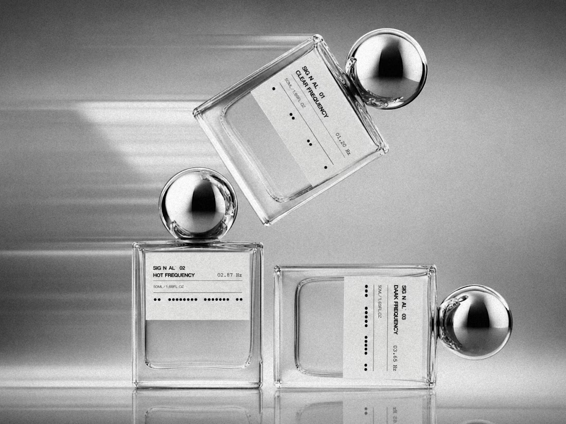
We’re excited to share a new brand identity we created for a perfume brand ✨
From the logo and bottle visuals to business cards, letterhead, perfume bags, and custom packaging - we crafted a cohesive identity designed to feel elegant, distinctive, and memorable.
Another project we’re proud to bring to life.


Super clean and subtle but still has a lot of personality!

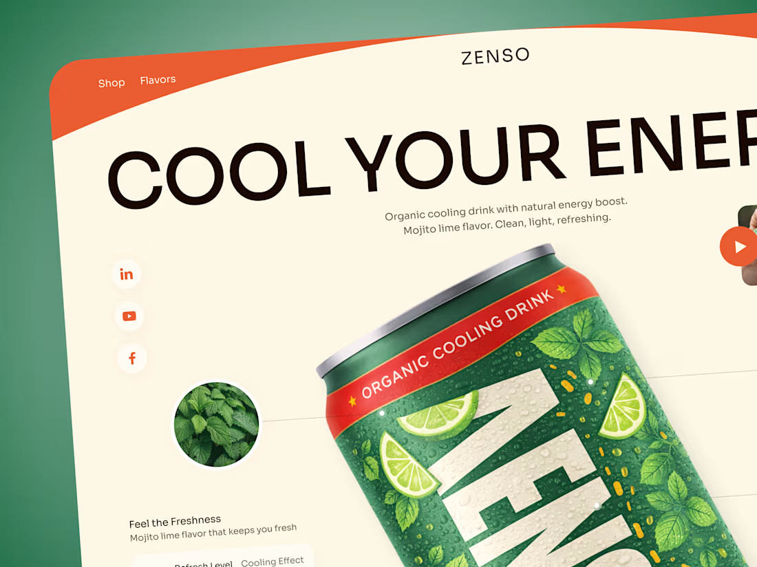
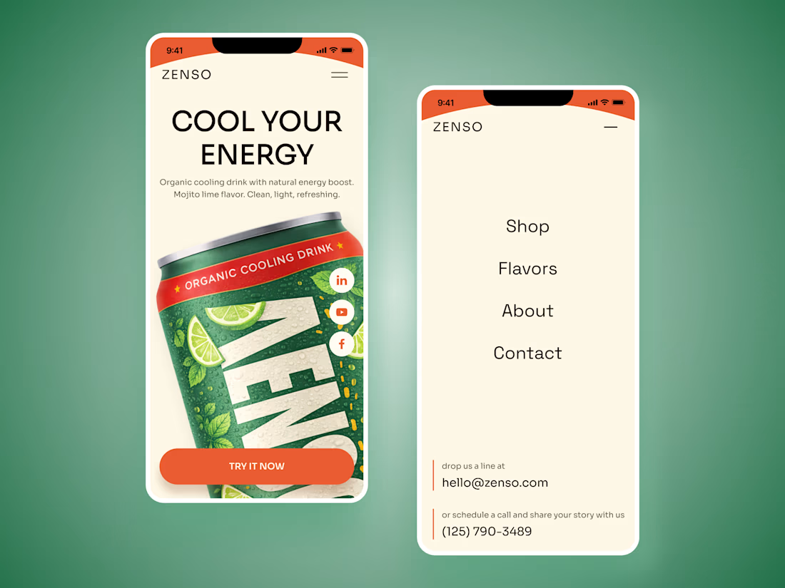
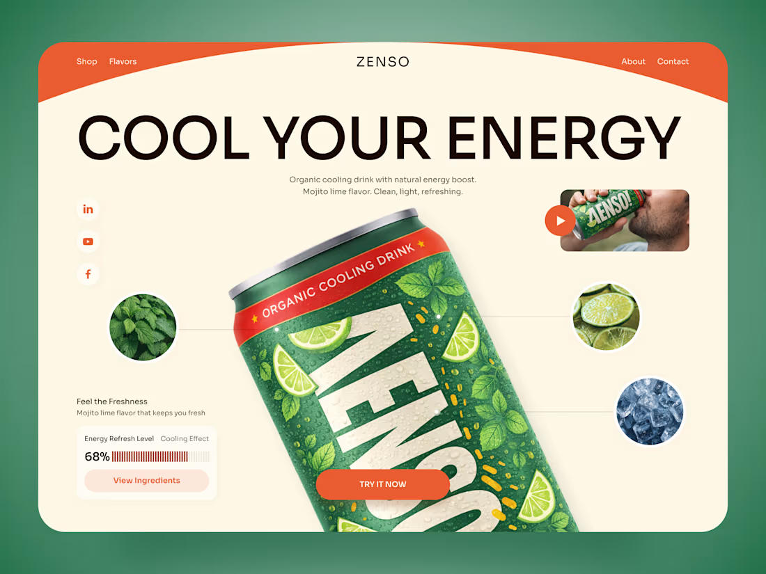
ZENSO — Organic Energy Drink Landing Page 🍋🌿
ZENSO is a bold landing page concept for an organic cooling drink that combines natural energy with a fresh, lifestyle-driven identity.
The goal was to make the product feel refreshing from the very first screen while giving the can a strong visual presence. The design combines oversized typography, organic colors, ingredient imagery, and playful composition to build a distinctive beverage experience.
Special attention was given to:
• a product-first hero that makes the ZENSO can the main visual focus;
• a fresh green, orange, and cream palette inspired by mojito lime, mint, and citrus 🍋;
• oversized typography that adds energy without competing with the product;
• ingredient close-ups that visually communicate flavor and freshness;
• supporting product details such as the cooling effect and energy refresh level;
• lifestyle imagery and video elements that make the brand feel more dynamic;
• a clear “Try It Now” CTA integrated naturally into the composition;
• responsive mobile layouts that preserve the oversized product presentation while keeping navigation simple 📱;
• a clean visual system that can scale across different flavors and future product launches.
The result is an energetic digital experience that turns a simple beverage into a memorable lifestyle product — fresh, playful, and easy to recognize.
Looking to create a bold digital experience for your beverage, food, or FMCG brand?
Let’s make your product impossible to scroll past ✨

The product-first hero with oversized type behind the can is the right call for FMCG: the pack does the branding work and the type just amplifies the energy. The piece I would build on is the scalable system for future flavors, since a citrus and a berry variant will want the...