
pro
Is this a $1500 or $4500 hero design?
Designed with claude and Gemini
1
22
Every person I know who creates for a living has asked themselves the same question in the last two years.
They just haven't said it to anyone.
This video is for them.
Watch till the end.
#AI #Design #Creativity #TheThreshold
0
21
As a product designer, I believe in stripping things down to fundamentals, flow, balance, and purpose. Recently, I took a project where nailing those basics let me push progress way ahead.
Every wireframe felt intentional, every interaction clicked, and honestly, it just worked. Keeping the core clean brought out its absolute best... no fluff, no shortcuts. Simple wins design every time.
2
1
49
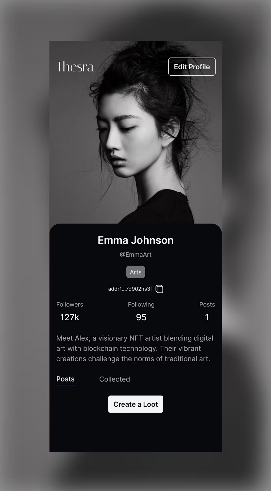
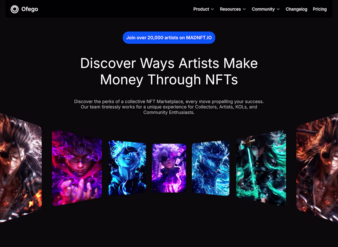
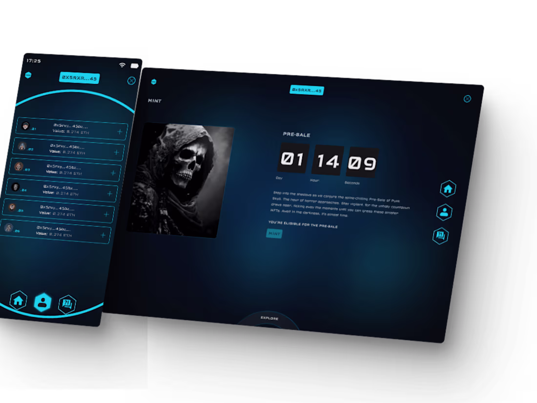
NFT Marketplace Design
This project blended familiarity with novelty for an NFT marketplace that feels social and human. I drew on user patterns from platforms like Instagram, profiles, followers, posts, and reinterpreted them for Web3.
My focus was on clarity and emotional connection. The layout prioritizes creators: identity first, content second, with transactions in the background. Clean hierarchy and restrained typography keep the interface calm and confident.
Design elements like profile-centric layouts and follower counts act as trust signals, allowing users to quickly assess credibility, crucial in NFT marketplaces.
The result is a product that feels familiar enough to reduce friction but distinct enough to stand out. It’s a marketplace that doesn’t scream “crypto,” yet fully belongs.
3
50
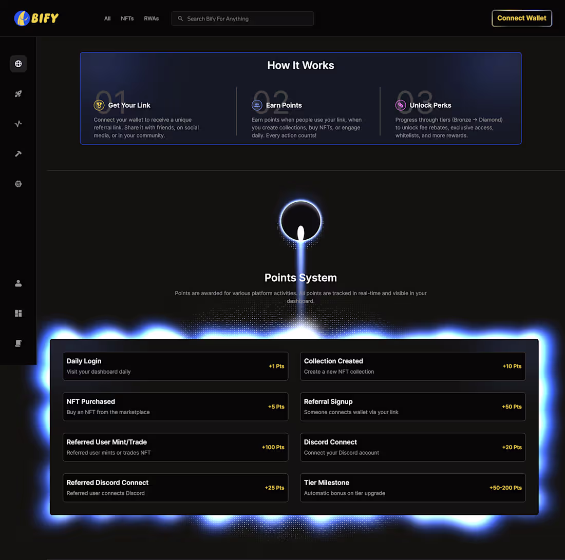
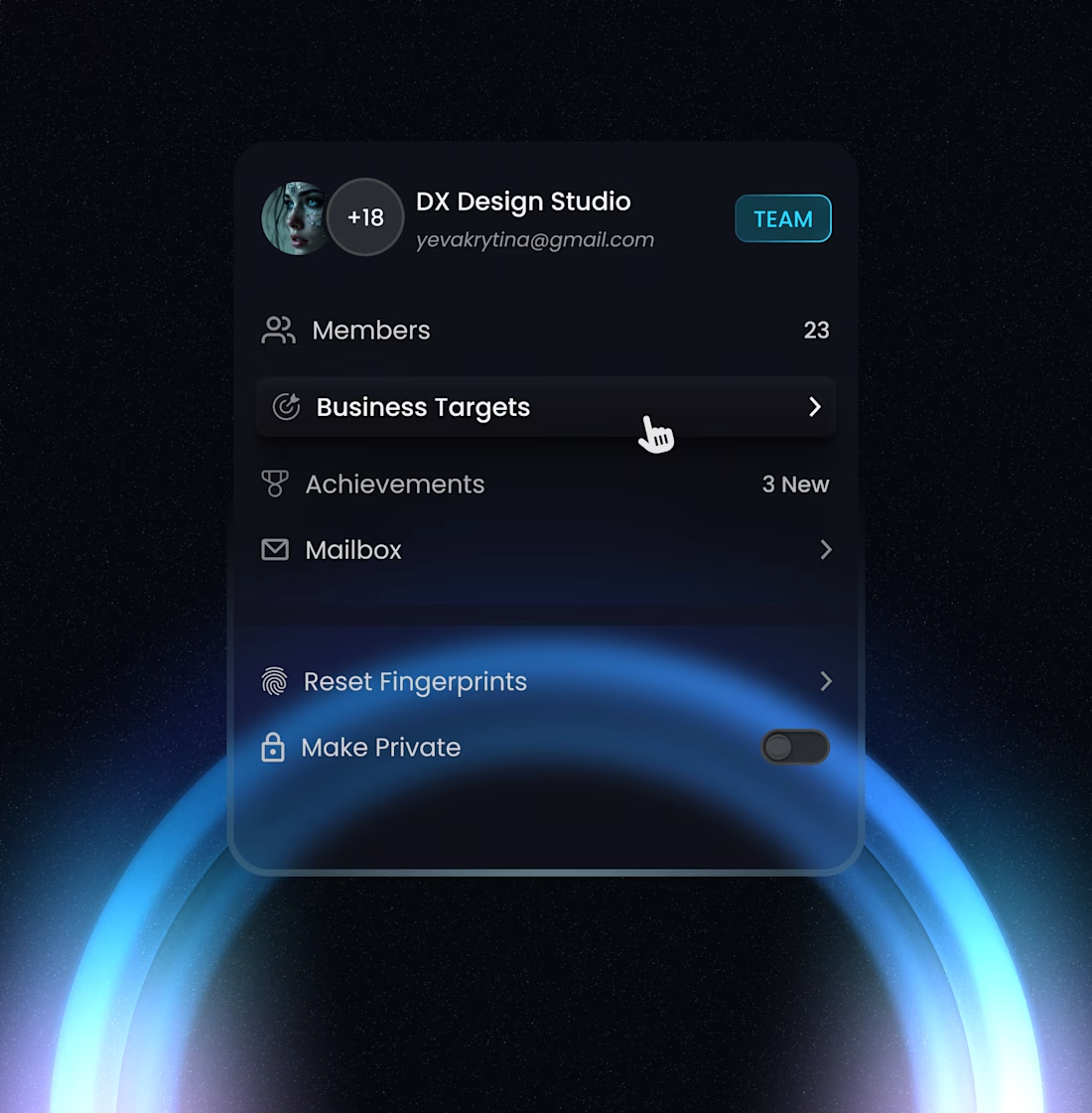
At BIFY, one of my goals was to turn participation into a habit, not a one-off action. This points system was designed to reward meaningful behavior while keeping the experience simple and legible in a Web3 environment that’s often noisy.
The “How It Works” section breaks the system into three clear steps: get a link, earn points, unlock perks. This framing reduces onboarding friction and sets expectations early, especially for users new to referrals or NFT marketplaces.
Visually, the interface leans into restraint. Dark surfaces, strong hierarchy, and controlled glow effects help guide attention without overwhelming the user. The emphasis is on clarity and motivation, not decoration.
1
102
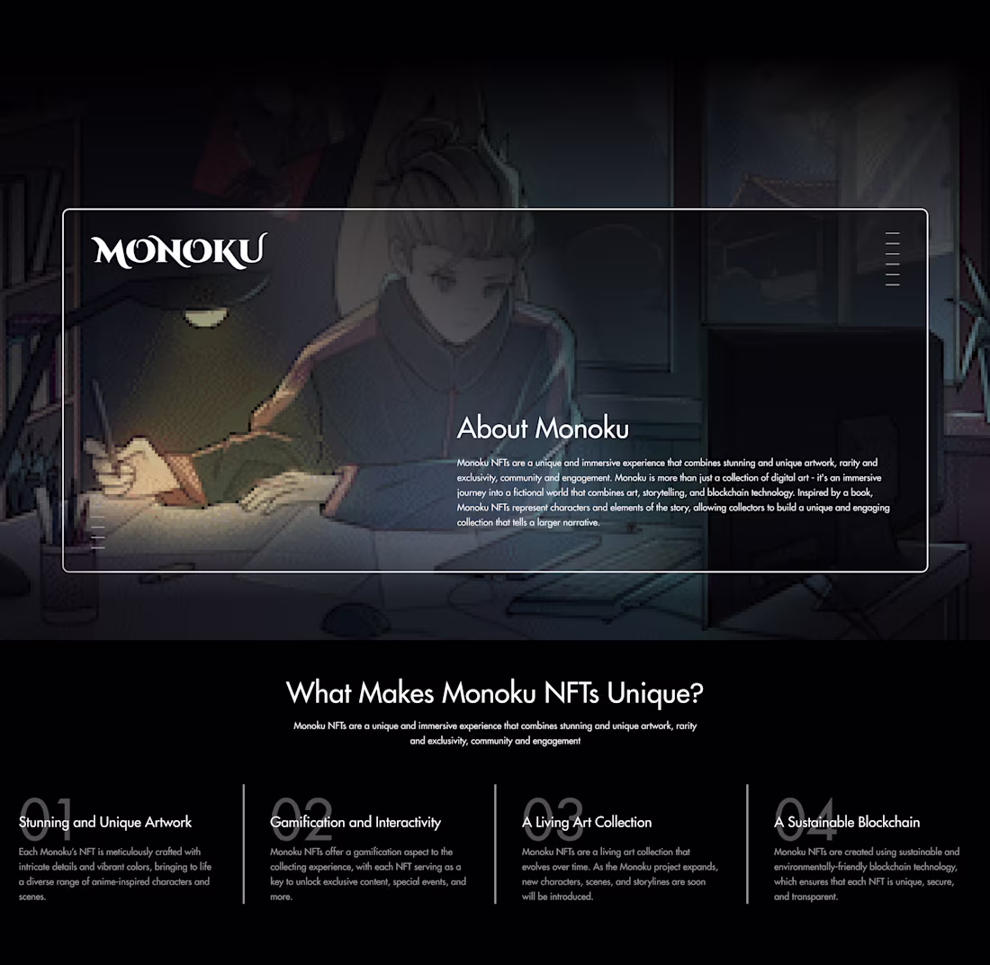
This project focused on clarity and narrative flow in a space where users are easily overwhelmed.
I designed a calm, immersive layout that introduced the product through storytelling first, then progressively revealed value and differentiation.
By controlling visual hierarchy, contrast, and content pacing, the interface reduced cognitive load and encouraged exploration.
The result was increased on-page interaction and deeper engagement, showing how intentional simplicity can drive better user behavior in Web3 products.
2
1
42
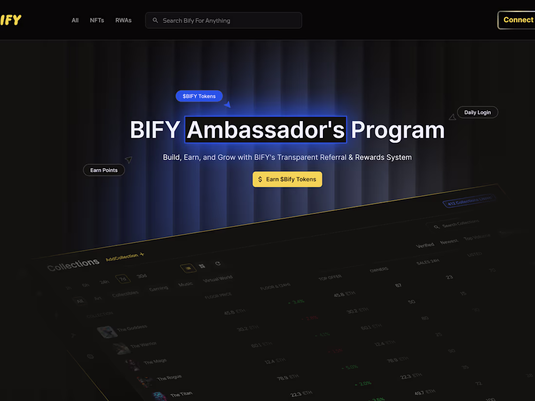
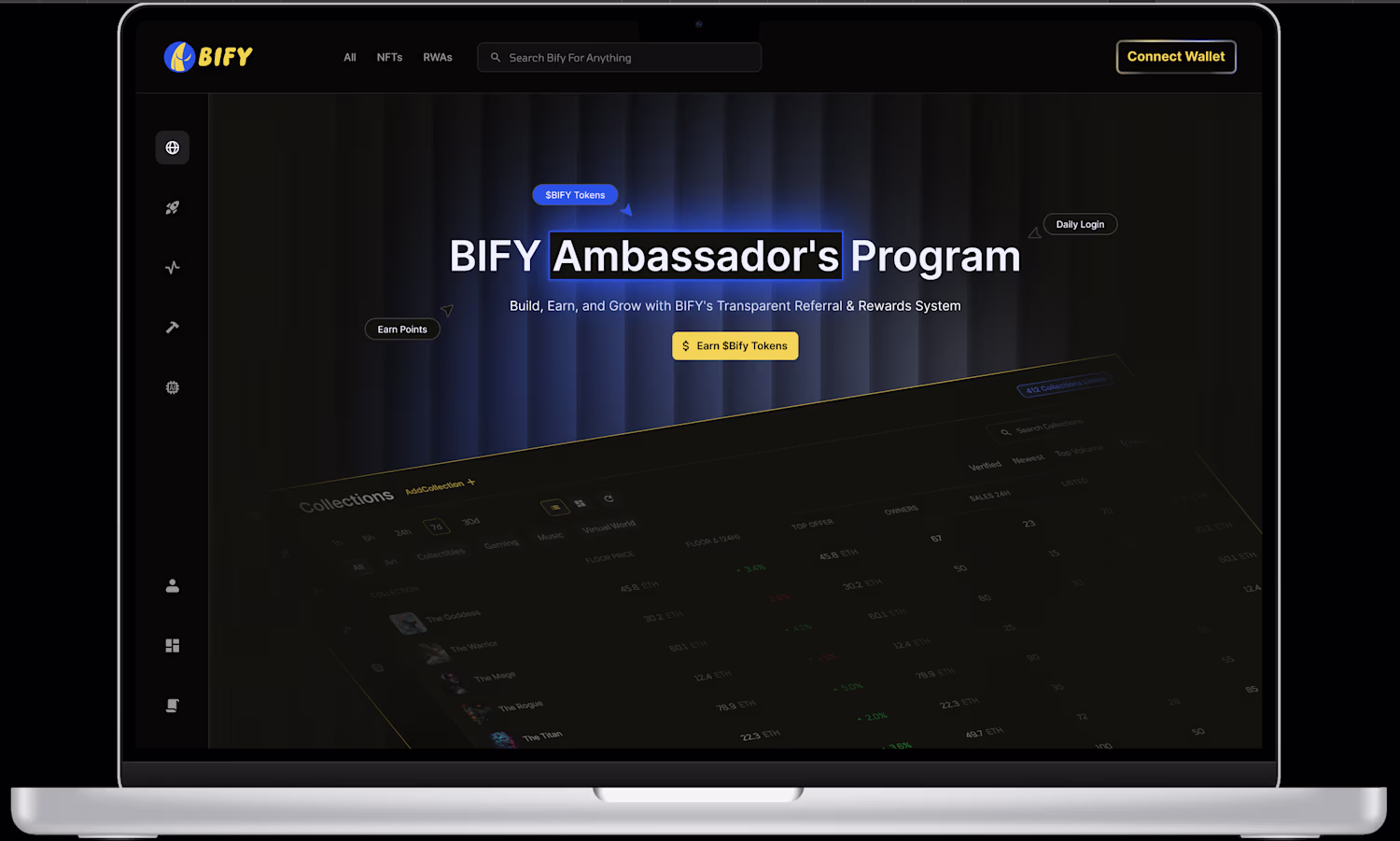
BIFY Ambassadors Program Page Redesign
1
0
This was a landing page I did for a friend and client
Loved it cos it was straight to the point and simple. Best designs solve the problems of users, or in this case, passes the most important information here.
Let me know what you think
0
35
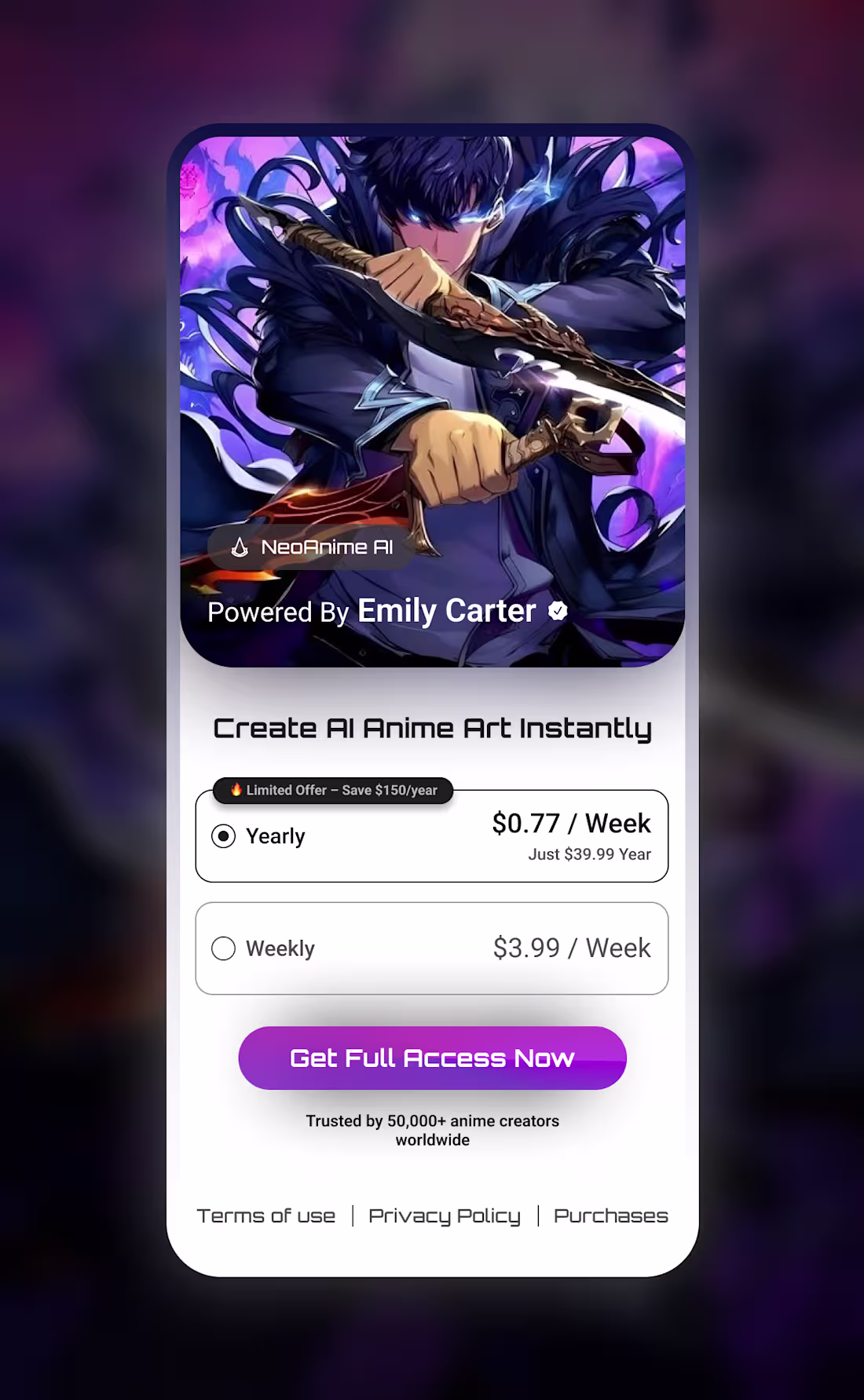
Having great hero sections is great, and sometimes, all you need are great images. Of course having the skillset to arrange them well is greater.
Awesome hero section = more users for your product
And the ability to have a great design copy sometimes trumps all that
1
33
Made this design a couple of months ago, after a potential client had told me that my designs lack finesse.
I locked in and went about learning more on visuals. Learning about more than the fundamentals is pretty good. Landed a full time just few months after this
4
2
50
MEME ART Framer Prototype
0
1