The network for creativity
Join 1.25M professional creatives like you
Connect with clients, get discovered, and run your business 100% commission-free
Creatives on Contra have earned over $150M and we are just getting started
Back to feedPost
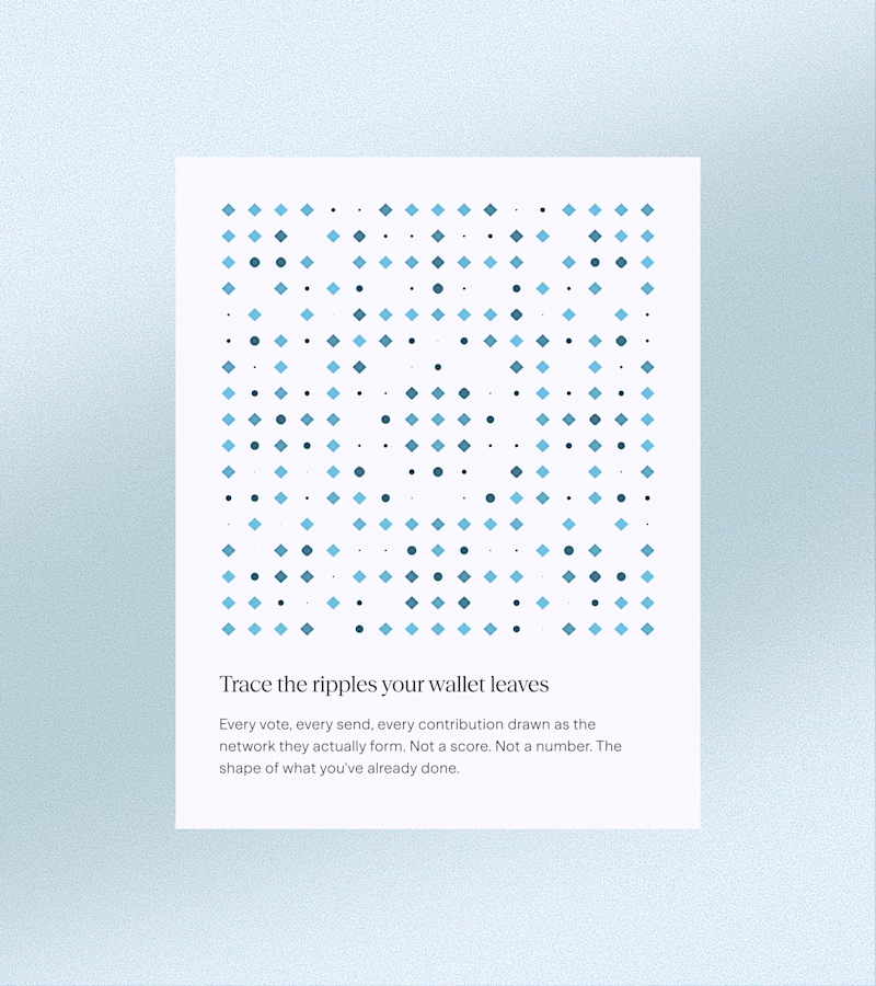
Taste Test
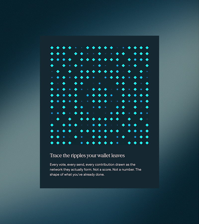
Oh my God, it's too much cognitive load for me to choose between these two, but I chose dark although I use light theme on my phone and laptop. I think in the dark one we are able to see every individual dots also there is a glow which I kinda like
Thanks Monic!
Yeah they both look cool
Hmm I'd prefer dark
I prefer Dark
Viewing light was a bit hard for me in terms of contrast and focus so I prefer dark.
Dark looks amazing!!
I’d definitely go for dark version. It’s easier to see subtle changes in the composition, and honestly, I just prefer dark themes.
the two mode works well
I chose the dark version because it creates better depth and contrast.
Dark, Because the pattern is more visible clearly...
the light coloured pattern and the font, both are pretty much better highlighted on the darker version. imo the background must be there to highlight the context - it's not about dark or light.
Dark one really pulls you in, the contrast makes everything feel more intentional
I think i prefer light
It's hard to choose actually, as both are looking great. but i think I would prefer the light over the dark version. As, the light version looks eye-soothing and calming to me.
The network for creativity
Join 1.25M professional creatives like you
Connect with clients, get discovered, and run your business 100% commission-free
Creatives on Contra have earned over $150M and we are just getting started
Related posts
I’ve been playing around with Shader Lab by Basement Studio: all day for a new project I’m working on (can’t share much rn) and I’m absolutely loving it.
This is doing something to me 😍 I love it!
Recently I’ve started prototyping my designs in Figma more than I have in the past.
I tended to avoid prototyping in the past due to it being time consuming and honestly most of the projects I was working on were simple enough to not require this amount of detail.
But as the projects I work on have become more complex I’ve found that this extra attention to detail really helps align with stakeholders and sell them on a design before starting development.
With a prototyped design clients are able to interact and see how the website will function, not just how it will look. This helps reduce uncertainty in the final deliverable and ultimately helps speed up Webflow development.
In the past describing all the hover interactions and click interactions for something even as simple as the slider below would require both time for me to explain and some imagination on the client’s part.
While imagination is great, it’s not the best way to align on fine details.
Anyways, long story short, new policy is show don’t tell.
Great interactions! Reminds me Framer sites (ahah sorry had to do it as a Framer dev :))
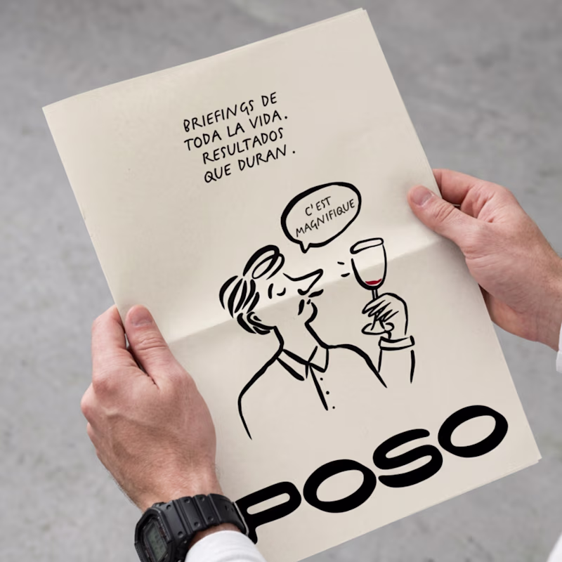
Taste test time 🍷
Some logo explorations for a brand identity I’m working on.
Different directions, different energies… not sure which one is “the one” yet.
Which one would you go for and why?
53 voted
59%
37 voted
41%
90 votes
Closed
I like better the Playful version, here's why: the hierarchy is better structured on the Playful version, the brand name - despite not being the bigger element - is clearly the most important one thanks to the boldness of its lines, and you can read each element in order from...
Trending
Claude
Claude has entered the design space. How are you using Claude Design?
Contra University
Learn from expert creatives how to earn more using next-gen AI tools.
creativeaiflow
Creative AI workflows are evolving. What tools do you use, and what are their strengths and weaknesses?
portfolioreview
The best portfolios tell a story, not just show a grid. Share yours for feedback.
freelancerlife
Freelancer life is wins, pivots, and everything in between. What’s yours right now?