The network for creativity
Join 1.25M professional creatives like you
Connect with clients, get discovered, and run your business 100% commission-free
Creatives on Contra have earned over $150M and we are just getting started
Back to feedPost
RACKET — Snack Brand Visual Direction
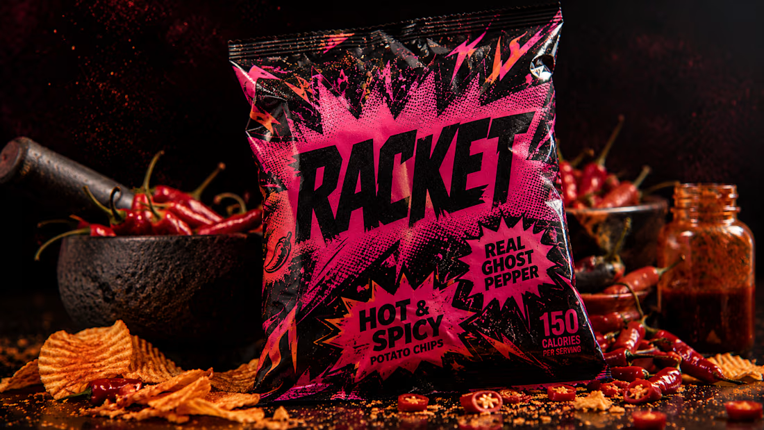
RACKET exists because most snack brands whisper their flavor and shout their logo — RACKET flips it.
The flavor is the entire personality, loud enough that the packaging itself looks mid-explosion.
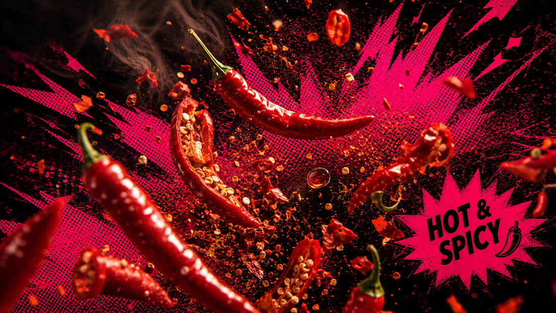
The crunch is the actual structural graphic language — jagged halftone shapes, comic-style crunch bursts, scattered crumb debris — built directly into the packaging, not layered as decoration.
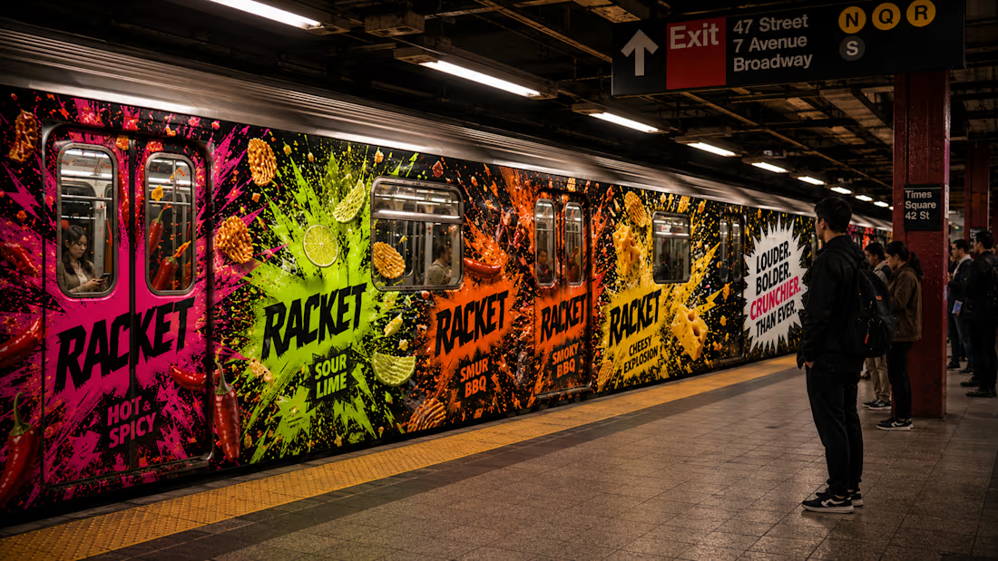
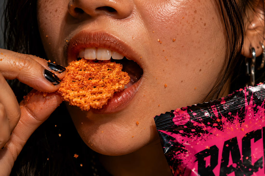
Four flavor lines, one shared mechanism. Every frame is snack-world chaos — chips mid-crunch, genuine debris, real foil crinkle and specular light.
This is what flavor looks like when it becomes structure.
M N LOKESHWAR REDDY, Creative Director


Link to the full project:
https://www.behance.net/gallery/253519159/RACKET-Snack-Brand-Visual-Direction
The network for creativity
Join 1.25M professional creatives like you
Connect with clients, get discovered, and run your business 100% commission-free
Creatives on Contra have earned over $150M and we are just getting started
Trending

Claude
Claude has entered the design space. How are you using it?

Contra University
Learn from expert creatives how to earn more using next-gen AI tools.
Brand Design
The best brand designers are on Contra. Scroll to see what's trending in brand design. What are you building?
creativeaiflow
Creative AI workflows are evolving. What tools do you use, and what are their strengths and weaknesses?
freelancerlife
Freelancer life is wins, pivots, and everything in between. What’s yours right now?






Related posts

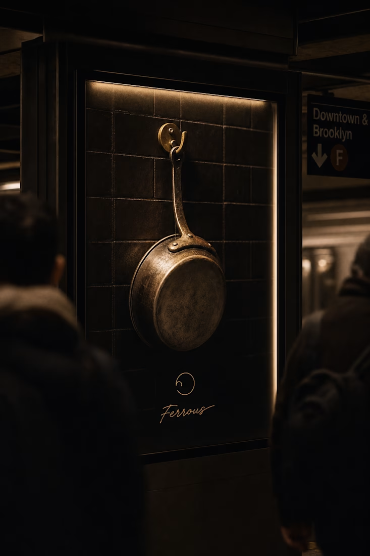
Most cookware brands sell the finished plate.
Ferrous sells the fifteen minutes before it — dark, brass-lit, mid-service.
One broken ring. One light source. Zero color exceptions across twenty mockups.


AI built the foundation. Human instinct built the brand. 🏛️✨
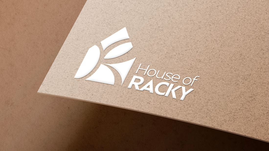
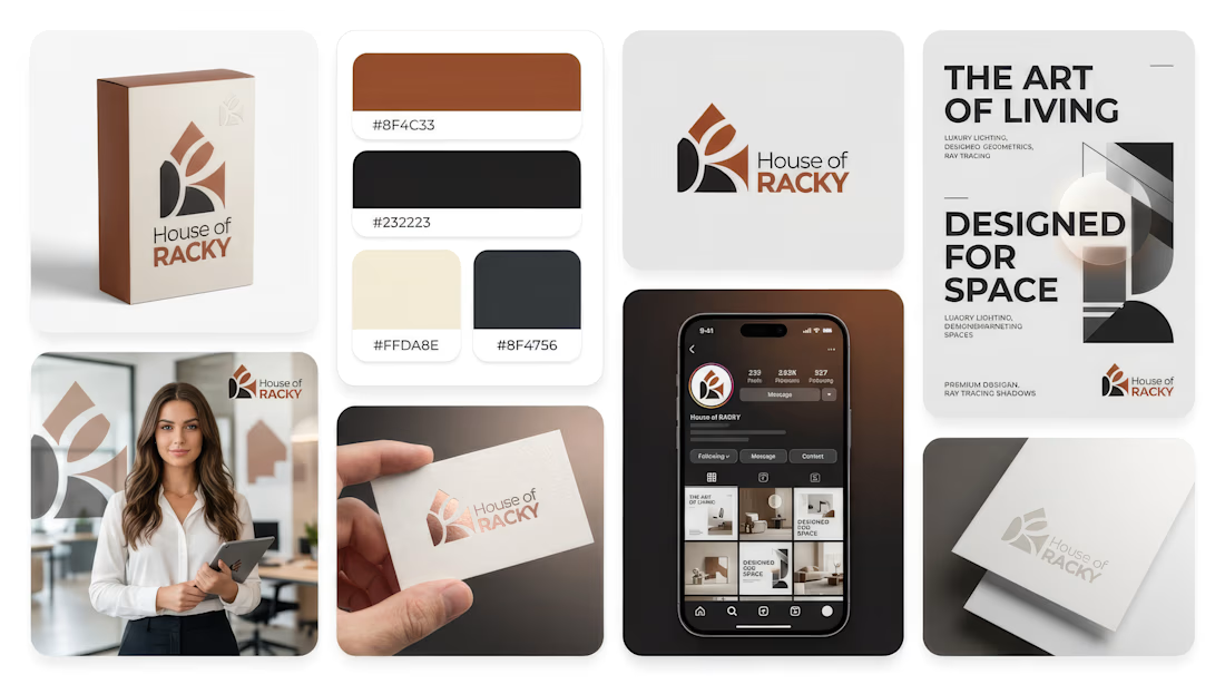
Reposting my submission for the #envatochallenge: a complete luxury visual identity and promo for House of Racky.
As a brand designer and video editor, I used @envato as my primary toolkit to explore what happens when AI speed meets human taste.
The "Human by Design" Pivot:
While AI generated the initial abstract shapes, the raw output lacked soul, structural balance, and usable typography. I stepped in as the director—stripping out the cold machine layout, manually rebuilding the geometric logo grid in Illustrator, and pairing it with a high-prestige typography system to create real emotional connection.
From there, I brought the identity to life using Envato Elements for cinematic stock B-roll, realistic mockups, and layered sound design.
AI is the spark, but human taste is the fire. 🔥
@envato @envatotuts
#envatochallenge #humanbydesign #houseofracky #brandidentity #videoediting #logodesign #motiongraphics #graphicdesign

Envato AI gave me a house. It took human instinct to turn it into a home.
For the #envatochallenge, I wanted to put the "Human by Design" philosophy to the test by creating a complete premium brand identity for House of Racky.
My goal was to use Envato’s creative toolkit to push...



Awesome!