The network for creativity
Join 1.25M professional creatives like you
Connect with clients, get discovered, and run your business 100% commission-free
Creatives on Contra have earned over $150M and we are just getting started
Back to feedPost
A selection of website hero sections from my recent portfolio work.
My focus in each design was to create a strong first impression through clear hierarchy, cinematic visuals, modern typography, and interfaces that feel both premium and easy to trust. From AI and fintech to travel and product-led brands, the goal stays the same: make the business feel sharper, clearer, and more valuable from the very first screen.
I enjoy designing websites that do more than look polished. They need to communicate fast, guide attention well, and make the brand feel credible immediately.
If you need a website that feels modern, strategic, and visually strong, I’d love to collaborate.


A formidable collection?
All are top-notch

Why Question Mark bro
I wanted that to be an exclamation!
Still waiting for Contra to roll out the sit button for messages and replies
Great work by the way
ok ok got it thanks

Wow..!!👏

Great work! Looks really solid

Amazing work

Great Work.

really like them all


Amazing collection!
All are done by me
Great job man! Not an easy feat.


Cinematic and high-impact.
Thanks

Great way to show top class hero sections
Thanks

Really love the focus on making a brand feel "valuable from the first screen." It’s rare to see designs that balance premium aesthetics with clear communication so well. It definitely sets a high bar for the rest of the customer journey would love to connect and talk shop on how these visuals could flow into long-term retention!
Thanks.
Really love the focus on making a brand feel "valuable from the first screen." It’s rare to see designs that balance premium aesthetics with clear communication so well. It definitely sets a high bar for the rest of the customer journey would love to connect and talk shop on how these visuals could flow into long-term retention!

Thanks :)
The network for creativity
Join 1.25M professional creatives like you
Connect with clients, get discovered, and run your business 100% commission-free
Creatives on Contra have earned over $150M and we are just getting started







Related posts

Day 12/30 of my hero section challenge.
Another day of prioritising the visuals and imagining a company that doesn't exist. I promise the next one is a tech brief with barely any imagery at all, I've leaned hard on beautiful photography for twelve days straight.
Concept: a mycelium materials company producing leather, packaging and foam grown from fungal networks. The design deliberately inverts the category's defaults; biotech branding tends toward dark, clinical and electric blue, so this one goes warm and botanical, with a subtle looping video of spores drifting and mushrooms emerging. The copy pulls hard the other way: plain, technical, B2B-direct, anchored by two concrete numbers instead of sustainability adjectives.
Twelve briefs across travel, food retail, personal branding, events, landscape architecture, pet services, hospitality, coffee, lighting, wellness, restaurants and now biomaterials.
12 down, 18 to go.
Built on the Viper template by Westhill Studio, adapted and customised by me.
Imagery and video generated with AI.


brilliant

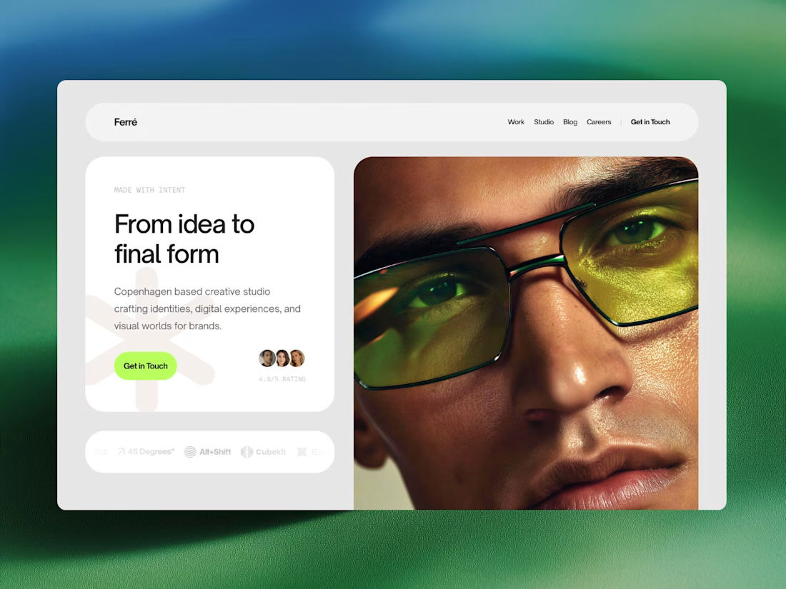
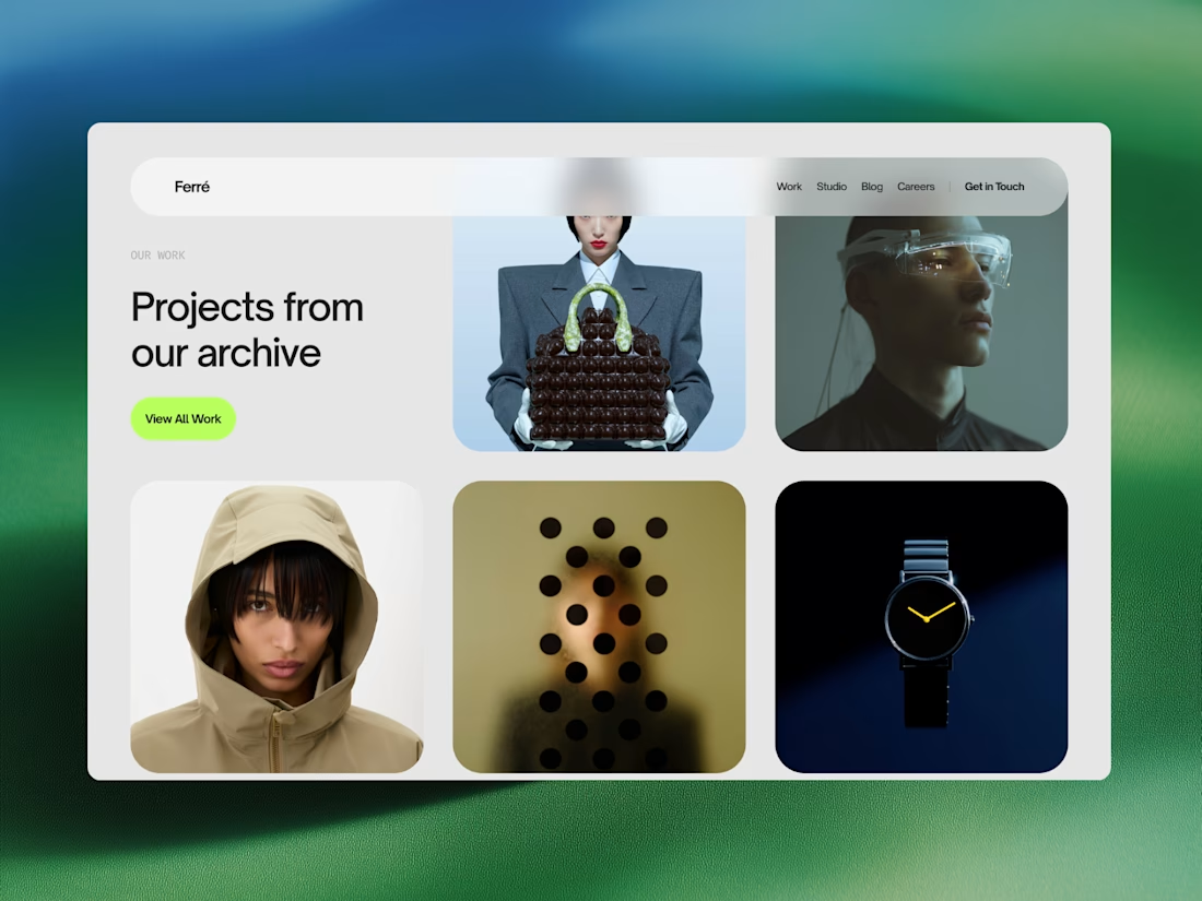
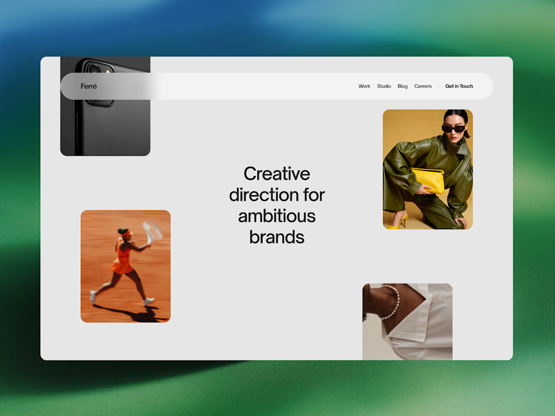
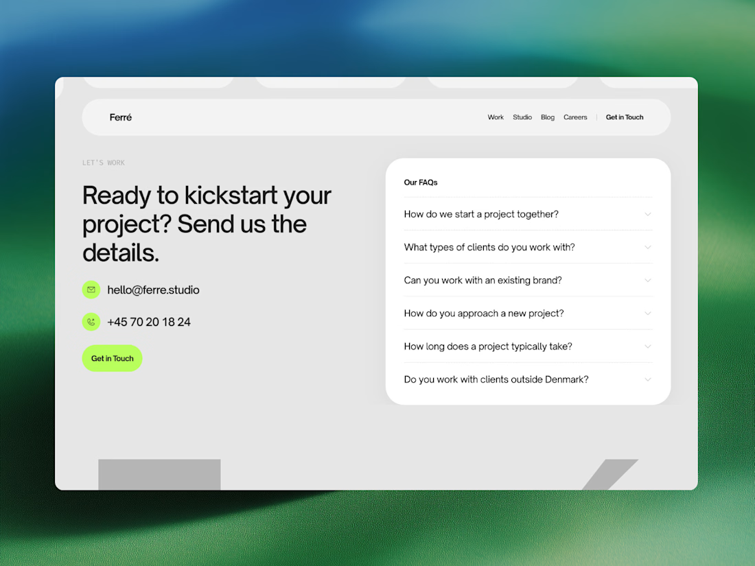
Ferré is an agency template designed for creative studios, design firms, and independent practices looking to present their work with clarity and confidence.
Built around an editorial visual language, this template combines bold typography, subtle interactions, and an immersive layout to create a sophisticated digital presence. Showcase your work, introduce your studio, share ideas through a journal, and give potential clients a clear sense of what you do.



Luxora Skincare Serum Packaging


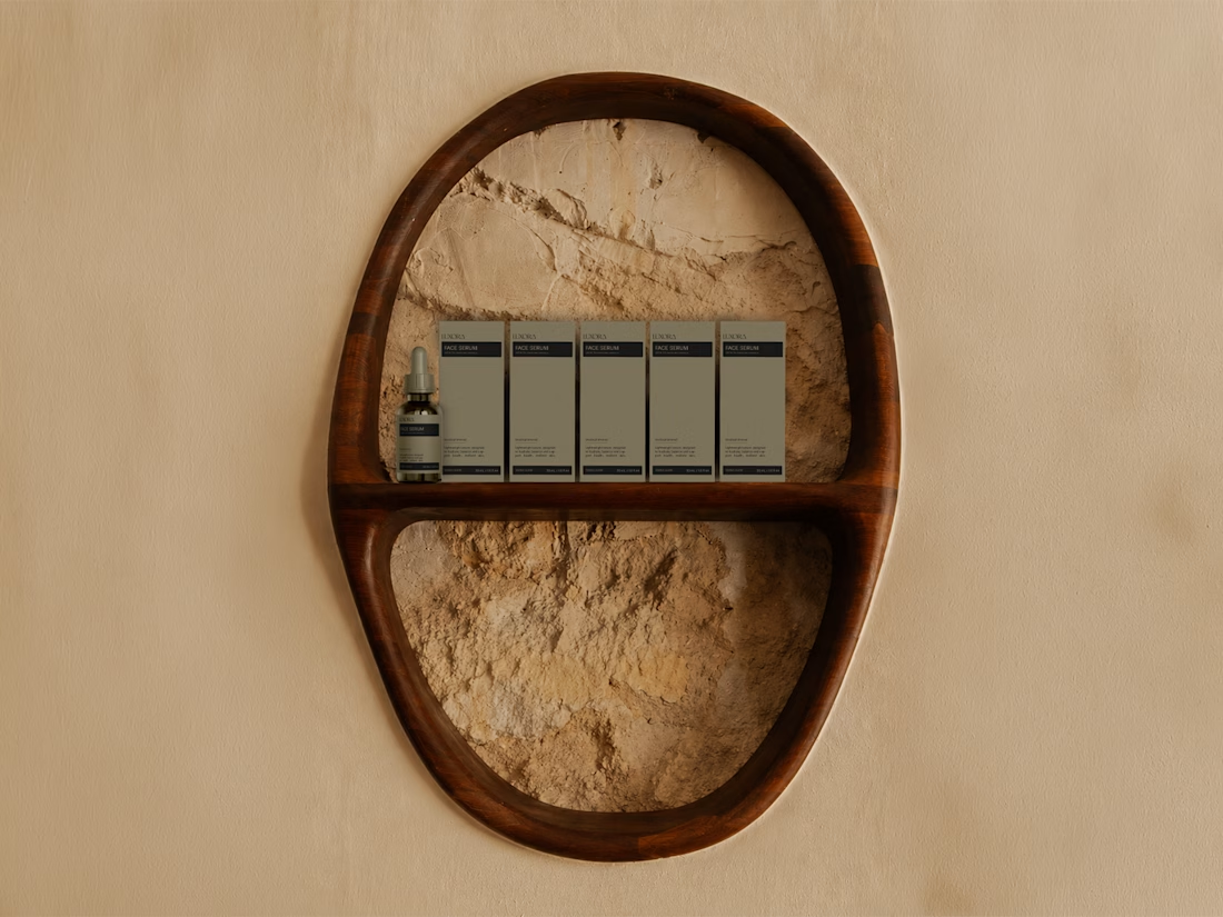
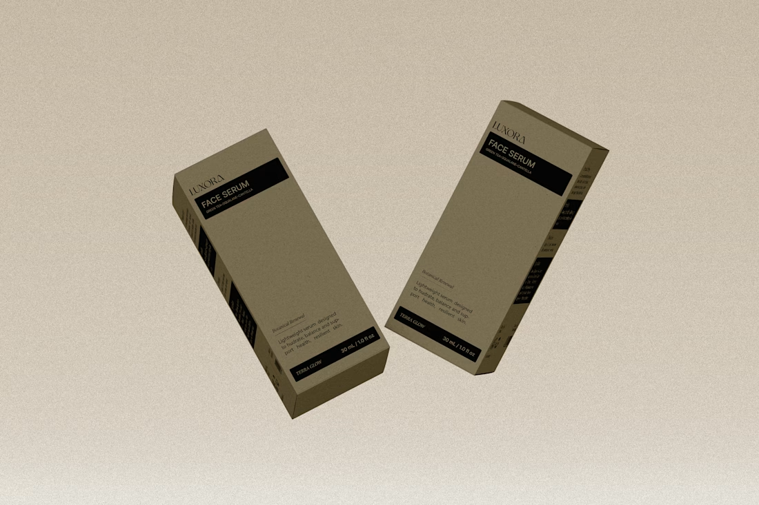
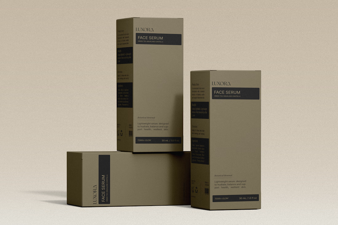
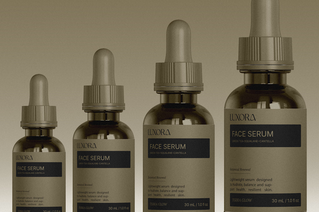

The olive droppers and FACE SERUM label stay in one calm palette, which is what makes the set feel expensive. The powder backdrop keeps it tactile instead of glossy-ad.