The network for creativity
Join 1.25M professional creatives like you
Connect with clients, get discovered, and run your business 100% commission-free
Creatives on Contra have earned over $150M and we are just getting started
Back to feedPost

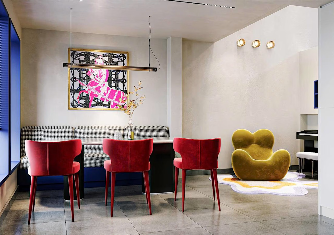
Modern Minimalist Living & Dining Interior Design


The network for creativity
Join 1.25M professional creatives like you
Connect with clients, get discovered, and run your business 100% commission-free
Creatives on Contra have earned over $150M and we are just getting started





Related posts

Meet my latest website template, Vauban, tailored for architecture studios.
Built around an editorial grid and Swiss typography, it puts projects at the center while giving the studio itself a clear presence.
Available as a Framer template.

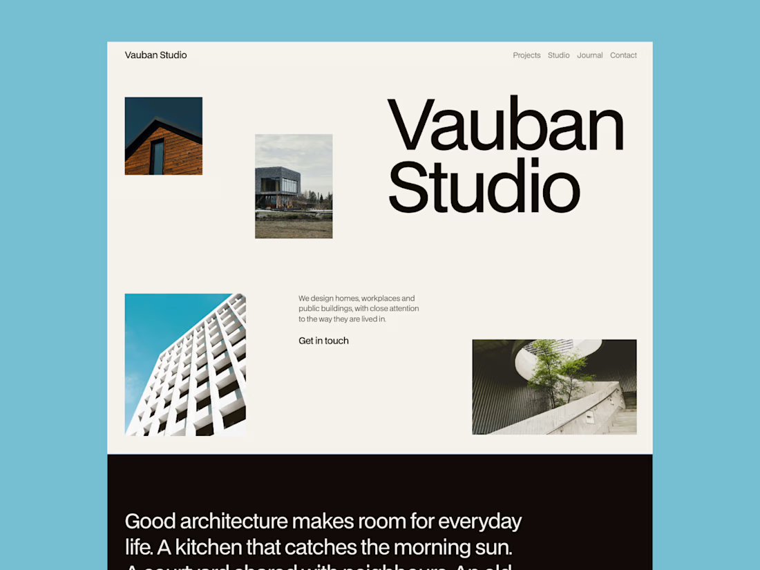
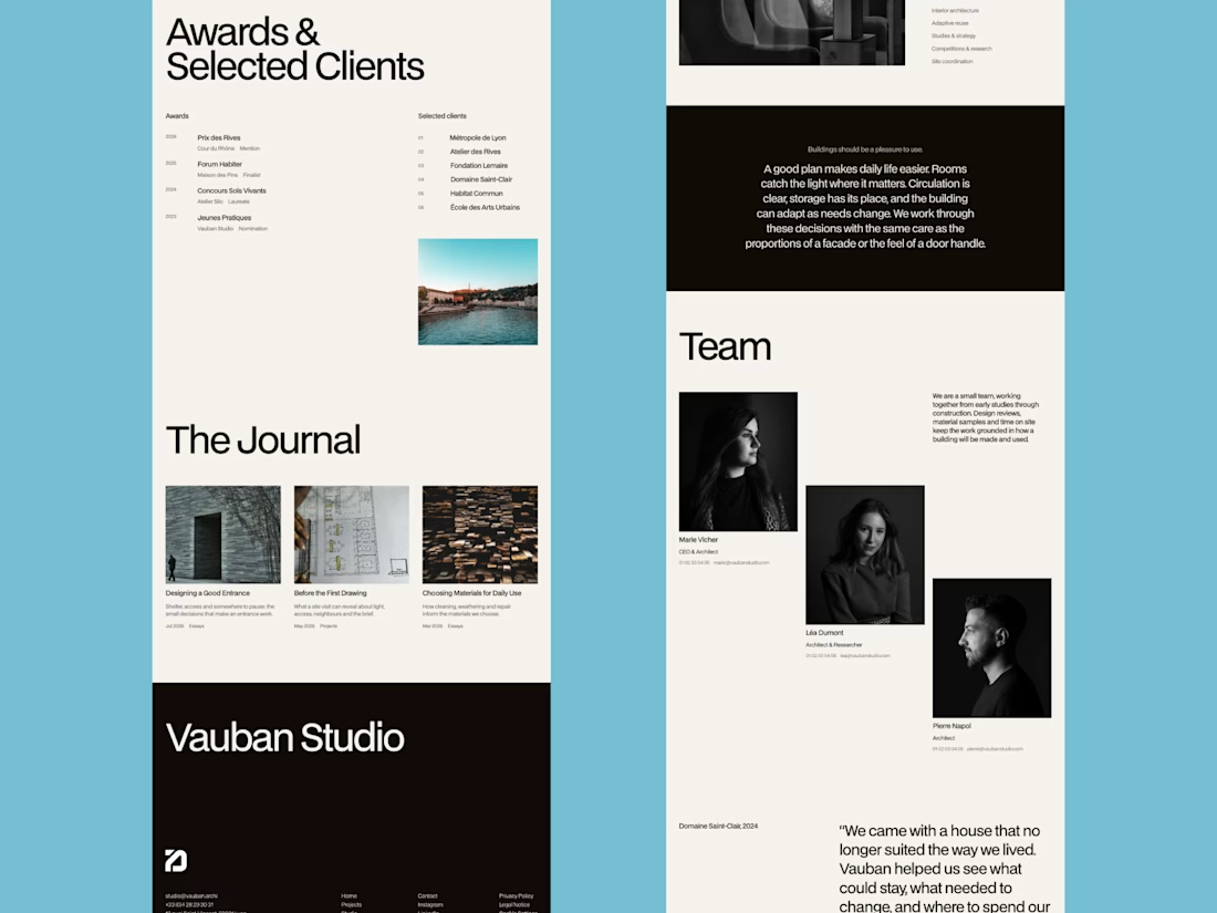
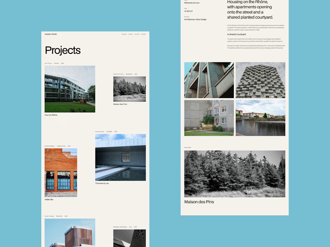

That blue background around the grid is a bold choice. Makes the photography pop.

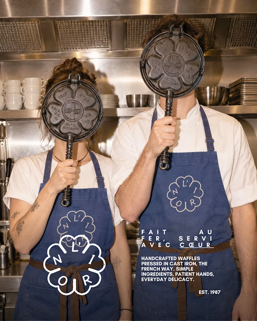
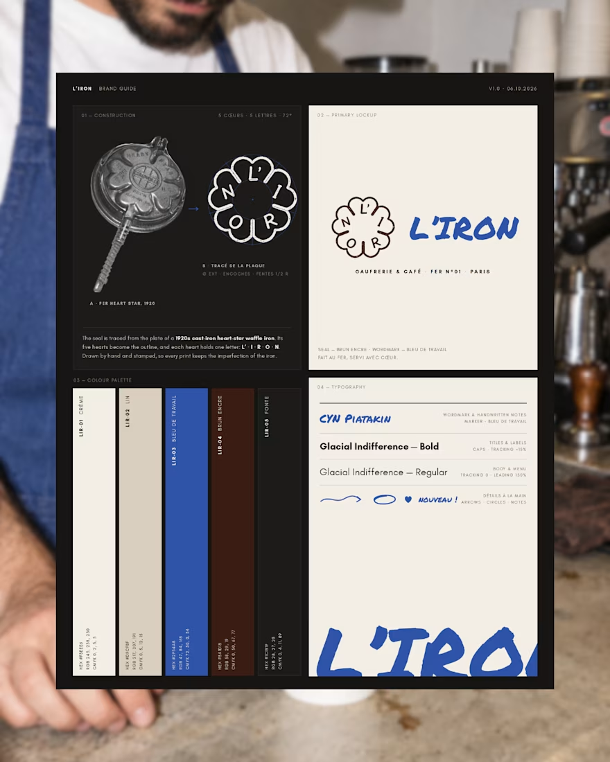
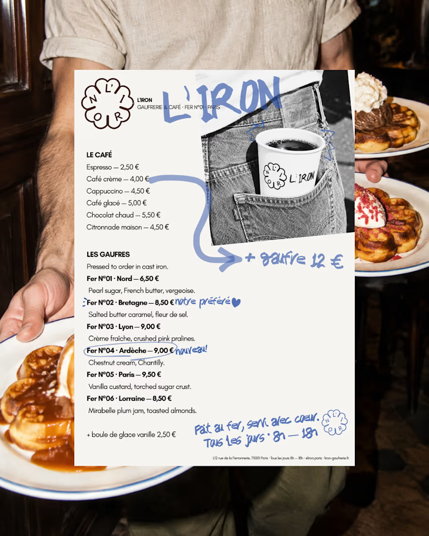
L'IRON is a brand identity for a modern French waffle house, created for the Designerbriefs weekly challenge (Brief 181). The logo is traced from the plate of a 1920s heart-star waffle iron: five hearts, five letters, L' · I · R · O · N. It works as a hand-stamped seal paired with loose blue marker notes, bringing an old iron craft into a café that feels young, warm and a little cheeky.
The project covers the logo, menu, packaging and a flash-lit, analog-style photo series.
Would you order a waffle from L'IRON? I'd love to know what you think of the logo and if it fits the brand.
See the full project on Instagram: https://www.instagram.com/p/Dd63blwDh7M/?utm_source=ig_web_copy_link&stkn=MzRlODBiNWFlZA==



So, so gooood!


New Brand Identity project alert! 🚨
GATE108 is a forward-thinking ecosystem bringing together people, ideas, experiences and new ways of living, working and connecting.
We’ve been their long-term design partner, shaping and continuously evolving a flexible visual ecosystem across visual strategy, brand identity, creative direction, digital experiences, event assets, 3D motion and social media.
Inspired by the idea of GATE108 as a gateway into a multidimensional world of people, ideas and possibilities, we’ve built a brand system designed to move, adapt and grow across physical and digital spaces.
As the brand evolves, we continue to create new expressions while keeping the wider ecosystem cohesive, recognisable and ready for what’s next.


