The network for creativity
Join 1.25M professional creatives like you
Connect with clients, get discovered, and run your business 100% commission-free
Creatives on Contra have earned over $150M and we are just getting started
Back to feedPost
Kinetic Reel treats the picture like a poster: title words fly in on the timeline, so the video's own rhythm drives the typography. A single orange accent keeps the controls and type readable over both bright and dark footage. Words stay decorative and hidden from screen readers, so every control remains reachable by keyboard and touch, and motion settles down when reduced motion is on.


Cool 🔥

The video's own rhythm driving the typography, great idea.

Letting the video's own rhythm drive the title typography is such a fun idea, it turns the timeline into a poster in motion. Keeping it to a single orange accent is a smart call for readability. If you get a moment, I'd love your thoughts on Geiger ☢

Thanks, Ammar! Glad the rhythm idea came through. Keeping the orange as the only accent was about readability, so I'm glad it reads that way. I'd be happy to share my thoughts on Geiger, what's your take on it?
Thanks Vitalii, that would mean a lot! Whenever you get a chance, honest feedback on Geiger is very welcome ☢
The network for creativity
Join 1.25M professional creatives like you
Connect with clients, get discovered, and run your business 100% commission-free
Creatives on Contra have earned over $150M and we are just getting started



Related posts


I took part on Video.js Skins Design Challenge on
Introducing Frame
- An editorial skin for Video.js 10, and the small publication that presents it.
- FRAME treats the player like a page in a well-made journal: the picture comes first and the controls stay quiet until you need them. Inside the picture everything is white on ink; the page's one accent color is kept for its buttons.
GitHub Link - https://github.com/olivebishop/frame
Live Link - https://frame-one-psi.vercel.app


A skin plus a small publication that presents it, great way to frame it. Very well-made journal feel.

All I did was copy the Figma page link, paste it into Claude Code, and give it a few instructions. Oh chim! it brought the whole thing to life
What do you think?


Going from a Figma link straight to motion is wild, "oh chim" is the right reaction 😂 Did you connect the Figma MCP, or did Claude Code work it out from the link alone?

A little look at how Nazariya Living stands apart from its category.
On one side, familiar visual conventions. On the other, an identity with its own character, rooted in stories worth keeping.
We chose not to blend in. :)
Which side catches your eye?

3 voted
30%
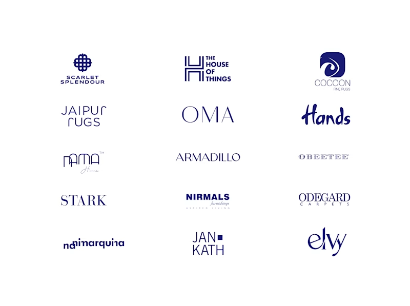
7 voted
70%
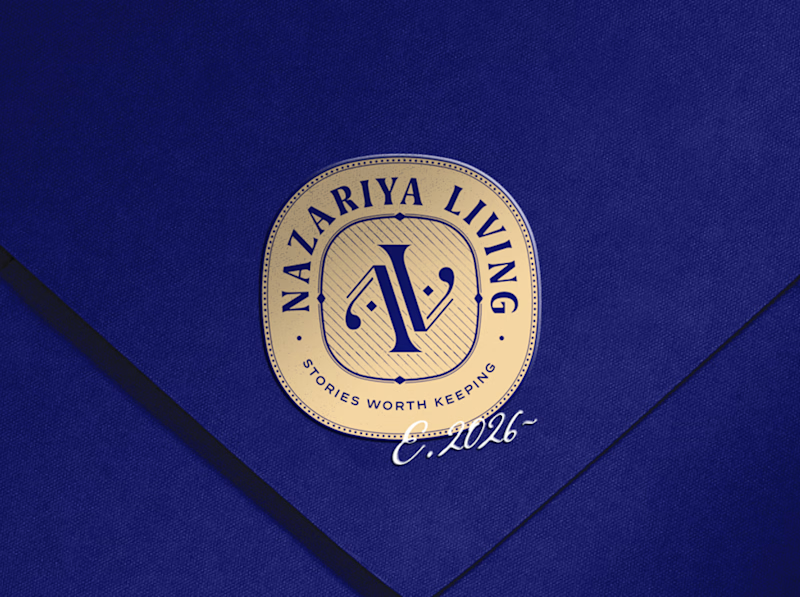
10 votes
Closed

That side with all the competitor logos in one grid is the slide I'd steal for a client presentation. Nothing explains "why this direction" faster than showing the sea of sameness first. The navy seal wins easily after that.