The network for creativity
Join 1.25M professional creatives like you
Connect with clients, get discovered, and run your business 100% commission-free
Creatives on Contra have earned over $150M and we are just getting started
Back to feedPost
One great hoodie does not prove you have a fashion brand.
A whole collection that still feels connected does.
That was the next challenge for LES WE TCHOMBE.
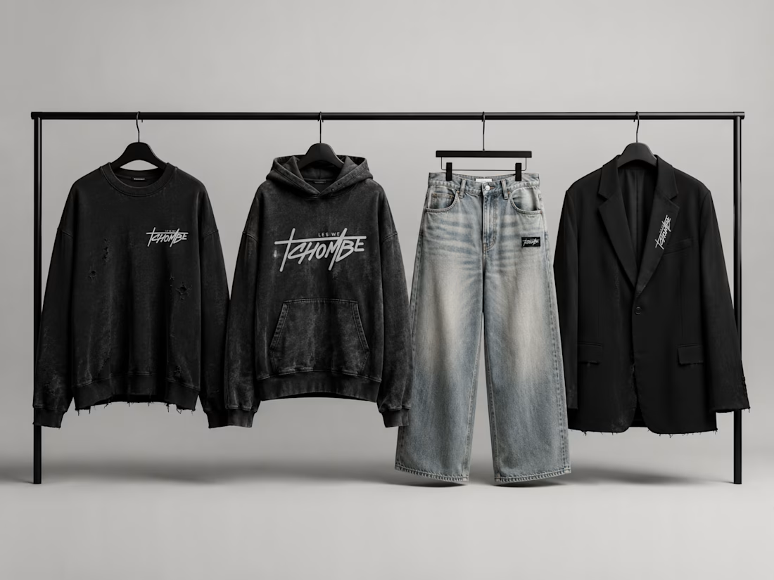
The identity needed enough personality to be recognizable, but enough flexibility to live across very different garments.
Sweatshirt.
Hoodie.
Denim.
Tailoring.
Different materials.
Different silhouettes.
Same brand.
The wordmark changes scale and placement without losing its character, while the restrained black, washed denim, and neutral palette lets the collection feel cohesive rather than over-branded.
This is where a visual identity starts doing real work.
Not by forcing the exact same logo treatment onto everything.
But by giving the brand enough rules that different products still feel like they belong together.
For fashion founders, I think this is the harder question:
Should every garment clearly carry the brand, or should some pieces be allowed to almost disappear into the collection?
I’d choose a flexible system over maximum logo exposure every time.
What would you do?
If you are building an apparel line and every new drop feels like it needs a new visual direction, the problem may be the identity system, not the collection.
#FashionBranding #StreetwearDesign #ApparelBranding #BrandSystem #VisualIdentity #CreativeDirection #BrandDesign



Nice to see it across the collection.

Thank you! That was the main goal, making sure the identity still felt consistent across very different pieces.
The network for creativity
Join 1.25M professional creatives like you
Connect with clients, get discovered, and run your business 100% commission-free
Creatives on Contra have earned over $150M and we are just getting started


Related posts

Can AI create a professional-looking logo?
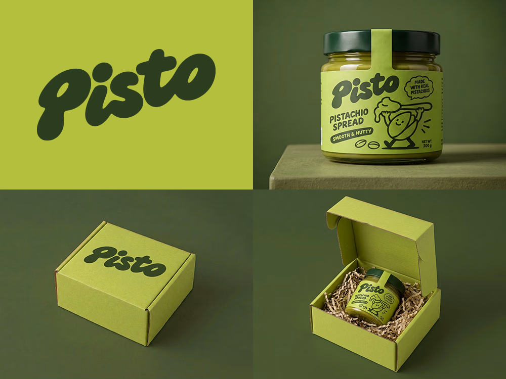
I tried to create a logo concept for a pistachio spread brand using Recraft Logo Maker.
After answering a few questions about the brand and going through several variations, I finally landed on a logo that felt right and captured the fun, fresh personality I had in mind.
But I didn't want to stop at just the logo.
I took it a step further by exploring how the identity could come to life through product packaging and a branded mailer box.
A quick process video is included in the comments.
What do you think?


Another category comparison, and this one's going to make you look twice.
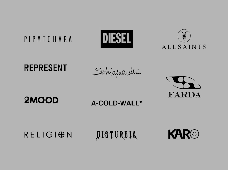
The fashion category needed a fresh point of view. Most established players relied on functional wordmarks and relatively restrained visual identities.
With Ru’asā, we took a different route. We challenged those conventions and built an identity designed to stand apart, be remembered and give the brand a world of its own.
Distinctive by design. Unconventional by nature.
Which would you choose?
Familiar category conventions
A fresh point of view
1 voted
11%
8 voted
89%
9 votes
Closed


Motion wins

A few months ago I got to work with Coderhouse, one of the leading education brands in Argentina, and the place where I took several courses myself.
So this one feels like a full circle. A brand that shaped my career and helped me grow as a designer, and now I got to design for it.
The funny part is Chris had no idea I was a former student when he reached out. I was really happy when that message came in.
I built a visual system for their 60+ course covers, made so their team can keep producing them on their own. Today it lives across their app, website and Meta ads.
Thanks Chris for trusting my work and for the opportunity 🧡 And thanks @Contra HQ for making connections like this one possible.


This looks great


