The network for creativity
Join 1.25M professional creatives like you
Connect with clients, get discovered, and run your business 100% commission-free
Creatives on Contra have earned over $150M and we are just getting started
Back to feedPost
THUNDER — Logo Design
Brand: Thunder
Industry: Snowboarding fan merchandise
About the brand: Thunder is a fictional brand that creates durable, high-quality merchandise for snowboarding fans, targeting college students.
Design brief: Create an abstract logo mark that conveys a sense of victory, energy, and professionalism. The logo should use yellow as the primary color and work effectively on the brand’s website.
Design direction: A bold lightning-inspired symbol combined with strong, modern typography to represent power, motion, and an energetic brand personality.
Project type: Self-initiated concept project
Tools: Inkscape


this looks great, love the color pairing!

Thank you so much! Glad you liked the colors! 💛

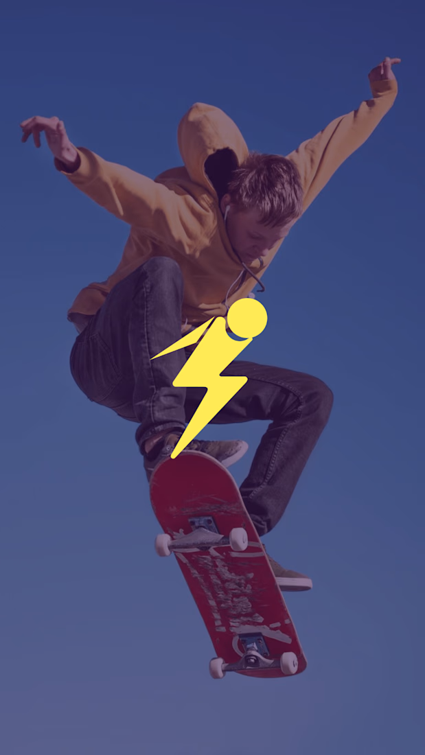
The lightning mark carries a lot of momentum without losing the clean, collegiate feel the brief calls for. I especially like how the yellow stays confident across both the flat mark and the lifestyle mockup.
Thank you so much! I’m glad the energy and clean feel came through. Really appreciate your feedback! 💛
The network for creativity
Join 1.25M professional creatives like you
Connect with clients, get discovered, and run your business 100% commission-free
Creatives on Contra have earned over $150M and we are just getting started
Related posts

What if your biggest streaming platform got a Halloween makeover? 🕸️
As Halloween is closing by, I decided to do a short campaign teaser for one of the biggest streaming platforms.
I redesigned their logo and played with the wording as part of their brand messaging in a spooky theme for the upcoming Halloween event.
I retained the brand consistency across the typography and overall logo shape and changed few details within.
Any twitch streamers, viewers or halloween celebrants here?


Fun concept and perfect timing. The spooky wordmark twist still feels on brand, nice one.

Inspired by, I'm sharing one of my own concepts that wasn't chosen for the final design, but that I absolutely love.
This idea is so good! We all have concepts hiding in our drafts that never get to see the light of day. I think they deserve their moment, too. ✨

How many concepts die in your drafts folder? 💀
In the spirit of Inktober, a digital sketch that never saw the light.
This was a lettering-inspired brandmark...


Really nice work here