The network for creativity
Join 1.25M professional creatives like you
Connect with clients, get discovered, and run your business 100% commission-free
Creatives on Contra have earned over $150M and we are just getting started
Back to feedPost

Just finished the new portfolio template for photographers in Framer. Minimal design, bold photos, simple layout. Off-white pages, one deep blue accent, big type, and a full-width hero that lets the image do the talking.

The network for creativity
Join 1.25M professional creatives like you
Connect with clients, get discovered, and run your business 100% commission-free
Creatives on Contra have earned over $150M and we are just getting started





Related posts


New case study - tash.cards, a Y Combinator backed platform for investing in graded sports cards. Identity design, commissioned by baked.design
The heart of the system is a pattern language taken from security printing. Every letter of the wordmark becomes a guilloché tile, like the engraving on banknotes and certificates, and tiles combine into endless patterns.

Nice!

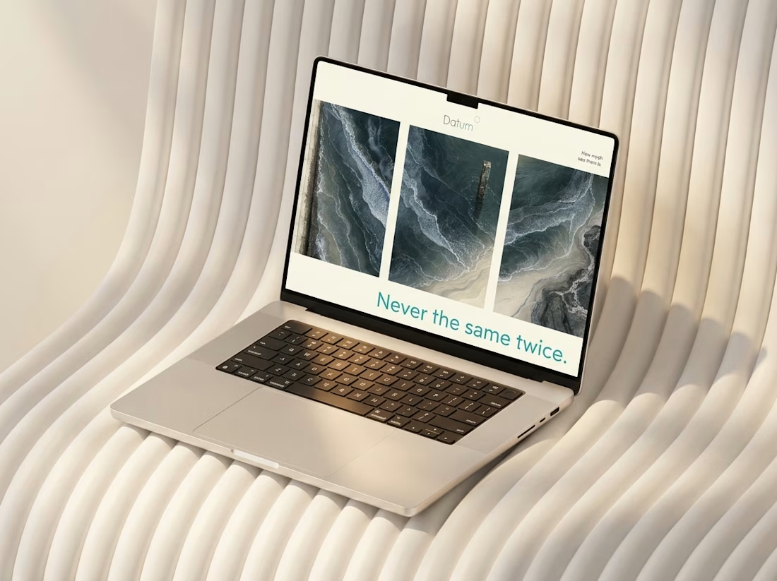
What does a logo do when it never holds still?
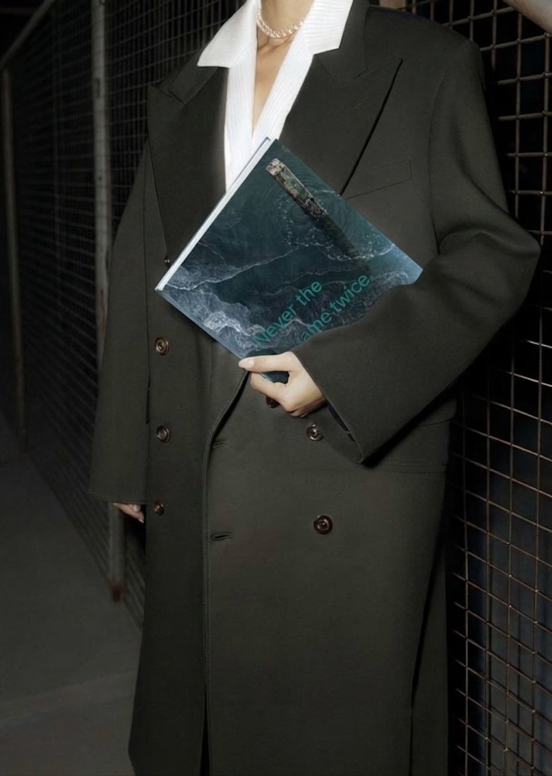
Datum is a wordmark half underwater. Tide height sets the waterline, phase tilts it, range sets the weight, and a small moon keeps the date.
One logo. Never the same twice.

Design Agency Website
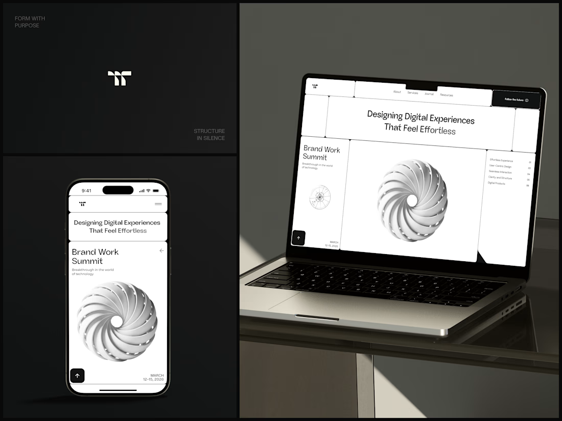
Only one cell on this homepage is black.
The rest of the page is a grid of rounded white cells: the headline, an event card, a white 3D spiral and a list of services. The black one, top right, holds the "Follow the future" button and stands out against all that white.
On the phone, the cells stack into a single column. The navigation folds into a menu icon, and the event card and spiral merge into one cell.
The headline reads "Designing Digital Experiences That Feel Effortless", so the grid has to look organized before anyone reads a word.
Designed by the Hue & Machine team.
#DesignAgency #WebDesign #AgencyWebsite #LandingPage #BentoGrid #MinimalDesign #UIDesign #ResponsiveDesign #MobileDesign #FigmaDesign



Looks cool