The network for creativity
Join 1.25M professional creatives like you
Connect with clients, get discovered, and run your business 100% commission-free
Creatives on Contra have earned over $150M and we are just getting started
Back to feedPost


The network for creativity
Join 1.25M professional creatives like you
Connect with clients, get discovered, and run your business 100% commission-free
Creatives on Contra have earned over $150M and we are just getting started







Related posts

Recent work on MAE - Visual identity

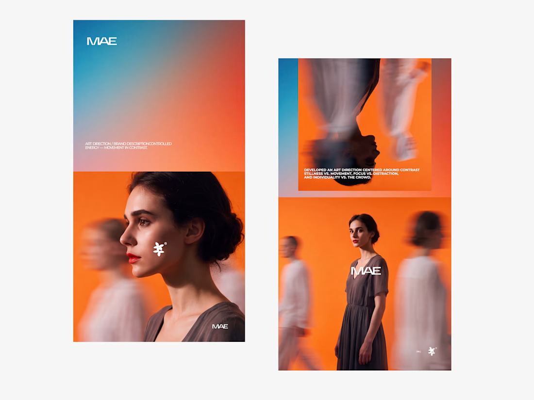

The motion blur on the figures gives the orange-to-blue gradient a reason to be there, and the small star mark stays readable on both the cheek and the shirt. Did the star come first as a standalone mark, or did it grow out of the photography direction?

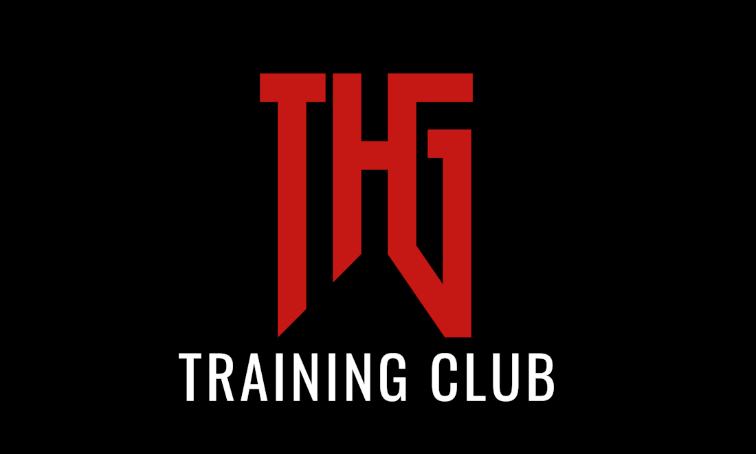
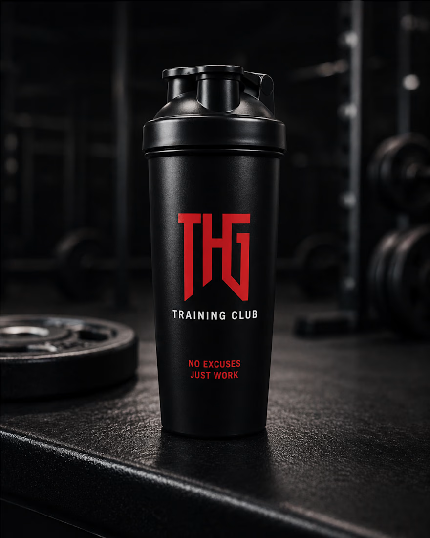
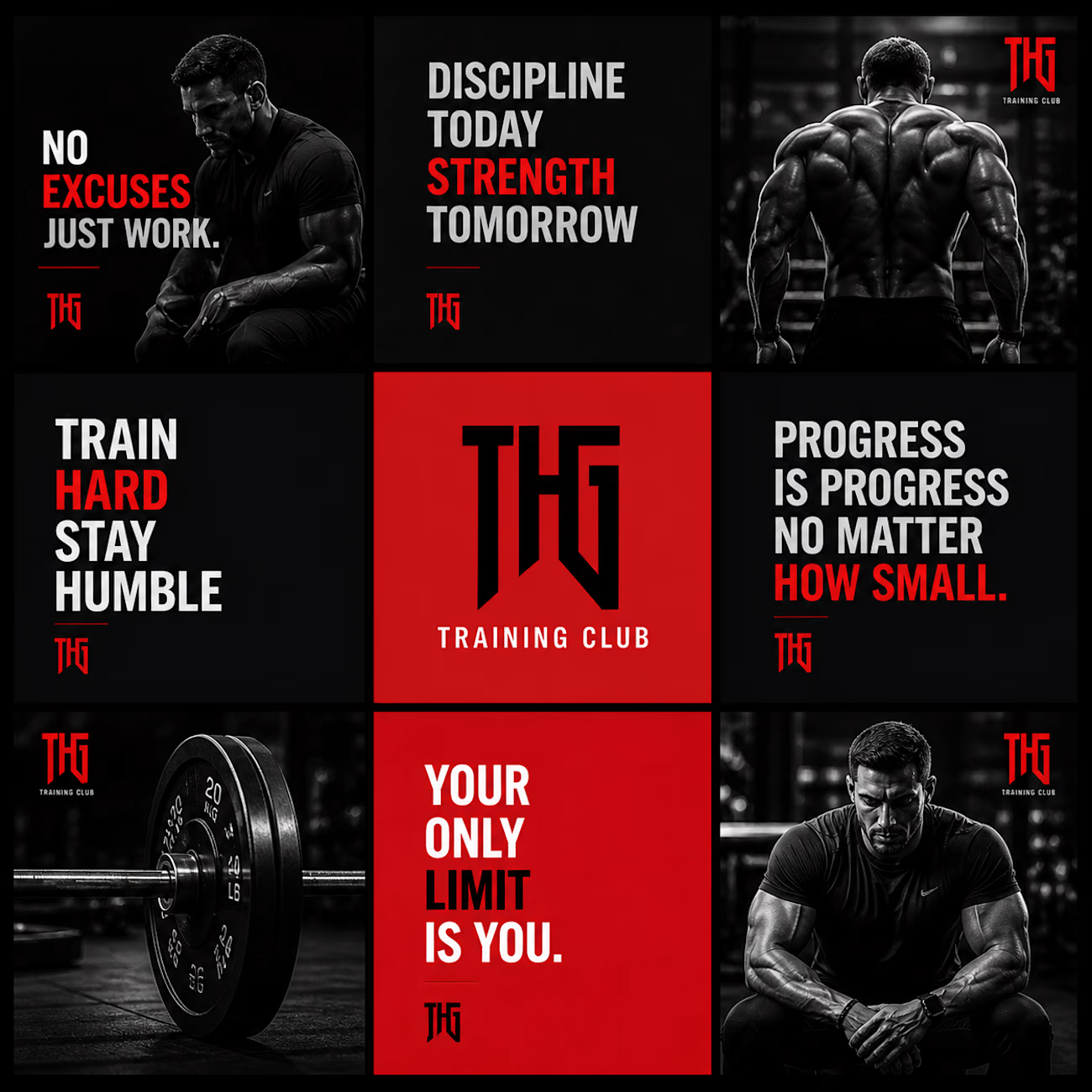
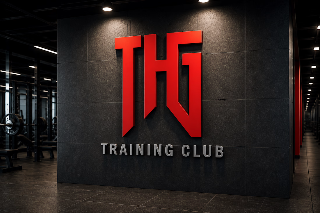
THG Training Club – Fitness Brand Identity & Mockup Design
A bold and modern fitness brand identity design created for THG Training Club. This project focuses on building a strong, powerful visual presence that reflects discipline, strength, and high-performance training culture.
The design revolves around a minimal yet aggressive aesthetic, using a dark theme combined with a striking red logo to create a premium and impactful look. The typography and visual hierarchy are crafted to enhance brand recognition while maintaining clarity across different applications.


whos the target member for THG, serious lifters or more of a general gym crowd

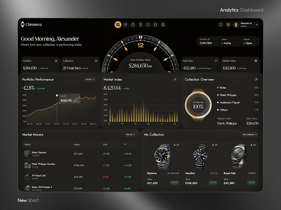
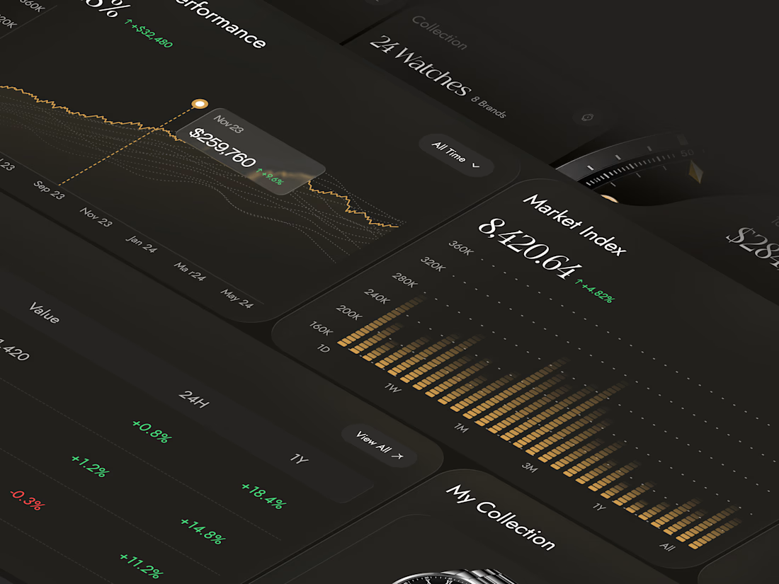
What if your watch collection had a dashboard this luxurious?
Meet Chronova. Built for collectors who care about every detail.
Would you use this?

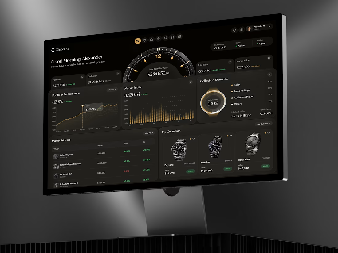

a dark dashboard makes sense here, the watches get to be the brightest thing on screen. how do you show a collection's value changing without it feeling like a trading app?