The network for creativity
Join 1.25M professional creatives like you
Connect with clients, get discovered, and run your business 100% commission-free
Creatives on Contra have earned over $150M and we are just getting started
Back to feedPost
Taste Test

I've designed this couple of hero sections, which one is better?
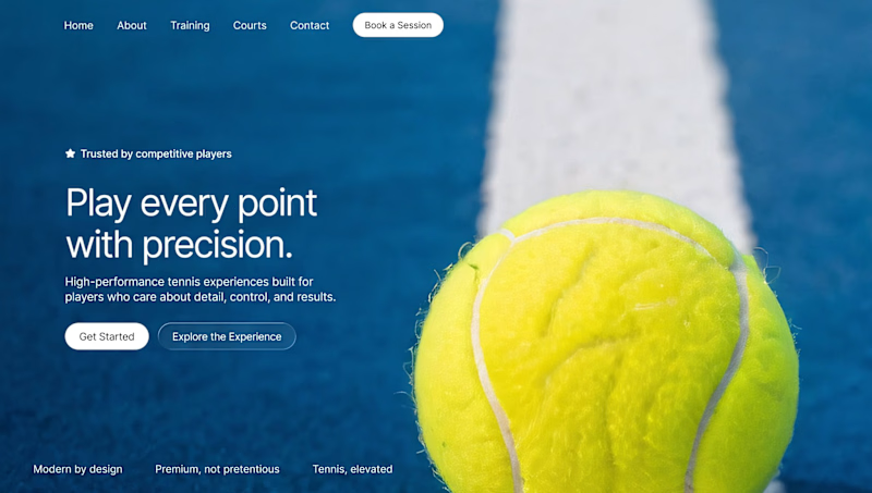
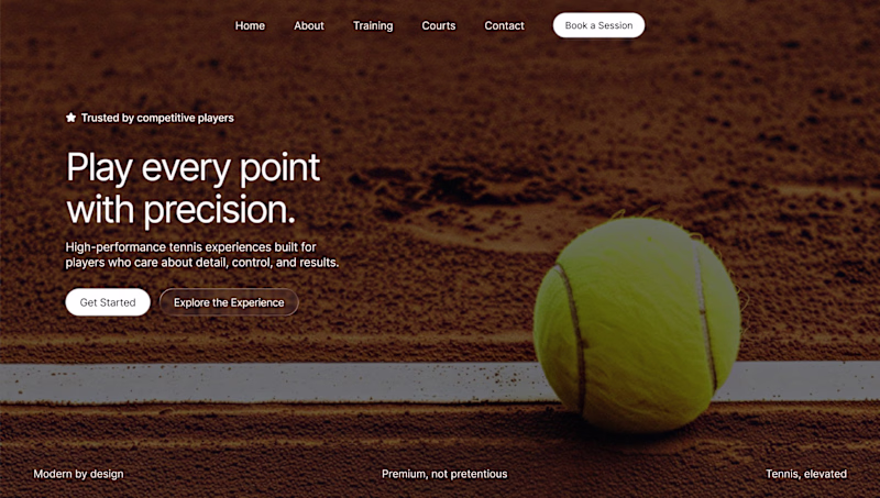
35 votes
Ends in 1h

Blue one got my attention faster than the brown one.

I’d go with the blue one. The contrast between the ball and the background makes the hero feel more dynamic and the headline stands out better.


Well said, agreed!
Thanks! Glad we’re on the same page — the blue version really makes the hero feel stronger.
Thank you!

Blue is much better ;)

agreed
Thanks!

I love close visual
Appreciate it man!

Blue all day. The contrast is stronger and the clean white makes the headline pop. Brown feels a bit heavy for a sports site.
Fair enough, thank u!

I voted for the blue one, as mentioned in the other comments -- it looks more dynamic. I noticed that the navigation is left positioned and I assume that's because of the white button but you might have the same problem if the page titles are longer (or more) or if the user is using a smaller screen.

Blue one looks cleaner.

I loved the blue more
The network for creativity
Join 1.25M professional creatives like you
Connect with clients, get discovered, and run your business 100% commission-free
Creatives on Contra have earned over $150M and we are just getting started
Related posts

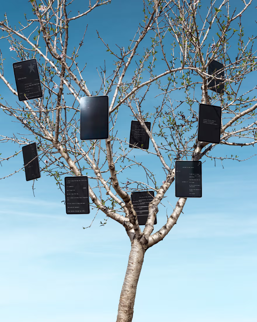
Add so much fun and creativity with this project


really great work, Miguel!


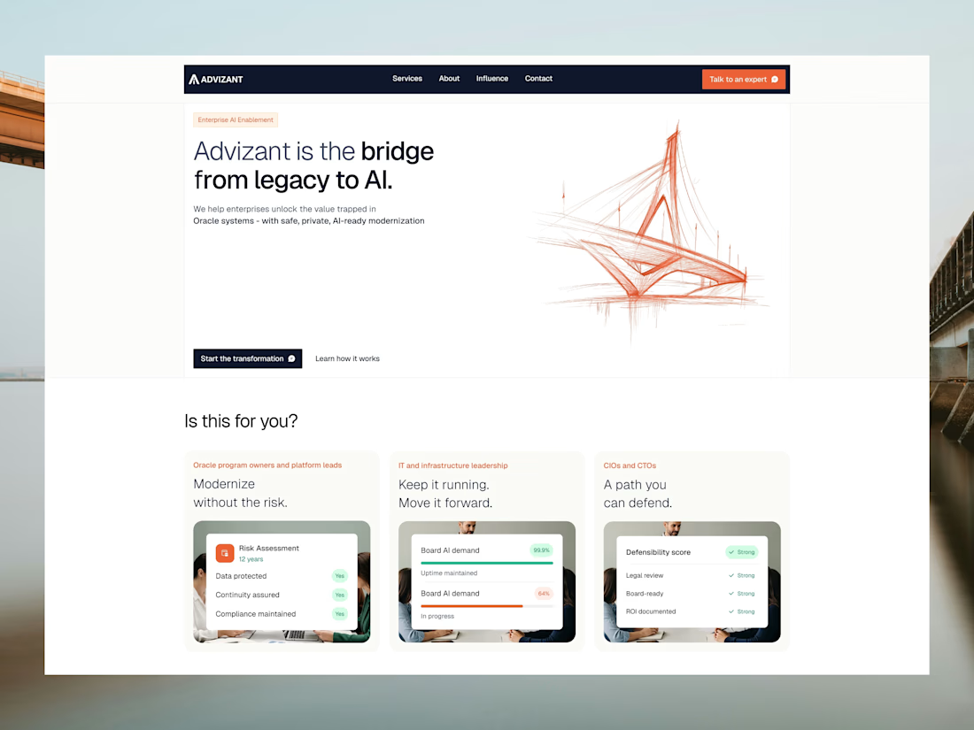
Trying to explain a whole vibe in one hero section. Take a look at the landing page and tell us, too much info or just right?

The headline is strong and clear.
The only thing that might compete for attention is the trends card — it slightly splits focus from the primary CTA. Maybe simplifying the hero to one dominant action could increase conversions.


Trending
maxearnings
The next frontier of payments is live on Contra. How are you maximizing revenue?
freelancerlife
Freelancer life is wins, pivots, and everything in between. What’s yours right now?
aidesignflow
AI tools are redefining how designer work. What does your workflow look like?
micrographics
Micrographics started as utility - barcodes, packaging, instruction labels. How would you use them?
aivideo
AI video tools are moving at warp speed. What tools are you using?