The network for creativity
Join 1.25M professional creatives like you
Connect with clients, get discovered, and run your business 100% commission-free
Creatives on Contra have earned over $150M and we are just getting started
Back to feedPost

A website redesign is not always about making something look better.
Sometimes, the bigger challenge is making a complex offering easier to understand.
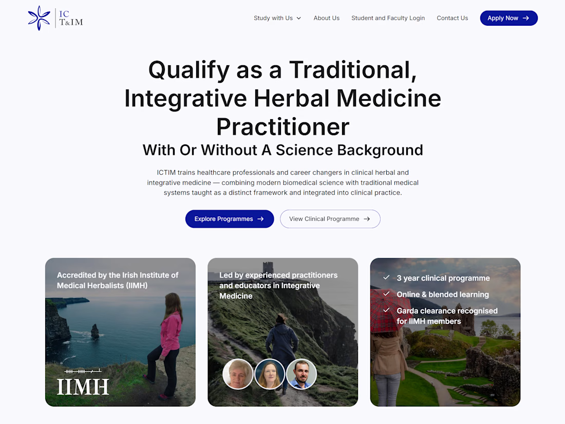
I recently worked with the Irish College of Traditional & Integrative Medicine (ICTIM) to redesign and develop their website in Webflow.
ICTIM offers specialist education in herbal and integrative medicine, with different programmes, application requirements, and learning resources.
The challenge was to bring all of that information together into a website that feels clear, professional, and easy to navigate.
My work included restructuring the content, designing the pages, building the site in Webflow, and creating clearer pathways for prospective students to explore programmes and submit enquiries.
The result is a website that better communicates what ICTIM offers while giving the college a flexible foundation to manage its content.
You can explore the website here:
https://www.ictim.ie/
The network for creativity
Join 1.25M professional creatives like you
Connect with clients, get discovered, and run your business 100% commission-free
Creatives on Contra have earned over $150M and we are just getting started



Related posts

Some details from my latest redesigns project
🔗 codex.io


Here's something I find fascinating about financial product design: the cleaner the interface becomes, the more authoritative the numbers can appear. But visual confidence and statistical confidence are two very different things.
A beautiful dashboard can make an uncertain...


So interactive

Design Agency Website
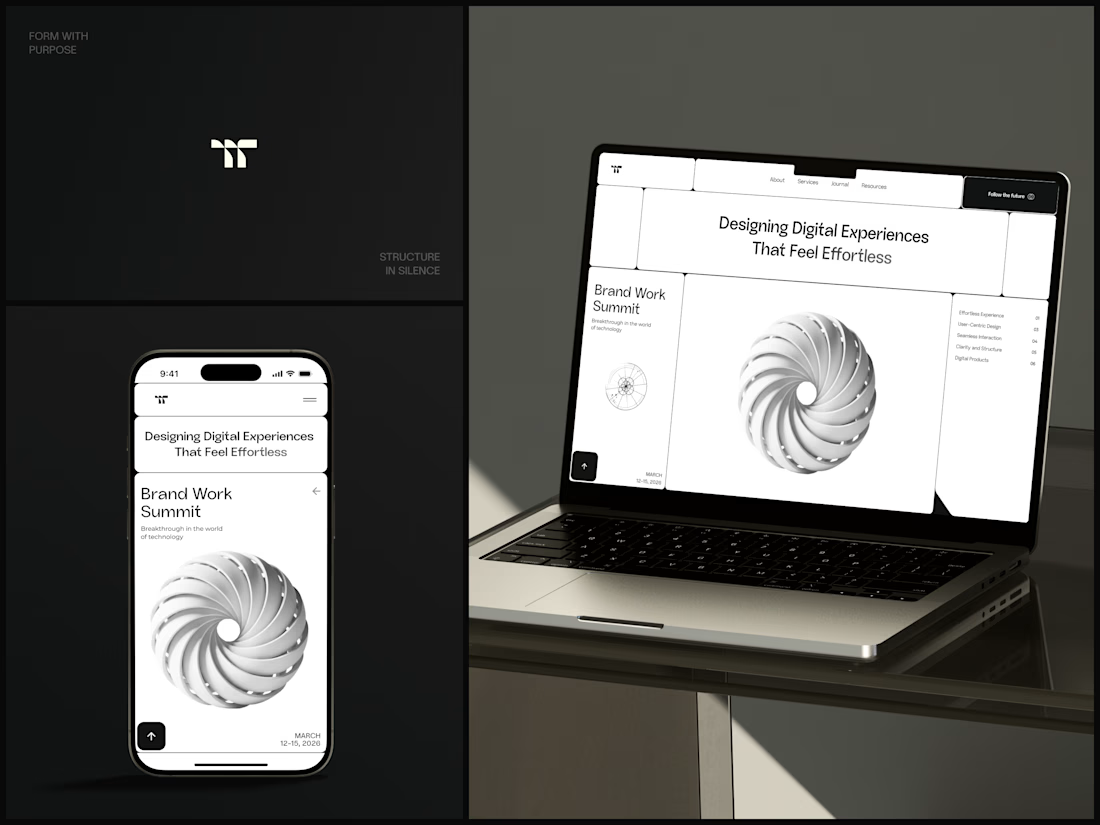
Only one cell on this homepage is black.
The rest of the page is a grid of rounded white cells: the headline, an event card, a white 3D spiral and a list of services. The black one, top right, holds the "Follow the future" button and stands out against all that white.
On the phone, the cells stack into a single column. The navigation folds into a menu icon, and the event card and spiral merge into one cell.
The headline reads "Designing Digital Experiences That Feel Effortless", so the grid has to look organized before anyone reads a word.
Designed by the Hue & Machine team.
#DesignAgency #WebDesign #AgencyWebsite #LandingPage #BentoGrid #MinimalDesign #UIDesign #ResponsiveDesign #MobileDesign #FigmaDesign



Looks cool