The network for creativity
Join 1.25M professional creatives like you
Connect with clients, get discovered, and run your business 100% commission-free
Creatives on Contra have earned over $150M and we are just getting started
Back to feedPost

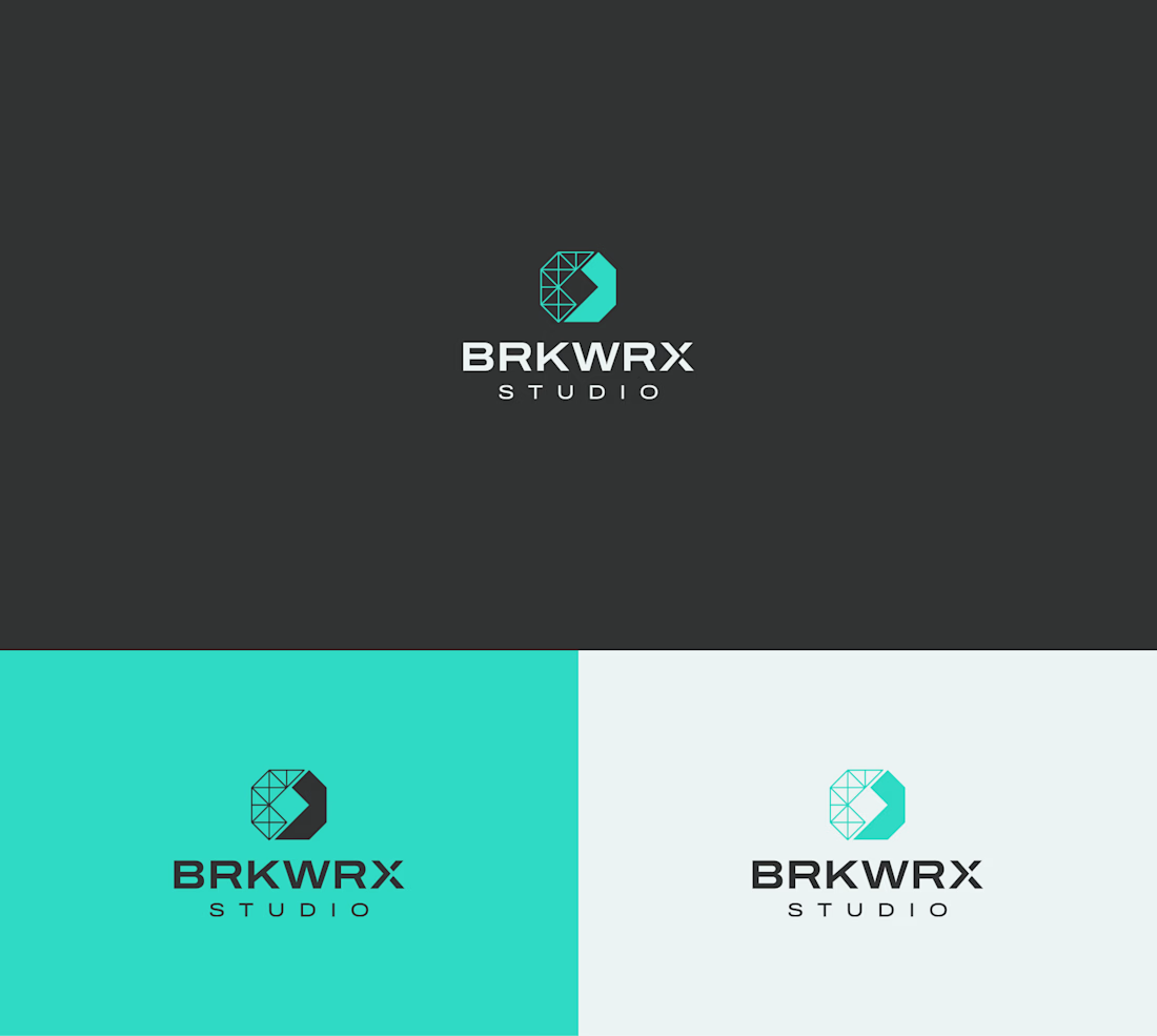
Brand helps visionary founders and product teams bring cutting-edge, consumer-facing IoT products to market—fast—by fusing technical rigor with human-centered design and rapid, real-world iteration. The logo communicates how the idea is translated to finished prototype that can be tested and reiterated.

The network for creativity
Join 1.25M professional creatives like you
Connect with clients, get discovered, and run your business 100% commission-free
Creatives on Contra have earned over $150M and we are just getting started

Challenges
View all


Related posts


Web Design for Contra Labs — an extension of the Brand Identity we created.
Translating the visual language, principles, and character of the identity into a cohesive digital experience.


Product first or brand first? 🤔
We're cutting the promo reel for our case study and can't agree on its start. ✨
Which product ad opening would make you stay past the first 3 seconds?
Vote and tell why! 👇
Product DesignSoftware DevelopmentAdobe After EffectsCinema 4DFigmaBrand DesigncreativeaiworkflowUX Design


15 voted
25%
46 voted
75%
61 votes
Closed

I think both is important, but good product first.

Reroll Brand Identity
A full visual identity created for Reroll, built around the idea of turning the “O” into a die.
The project includes logo design, social media identity, motion, graphics and a custom playing card back.
Creative direction: Dmitry Lepisov
Identity design + motion: Arthur Skripnik
3D + motion created with Spline


That mint card-back pattern is such a fun extra, and the chunky Anton headers keep the whole system feeling punchy.


