The network for creativity
Join 1.25M professional creatives like you
Connect with clients, get discovered, and run your business 100% commission-free
Creatives on Contra have earned over $150M and we are just getting started
Back to feedPost

Pro-Nutrition Light — High-Impact Visual Advertising & Creative Direction
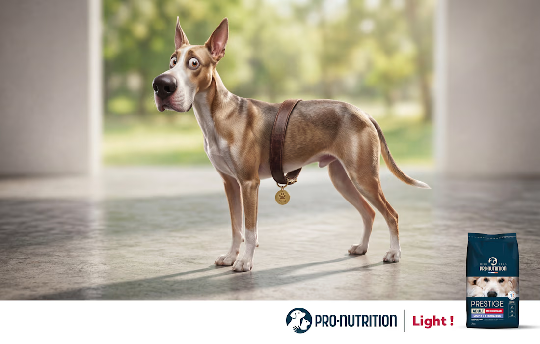
A humor-driven advertising campaign crafted for Pro-Nutrition to launch their "Light / Sterilised" pet food range. The campaign leverages visual hyperbole to showcase effective weight loss and pet vitality in a single, memorable shot.
The Creative Concept & Insight
Pet weight-management ads are often overly clinical or generic. The creative objective was to communicate a dramatic transformation through an instantly readable visual punchline: a dog that lost so much weight its collar slipped down to its waist like a belt, now back to peak energy and shape.
The Art Direction & Execution
As Senior Art Director, I conceptualized and oversaw the complete visual storytelling:
Visual Metaphor & Humor: Developed a high-concept visual joke that delivers the core product benefit in under two seconds without relying on heavy copy.
Art Direction & Character Staging: Directed the character expressive design, lighting, and composition to emphasize vitality, health, and a lighter physique.
Commercial Campaign Layout: Engineered a clean, high-impact poster layout balancing narrative humor with clear product hierarchy and brand identity.


The network for creativity
Join 1.25M professional creatives like you
Connect with clients, get discovered, and run your business 100% commission-free
Creatives on Contra have earned over $150M and we are just getting started



Related posts

Pulsix started with a question: how much of a sportswear identity can you fit on the front of a cap?
I designed the brand around an angular X with a pulse cut through its center. On a pink cap, the chartreuse X can stand alone. On a billboard, the photograph and “Future is now!” headline take the lead. In this loop, the black Pulsix logo anchors a moving grid of apparel, campaign graphics and digital layouts.
My roles: Brand Designer, Graphic Designer, Motion Designer.
Tools: Adobe Illustrator, Adobe After Effects, Figma.
Where would you try the X first: on the cap or in motion?



I'd try it on the cap first. Motion can borrow the pulse cut once the static X proves it holds up at small sizes, and the watch face already hints that it does. Did the pulse line change shape between the cap and the animated loop?

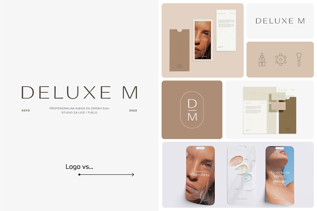
A logo is one thing. Giving it a whole personality is another. 👀
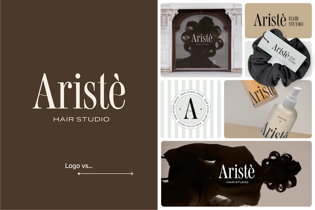
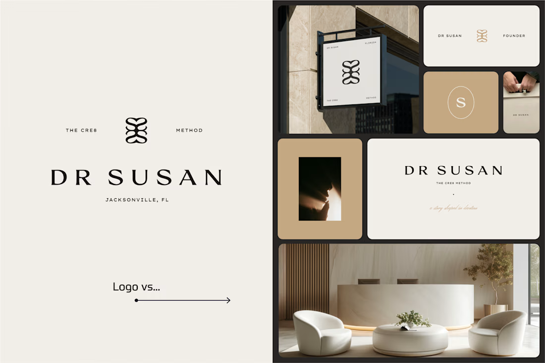
I picked a few of my branding projects to show what happens beyond the logo.
First, the logo on its own. Then, the full visual identity: colours, typography, graphic elements, patterns, packaging, and all the little details that make each brand feel like itself.
Because I don't want a logo to just look good sitting on a presentation slide. I want to see what it can become when it gets out into the real world.
Every project has a different story, personality, and visual direction. And that's probably my favourite part of brand design: figuring out how to turn one initial idea into a whole visual language.
Swipe through and meet the logos, then their bigger personalities. ;)
A logo is the starting point. The fun really begins after that.
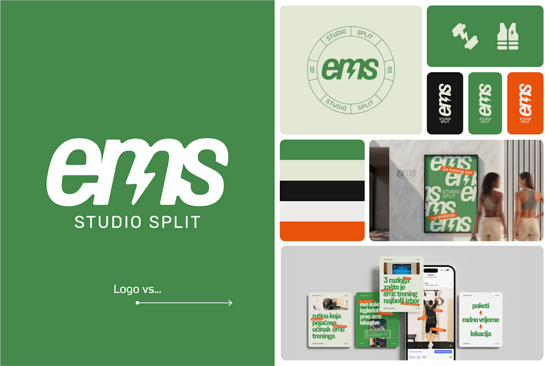

Clever use of the lightning bolt in the EMS logo!

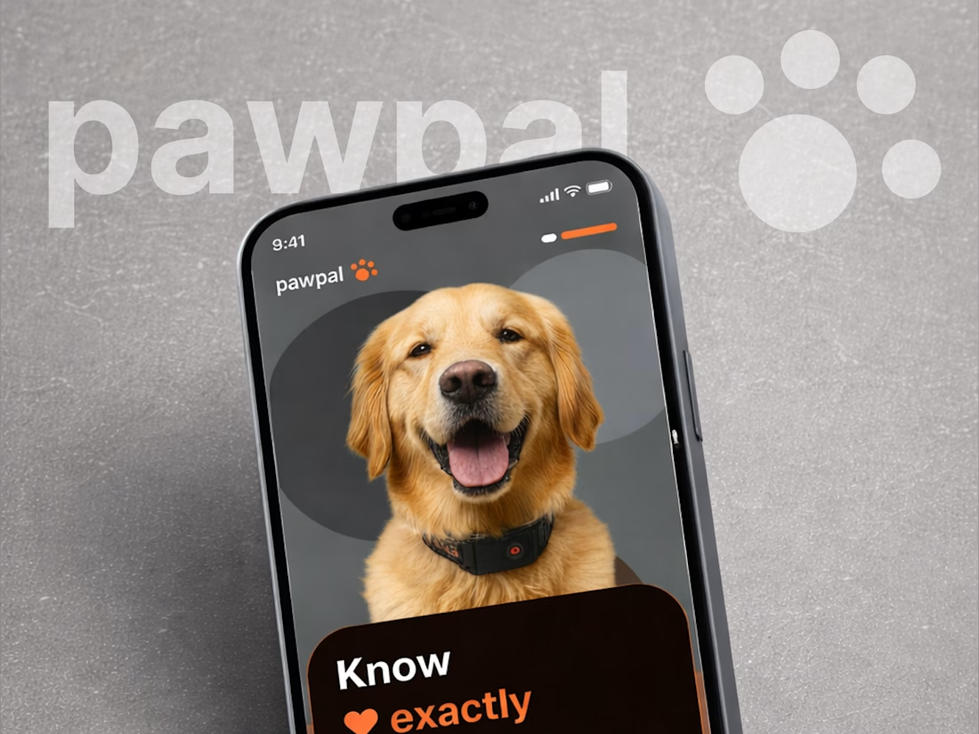
Pawpal - Pet GPS Tracker Mobile App UI Design 🐾
🐾 Pawpal - Keeping Your Best Friend Close
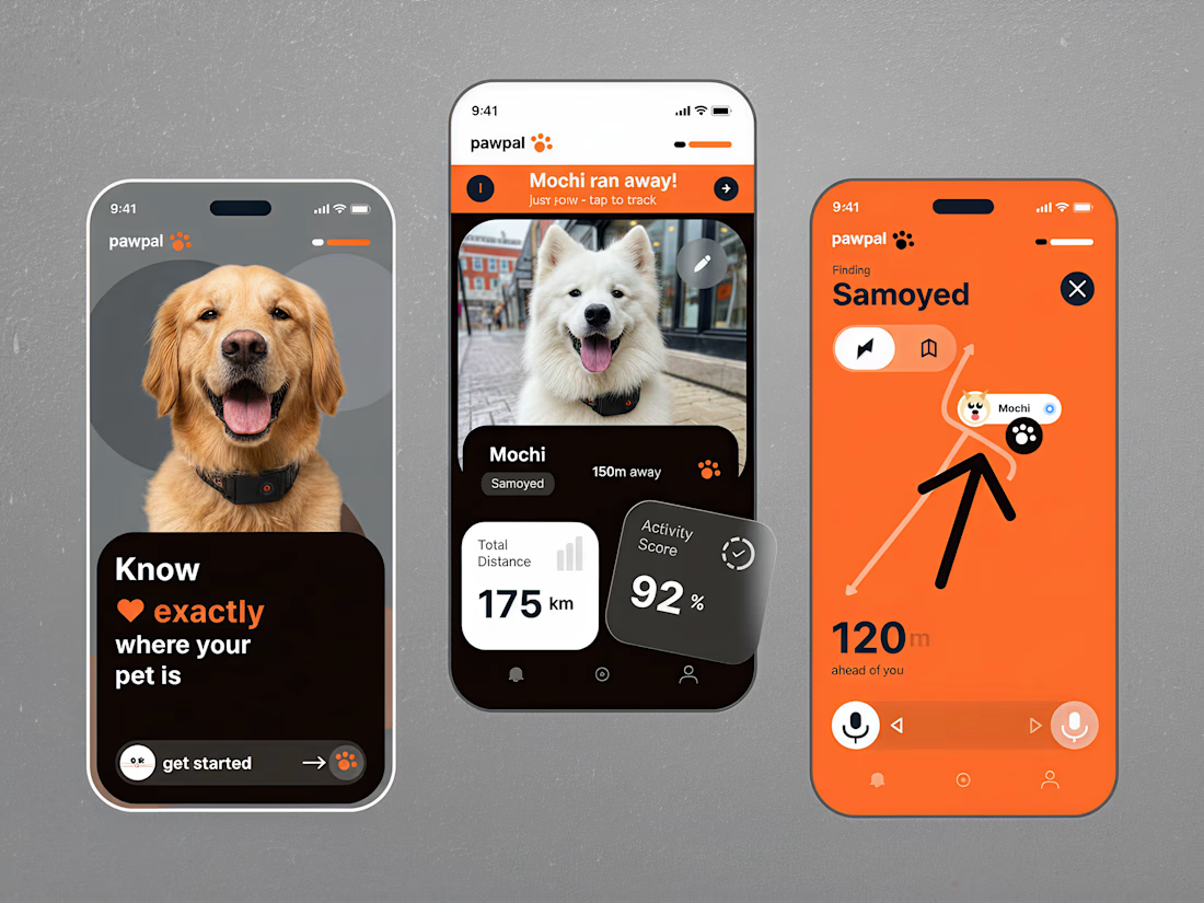
A playful yet practical mobile app concept designed to make pet tracking feel simple, reassuring, and engaging. Pawpal brings together real-time location tracking, activity insights, and a friendly visual experience built around the bond between pets and their owners.
Special attention was given to:
• Bold orange accents, rounded UI elements, and a warm, pet-friendly visual identity
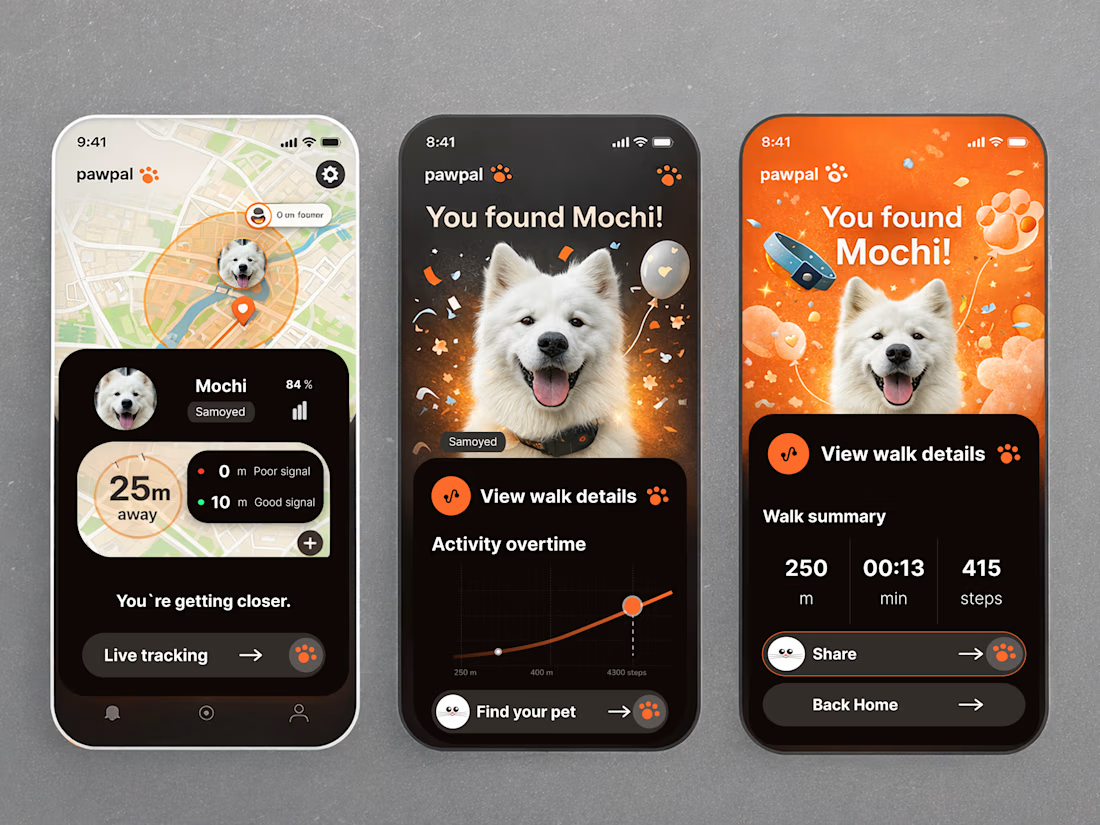
• Intuitive GPS tracking screens with maps, distance indicators, and clear location updates
• Personalized pet profiles featuring large photography and essential activity information
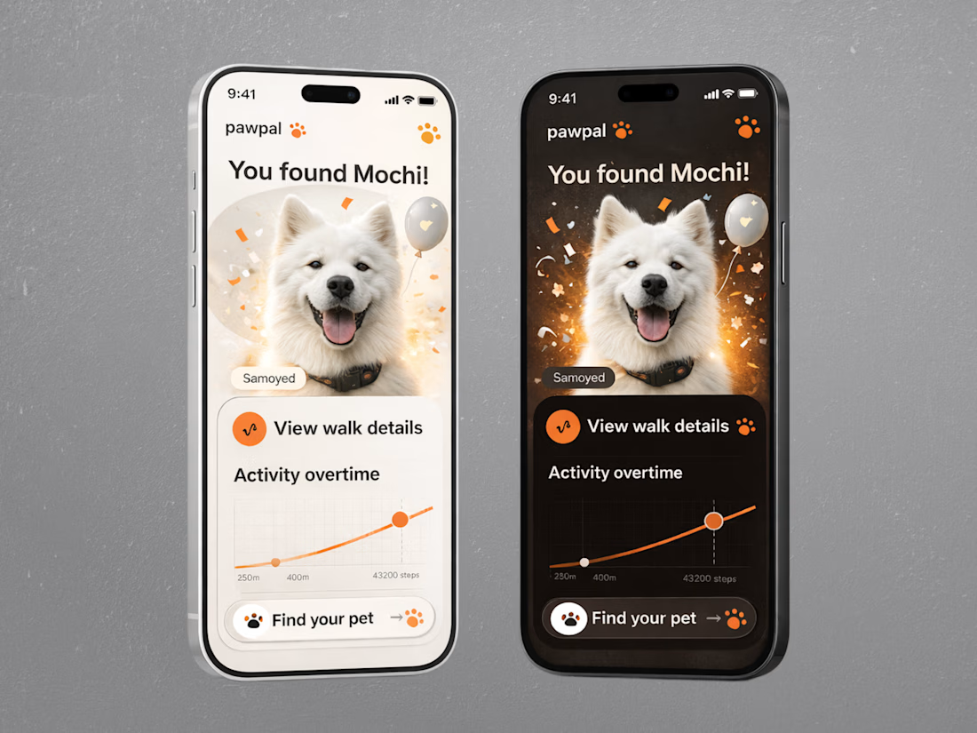
• Light and dark interface variations with consistent visual hierarchy
• Engaging success screens, activity charts, and walk summaries that make everyday pet care more enjoyable
The result is a friendly, modern mobile experience that balances useful tracking features with a little personality. Every screen is designed to make important information easy to find while keeping pets at the heart of the experience.
Have an idea for a pet care or lifestyle app? Let's bring it to life together! 🧡