The network for creativity
Join 1.25M professional creatives like you
Connect with clients, get discovered, and run your business 100% commission-free
Creatives on Contra have earned over $150M and we are just getting started
Back to feedPost
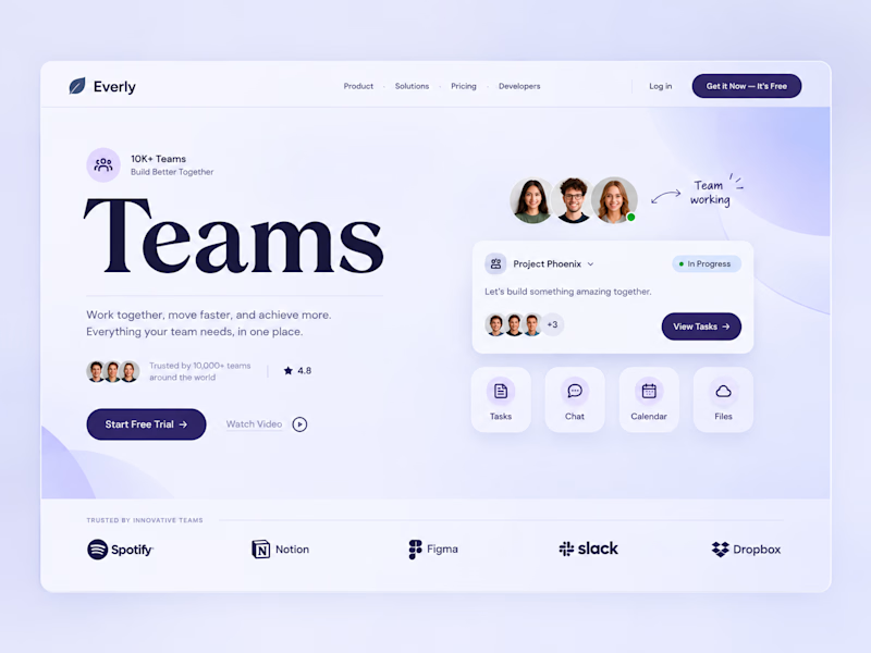
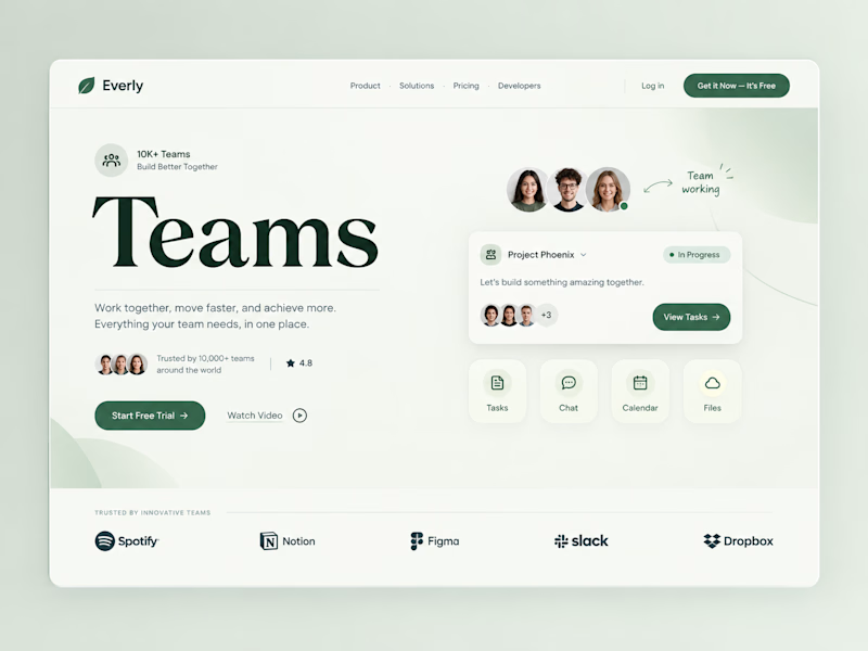
Taste Test
Two color directions, same team-collab pitch.
Sometimes the "safe" color isn't the smarter choice.
Which color would make you trust this tool with your team? 👇


9 votes
Ends in 1d


Both Are looking good But I will go with calm and fresh one It looks more pretty 🙌

Appreciate your feedback 😍

Thanks for the feedback, means alot🙌

Calm and fresh. For a team tool I'd trust the green, since the purple reads like every other SaaS landing page.

calm and fresh


Superb design !
The network for creativity
Join 1.25M professional creatives like you
Connect with clients, get discovered, and run your business 100% commission-free
Creatives on Contra have earned over $150M and we are just getting started





Related posts

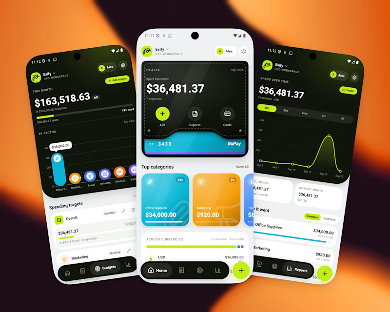
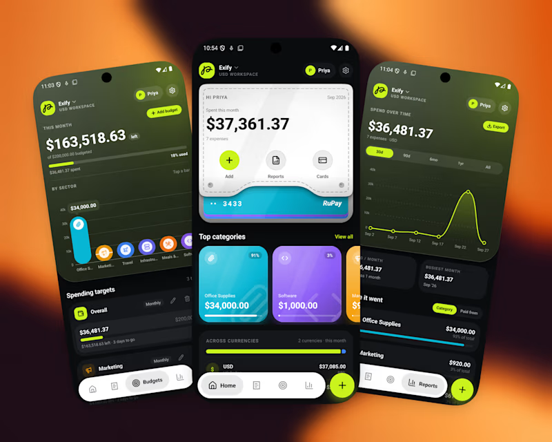
A great app should not just function, It should feel visually distinct
When the market is full of similar-looking products, design becomes part of the product’s well identity
For this finance project, we focused on a sleek UI, intuitive UX, and a visual language that doesn’t feel generic
Both dark and light modes were designed to feel equally intentional.
Which one do you prefer?
10 voted
56%
8 voted
44%
18 votes
Closed

I’d go with Light Mode. 👌 It feels fresh, clean, and the UI elements stand out beautifully against the background. Both are strong, though! 🔥

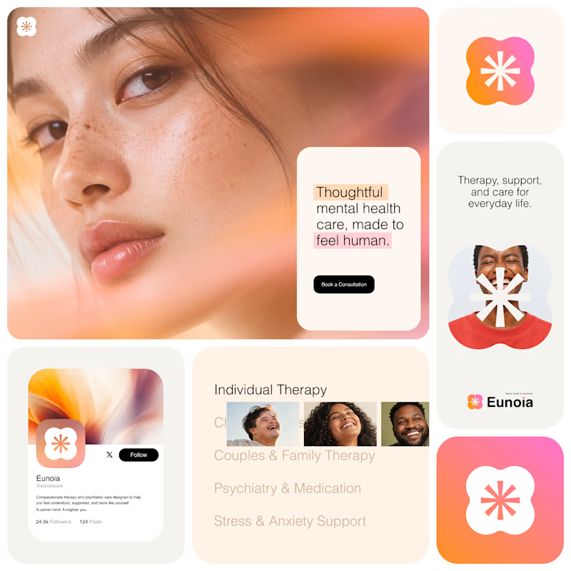
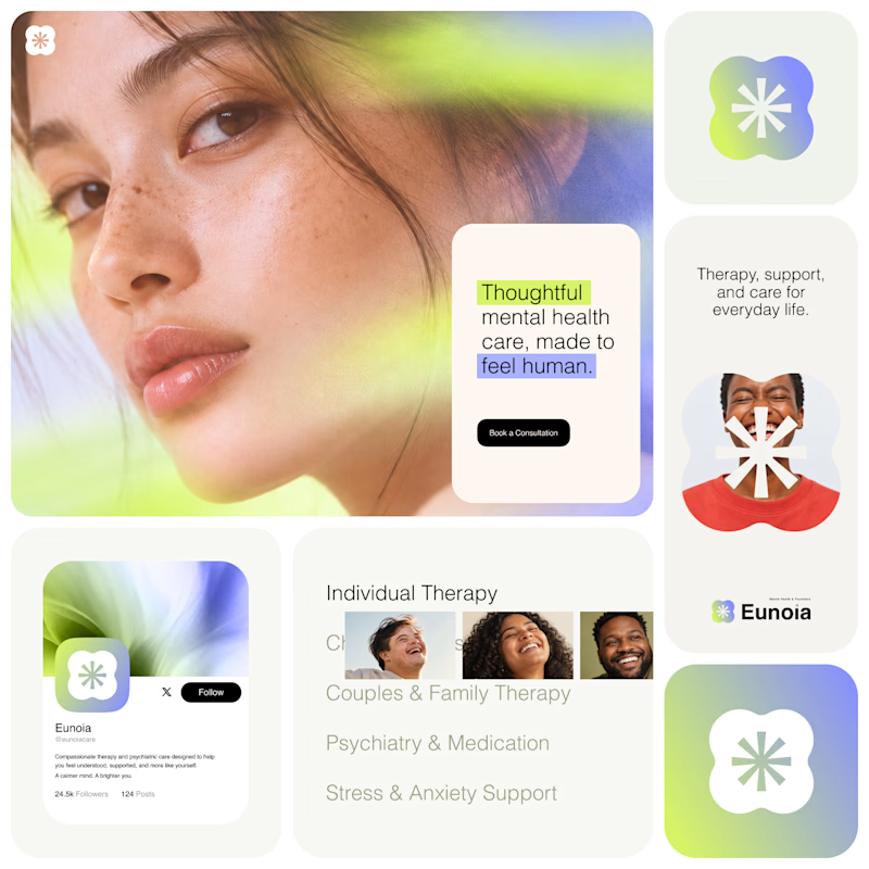
Exploring two visual directions for Eunoia, a mental health & psychiatry brand.
Direction 01 - Warm peach, orange and soft pink tones for a calm, human and comforting feel.
Direction 02 - Lime and periwinkle tones for a fresher, more optimistic and contemporary expression.
Same brand system. Different emotional energy.
32 voted
52%
29 voted
48%
61 votes
Closed

That's impactful, love to see fresh styles

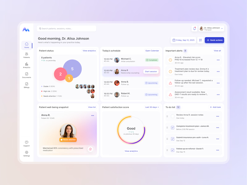
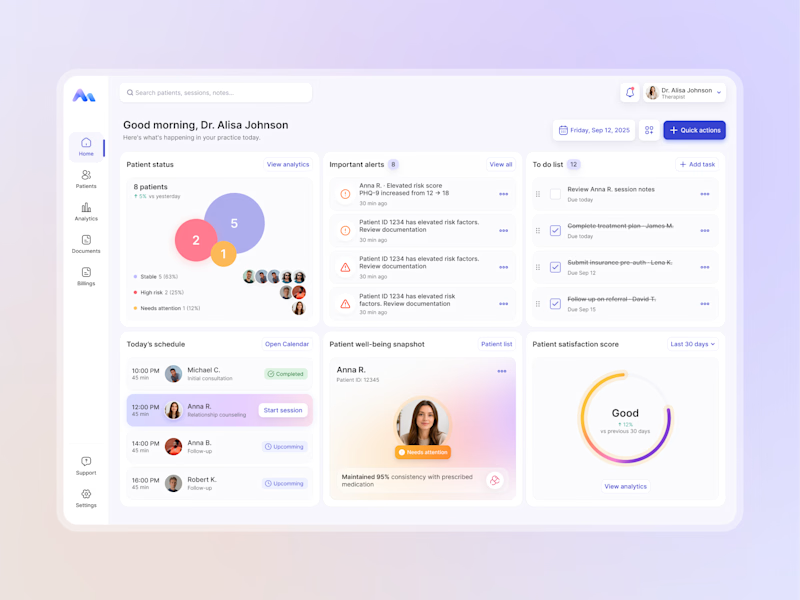
Designing for therapists means prioritizing what matters in the next few minutes, not just what looks good on a dashboard.
I explored two layout directions for a mental health practice management web app that helps psychologists manage sessions, patients, documentation, tasks, and follow-ups.
Both concepts use the same core widgets, but with different positioning and visual hierarchy. The goal was to make daily priorities easier to scan and act on.
Which option feels more intuitive - A or B? 🤔
17 voted
68%
8 voted
32%
25 votes
Closed
