The network for creativity
Join 1.25M professional creatives like you
Connect with clients, get discovered, and run your business 100% commission-free
Creatives on Contra have earned over $150M and we are just getting started
Back to feedPost
Taste Test
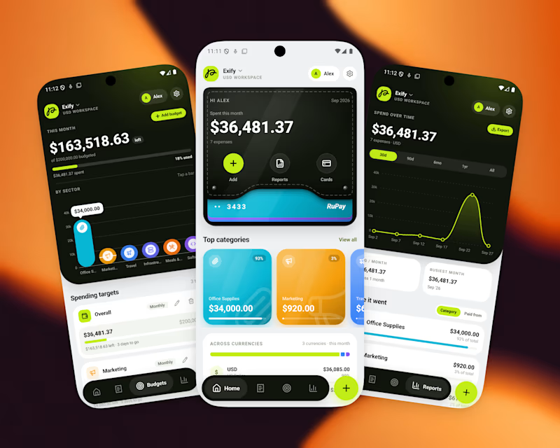
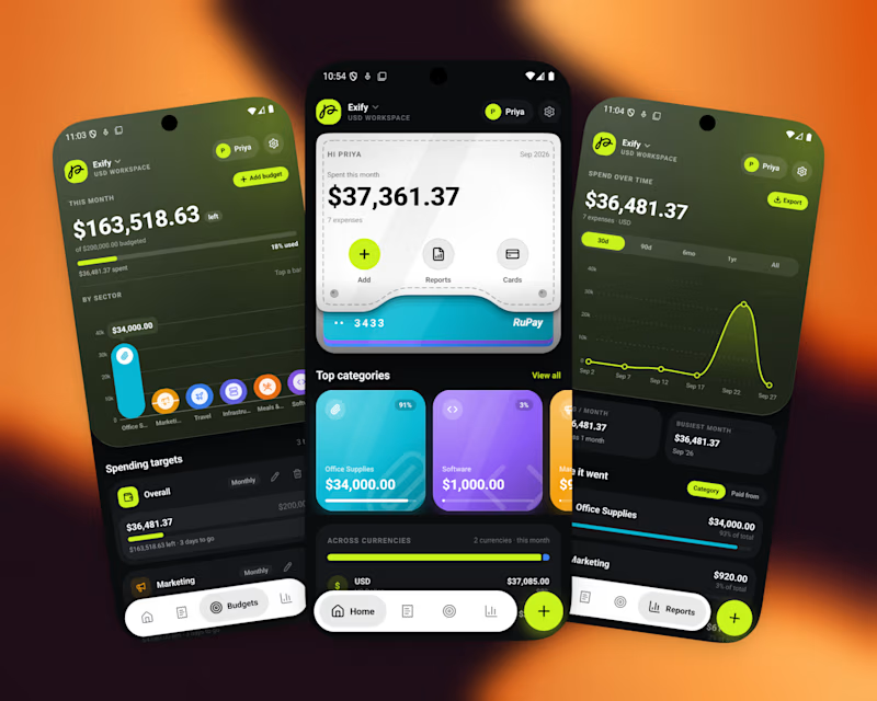
A great app should not just function, It should feel visually distinct
When the market is full of similar-looking products, design becomes part of the product’s well identity
For this finance project, we focused on a sleek UI, intuitive UX, and a visual language that doesn’t feel generic
Both dark and light modes were designed to feel equally intentional.
Which one do you prefer?

10 voted
56%
8 voted
44%
18 votes
Closed

light mode

Glad you liked the light mode @Sahil Sharma

I choose dark mode but both of them are great but you need to balance between darkness and lightness of the colors in light mode UI specially the one in center
Great observation @Mostafa Moamen, Thank you!

Light mode
I'm glad you liked it @Shubhang Chouhan

Nice Good Job Bro
Thanks @Syed Aman Abbas Naqvi

Dark Mode for a finance app. It makes the charts and balances pop, feels premium, and is easier on the eyes for people checking numbers late at night. Light is cleaner for onboarding but the daily driver here should be dark. These mockups look sharp either way.
That's very sharp insight, Loved your take on this. Thanks @Aditya Pandey

I'm glad you liked it. Thanks @Ganesh S

I loved the dark mode!
Good choice @Zulker Naeen Hamim Thank you!

Light mode! Dark one is making the screen look too heavy.
Good choice @Leena | Product Design, UX/UI & Web and thank you for the observation you shared.

Exactly. A strong visual identity can make a finance app feel much more premium and memorable. Both modes look intentional here.
I'm happy you liked it, Thanks @Devowise Studios


Well done !
Thank you @Sahil Dobariya

I’d go with Light Mode. 👌 It feels fresh, clean, and the UI elements stand out beautifully against the background. Both are strong, though! 🔥
Thanks @Shohel Rana I'm glad you liked both the variation.
The network for creativity
Join 1.25M professional creatives like you
Connect with clients, get discovered, and run your business 100% commission-free
Creatives on Contra have earned over $150M and we are just getting started











Related posts

A little peek at the brand work we did for Elio Mortgage.
A warm, approachable identity full of warm vibrant colors paired with soft sun rising inspired gradients, inner glows and custom illustrations & more. Loved this direction!
Full case study coming soon, from process to final identity.
Plenty of logo explorations to share too!


That color palette takes the whole identity to a different level!! I loove it.

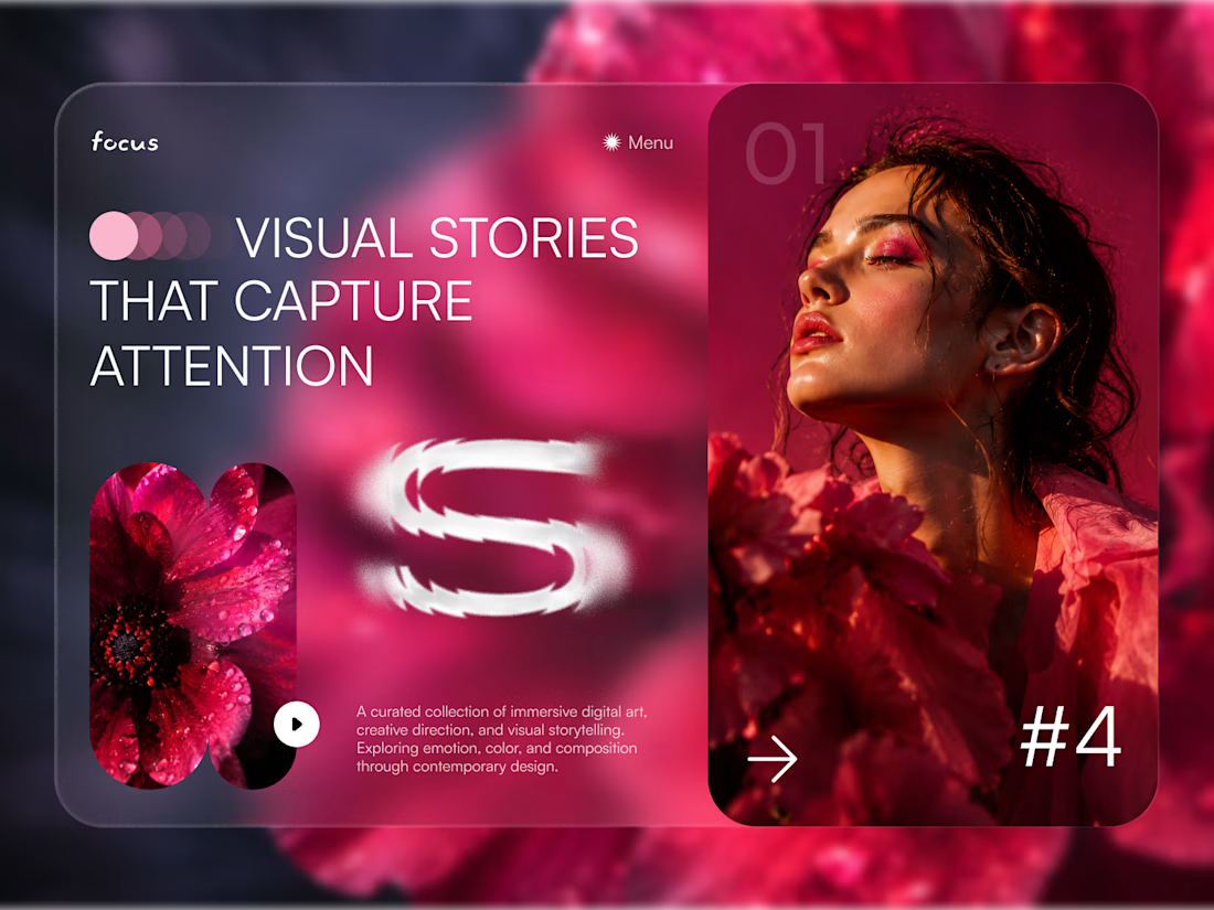
FOCUS — Creative Portfolio & Digital Art Website 🌸✨
A visually expressive website concept for a creative portfolio, built around digital art, bold imagery, and visual storytelling
The design combines vibrant pink tones, soft gradients, experimental typography, and immersive photography to create a distinctive editorial experience
Special attention was given to:
• Bold editorial hero composition
• Vibrant pink and dark color palette
• Experimental typography and visual details
• Immersive photography and digital artwork
• Creative project gallery and navigation
• Responsive mobile experience
• Clean layouts with a strong visual identity
The result is an expressive digital experience that puts creativity, emotion, and visual storytelling at the center of every screen 💗
Looking to create a standout portfolio or website for a creative brand? Let’s connect 🚀

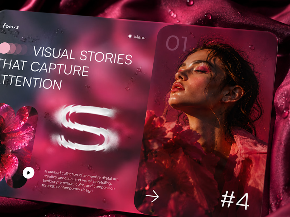
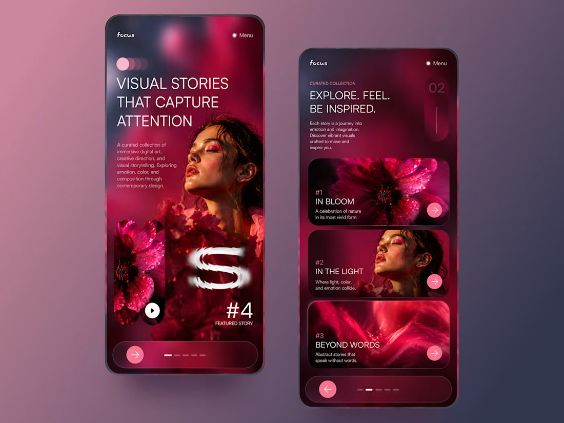

The vibrant pink against the dark palette gives this such a bold editorial feel. The experimental typography is the star here.

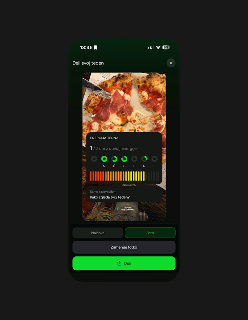
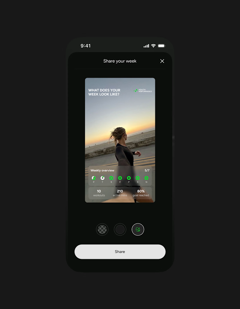
This week client came to me with a new idea for their app's share feature. They were trying something with Claude... But let's simplify this thingy:)
Let's remove all the buttons that confused me already - imagine what they'd do to a user...
Take our predefined bottom sheet and give our users 3 simple choices.
GOALS:
make it as simple as possible for our target persona (35-55 y/olds that aren't necessarily as modern and advanced in tech)
Create an aesthetically pleasing UI frame for stories, that makes people want the app & their lifestyle.
Which one would you go with?
SPOILER ALERT 🚨 we absolutely went with the after result😆
0 voted
0%
5 voted
100%
5 votes
Closed

Afterrrrr😊