The network for creativity
Join 1.25M professional creatives like you
Connect with clients, get discovered, and run your business 100% commission-free
Creatives on Contra have earned over $150M and we are just getting started
Back to feedPost

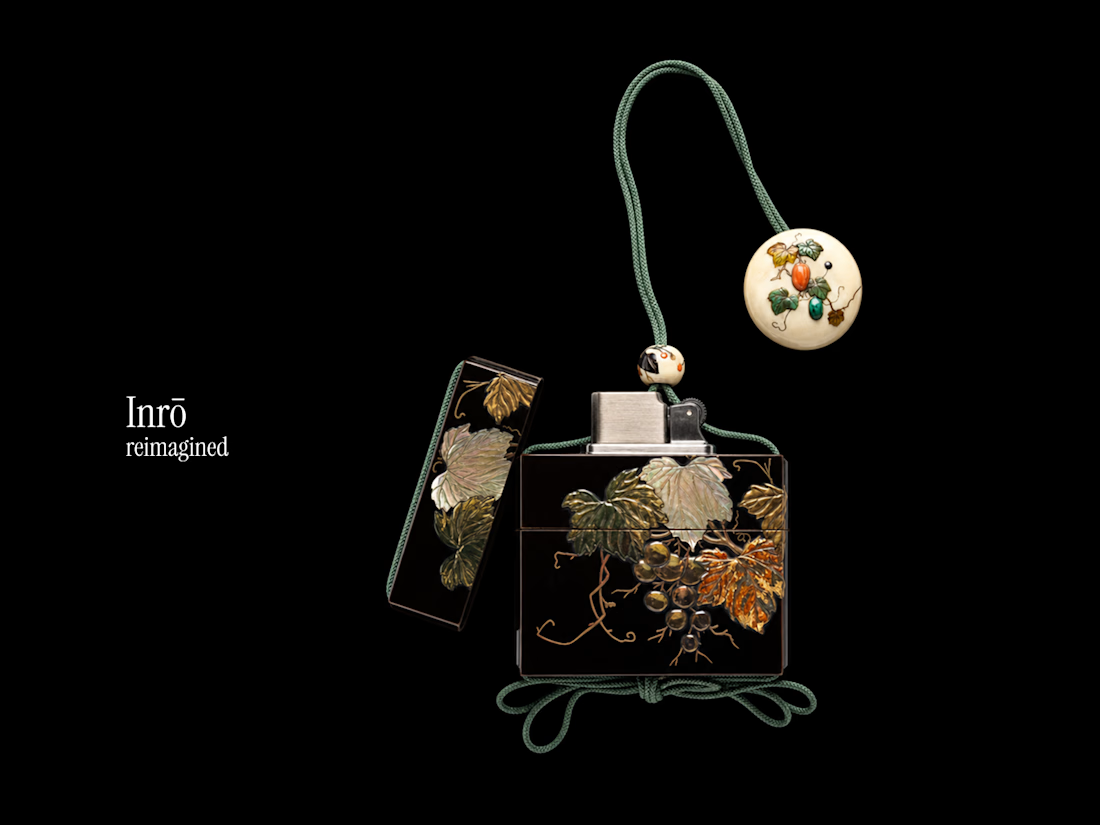
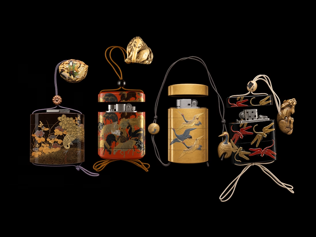
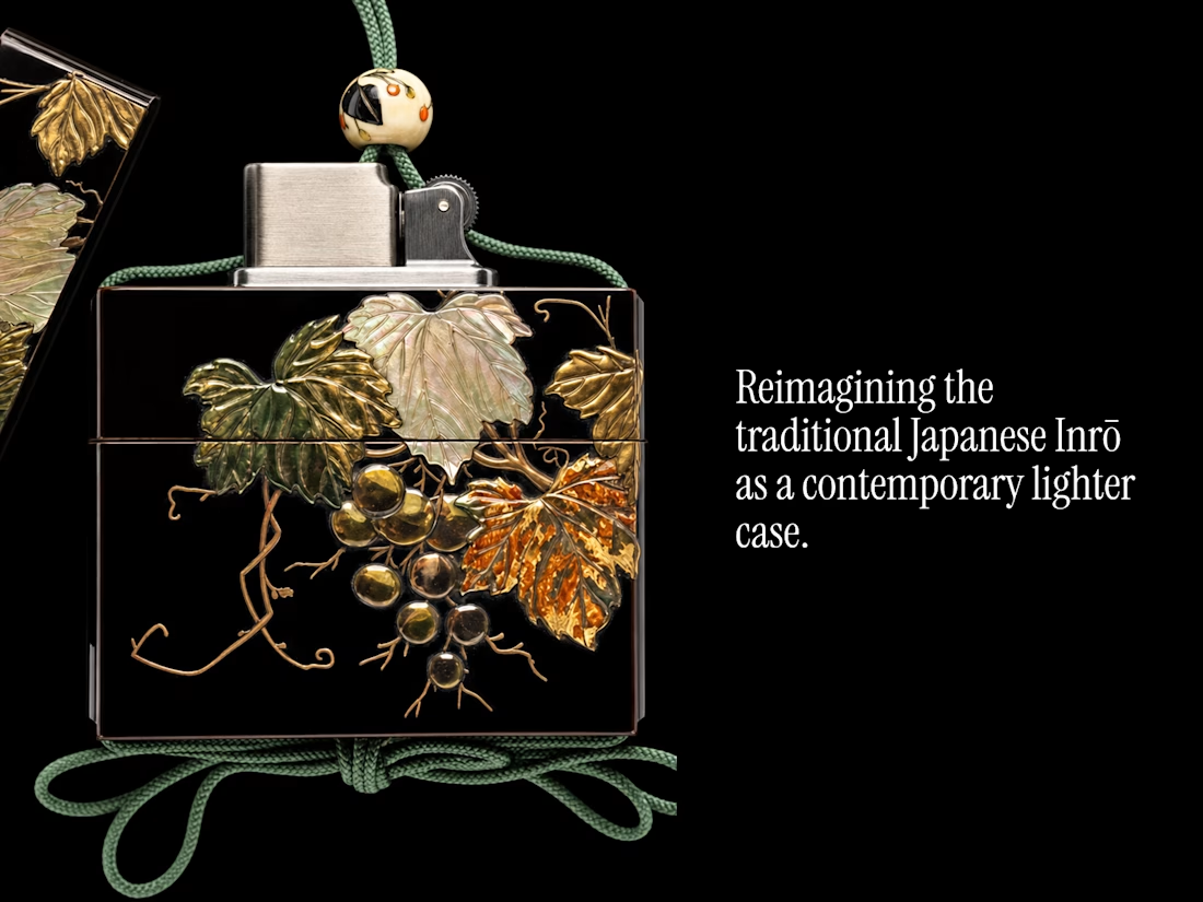
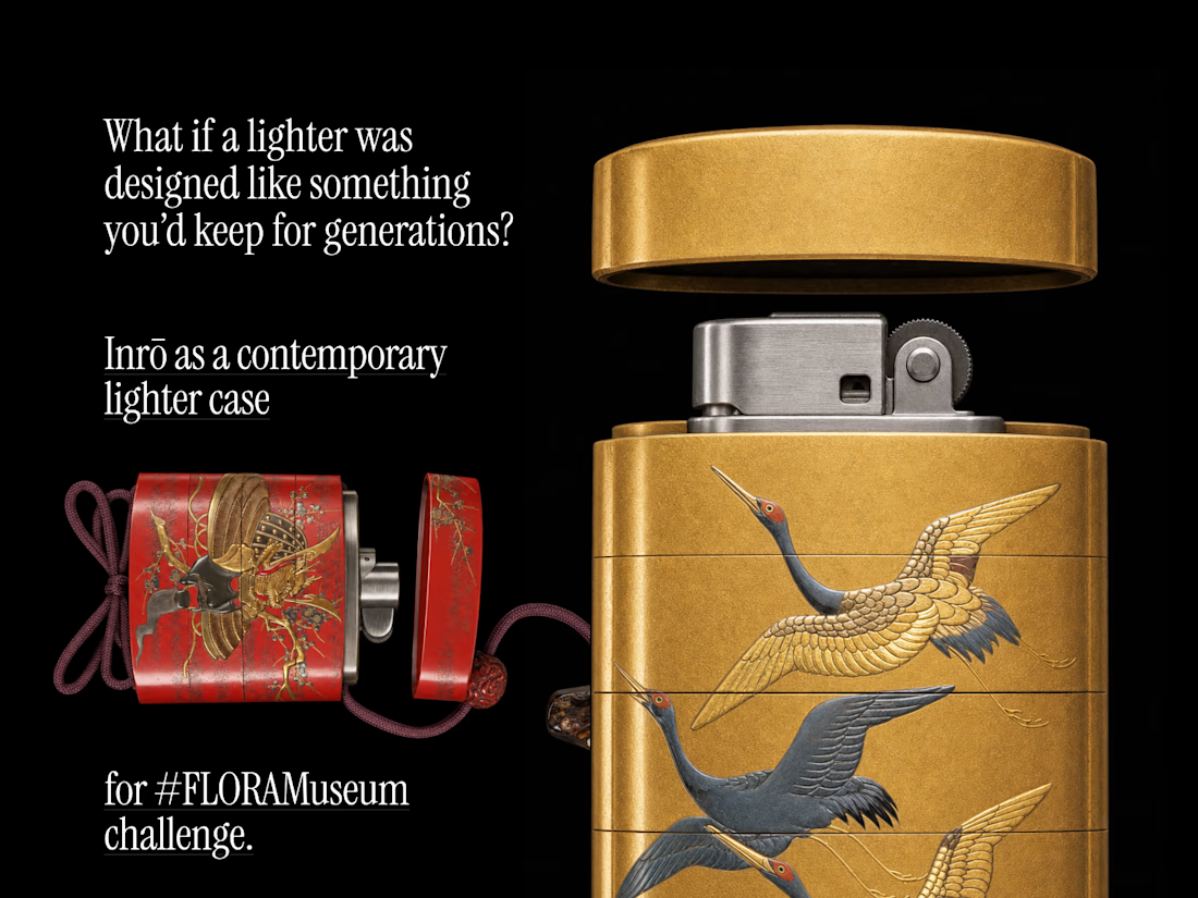
Reimagining the Inrō as a contemporary lighter case.
The Inrō was originally a small, highly refined everyday-carry object designed to hold personal items or stamps.
The problem I’m exploring is that everyday objects like lighters are often disposable, generic, and designed without much emotional or personal value. I want to ask:
What would a lighter look and feel like if it were designed as an object worth keeping?
The Met’s Inrō collection becomes my historical design reference, while FLORA becomes the space where I research, reinterpret, prototype, and visually develop the idea.
links:
Flora: https://app.flora.ai/join-project/7ea98b7b-e261-4ca6-9ce1-ae0824652cf5
The Met's public domain archive of works links
https://www.metmuseum.org/art/collection/search/58927
https://www.metmuseum.org/art/collection/search/58569
https://www.metmuseum.org/art/collection/search/58803
https://www.metmuseum.org/art/collection/search/58820
https://www.metmuseum.org/art/collection/search/58616
https://www.metmuseum.org/art/collection/search/58373
sitaram



I wish i had one irl!
I know right!!! Now gonna make one irl!!
The network for creativity
Join 1.25M professional creatives like you
Connect with clients, get discovered, and run your business 100% commission-free
Creatives on Contra have earned over $150M and we are just getting started





Related posts


Premium doesn’t have to mean boring.
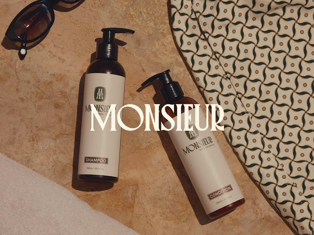
Monsieur started with a clear ambition: build a grooming brand that felt elevated and confident, without slipping into the usual world of black packaging, old-school barbershops and overly masculine clichés.
So we built the identity around a different kind of luxury. Refined, warm and full of personality.
A brand that can sell grooming products today, but has enough range to grow into something much bigger tomorrow.
Do you think premium brands are finally moving away from the idea that luxury has to feel serious?
Full Monsieur case study now live 👇


Monsieur avoiding black barbershop clichés while still feeling premium is a hard lane for grooming. Warm personality with room to grow beyond SKUs feels like the win.
Does an AI brand still need to look like an AI brand?
Lupr helps small and growing businesses adopt AI without the complexity, so the identity needed to do the same.
We built a clean, approachable system around movement, connection and continuous improvement, without leaning on the usual futuristic tech clichés.
The idea was simple: make AI feel like useful business infrastructure, not something you need to be an expert to understand.
As AI becomes part of everyday business, do you think brands still need to visibly signal “AI”?
Full case study below 👇

Great design it feels alive 🎉🎉❤️❤️

Four brands. Four personalities. One design philosophy: make simplicity feel intentional.
When I started working on this collection, I wasn’t interested in creating logos that were simply clean or visually attractive.
I wanted each identity to feel like it belonged to a real, established brand — something you could imagine seeing on luxury packaging, storefront signage, editorial campaigns, menus, clothing labels, or premium property marketing.
The challenge was creating that high-end feeling without overdesigning.
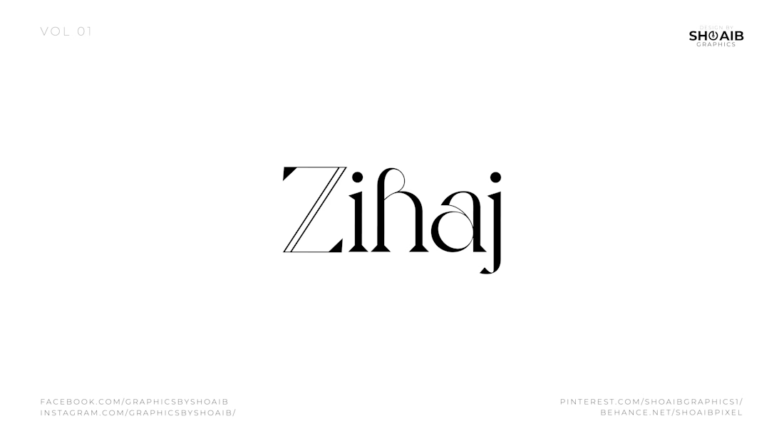
For Zihaj, I explored expressive editorial typography. The contrast between sharp and flowing letterforms gives the wordmark a fashion-forward personality while keeping it sophisticated and memorable. Rather than adding a separate symbol, the typography itself becomes the identity.
Aristowear takes a different approach. Here, the oversized AW monogram becomes the visual signature. The thin, elegant proportions and high-contrast letterforms were designed to communicate refinement, femininity, and an elevated fashion aesthetic. The goal was to create something that could work just as naturally on a clothing label as it would across premium packaging or a storefront.
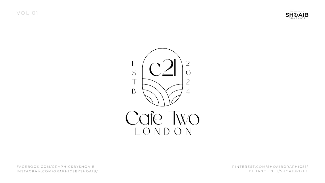
For Cafe Two London, I wanted the identity to feel more architectural. The C21 emblem sits inside an arched structure, supported by subtle curved linework underneath. Combined with the ESTB and 2024 details, it creates the feeling of a contemporary London café with an established, carefully considered visual presence.
Then came Oasis Towers.
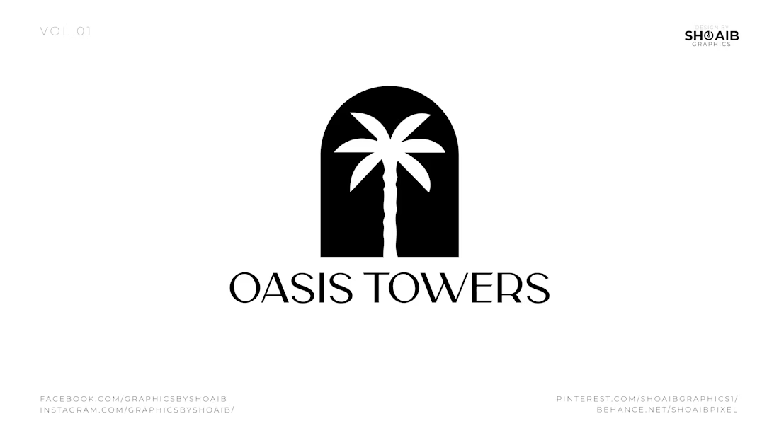
Instead of relying only on typography, I built the concept around a simple architectural arch containing a palm tree. The arch communicates structure and property, while the palm introduces the idea of an oasis, lifestyle, and destination. The result is a bold symbol that can remain recognizable even when the brand name is removed.
What connects all four identities is restraint.
No unnecessary elements.
No decoration added just to fill space.
No complicated symbols that need to be explained.
Every curve, letter, proportion, and piece of negative space has a purpose.
That is the approach I bring to identity design: understand the personality first, then reduce the idea until only the strongest visual elements remain.
Because a premium logo isn't created by adding more.
It comes from knowing exactly what to leave out.
If you're building a fashion, hospitality, lifestyle, real-estate, or premium consumer brand and want an identity that feels distinctive rather than template-driven, I'd love to help shape it.
Available for freelance logo design, visual identity & branding projects.



which of the four was hardest to keep from tipping into overdesigned?