The network for creativity
Join 1.25M professional creatives like you
Connect with clients, get discovered, and run your business 100% commission-free
Creatives on Contra have earned over $150M and we are just getting started
Back to feedPost
LOGO DESIGN: Apexforce LTD.
CHALLENGE: It was to make a logo that stood out in their industry(pesticide manufacturing), a market with maximalist design, We leaned to the opposite direction, minimalism.
SOLUTION(my thought process): As I went down the word map on the words apex and force I found apex was synonymous with peak which also related to the word mountain as in the peak of mountain. And i built it from there
RESULT: I made a triangle and made the edges soft and added the letter A from the brandname(ApexForce), finally i made the design hollow.

The network for creativity
Join 1.25M professional creatives like you
Connect with clients, get discovered, and run your business 100% commission-free
Creatives on Contra have earned over $150M and we are just getting started
Related posts
Most brand designers start with visuals. I start with strategy.
Here's the actual workflow I use to build brand identities from positioning to final system, using three AI tools and Figma.
Claude helps me with thinking. Positioning, messaging frameworks, competitive analysis. The brand direction is locked before I open a design file.
Midjourney helps with exploration and for testing 20 visual directions in the time it takes to sketch one.
Figma is where it all comes together. Every decision traces back to the strategy. Nothing decorative, everything intentional.
The tools changed but the principle didn't.
Do you think there’s a big difference between Claude and GPT when it comes to conceptualization support and creative process support ?
Recharging for this week has been amazing and I can’t wait for OFFF Barcelona.
Anybody coming as well?
Impressive
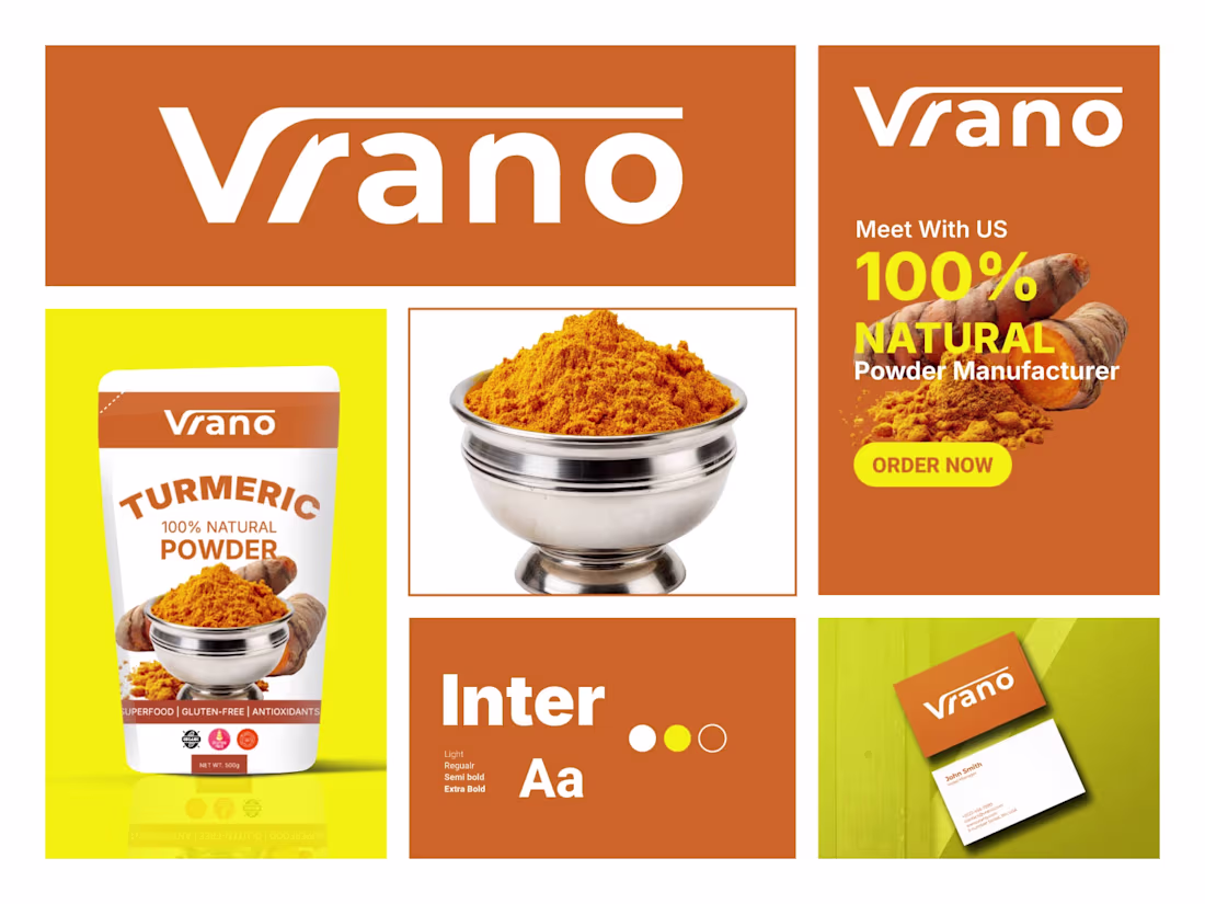
Vrano – Turmeric Powder Brand Identity & Packaging Design
Complete brand identity design for Vrano – a premium 100% natural turmeric powder manufacturer.The identity features a bold, modern logo with warm orange tones that instantly communicate energy, purity, and the vibrant essence of turmeric.
The system includes:
1. Primary logo lockup
2. Packaging design for stand-up pouch (500g)
3. Color palette with signature orange and complementary yellow-green
4. Typography system (Light, Regular, Semi Bold, Extra Bold)
5. Business card mockup
6. Promotional banner with strong call-to-action
The design aims to position Vrano as a clean, trustworthy, and appetizing superfood brand that stands out on spice shelves while maintaining a premium yet approachable feel.Focused on shelf impact, clarity, and natural product storytelling through vibrant turmeric imagery.What do you think of this brand system?
Feedback is always appreciated!
Ready to dominate?
👉 Say goodbye Unmemorable Logo, Branding, Social Media Post & Packaging Design Hello to memorable and Recognisable design!🌟
📩 Available for new projects
looks stunning, great job 👌
Trending
Runway
AI video generation is exploding. What are you dreaming up in Runway?
Contra University
Learn from expert creatives how to earn more using next-gen AI tools.
creativeaiflow
Creative AI workflows are evolving. What tools do you use, and what are their strengths and weaknesses?
portfolioreview
The best portfolios tell a story, not just show a grid. Share yours for feedback.
freelancerlife
Freelancer life is wins, pivots, and everything in between. What’s yours right now?