The network for creativity
Join 1.25M professional creatives like you
Connect with clients, get discovered, and run your business 100% commission-free
Creatives on Contra have earned over $150M and we are just getting started
Back to feedPost
Taste Test
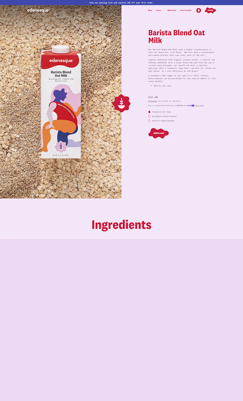
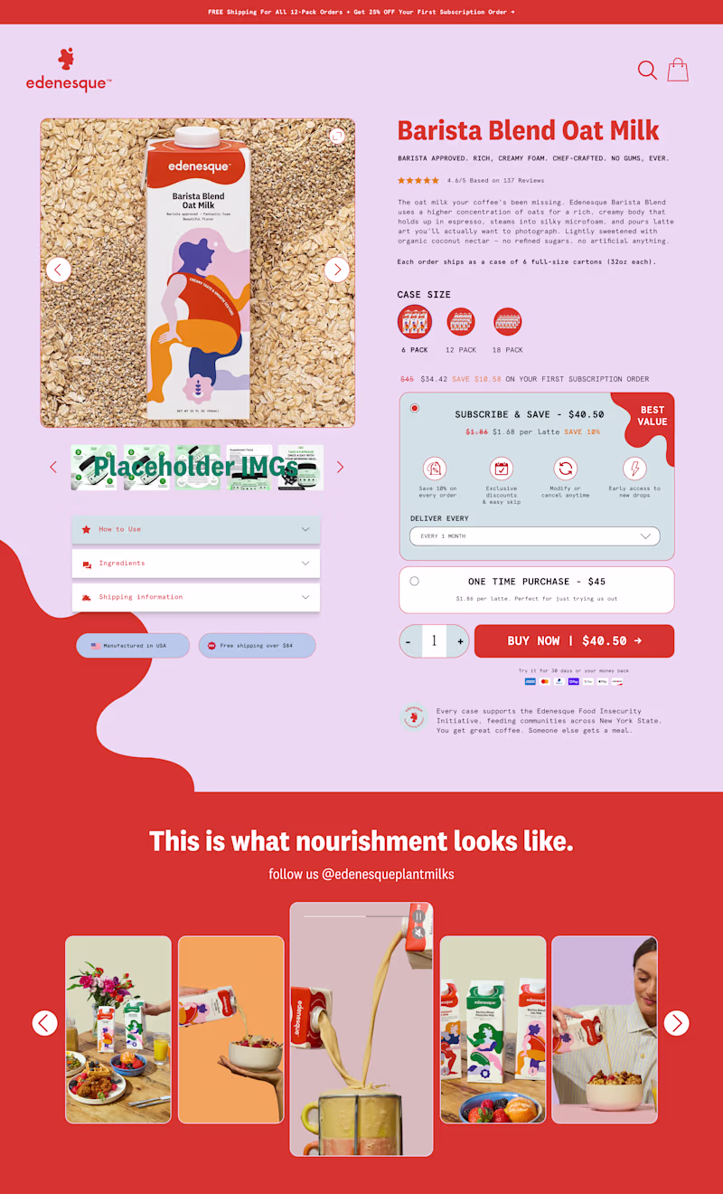
Two FAQ versions. Which one is better for you?
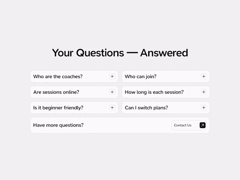
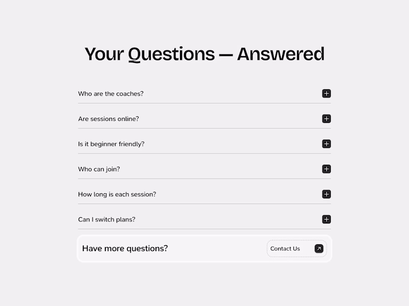
36 votes
Ends in 7h
the first one is clearer and easy to read
Okay!
The first one feels simpler layout to read more quickly
Got it, thank you for opinion, Abi!
I like the first version better
Okay, got it!
The First version is good for visualising, but I go with the second version just because when it expands, the accordion covers the full width of the section instead of the First version. And when you expand the First version accordion, then the right column leaves more space, and it's not looking good.
Good point, Dhaval. Thank you!
Got it! Cool!
First one looks better
Appreciate your opinion!
The first version is the best!
What's so good about it? :)
This first version has a lot of great foundational UI/UX elements going for it
For aesthetics, first version. For functionality + aesthetics, definitely second version. And I'd always pick functionality + aesthetics any day. Both versions are beautifully designed nonetheless. 👏🏽
Thank you, really great answer, I like it!
definitely the left one, it feels much cleaner
Got it! Thanks for opinion!
The second version is generic, but the first version has some taste 👍
Got it, Aman!
Why?
That's valid! Thank you for your opinion!
I prefer First Version
Why?
The network for creativity
Join 1.25M professional creatives like you
Connect with clients, get discovered, and run your business 100% commission-free
Creatives on Contra have earned over $150M and we are just getting started
Related posts
Working on the UI/UX design flow for this screen.
If you were the player, which would you prefer?
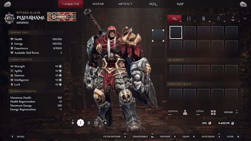
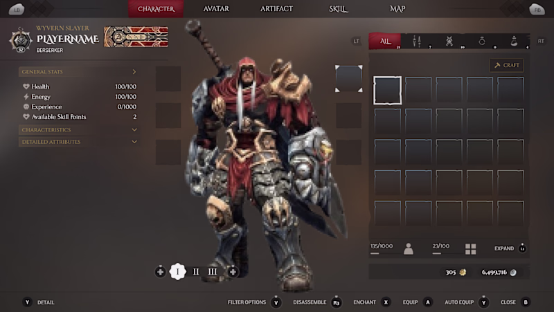
6 votes
Ends in 1d
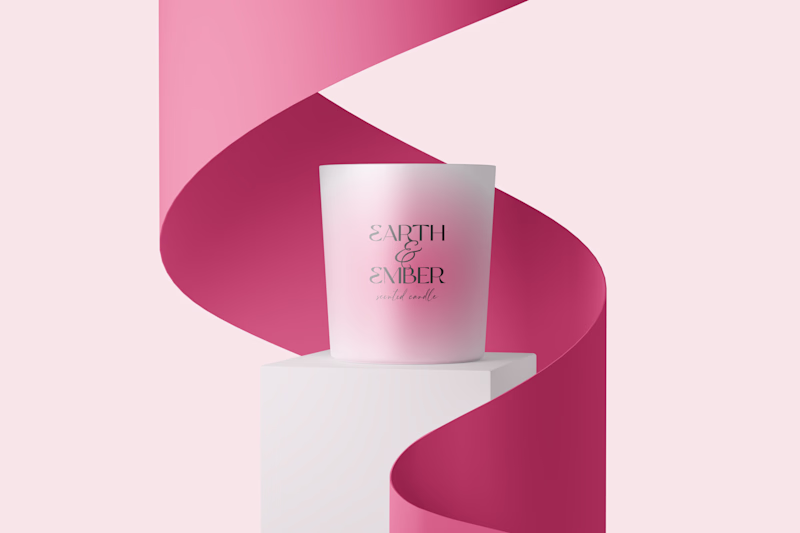
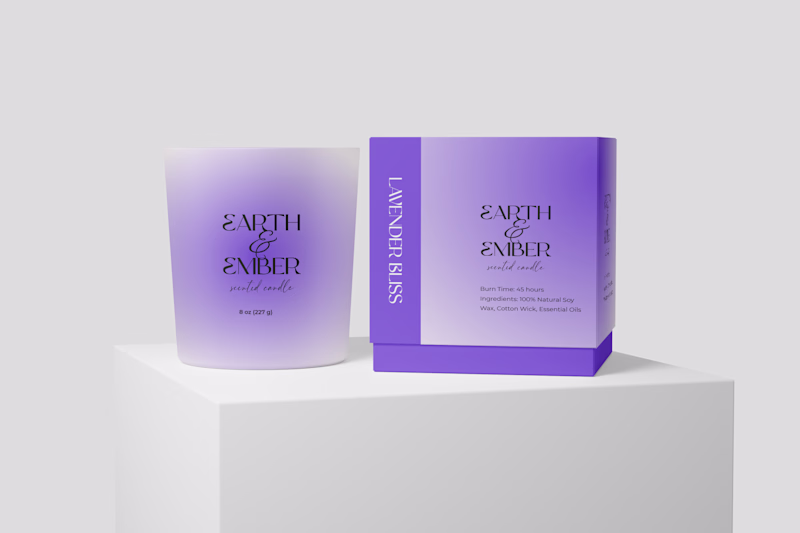
which one will you prefer?
Brand DesignPackaging DesignVisual DesignAdobe PhotoshopAdobe Illustratorfreelancerlifelogoexplorationpackaigng
4 votes
Ends in 16h
Love the both, but will go for option 1
Trending
Claude
Claude has entered the design space. How are you using Claude Design?
Contra University
Learn from expert creatives how to earn more using next-gen AI tools.
creativeaiflow
Creative AI workflows are evolving. What tools do you use, and what are their strengths and weaknesses?
portfolioreview
The best portfolios tell a story, not just show a grid. Share yours for feedback.
freelancerlife
Freelancer life is wins, pivots, and everything in between. What’s yours right now?