The network for creativity
Join 1.25M professional creatives like you
Connect with clients, get discovered, and run your business 100% commission-free
Creatives on Contra have earned over $150M and we are just getting started
Back to feedPost
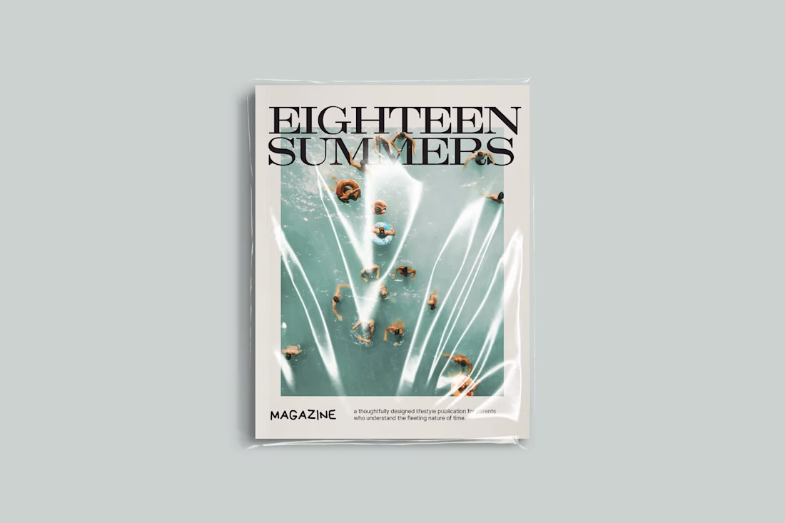
EIGHTEEN SUMMERS is art direction first, layout second. I established a seasonal structure and then designed around it, using pacing, white space, and image hierarchy to let the story breathe instead of suffocating it with decoration. Typography does a lot of the heavy lifting. Clean, editorial fonts paired with intentional scale shifts create rhythm across pages so it actually feels like something you’d want to flip through, not just politely admire once.
Visually, I leaned into restraint. Soft color palettes, consistent spacing, and minimal but thoughtful graphic elements keep it cohesive while still letting the photography carry emotional weight. Every spread feels considered, not crammed. The result is a publication that feels personal without being chaotic and elevated without trying too hard, which is a rare combo considering most people would’ve turned this into a glitter glue situation within five pages.
The network for creativity
Join 1.25M professional creatives like you
Connect with clients, get discovered, and run your business 100% commission-free
Creatives on Contra have earned over $150M and we are just getting started
Related posts
This looks clean and well thought out. How long did it take you to bring everything together?
It was a truly rewarding experience designing a brand identity for ⚓️ Anchor Lex, translating its values into a clear visual language. ✨
top class work 🔝
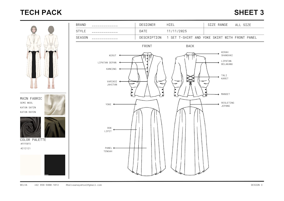
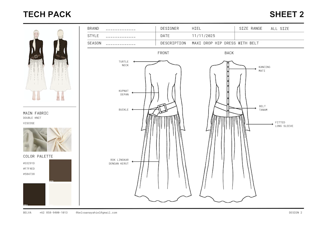
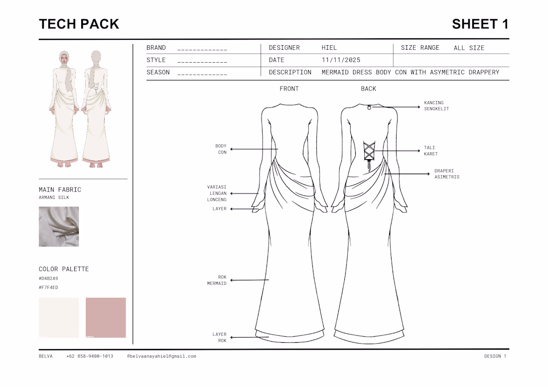
Recent work for a modest clothing brand. Included : 3 Full colored designs and tech pack for each design.
Contact me for collaboration and more infos!
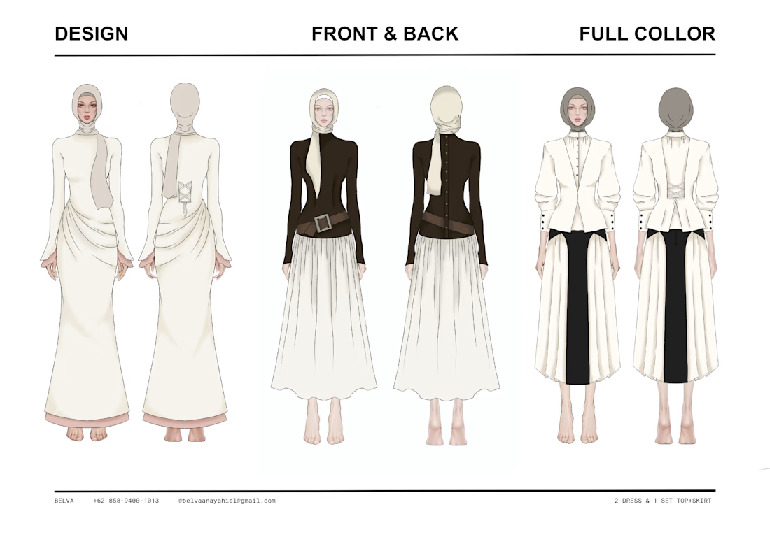
The transition from the digital illustration to the full tech pack is so seamless!
As a Social Media Manager, I'm curious do you find that showing these behind-the-scenes 'process' visuals helps the brand build more Visual Trust with their community than just showing the final product? It’s such a strong High-Fidelity look!
Trending
Claude
Claude has entered the design space. How are you using Claude Design?
Contra University
Learn from expert creatives how to earn more using next-gen AI tools.
creativeaiflow
Creative AI workflows are evolving. What tools do you use, and what are their strengths and weaknesses?
portfolioreview
The best portfolios tell a story, not just show a grid. Share yours for feedback.
freelancerlife
Freelancer life is wins, pivots, and everything in between. What’s yours right now?