
Tara Vanhooser
Brand designer who builds human brands that actually connect
New to Contra
Tara is building their profile!
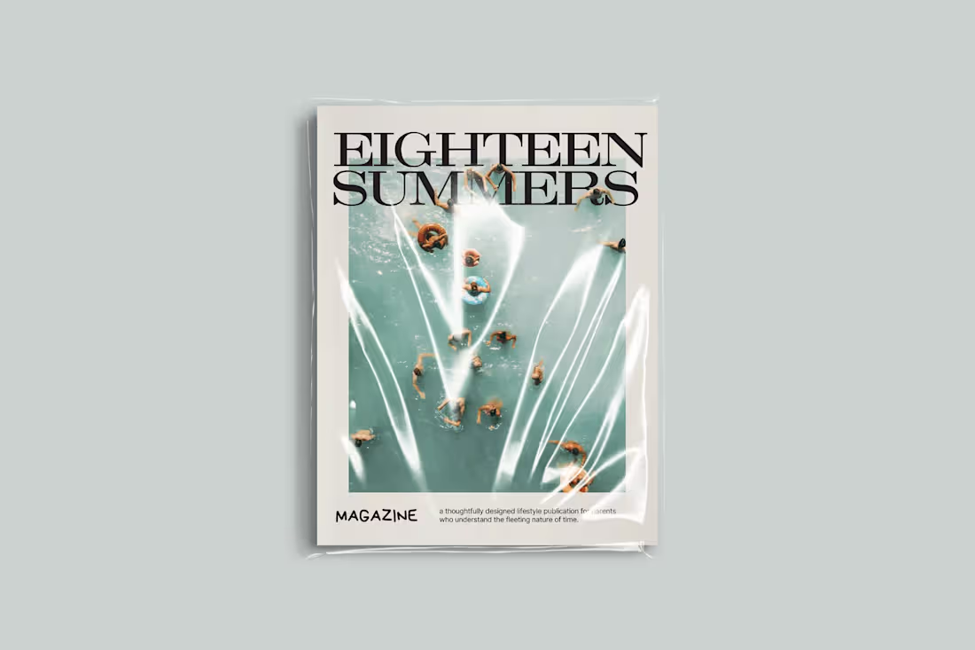
EIGHTEEN SUMMERS is art direction first, layout second. I established a seasonal structure and then designed around it, using pacing, white space, and image hierarchy to let the story breathe instead of suffocating it with decoration. Typography does a lot of the heavy lifting. Clean, editorial fonts paired with intentional scale shifts create rhythm across pages so it actually feels like something you’d want to flip through, not just politely admire once.
Visually, I leaned into restraint. Soft color palettes, consistent spacing, and minimal but thoughtful graphic elements keep it cohesive while still letting the photography carry emotional weight. Every spread feels considered, not crammed. The result is a publication that feels personal without being chaotic and elevated without trying too hard, which is a rare combo considering most people would’ve turned this into a glitter glue situation within five pages.
1
12
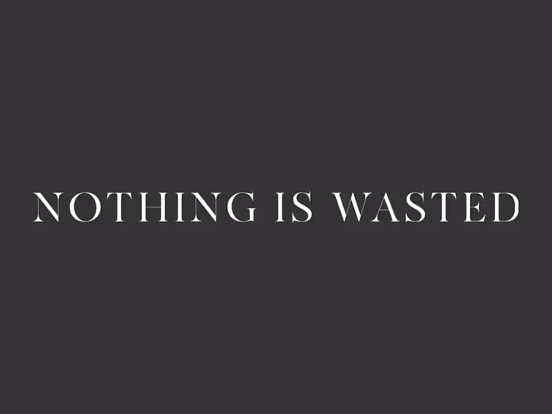
I spent four years leading creative direction for Nothing Is Wasted, building a cohesive brand system and multi-platform content ecosystem for a global, mission-driven organization. I translated complex, emotionally layered stories around trauma and healing into clear, scalable design and campaigns that actually connect with people.
2
18